Mobile SDK Developer Guide
Introduction
What is the Mobile SDK?
A software development kit (SDK) is typically a set of frameworks and tools that gives developers a foundation for building applications. In the case of SugarCRM's mobile SDK, the term has a slightly different meaning. Our mobile SDK is a fully functional mobile app capable of connecting to a Sugar server instance and providing the same set of features as the stock SugarCRM mobile app. As a mobile developer, you can produce a full-fledged CRM app in minutes with virtually zero configuration that only differs in branding from Sugar's stock app. The SDK gives you a white-labeled code set with the ability to customize your brand and add custom business logic.
Although we give you the full source code of the SugarCRM mobile app without SugarCRM branding, you are still required to stay within the limits of specific APIs when creating customizations. SDK code exposes a set of public APIs via JavaScript and the app configuration file to let you develop custom functionality.
The following diagram summarizes the relationship between SDK code base, the stock SugarCRM mobile app, and custom mobile apps developed via SDK: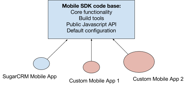
Here, the size of the ovals symbolizes the amount of custom code and instance-specific configurations. For example, the stock SugarCRM mobile app does not have any custom JavaScript code apart from Sugar brand assets and configuration.
SDK Versioning
Given the nature of the SDK code base, the SDK version is composed of three primary parts separated by dash characters:
- Core feature set version: The first part is a semver that contains the version and build number. This version changes when a new feature or fixed issue is introduced to the stock mobile app. It is visible on the About page of the app.
- Build tools version: The second part is also a semver (e.g. 1.1.3). This version changes when a new feature or fixed issue is introduced to the SDK command line build tools.
- API level: The third part is an integer with an optional "beta" suffix (e.g. 1 beta2). This version changes when a new public API is added to SDK or an existing API is deprecated. When a "beta" suffix exists, it indicates that an API is unstable and may change in a non-upgrade-safe way (e.g. without graceful deprecation in future versions until the API becomes stable).
Prerequisites
This developer guide assumes you have successfully installed the SDK and any supporting software. Please refer to the Mobile SDK Quick Start Guide for the software requirements and installation instructions.
Mobile App Overview
Both the stock SugarCRM mobile app and any custom SugarCRM mobile apps provide read and write access to data stored in a Sugar instance. The layouts and other configurations are controlled by metadata in the instance and cannot be modified from a mobile app, although end users have the ability to set up their own list views using List View Builder. For example, Studio and other configuration functionality are not available from the SugarCRM mobile app.
SugarCRM mobile apps can continue to operate when the device is offline. Users are not only able to access a cached subset of the server data, but also to perform modifications to it such as update, delete, link, unlink, and create new records. Such changes are recorded in an offline transaction log and synchronized to the server once the network becomes available.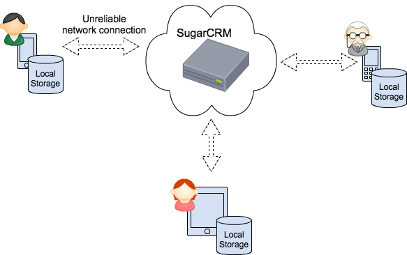
SugarCRM mobile apps support a variety of mobile platforms and device form factors. The app's user interface adapts to the device's screen size.
Device-Server Communication
SugarCRM mobile apps communicate with a Sugar instance via Sugar's REST API. Please refer to the Sugar Developer Guide for detailed documentation on the REST API.
Security
Transport
The data traveling between the mobile app and a Sugar instance is encrypted. The mobile app uses the HTTPS protocol to communicate with the server.
Authentication
SugarCRM mobile apps use the OAuth2 protocol to authenticate users with their username and password credentials. These users must already have an active account in the Sugar instance. The mobile app does not store user credentials on the mobile device. Instead, they are passed to the server in the login request and exchanged for OAuth2 tokens. The tokens are then securely stored on the mobile device and used for authenticating subsequent requests to the server.
Note: The mobile app securely stores user credentials on Apple device when Touch ID is enabled.
Authorization
The mobile app relies on Sugar roles to manage user permissions. Roles are communicated by the server to the mobile app when the app synchronizes metadata and the user profile after a successful login.
Data Protection
The mobile app stores data encrypted in SQLCypher database in case offline mode is enabled.
Technology Stack
Sugar's mobile app is a hybrid mobile application. The core of the application functionality is implemented using HTML5/JavaScript technologies that provide a common source code base for multiple mobile platforms (i.e. iOS and Android). The core web application is run in a native web view control embedded into a native shell provided by a third-party Cordova library.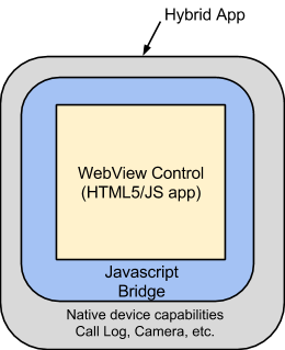
A JavaScript bridge is used to communicate between the core web application and the native code. The native part of the app provides features that can not be implemented using standard web technologies, including but not limited to the following:
- Phone call tracking
- Photo/video camera access
- Offline database
The application stack is a mix of Javascript frameworks and native code: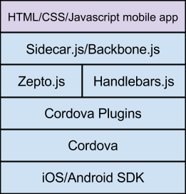
The core web application is based on a similar set of frameworks that Sugar 7 uses:
- Sidecar.js/Backbone.js: SugarCRM custom metadata-driven framework that provides API for object extension and instantiation, URL routing, view rendering. Please refer to the Sidecar documentation for details.
- Zepto.js: Replacement of JQuery.js for touch-based devices
- Handlebars.js: Templating engine
- Cordova: Javascript/Native bridge
Application Architecture
The following diagram depicts the main components of a SugarCRM mobile app: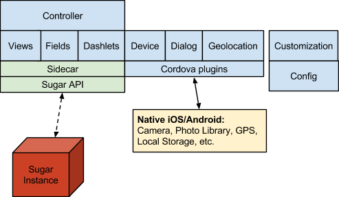
Here, the controller component orchestrates navigation and the management of views, fields, and dashlets. The device component provides access to native device capabilities. The dialog component provides an API to display native dialog widgets such as confirmation messages, action sheets, etc. Geolocation gives access to the device's GPS. The Nomad component provides a general API including app version and access to app and user settings. The customization component is used to connect your custom code, and the config component contains the app configuration.
All the complexities of data model management, metadata management, and view rendering are abstracted by the Sidecar framework. Please refer to the Sidecar documentation for detailed information about the Sidecar framework.
Metadata
The mobile app data model and user interface are driven by metadata which is supplied by the Sugar instance. The mobile app keeps a copy of the server metadata payload locally to avoid communication overhead at the application start-up and to enable the app to work offline. When requesting the metadata, the mobile app communicates device information which, along with the authenticated user profile, provides the server with enough information to build metadata payload tailored specifically for the logged-in mobile user.
The mobile app is able to detect metadata changes that happen on the server. If changes occur, the app configures itself while running.
Application Lifecycle
When a mobile app is launched, it goes through a series of state changes and makes a number of REST API requests before a user can interact with the UI. Consider the following diagram:
When the app is launched, it reads device properties, opens local storage, and initializes its internal state. Next, the app checks if a user is authenticated. If one is, the application becomes ready for use by reading cached metadata, navigating to the default view, and rendering its UI. At this point, the app starts requesting data from the server. A regular flow of CRUD operations continues when a user navigates between views.
Depending on the configuration of the offline mode, the app communicates with device's local storage to read previously cached data as well as to update the database with the latest changes from the server.
If a user is not authenticated, the app renders the login view to capture user credentials and make an authentication request to the Sugar instance. Upon successful authentication, the app requests the user profile which includes user preferences and roles, metadata payload, and label translations. Once these pieces are retrieved, they are cached in the app's local storage and the app synchronization event app:sync:complete is triggered. Afterward, the app is ready for use.
It is important to note that during the normal operation of the app, the metadata or user preferences may change on the server side. In this case, any CRUD REST call results in a 412 HTTP error. The app is able to handle this error by notifying the user about the server-side changes, re-fetching server configuration, and reinitializing the UI.
Local Storage
The mobile app has two types of local storage: key-value store and relational store. The former is used to keep application settings, user preferences and roles, metadata, and dashboard configurations. The key-value store is also used for caching dashlet chart data when offline mode is enabled. The relational store is used to keep records and their relationships to provide offline access to Sugar data. The relational store is created only if offline mode is enabled.
Offline Mode
The mobile app supports an offline mode of operation which employs several techniques to provide access to Sugar data when the network connection is unavailable:
- Actively caches records in local storage while the user is browsing through list views, detail views, edit views, and chart-type dashlets
- Keeps a log of user changes (record create/update/delete transactions) for subsequent synchronization with the server once the network becomes available
- Loads records in bulk on demand
- Periodically refreshes records kept in the device's local database with the latest changes from the server
The architecture of the offline mode is out of the scope of this document. Writing custom code is transparent with respect to the offline mode and does not require any special knowledge of its inner workings. In other words, code-level customization of the offline mode is currently unsupported by the SugarCRM Mobile SDK. However, certain parts of the offline operation can be customized declaratively via the app configuration file (e.g. the size of the storage). See the SDK Documentation for the Config module for details.
User Interface
The mobile app's UI consists of several components and elements. Only some of those components are customizable using the SDK API. It is important to understand basic user interface concepts such as the definition of a view or a field and when to use each.
UI Elements From a User's Perspective
Before exploring various UI components, it is important to clarify the term "view". "View" means different things from a CRM user/admin perspective versus a developer perspective. From the point of view of a CRM user or administrator, views are a set of fields pre-configured in Studio or built-in views available in the mobile app by default. The following is a list of mobile views:
| View | Description | Customizable via Studio or desktop app? |
| Global Search | Default home view; displays recently viewed items or search results when the search is initiated | Yes |
| Activity Stream | Displays the global activity stream | No |
| List | Displays a list of records for a given module | Yes |
| Detail | Displays a record for a given module in read-only mode | Yes |
| Edit | Displays an editable record view for a given module | Yes |
| Dashboard | Displays a list of dashlets | Yes |
| Dashlet | Displays a dashlet | Yes |
| About | Displays information about the app | No |
| Settings | Displays application settings | No except for the offline mode setting |
| Offline | Displays offline status, link to the transaction log, and bulk load view | No |
Other important UI components are as follows:
- Header: The top part of any view hosting hamburger button, back button, right menu button, search button, and view title
- Main menu: The slide menu revealed when a user taps the hamburger button on the top left side of the header
- Right menu: The slide menu on the right-hand side that contains additional actions for the current view and is revealed when a user taps the overflow button on the right side of the header
- Context menu: The record action menu revealed when a user swipes on a list item
- Record Summary view: The bottom portion of a record detail view with the list of record fields
- Actions toolbar: The record action band displayed on a record detail view
- Edit overflow menu: The dropdown menu displayed on a record edit view when there are multiple actions available
It is important to understand that the mobile UI is metadata-driven. Studio configurations to mobile views are translated into a metadata payload which is processed by the mobile app which renders the UI accordingly. The metadata contains information about sets of fields to display for each module and for each of their three views: list, detail, and edit.
UI Elements From a Developer's Perspective
Views and Screens
When discussing the SDK, a "screen" is the user interface currently displayed to a user. A screen takes all real estate of the device's screen and may contain multiple views.
The term "view" refers to an application UI component that is responsible for rendering and controlling a single, logically encapsulated piece of functionality. In technical terms, a view is a combination of a Handlebars template and Javascript controller object with Backbone.View at the foundation of the inheritance chain.
The following are examples of mobile views:
- ListView renders a list of records together with item context menus, the "Show More" button, pagination control, etc. ListView handles user actions, such as tapping on records, swiping them, long taps, etc.
- HeaderView is responsible for rendering a header that can be seen on almost every application screen. HeaderView controls which buttons should be shown at every given moment, which of them are disabled, and also handles button actions.
- FiltersView renders dropdown filters that provide users with the ability to choose a filter and sort parameters for a list view.
- Other views available in mobile include MainMenuView, AboutView, DetailView, EditView, etc. Please note that not every mobile view is available for extension and configuration via SDK APIs.
There are also complex views that are containers for child views. For example, FilteredListView groups SearchBoxViews, FiltersView, and ListView to provide filtering, sorting and search functionality for lists.
The mobile app also provides a few container views. A simple BaseContainerView can be used to render child views as a sequence of <div> elements. SwitchContainerView provides more advanced functionality where child views can be rendered as cards, tabs, etc.
This image shows a FilteredListView structure that is based on the simple BaseContainerView: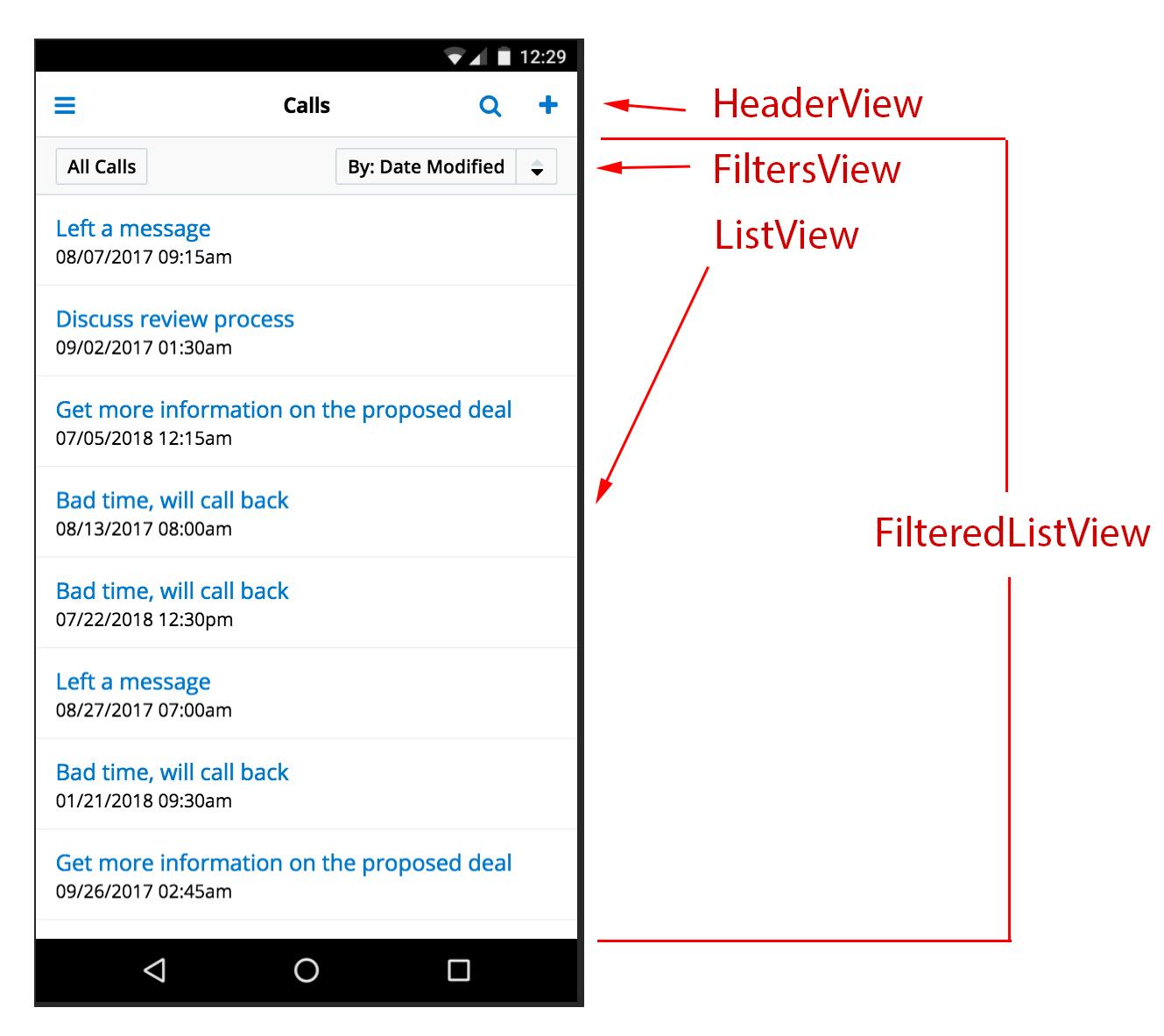
In the picture above, FilteredListView combines FiltersView and ListView. HeaderView is independent and rendered separately.
Views are built, cached, and destroyed by a special component called the controller. Refer to the User Interface Navigation section for information about the controller component.
Fields
Any Studio-configured mobile view has a set of fields. There are a set of predefined field types, each of which has a corresponding class declared in the mobile SDK. One could override the behavior for built-in field types as well as implement template and business logic for new field types using the SDK. Refer to the Customization section for details.
Technically, each field is an instance of the Backbone.View class. Like a view, every field has a Handlebars template and a JavaScript controller which defines the UI and the logic respectively. To be more precise, a field has four templates. Each template defines the look and feel of the field for one of the following mobile views: list, detail, and edit. The fourth template is called "read-only" and is used on the edit view to render the field in a read-only format when the user does not have edit access. All mobile field classes are derived from the base TextField class which defines the default UI for all four use cases. Please refer to the JavaScript API documentation for the full list of field types.
Menus
There are a number of menus available in the mobile UI:
- Main menu under the hamburger button
- Quick create under the plus button on the global search view
- Record context menus on list views
- Action toolbars on detail views
- Right menus on detail views
- Overflow menus on edit views, which are only displayed when there are actions in addition to Save
Record Actions
The mobile app has a notion of record actions. These are operations you can perform on a single record. Although Studio does not have a dedicated UI for configuring actions, the availability of some actions is still determined by the metadata, namely, the type of fields that are available on a view. The following field types have these coordinating actions available in list item context menus and detail view toolbars:
| Field type | Action |
| phone | Call, SMS |
| address | Map |
| url | Web |
| file, attachment, image | File |
The following actions are not controlled by metadata but, rather, are available by default or determined by user roles:
| Action | Available on | Controlled by User Roles |
| Edit | Context menu, right menu | Yes |
| Delete | Context menu, edit view | Yes |
| Favorite | Context menu, detail view | No |
| Share | Right menu | No |
| Close | Context menu, edit view overflow menu only for Meetings, Calls, and Tasks | Yes |
| Create related | Right menu | Yes, also depends on relationship type |
| Link related | Right menu | Yes, also depends on relationship type |
| Unlink | Context menu on related lists | Yes, also depends on relationship type |
Dashboards and Dashlets
The mobile application fetches the dashboard configuration asynchronously after login completes and the main metadata synchronization procedure completes. The dashboard metadata is stored in the app's local storage to provide offline access to dashboards. Users will see a "Dashboard configuration has changed" message appear after login if the app detects that the dashboard metadata stored locally does not match the server-side copy.
Development Workflow
A typical development process entails authoring JavaScript code, Handlebars templates, and an app configuration file. It is up to the developer which tools to choose for custom code authoring such as a simple text editor or a full-fledged IDE like WebStorm.
It is important to note that mobile app developers must not touch any code in the SDK folder specified by the $SUGAR_MOBILE_SDK_HOME environment variable. Custom code lives outside, in your custom app folder. Developers can have multiple versions of the SDK installed on their system and have multiple custom mobile apps using different versions of the SDK.
To get started with a new custom mobile app, a developer would typically bootstrap it using the SDK's generate-app script. Please refer to the Mobile SDK Quick Start Guide if you would like to generate a sample project before moving on to an advanced custom app project.
Custom App Project
To bootstrap a custom mobile app project, run the following command:
$ "$SUGAR_MOBILE_SDK_HOME/<sdk-version>/sdk/generate-app" [path]
Use the "path" parameter to specify the folder where the project should be created. The generate-app script is interactive. It asks for an app name and Sugar instance URL, gives the option to include sample data, and suggests to create a signing key for Android application binary.
Note: The names of apps built with the SDK can only contain alphanumeric characters.
Once the app is generated, you should see a folder structure similar to the following:
~/Projects/acmecrm/
 .gitignore
 get-sdk-path.js
 cordova
 package.json
 sdk
 build/
 config/
   app.json
   app-dev.json
   branding assets
   binary signing assets
 custom/
 native/
   platforms/
     android/
     ios/
   ...
The following elements will be included in the generated project:
.gitignore: Default ignore configuration for gitget-sdk-path.js: Helper script for the SDK build toolcordova: Helper script for running Cordova taskspackage.json: Minimum npm configuration to get the app build goingsdk: SDK build script used to interact with the SDK via command linebuild: Build artifacts and logs will be stored in this folderconfig: App configuration, branding, and signing assetsnative: Native projects for iOS and Androidcustom: This is the folder to store your custom JavaScript and handlebars files
Note: The package.json file contains an sdkVersion property which indicates the SDK version to use for building the application. You can update this property to target a specific SDK version if you have multiple versions installed. If you change the version, make sure you recreate the native project by running the ./sdk init-native command.
Configuration
You can specify your custom app configuration in the config/app.json file. The SDK has a main configuration file with reasonable defaults preset. Refer to the JavaScript API documentation for configuration defaults and options. You can override specific settings in your custom config file without replicating all the settings. Refer to the next section for details about making an app-dev.json development configuration file.
In addition to the app.json configuration file, the config folder contains the following branding and signing assets for your custom app:
app-icon-android.svgandapp-icon-ios.svg: Application icon images in SVG format for Android and iOS, respectively. The SDK is capable to generate the required images in various sizes for various screen size resolutions and device types.company-logo.svg: Company logo image in SVG format displayed on the login viewsplashscreen-logo.svg: Splashscreen logo image in SVG format displayed on the app launch screenapp.less: LESS stylesheet with custom styles and overridden styles
For details about signing assets and how to sign binaries for testing and production, please refer to the App Signing for Mobile SDK article.
Development Configuration File
A development configuration file is recommended for source control. Different developers may have Sugar instances installed at different URLs. Developers may also prefer certain configuration settings for app debugging only. Such settings may not necessarily be the same in the CI environment, which builds the app for production or QA testing.
During development, create an app-dev.json file in the config directory and ignore it for source control. This file would contain only the settings that are different from the main configuration stored in config/app.json.
For example, to disable the welcome tutorial during development without removing it from the main application, create a config/app-dev.json file that contains the following:
{
 "jsConfig": {
 // URL path to my local instance of Sugar
 "siteUrl": "http://localhost:8888/ent7900",
 // Do not display welcome guide
 "ui": { "showTutorial": false }
 }
}
The contents of config/app-dev.json will be applied on top of the main app configuration stored in config/app.json when the app is compiled for debug scheme.
Building
The SDK build tools are command-line based and are run from a terminal window. There are a number of build tasks available, with the following being the most frequently used:
# Run web app debug server
$ ./sdk debug

# Build native app
$ ./sdk build [--platform ios|android|native] [--scheme debug|release]

# Generate web bundle
$ ./sdk bundle-web [--platform ios|android|native] [--scheme debug|release]

# Recreate native projects
$ ./sdk init-native

# Update native projects
$ ./sdk update-native
To get the full help materials for all build tasks and options, run the following command:
$ ./sdk help
SDK supports a notion of build schemes. Build schemes are commonly used in scenarios where you would like to distribute an app to a small group of test users or easily port the build from a development to a production environment. The app will need to be built for different environments: development, testing, production, etc. Each environment can then have different application configurations. You can declare your own custom build schemes in the config/app.json file or use one of the two default schemes:
- debug: Used during development
- release: Used for building applications for production environment and store submission
To specify the build scheme, use -s|--scheme in command line when running ./sdk build script, for example:
$ ./sdk build [-s debug|release]
The platform parameter -p|--platform is used to specify which mobile platform you are building the application for: Android, iOS, or both (native).
The build pipeline consists of multiple steps and depends on the build scheme and platform. Consider the build tasks in the following diagram which depicts a simplified build process: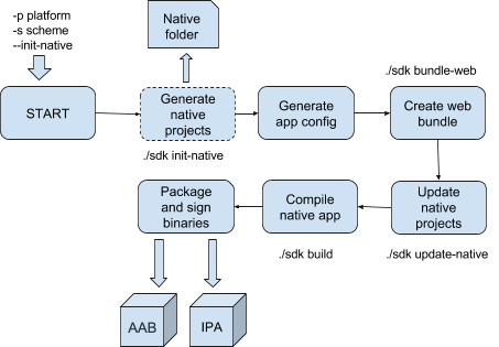
As mentioned in the Custom App Project section, the app folder structure includes native projects for Android and iOS in a folder called "native". This folder is auto-generated and is not meant to be directly edited by developers. You can re-create native projects by running the ./sdk init-native task or passing the --init-native option to the build command. The first task which is optionally run in the build pipeline is "Generate native project". It is worth mentioning that this task does not need to be re-run if any of the native project configuration properties have changed such as application icons, splash screen background color, Java package name, iOS bundle ID, etc. The build tool will update native projects with new settings without re-creating files in the "native" folder (the update-native task in the diagram). Any Cordova plugins you have installed after the app has been generated will not be affected. However, if you want to start from clean slate, it is recommended to run the ./sdk init-native command or pass the --init-native option to the ./sdk build task.
The "Generate app config" task creates an application configuration file by taking the default config file from the SDK and applying your custom mobile app config config/app.json on top of it. Next, "Create web bundle" compiles the web portion of the app by concatenating the JavaScript files, optionally obfuscating them, compiling the LESS stylesheet into CSS, and finally copying web assets into the corresponding native projects. This is the last task performed if only ./sdk bundle-web is run.
In the case of executing the full build command ./sdk build, the script compiles the native projects into binaries, creates the packages, and signs them.
Build artifacts are output to your custom app's build folder.
If you encounter errors when building your app, see the Troubleshooting the Mobile SDK article for some common environment errors and how to resolve them.
Debugging
There are two debugging scenarios that you will encounter. Since the app is a hybrid and the custom logic is implemented in JavaScript/CSS/HTML, the primary debugging scenario is running the web portion of the app in a desktop browser and using its developer tools to step through the code, inspect HTML/CSS, etc. The SDK is able to run a local HTTP server for web debugging:
$ ./sdk debug [--debug-host host] [--site-url sugar-instance-url] [--disable-livereload]
By default, the debug server is run at http://localhost:9000. You can specify a different host, port, or enable SSL using the --debug-host parameter. If you do not specify a Sugar instance URL, the SDK will look into your app-dev.json configuration file and then fallback to the main app.json. Our recommendation is to specify an instance URL in app-dev.json so that you will not have to specify it in the command line.
The server does not need to be restarted after modifying your custom js/hbs/less files. The browser will reload the app automatically. You can turn this off with the --disable-livereload option.
The second debugging scenario is running the app on an iOS Simulator/Android Emulator or a physical device. Once you have generated the native projects and web bundle, you can fire up Xcode or Android Studio, open a native project, and run the app from the IDE. The native Android and iOS projects are located in the following corresponding folders: native/platforms/android and native/platforms/ios. You can step through not only the native code when running the native app from the IDE but also debug the web code by attaching Chrome dev tools or Safari dev tools to the simulator/emulator/device.
The following diagram summarizes the debugging scenarios: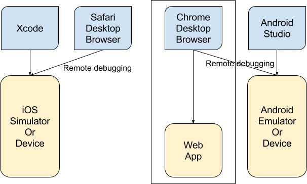
Testing and Releasing to Production
Use the following command to compile the native application for testing or production:
$ ./sdk build [--init-native] [-p ios|android|native] [-s debug|release]
Typically, app binaries have to be signed even for the QA environment. It is easily accomplished for Android. Sugar provides a dummy signing key which you can use for installing a test build on your device or devices of your beta testers. We recommend you generate your own signing keys for security reasons.
The signing process for the iOS platform is much more involved and requires a developer or enterprise account with Apple. Please refer to the App Signing for Mobile SDK article for full details about Android and iOS binary signing.
Customization
There are a number of ways of extending or customizing the standard application:
- Modify configurations in
config/app.json - Modify CSS styles in
config/app.less - Implement new functionality using Javascript and Handlebars in the
customfolder - Integrate a custom Cordova plugin to add native functions
Configuration
Many application behaviors can be controlled declaratively without writing custom code but rather by configuring settings in the application configuration file.
The mobile SDK contains a default configuration file. When compiling the app, the SDK build tool takes the default configuration and overrides values with your custom settings defined in the config/app.json file. The override sequence is as follows:
- Default configurations are taken from the "defaults" section of the SDK's
config_template/app.jsonfile. - Scheme-specific configurations from the SDK's
config_template/app.jsonfile are applied. - Custom configurations from the "defaults" section of your custom
config/app.jsonfile are applied. - Scheme-specific configurations from your custom
config/app.jsonfile are applied. - Development configurations from your
config/app-dev.jsonfile are applied. This step is executed only when the./sdk debugcommand is run or--scheme debugis used.
Please refer to the Development Workflow section for details about build schemes and development configuration.
Consider the structure of a typical custom configuration file:
// config/app.json
{
   // Settings in the defaults section to take effect in all build schemes
   "defaults": {
       "jsConfig": {
          // Settings specific to the web portion of the app
       },
       "native": {
          // Settings specific to the native of the app
       }
    },
    // Override settings for the "debug" scheme
    "debug": {
       "jsConfig": {
       },
       "native": {
       }
    },
    // Override settings for the "release" scheme
    "release": {
       "jsConfig": {
       },
       "native": {
       }
    }
}
Please refer to the JavaScript API documentation for a detailed explanation of all configuration settings.
Branding and Theming
This section describes how to specify application images and change the colors of basic UI elements.
Images
First, prepare graphic assets for your application. There are four images you need to create. All of them must be in SVG format. The SDK tools generate a set of PNG images of all sizes and resolutions required by the iOS and Android platforms.
| File Name | Description | Config Setting in app.json |
| app-icon-android.svg | Android app icon (launcher icon) | native.android.applicationIcon |
| app-icon-ios.svg | iOS app icon | native.ios.applicationIcon |
| company-logo.svg | Logo displayed on the login view | ui.companyLogo |
| splashscreen-logo.svg | Logo displayed on the app launch screen | native.splashscreenLogo |
Note that you do not have to specify paths to images in config/app.json as long as your image files have the default names specified in the table above.
Consult the Android Launcher Icons and iOS Human Interface Guidelines documents about creating proper application icons.
Native UI
The background color of the splash screen (application launch screen) and the color of the device status bar can be specified in the app.json configuration file using the following settings:
native.splashscreenBackgroundColornative.statusBarBackgroundColor
Use hexadecimal format for the color value. For example:
// config/app.json
{
   "defaults": {
       ...
       "native": {
           ...
           "statusBarBackgroundColor": "#bf2020",
           "splashscreenBackgroundColor": "#7f8384"
...
}
Web UI
Many UI elements can be customized by changing their color, font, and other properties. The SDK's default LESS stylesheet contains a number of @SDK__ variables whose value can be overridden. To do that, create a stylesheet named app.less in your custom app's config folder and specify custom values there. For example, suppose you want to change the header background to blue and the header font color to white. Override the corresponding variables in your app's LESS file as follows:
// config/app.less
@SDK__headerBackgroundColor: blue;
@SDK__headerFontColor: white;
See the SugarCRM Mobile Style Guide for the full list of SDK LESS variables.
Organizing Custom Source Code
A typical custom mobile app contains source code in various languages:
- JSON: App configuration
- LESS: CSS styles
- Javascript: Business logic such as custom views, fields, actions, navigation, etc.
- Handlebars: View templates
- Native code (e.g. Java, Objective C, or Swift): Custom Cordova plugins
Previous sections describe how to write app configurations and CSS styles. Please refer to the Integrating a Cordova Plugin section for details about native integrations. This section discusses Javascript and Handlebars code.
The mobile SDK does not impose any restrictions or rules on how JavaScript files should be organized. The only requirement is that your code must reside in the app's custom folder. It is totally up to you how you want to organize your custom JavaScript code. You can put all of your custom logic in a single JavaScript file or split it into multiple files. As for Handlebars template code, the mobile SDK imposes certain rules (see below).
Best practice is to split custom JavaScript code into multiple .js files and place them into subfolders. For example, consider the following scheme:
custom/
 fields/
   {field-type1}/
     field-type1.js

   {field-type2}/
   . . .
 views/
   {view-name1}/
     view-name1.js
     view-name.hbs
   {view-name2}/
   . . .
 actions/
   my-action1.js
   my-action2.js
   . . .
In the example above, custom field implementations are placed under the fields folder. Each field type has a corresponding subfolder hosting the field's JavaScript controller and Handlebars templates. A similar organization pattern is applied to views: their code is placed under the views folder with each view having its own subfolder with a JavaScript controller and a Handlebars template.
File naming is important when working with Handlebars templates. When you interact with the SDK via a CLI script, the build tools automatically process and pre-compile all *.hbs files found inside your custom folder. All compiled templates are delivered to the browser as JavaScript functions and are all accessible through a global Handlebars.templates object. You can examine the contents of this object during debugging. However, using the templates' functions by accessing this object directly should not be done. Templates can be referenced inside your custom classes simply by name which is the same as the template file name without the .hbs extension. For example, suppose you want to declare a custom MyDayView class that uses a custom template meetings-list.hbs. In this case, you would reference the template by name in the view declaration. Your custom folder would have two files: the JavaScript controller and the template, as follows:
    // custom/views/my-day-view/my-day-view.js
class MyDayView extends ListView {
    template = 'meetings-list';
}
// custom/views/my-day-view/meetings-list.hbs
<div class="listing" id="{{listViewId}}">
...
</div>
Note that the template name is always derived from the file name only. This means that the template name for the meetings-list.hbs file located inside the root custom folder will be the same as the file name for the meetings-list.hbs file located in the subfolder /custom/views/my-day-view. In other words, subfolder names are ignored. For this reason, you should give unique names to your template files.
Field Templates
Field templates are treated by the mobile SDK in a special way. There are four types of field templates: list, detail, edit, and readonly. As their names imply, the templates are used to render a field on the corresponding view: list, detail, or edit. The readonly template is used on the edit view when a user does not have edit permissions and the field needs to be rendered in the disabled state. The location and name of field template files must adhere to the following pattern:
custom/
 fields/
     {fieldType}/
         list.hbs
         detail.hbs
         edit.hbs
For example, consider customizing how the email type field is rendered on the record detail view. You also have a custom signature type field which can be rendered on record edit view only. In this case your custom folder would appear as follows:
custom/
 fields/
     email/
       detail.hbs
     signature/
       edit.hbs
       signature.js
Note that the signature.js controller is located in the same folder as the signature edit template. In theory, you can place signature.js anywhere inside the custom folder. However, in practice it does not make sense as you would probably want to keep each component's controllers next to its template files.
User Interface Navigation
Web browser navigation lies at the foundation of the mobile UI navigation. This is because custom mobile apps are hybrid apps, as was discussed in the Application Architecture section. Nearly all screens have URLs unless they are dynamic views. You can inspect the URLs of app screens when running the app in debug mode in a browser.
The SDK employs the Backbone.js routing mechanism to provide an API for switching between screens. The SDK's navigation module also keeps track of route history to allow backward navigation. The navigation API is available via the Controller module. The main and most commonly used method is controller.navigate. In the simplest scenario, you can pass a URL hash in order to navigate to the desired screen. For example, the following code snippet switches the UI to the Accounts list view:
app.controller.navigate('#Accounts');
A typical URL hash pattern is as follows: :module(/:<modelId)(/:action). The model ID and action parameters are optional. Here are more examples of URL hashes:
| URL Hash | Description |
| Contacts | Contacts list view |
| Contacts/123 | Contact detail view (id = 123) |
| Contacts/123/edit | Contact edit view (id = 123) |
| Contacts/create | Contact create view |
A route in SDK terms is a combination of URL patterns and business rules that describes how these patterns address application screens. A route may address multiple screens. In such cases, it is said that the route has multiple steps. For example, a URL hash like :param1(/:param2)(/:param3) can be defined as a three-step route or three separate, single-step routes.
Registering a New Route
To register a new route, use the customization.registerRoutes API. Each route object contains a list of steps, a handler function, and an options processor. Any route, as well as each step of a route, must have a unique name. Consider the following example of a one-step route:
    import customization from 'APP/js/core/customization';
import TodoListView from './views/todos/todo-list-view';
const todoRoute = {
    name: 'todo-list',
    steps: 'todos',
    handler() {
        app.controller.loadScreen(TodoListView);
    },
};
customization.registerRoutes([todoRoute]);
In the example above, we register a "todo-list" route which will be matched to a #todos URL hash. When such a URL is hit, the SDK will call the handler function which, in turn, will load a screen to show the TodoListView view.
Consider a scenario where two screens are addressed by the same route. The first screen displays a list of pandas. The second screen displays panda details. We also would like to parameterize both views by panda type. To do that, you can define a route with two steps, "panda-list" triggered by a #Panda/:pandaType URL and "panda-detail" triggered by a #Panda/:pandaType/:pandaName URL. Note that the pandaName parameter is optional and thus is enclosed in parentheses:
const twoStepsRoute = {
  name: 'two-steps-panda',
  steps: [
      {
          name: 'panda-list',
          url: 'Panda/:pandaType',
      }, {
          name: 'panda-detail',
          url: '(/:pandaName)',
      },
  ],
  getScreenOptions(pandaType, name) {
      return {
          pandaType: pandaType,
          pandaName: name,
      };
  },
  handler(screenOptions) {
      if (screenOptions.action || screenOptions.pandaName) {
         app.controller.loadScreen({
            primary: {
               view: screenOptions.action ? PandaActionView : PandaView,
               data: screenOptions,
            },
            secondary: {
               view: PandaListView,
            },
         });
      } else {
         app.controller.loadScreen({
            data: screenOptions,
            view: PandaListView,
         });
      }
  },
};
The getScreenOptions method is used to construct an options object which is passed to the route handler. In this case, we would like to let the handler know the type and ID of a panda. The second parameter pandaName will be undefined when the first step is hit. Based on the screen options information, the handler decides which view to load into the screen. Both list view and detail view are rendered when a user navigates to the second step of the route. This results in the detail view being rendered side-by-side with the list view on tablet screens.
Both the getScreenOptions and handler methods are optional. If the handler callback is omitted, a virtual handler is created which calls controller.loadScreen(route.getScreenOptions()).
Keep in mind that the order of registering routes is important. The SDK will use the first route that is matched for a given URL hash.
Back and Up Navigation
In some cases, a mobile app needs to render a previous application screen after doing a certain action. For example, tapping the Back button on a record detail should navigate back to a list view, while tapping the Cancel button on edit view should close the view and navigate back to the previous screen, which could be either list view or detail view. For this purpose, the SDK keeps track of all screens a user navigated through. By default, every invocation of controller.navigate(url) records the screen URL in the navigation history storage. To exclude a route or a route step from tracking, pass the skipTrack flag in the route or step definition.
The SDK navigation module has two methods of traveling back in the history: navigating back and navigating up. "Back" navigation takes the previous step from history storage and renders the corresponding screen. So, if a user needs to be navigated exactly to the previous screen, then controller.goBack() should be used.
"Up" navigation is more intelligent. In most cases, it works like back navigation, but there are cases when showing the previous step in the history is not expected. For example, when the app is running on a tablet, it is capable of rendering two views side-by-side on a single screen. A user launches the app and navigates to a list of records. Then, she browses through a number of records from a list by opening their record detail views. In this scenario, the list view (secondary view) remains visible on the left, and the current record's detail view (primary view) appears on the right. The navigation history should be as follows: List > RecA > RecB > RecC.
In case of back navigation, all the steps would be retraced one-by-one: RecC (back) > RecB (back) > RecA (back) > List.
Up navigation keeps the "parent" step (List) for each of the "child" steps (RecX) and brings the user directly to the parent step, skipping all children which are stored in the history. The example above would be simplified to: RecC (up) > List.
For an Android application, tapping the device's Back button always retraces the navigation history using back navigation. The Back button in the UI, on the other hand, employs up navigation.
Up navigation makes it possible to render a parent screen even when the navigation history is empty. Mobile apps support deep linking, meaning an app can be launched into a specific view via a specially-crafted link. If a user taps a link which loads the app into the Accounts edit view such as #Accounts/:AccountId/edit, the navigation history would be empty since the application just started. Calling app.controller.goBack() would close the app. This is equivalent to tapping an Android device's Back button and is the expected behavior. However, tapping the Cancel button on the edit view would navigate the user back to the record detail view. Tapping the Back button on the detail view would navigate to the corresponding module list view. This is made possible by the up navigation module. The parent screen in such cases is calculated according to the rules described in the up navigation map, which can be passed as the second parameter to the customization.registerRoutes method. This object has a tree structure and describes parent-child relationships between different navigation steps. Please refer to the Mobile SDK Sample Library for examples.
Showing Views On a Screen
Use the app.controller.loadScreen method to display views on a device screen. The main parameters of this method are the view constructor functions and the data that you want to pass to the views after they are created.
app.controller.loadScreen({
  view: MyListView,
  data: {
      myId: 'xyz123',
  },
});
In more advanced cases, the loadScreen API can be used to display two views side-by-side, to provide initialization options to the view, etc. Please refer to the JavaScript API documentation and Mobile SDK Sample Library for more detailed information about supported parameters.
Customizing Views and Fields
This section describes how to customize the behavior of standard UI components by extending from the base SDK classes or creating new components from scratch.
The SDK APIs allow you to extend or completely replace the standard functionality. You can make simple changes to the standard views (e.g. changing the header title for the Meetings module or disabling the "Create New" button on the Tasks list view) as well as completely replace the standard UI template and business logic.
The workflow consists of two steps. The first step is to take an existing view you want to extend or override as a parent class and create a new child class. This is done using the customization.extend API, which is very similar to Backbone.extend and accepts a simple set of parameters: parent class, prototype extension object, and constructor extension object (the last parameter is rarely used).
Consider the following example:
    class MeetingsListView extends FilteredListView {
    isFilterEnabled = false; //disable filters and search
    isSearchEnabled = false;
    headerConfig = {
        title: 'My Day',
    };
    initialize(options) {
        super.initialize(options);
        // Specify custom filter for the view collection.
        this.collection.filterDef = {
            date_modified: {
                $dateRange: 'last_7_days',
            },
        };
    }
    //Below we show how we can extend inner ListView without declaring separate  class
    //This can be done by extend getListViewDef function
    //We provide custom list item template
    getListViewDef(options) {
        return _.extend({}, super.getListViewDef(options), {
            listItemTpl: 'custom-list-item',
        });
    }
}
In the example above, the customization.extend API returns a reference to a new class.
The second step is to instruct the mobile app to use this class, which is done using the customization.register API.
The following code registers our MeetingsListView class:
customization.register(MeetingsListView, { module: 'Meetings' });
After registration, the MeetingsListView class will be used instead of its parent class FilteredListView in the Meetings module. More advanced features provided by the customization.extend API are described in the JavaScript API documentation.
Fields can be extended in a similar way, as shown in the following example:
    import customization from 'APP/js/core/customization.js';
import CurrencyField from 'APP/js/fields/currency/currency.js';
function _validate(fields, errors, callback) {
    // Provide validation logic here
    //...
    callback(null, fields, errors);
}
// Extend existing CurrencyField class
class RliCurrencyField extends CurrencyField {
    initialize(options) {
        super.initialize(options);
        if (this.name === 'discount_amount') {
            // Validation task will be called when bean is saved
            this.model.addValidationTask('CustomCurrencyValidation' + this.name,
            _validate.bind(this));
        }
    }
    handleValidationError(error) {
        //This function will be called if validation fails.
        super.handleValidationError(error);
    }
}
// Fields must be registered for a specific metadata type
customization.register(RliCurrencyField, {
    metadataType: 'currency',
    module: 'RevenueLineItems',
});
Customizing Headers
The Header view is an essential component of almost every screen of a mobile app, making header customizations frequently required.
The mobile SDK provides a simple way to configure headers by allowing views to return a header configuration object or function. The mobile app will automatically take the provided configuration and apply it to the header. The following is an example of how to configure the header when declaring a custom view:
    class AccountsDetailView extends DetailView {
    // headerConfig can be either a static object or a function returning an object
    headerConfig(headerConfig) {
        // "headerConfig" parameter contains initial value for header config object
        let recordName = this.model.get('name');
        if (recordName) {
            headerConfig.title += ' - ' + recordName;
        }
        return headerConfig;
    }
    onHeaderSaveClick() {
        // Override Save button click handler if needed.
        // All buttons have corresponding handlers
    }
}
// Register AccountsDetailView class to be used as detail view for Accounts module
customization.register(AccountsDetailView, { module: 'Accounts' });
Some of the configuration properties are as follows:
- title: A title string to render in the header
- buttons: A button configuration object
Available buttons include: "back", "rightMenu", "search", "mainMenu", "cancel", and "save". The Save and Cancel buttons also support the label property which allows changes to their text.
Please refer to the JavaScript API documentation for additional supported properties.
You can also provide custom logic for button handlers. Each button has a corresponding click handler, which you can override in your custom view class. Button handler functions follow the naming convention onHeader<ButtonName>Click where the button name can be "MainMenu", "Save", "Cancel", etc. These handlers are invoked first on a layout and afterward on child views. Refer to the code snippet above for an example of declaring a header handler function.
If you require more than basic customizations, you can declare your own header view either by implementing a new class from scratch or by extending the standard HeaderView class and providing a custom Handlebars template.
Custom Dashlets
For custom dashlets, the SDK uses the same straightforward workflow as for the customization of views and fields. You can extend the existing dashlet class and register it in the app by mapping your class to the server metadata type.
In the example below, the server metadata contains a dashlet definition of type filtered-dashable-list, and we want to provide our view controller that will be responsible for dashlet business logic:
    import customization from 'APP/js/core/customization';
import ListViewDashlet from 'APP/js/dashlets/list-view-dashlet';
class FilteredListView extends ListViewDashlet {
    iconKey = 'dashlets.dashablelist';
    getTitle(dashletMeta) {
        return 'Filtered ListView';
    }
    getListViewDef() {
        // ListViewDashlet is a wrapper for ListView.
        // getListViewDef() function returns parameters that will be provided to the created ListView.
        // We will extend this parameters to provide filter for ListView collection.
        let listViewDef = super.getListViewDef.apply(this, arguments);
        listViewDef.listParams.filter = {
            date_modified: {
                $dateRange: 'last_7_days',
            },
        };
        return listViewDef;
    }
}
customization.register(FilteredListView, { metadataType: 'filtered-dashable-list' });
Please explore the Mobile SDK Sample Library for more examples of custom dashlets.
Custom Actions
This section explains how to customize existing actions as well as to create custom ones. For more details about record action architecture, refer to the Record Actions section. The SDK provides the ability to customize actions in the list item context menu, detail view toolbar, detail view right menu, and edit view overflow menu.
As an example, the following code snippet will implement a custom action called "magic action" for the Contacts module and have it rendered everywhere (i.e. toolbar, context menu, list view, detail view, and the edit view overflow menu):
    // custom/magic-action.js
import customization from 'APP/js/core/customization';
import dialog from 'APP/js/core/dialog';
customization.registerRecordAction({
    name: 'magic-action',
    modules: ['Contacts'],
    types: ['context-menu', 'toolbar', 'right-menu-list', 'right-menu-detail', 'edit-menu'],
    label: 'Magic Action',
    // key to CSS class defined in config/app.json
    // under defaults.jsConfig.ui.icons.actions.magic property
    iconKey: 'actions.magic',
    rank: 1,
    stateHandlers: {
        isVisible: function(view, model) {
            // Check if action is visible here
            return true;
        },
        isEnabled: function(view, model) {
            // Check if action is available here
            return true;
        }
    },
    handler: function(view, model) {
        dialog.showAlert('Magic is about to happen...');
    },
});
The above code uses the registerRecordAction API from the Customization module. This method accepts an object which represents action configuration:
- name: Unique action name
- modules: List of modules the action should be rendered for
- Omit this property if you want to render the action for all modules.
- types: List of menus the action should be rendered on
- label: Localized action label displayed to a user
- iconKey: Key to the icon CSS class
- The key must be defined in
config/app.jsonunder thedefaults.jsConfig.ui.icons.actions.magicproperty. Please refer to the JavaScript API documentation for icons that are available out of the box.
- The key must be defined in
- rank: Action position relative to other actions
- Lesser values move the action to a higher position.
By default, the action will be visible and enabled. You can provide custom logic using the isVisible and isEnabled handler functions under stateHandlers property.
Finally, define your custom logic in the handler function which will be executed when a user clicks the action button or link. The handler accepts two parameters: a reference to the view the action was clicked on and the model instance the action has to be executed for.
The following images show what our custom action "Magic Action" looks like in various locations within the app:
| Location | Appearance |
| Context Menu (list item) |
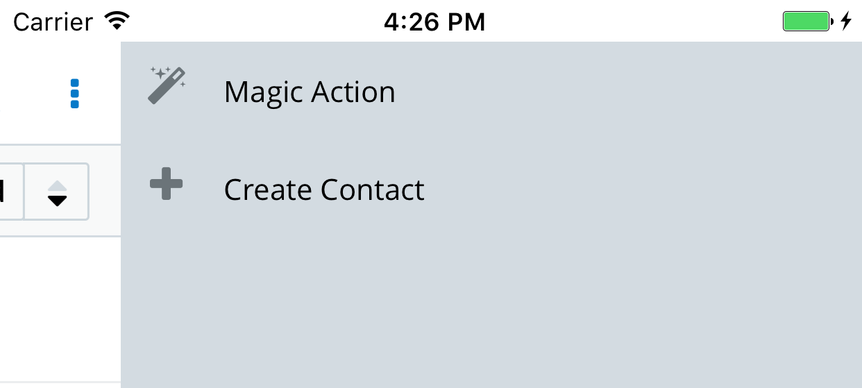 |
| List View (right menu) |
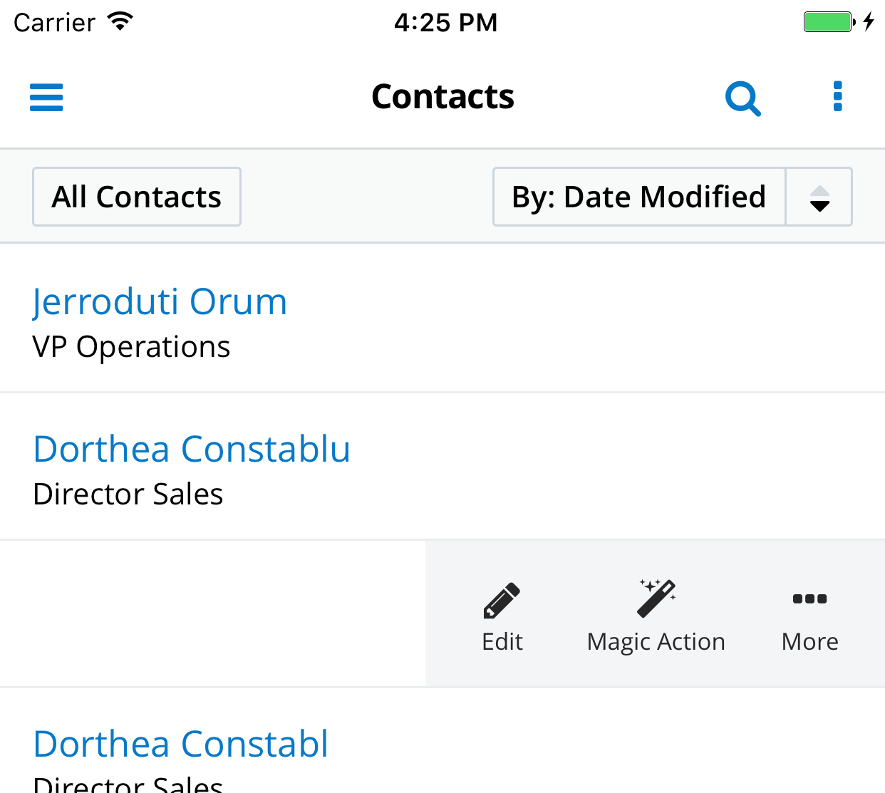 |
| Detail View (toolbar) |
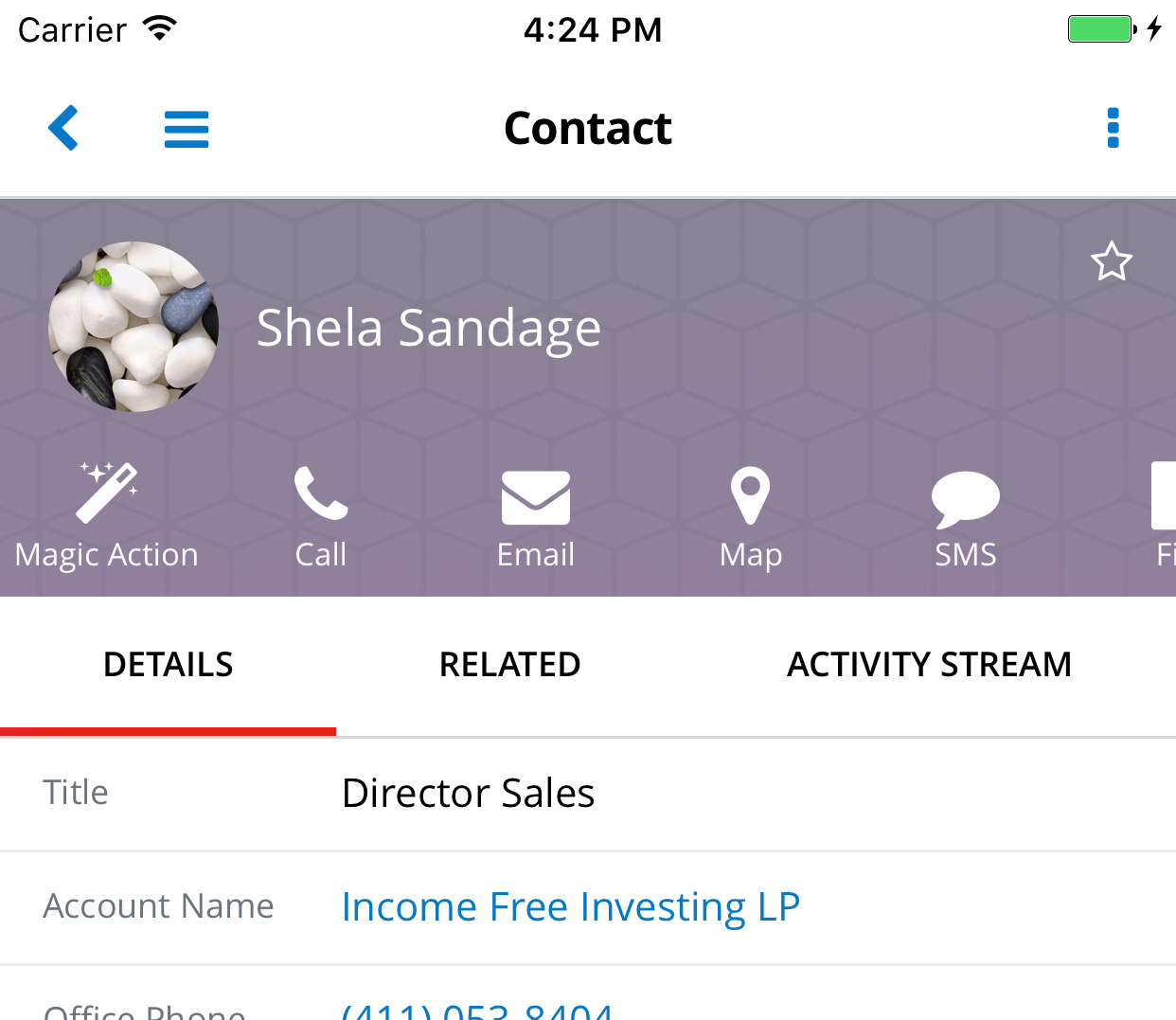 |
| Detail View (right menu) |
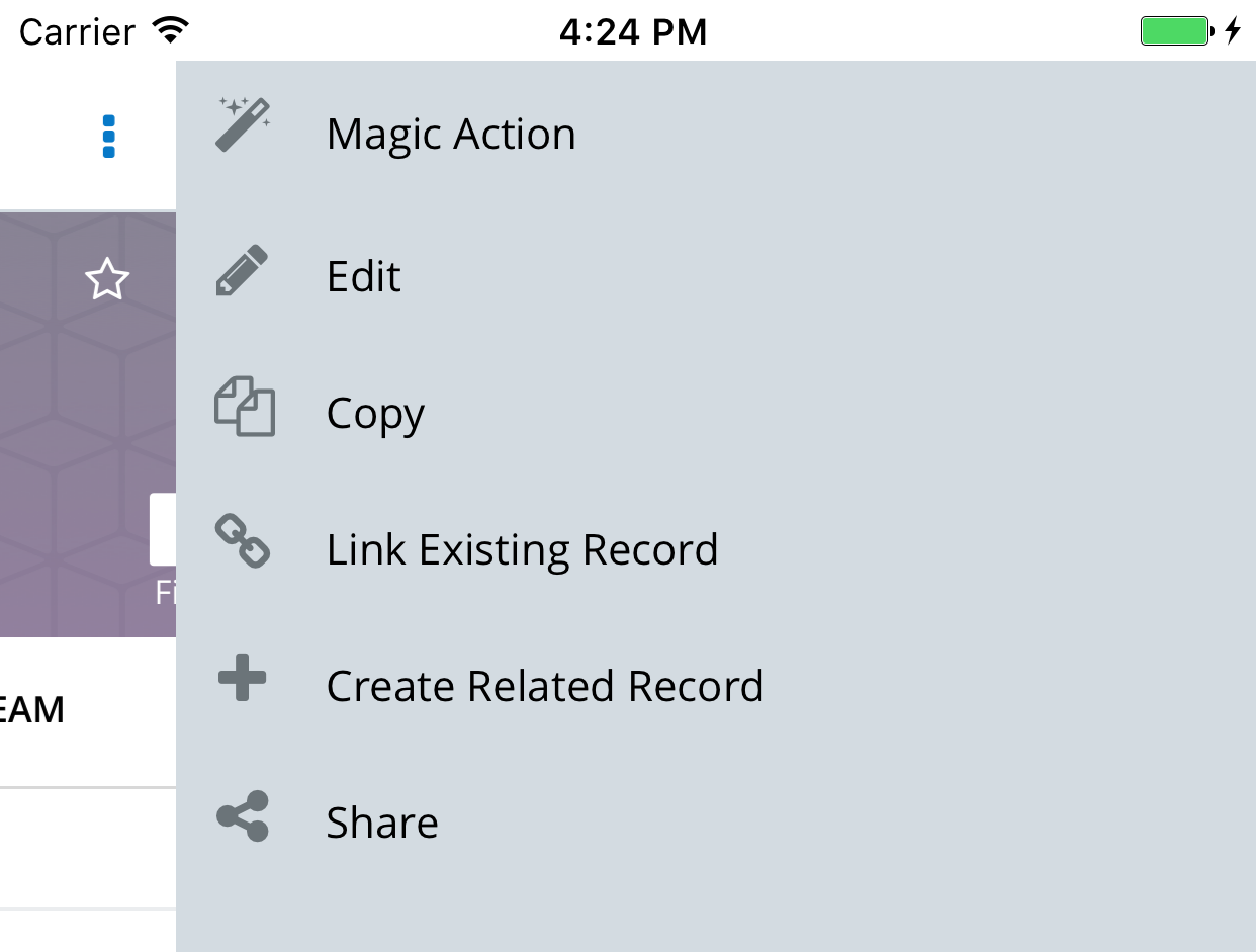 |
| Edit View (overflow menu) |
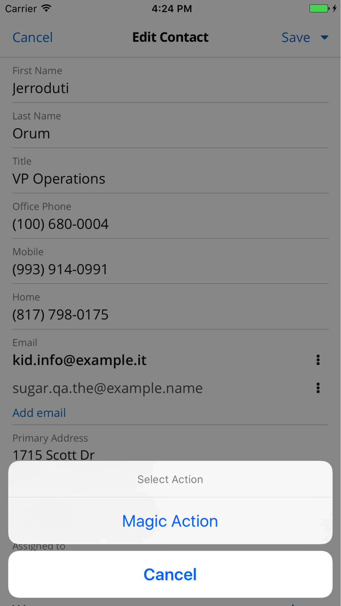 |
Built-in actions are also customizable similar to how custom actions are created. You can override any of the action configuration properties using the same registerRecordAction API. You will reference the built-in action by its unique name. For example, the following code snippet sets the rank of the Email action to zero (highest) for the Accounts module:
customization.registerRecordAction({
  name: 'email',
  modules: ['Accounts'],
  types: ['toolbar'],
  rank: 0,
});
Note that you still have to specify the types parameter. In this example, the change of rank will be applied to the toolbar menu only. While the Email action is also rendered in the context menu, its rank there will remain unmodified.
Here is another example that demonstrates how to hide the File action in the context menu for the Reports module:
customization.registerRecordAction({
  name: 'file',
  modules: ['Reports'],
  types: ['context-menu'],
  isVisible: false,
});
Note that you can specify a boolean value for the isVisible property instead of writing your own handler function.
You can see the full list of built-in actions in the SDK distribution in the $SUGAR_MOBILE_SDK/<version>/app/js/core/record-actions/default-record-actions.js source file.
Custom Menu Items
This section explains how to add custom items to the main menu. You use the registerMainMenuItem method from the Customization module to add custom items. The following code snippet adds two items to the main menu: "Create Account" and "Magic item".
    import customization from 'APP/js/core/customization';
customization.registerMainMenuItem({
    label: 'Create Account',
    rank: 1,
    route: 'Accounts/create',
    });
customization.registerMainMenuItem({
    label: 'Magic item',
    rank: 2,
    iconKey: 'actions.magic',
    handler() {
        // Implement your custom magic here
    },
});
There are a number of properties you can use to customize the behavior of a menu item:
- label: Localized item label displayed to a user
- rank: Identifies the relative position of the item
- iconKey: Key to the icon CSS class
- The key must be defined in
config/app.jsonunder thedefaults.jsConfig.ui.icons.actions.magicproperty. Please refer to the JavaScript API documentation for icons that are available out of the box.
- The key must be defined in
- route: Route to navigate to when the item is clicked
- In the example above, the app will navigate to the "#Accounts/create" URL when "Create Account" is clicked in the menu.
- handler: Callback function which is invoked when the item is clicked
- Use this property instead of the route property if you need to implement custom logic.
The following image depicts the result of the customizations. The new items are added to the modules section of the menu.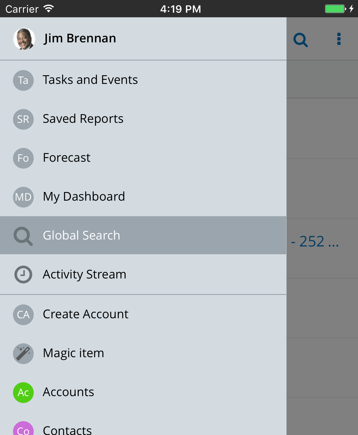
Integrating a Cordova Plugin
Not all mobile functionality can be implemented in JavaScript. For example, you may need access to the device's native address book or to display a native map control inside the application. In such cases, you can integrate a Cordova plugin. Cordova plugins usually have two components:
- Web: The web component is implemented in JavaScript. It acts as a proxy for the web app to communicate to the native device API.
- Native: The second part is a native component implemented in Java for Android or Objective C/Swift for iOS. The native component implements the actual business logic which is not available in the web app.
For more information about the Cordova architecture, please refer to the Apache Cordova project website.
SDK includes a number of Cordova plugins by default. If you need custom functionality, you can integrate a third-party plugin from Cordova or develop your own. For this example, we will integrate a third-party Google Maps plugin. Run the following commands from your project's folder:
$ cd native
$ ../cordova plugins add cordova-plugin-googlemaps
Here, "cordova" is a wrapper for the Cordova CLI tool. The command downloads the plugin and installs it into Android and iOS native projects.
Keep in mind that running ./sdk init-native command recreates the "native" folder. So, if you have custom plugins installed, you must re-add them using the Cordova script. For the full list of Cordova CLI commands, run:
$ ../cordova --help
Additional Documentation
Mobile SDK API Documentation (sugarcrm.com login required)