Creating an Action Button
Overview
Action Buttons are custom buttons that can be added to records to enable users to perform quick actions directly from records such as sending an email, creating or editing a related record, and opening an external web page. Action Buttons are implemented as a field type in Studio and are easily configurable with Sugar Logic and SugarBPM. This article provides information on stock Action Buttons and steps to implement several use-case examples. For more information on Action Buttons, please refer to the Studio documentation in the Administration Guide.
The following stock buttons are described:
The following use cases are included in this article:
- Escalate a Case
- Reject a Lead
- Add a Call Record to an Opportunity
- Access Supporting Documents from a Quote
- Email Team
- Email the Contact for a Case
- Include a Map to Account Location
- Open a dynamic URL
Prerequisites
- You must have administrator or developer access in Sugar to create and manage fields in Studio as required by this article.
- Before performing the steps in this article, it is recommended that you have a basic understanding of Studio.
Stock Action Buttons: Assign, Claim, and Close
Sugar version 14.0 and higher comes with three Action Buttons for the Cases module. These buttons are editable in Studio and can help as a point of reference if you wish to modify them or create similar actions in other modules. All three buttons are found in Studio > Cases > Fields if you wish to modify them.
The Claim button allows the user to assign a case to themselves when they click the button. This is accomplished with a new Sugar Logic formula, isOwner that is also available in version 14.0 and higher.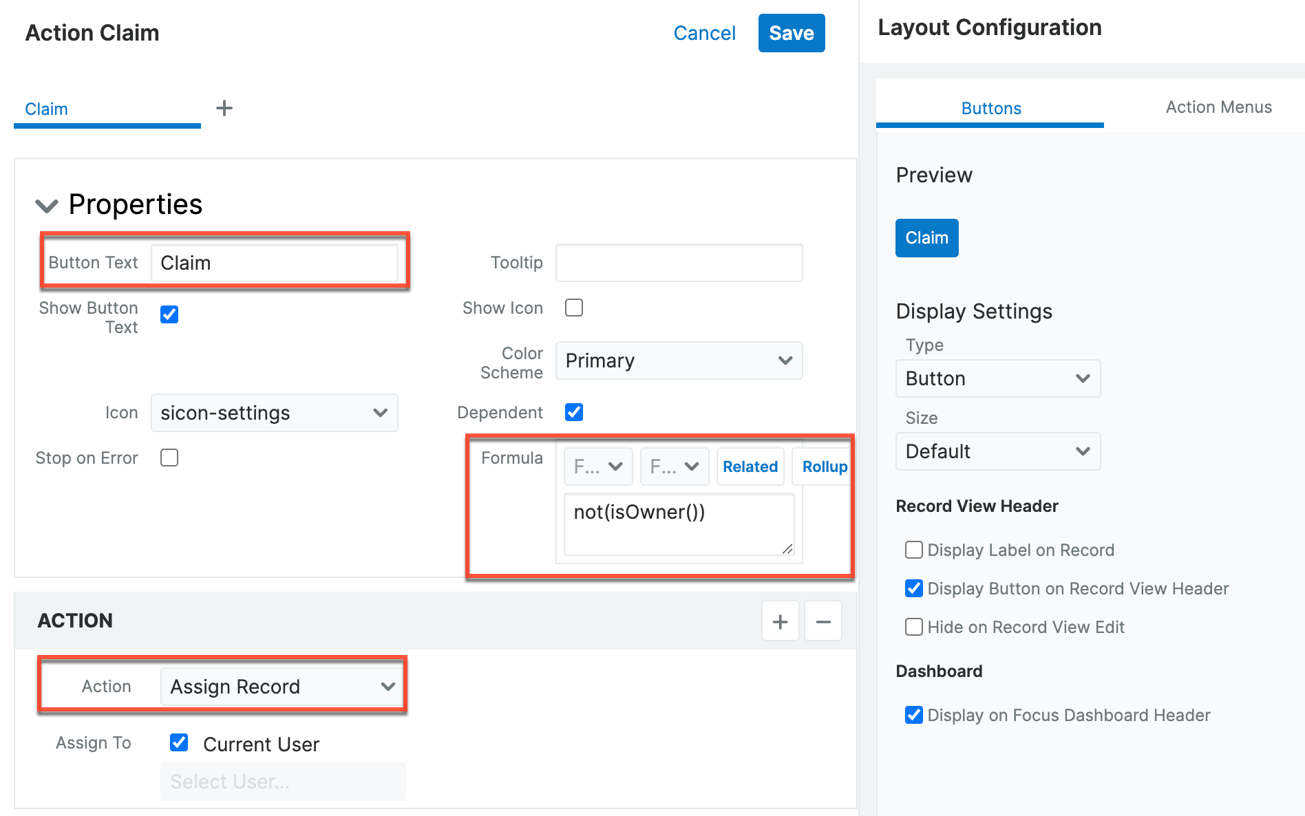
"Close" is used to quickly change a case's status field to "Closed" when clicked. This can be easily copied to be used with other modules to perform an action when a field does or does not have a specific value.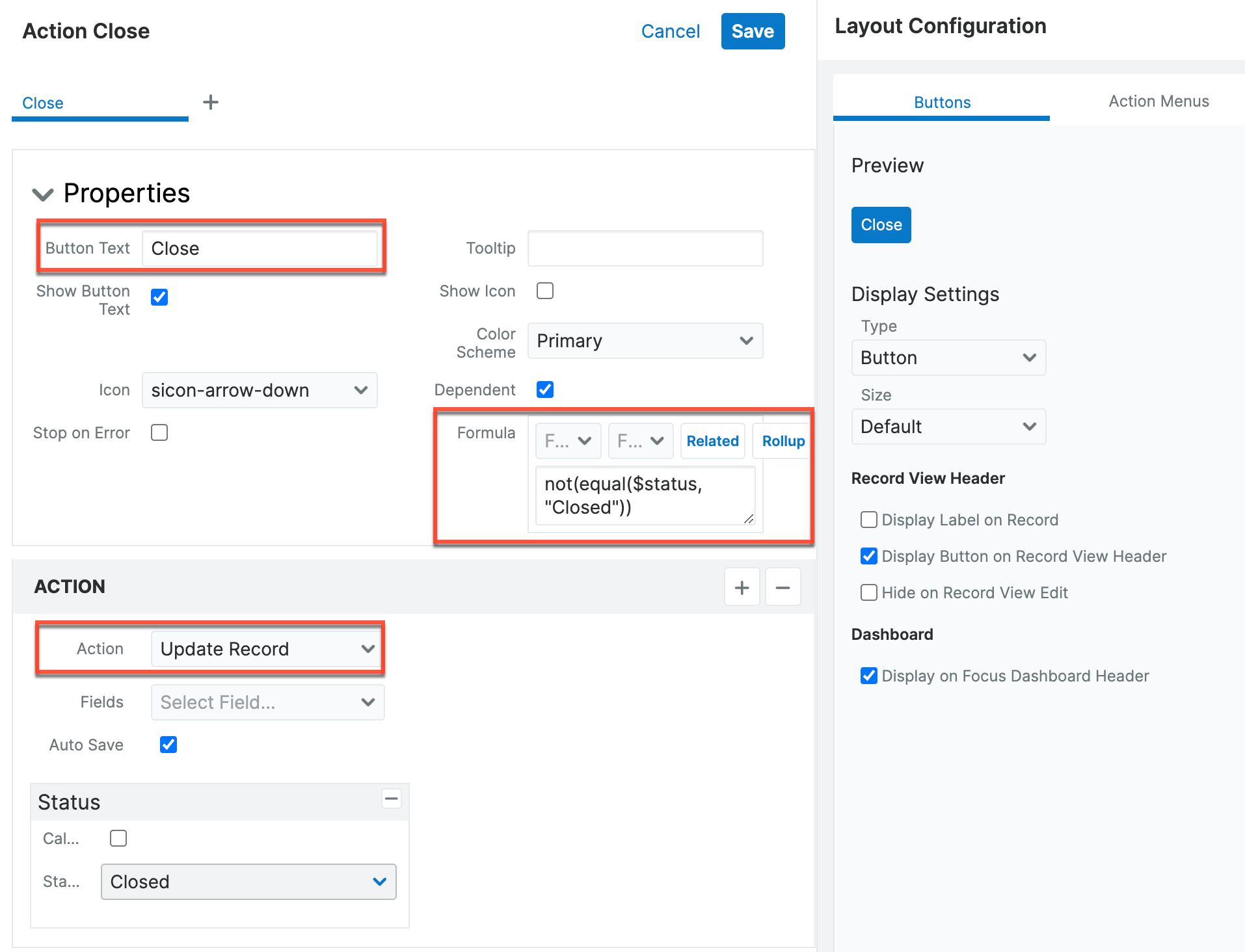
Lastly, "Unassign" is an Action Menu option that appears in the Actions menu next to the Edit button on record view. This Action Menu option allows you to make the assigned user empty when clicked. Then, this could be used, for example, to trigger a process definition when the criteria is met. 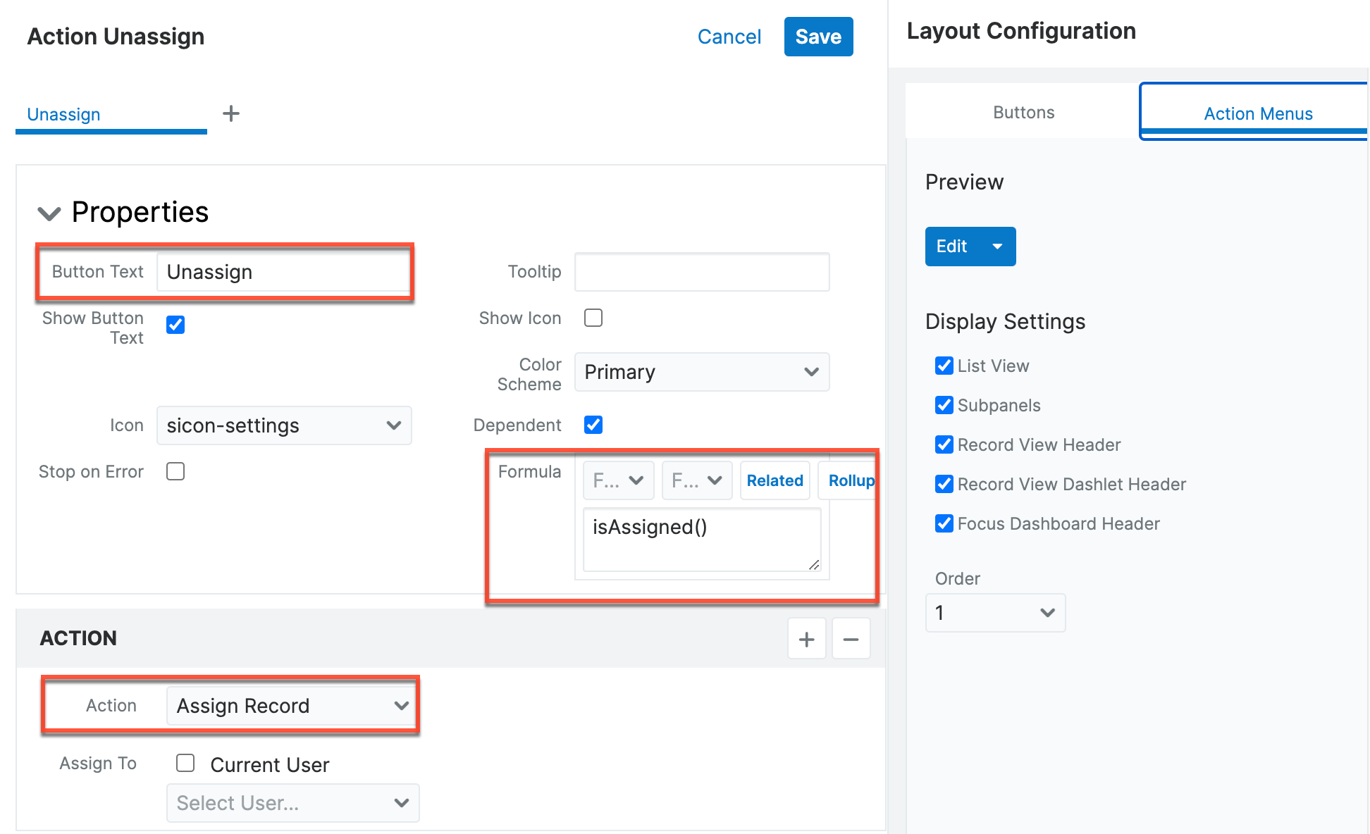
Use Case: Escalating a Case
Provide your Support team with a one-step method of case escalation with an Action Button that updates the Priority field to "High" and the Assigned To field to the manager. While you can also define a SugarBPM process for case escalation, utilizing an Action Button in this way does not require BPM knowledge and allows your Support reps to instantly escalate a case while engaged with a customer on the phone.
To create a button for case escalation:
- Create a new field in the Cases module. For this example, configure the field with the following settings:
- Data Type: ActionButton
- Field Name: escalate
- Display Label: Escalate
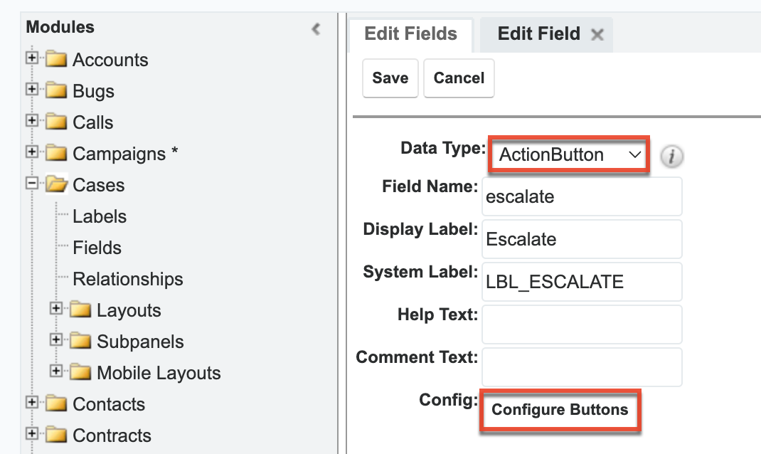
- Click "Configure Buttons" at the bottom of the field settings to open the button configuration drawer.
- Configure the button using the following settings:
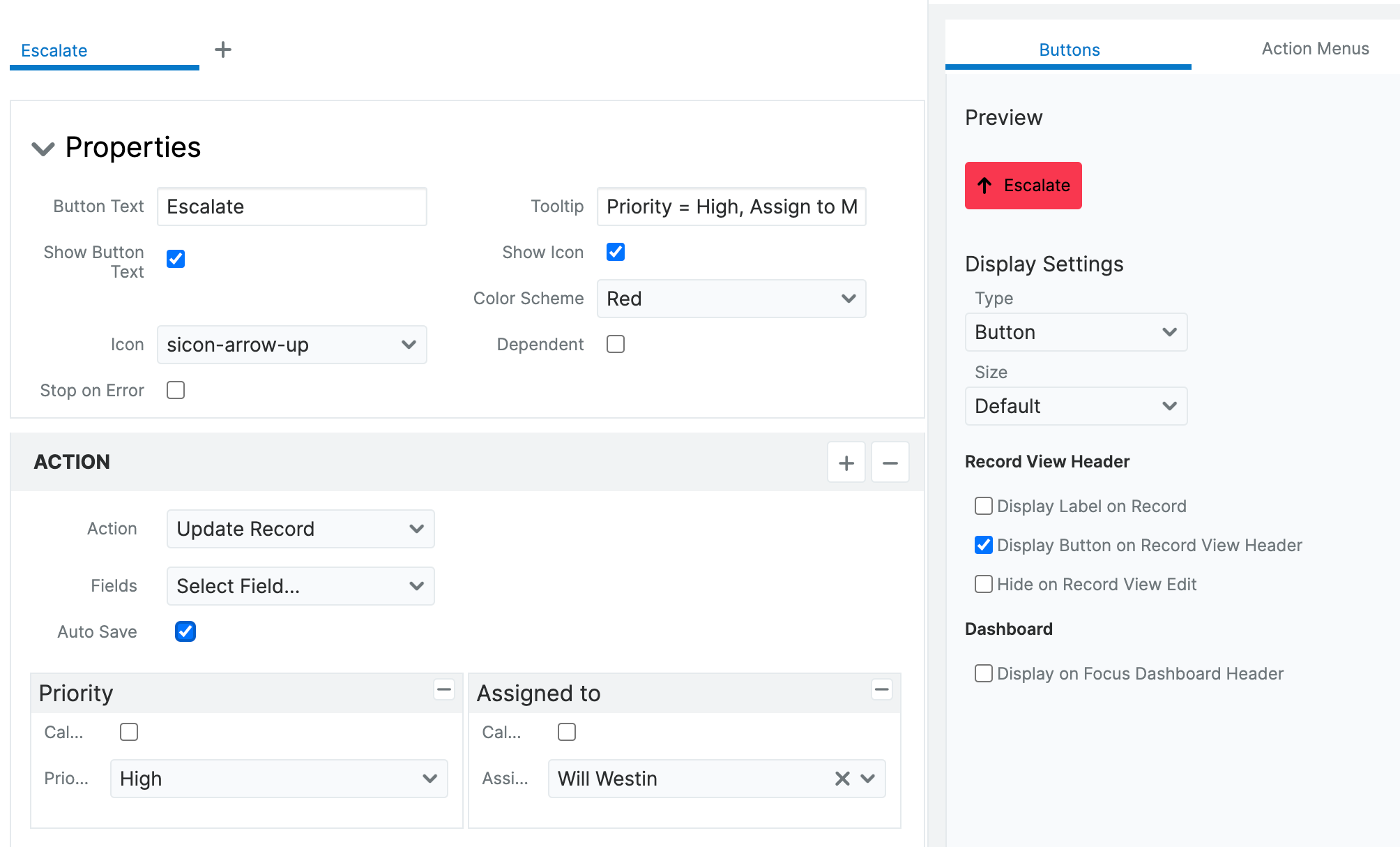
- Properties: In this example, we set the following properties:
- Button Text: Escalate
- Show Button Text: Enabled
- Color scheme: Red
- Tooltip: Priority = high and assign to manager
- Show Icon: Enabled
- Icon: sicon-arrow-up
- Display Settings: In this example, we set the following display settings:
- Type: Button
- Size: Default
- Display in Header: Enabled
- Action: In this example, we set the following display settings:
- Action: Update Record
- Fields: Priority = High
- Fields: Assigned to = Support Manager for the company (Will Westin in this example).
- Properties: In this example, we set the following properties:
- Save the configuration and then save the field. The button now appears on the case record view.
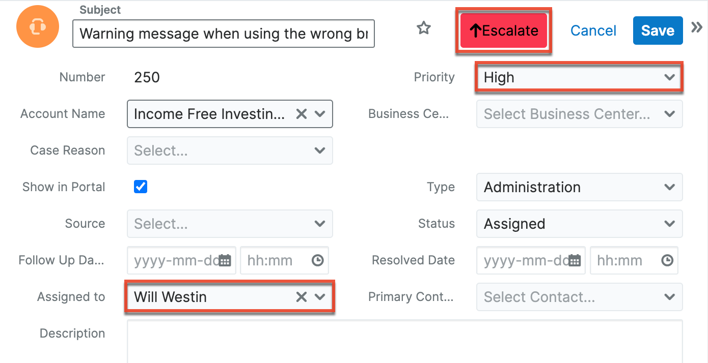
The new field is added to the Cases module with "_c" appended to its name to identify it as a custom field. In case records, users can now click the Escalate button in the header to automatically change the record status to "high" and assign it to the manager, Will Westin.
Use Case: Rejecting a Lead
Enable your Sales team to quickly update a lead record to reject the lead, assign the record to the regional sales manager, set the status to "Dead", and add "no purchase potential" to the Description field.
To create a button for lead rejection:
- Create a new field in the Leads module. For this example, configure the field with the following settings:
- Data Type: ActionButton
- Field Name: reject
- Display Label: Reject
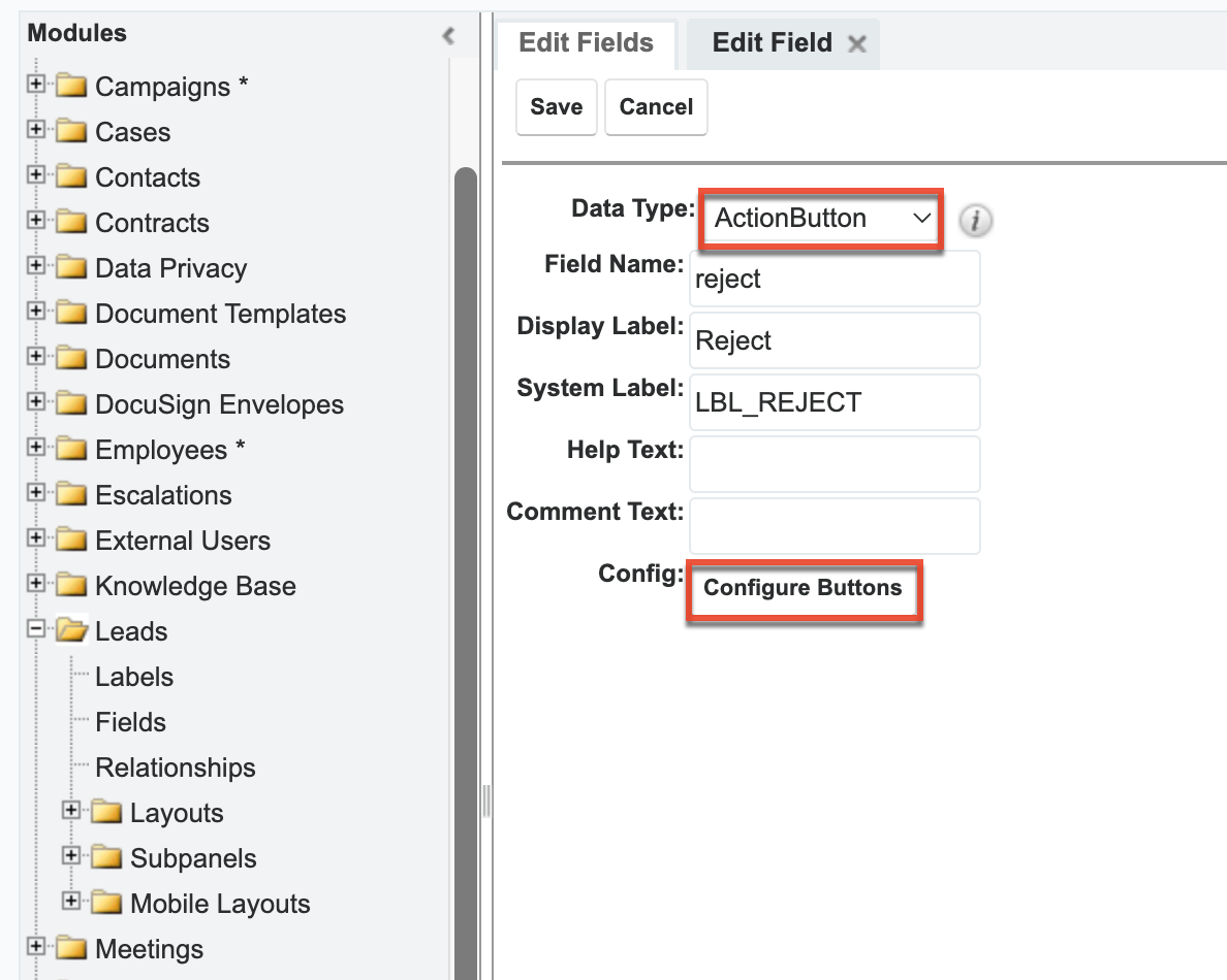
- Click "Configure Buttons" at the bottom of the field settings to open the button configuration drawer.
- Configure the button using the following settings:
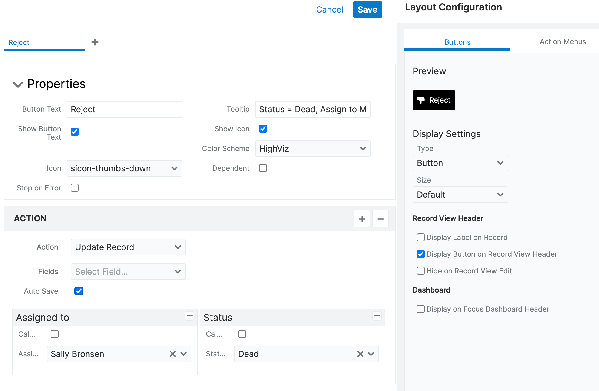
- Properties: In this example, we set the following properties:
- Button Text: Reject
- Show Button Text: Enabled
- Color scheme: HighViz
- Tooltip: Assign to regional sales mgr, status = Dead, no purchase potential
- Show Icon: Enabled
- Icon: sicon-thumbs-down
- Display Settings: In this example, we set the following display settings:
- Type: Button
- Size: Default
- Display in Header: Enabled
- Action: In this example, we set the following display settings:
- Action: Update Record
- Fields: Assigned to = Regional Sales Manager (Sally Bronsen in this example)
- Fields: Status = Dead
- Fields: Description = "No purchase potential".
- Properties: In this example, we set the following properties:
- Save the configuration and then save the field. The button now appears on the leads record view.
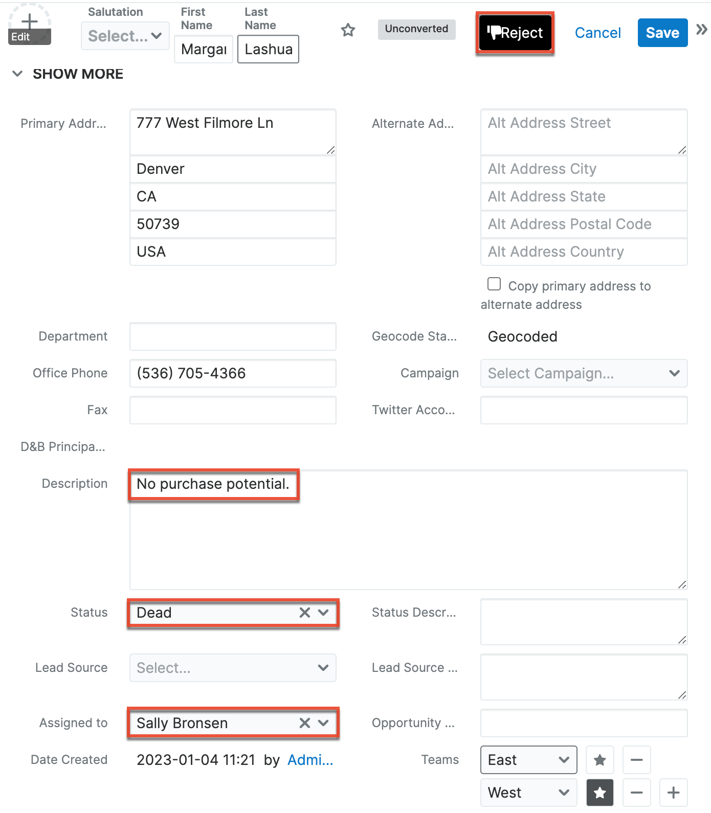
The new field is added to the Leads module with "_c" appended to its name to identify it as a custom field. In lead records, users can now click the Reject button in the header to automatically change the record status to "Dead", assign it to the Regional Sales Manager, and add a "No purchase potential" note to the description.
Use Case: Adding a Call Record to an Opportunity
Using an Action Button in an opportunity record can provide quick creation of calls associated with the opportunity. For example, automatically create a call record with the Status field set to "Held", Direction set to "Outbound", and Subject populated with the name of the opportunity.
To create a button that adds a call record:
- Create a new field in the Opportunities module. For this example, configure the field with the following settings:
- Data Type: ActionButton
- Field Name: logcall
- Display Label: Logcall
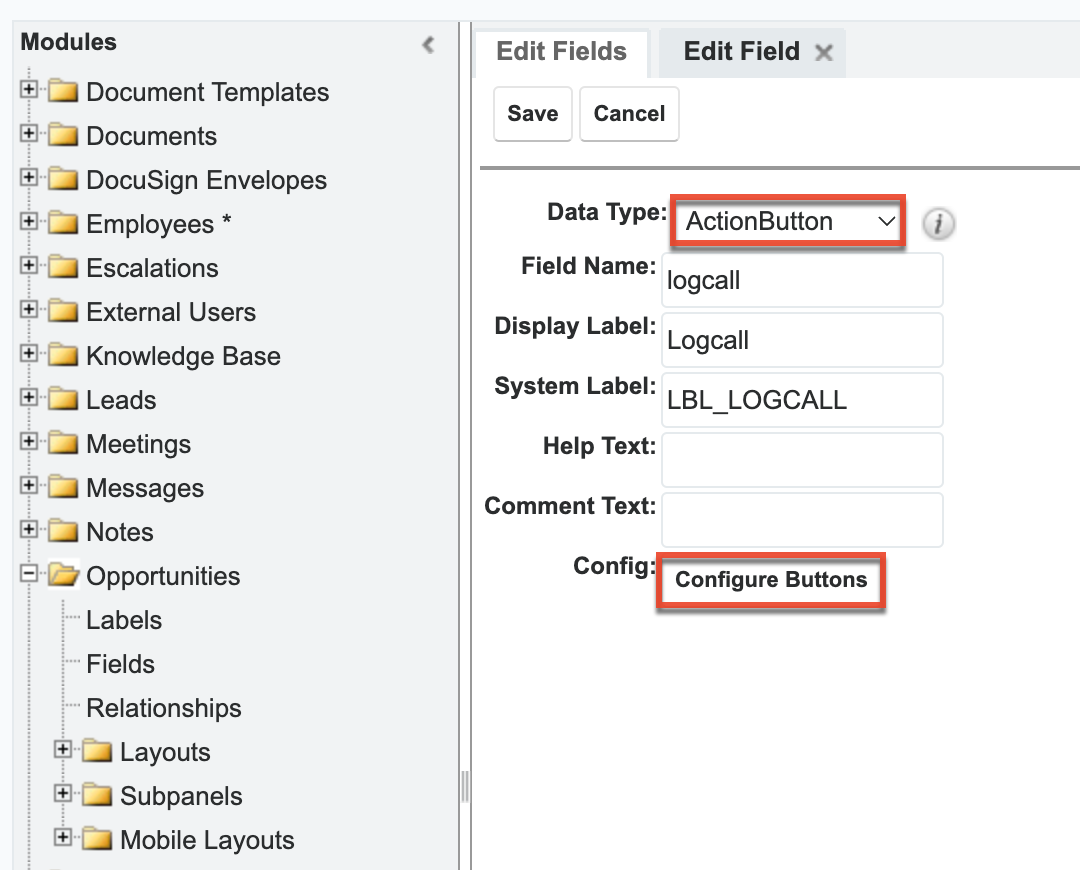
- Click "Configure Buttons" at the bottom of the field settings to open the button configuration drawer.
- Configure the button using the following settings:
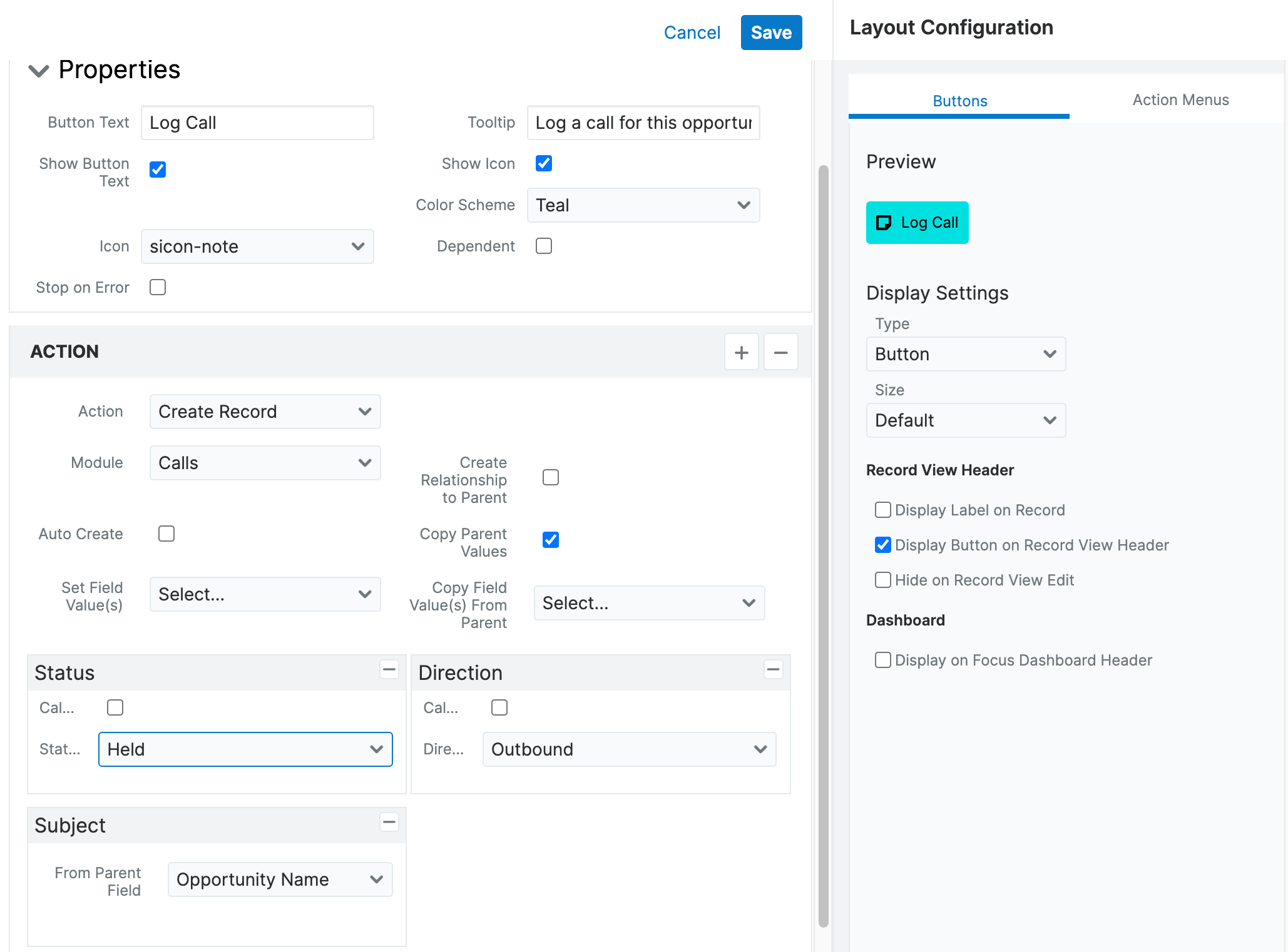
- Properties: In this example, we set the following properties:
- Button Text: Log Call
- Show Button Text: Enabled
- Color scheme: Teal
- Tooltip: Log a call for this opportunity
- Show Icon: Enabled
- Icon: sicon-note
- Display Settings: In this example, we set the following display settings:
- Type: Button
- Size: Default
- Display in Header: Enabled
- Action: In this example, we set the following display settings:
- Action: Create Record
- Module: Calls
- Preset: Status = Held
- Preset: Direction = Outbound
- Preset From Parent: Subject
- Then set From Parent Field to "Opportunity Name".
- Then set From Parent Field to "Opportunity Name".
- Properties: In this example, we set the following properties:
- Save the configuration and then save the field. The button now appears on the opportunity record view.
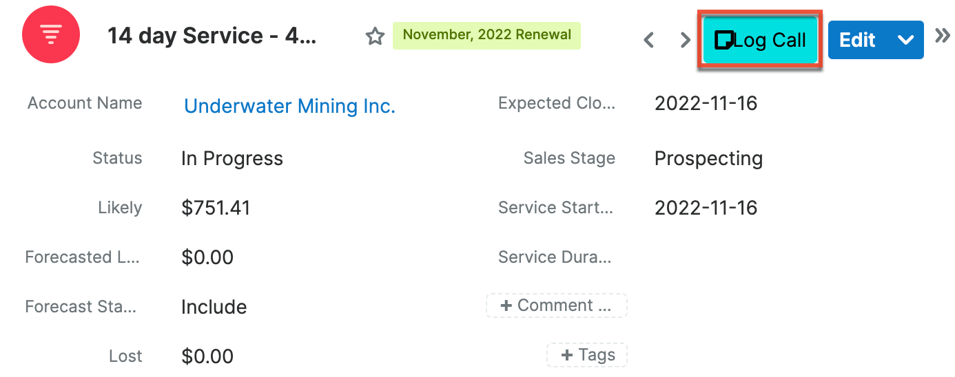
The new field is added to the Opportunities module with "_c" appended to its name to identify it as a custom field. In opportunity records, users can now click the Log Call button in the header to automatically create a call record with a status of "Held", direction set to "Outbound", and add the opportunity name populated in the description.
Use Case: Accessing Supporting Documents from a Quote
Use an Action Button to provide a link to external systems that contain supporting documentation. For example, link to design documents located in a corporate intranet from a quote record to provide user access to all information directly where it is needed.
To create a button that links to supporting documents:
- Create a new field in the Quotes module. For this example, configure the field with the following settings:
- Data Type: ActionButton
- Field Name: designdocs
- Display Label: Designdocs
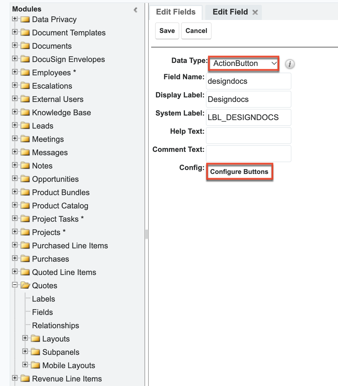
- Click "Configure Buttons" at the bottom of the field settings to open the button configuration drawer.
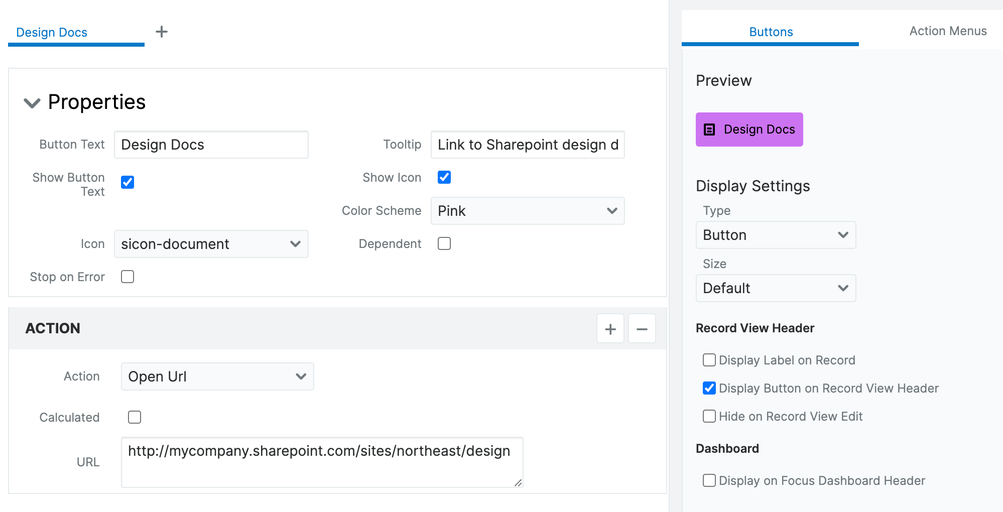
- Configure the button using the following settings:
- Properties: In this example, we set the following properties:
- Button Text: Design Docs
- Show Button Text: Enabled
- Color scheme: Pink
- Tooltip: Link to design doc on Sharepoint
- Show Icon: Enabled
- Icon: sicon-document
- Display Settings: In this example, we set the following display settings:
- Type: Button
- Size: Default
- Display in Header: Enabled
- Action: In this example, we set the following display settings:
- Action: Open URL (e.g., https://yourorg.sharepoint.com/sites/northeast/design)
- URL: Location of your document.
- Properties: In this example, we set the following properties:
- Save the configuration and then save the field. The button now appears on the quotes record view.
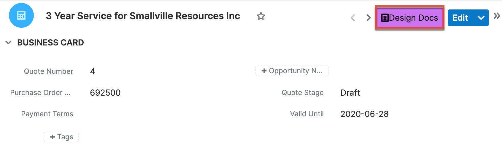
The new field is added to the Quotes module with "_c" appended to its name to identify it as a custom field. In quote records, users can now click the Design Docs button in the header to automatically open a new browser window that directs to the location of your design documents.
Use Case: Emailing a Team
Including an email Action Button can be a time saver in any module. This type of Action Button enables users to quickly send email to a predetermined recipient list using an email template or process email template.
To create a button that launches an email to a team:
-
- Create a new field in the Meetings module. For this example, configure the field with the following settings:
- Data Type: ActionButton
- Field Name: emailteam
- Display Label: Emailteam
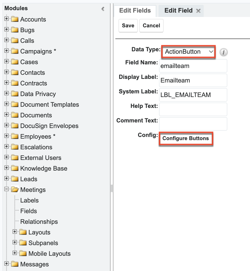
- Click "Configure Buttons" at the bottom of the field settings to open the button configuration drawer.
- Configure the button using the following settings:
- Properties: In this example, we set the following properties:
- Button Text: Email Team
- Show Button Text: Enabled
- Color scheme: Green
- Tooltip: Email update to northeast team
- Show Icon: Enabled
- Icon: sicon-email
- Display Settings: In this example, we set the following display settings:
- Type: Button
- Size: Default
- Display in Header: Enabled
- Action: In this example, we set the following display settings:
- Action: Compose Email
- Template: "Meeting Notifications Emails"
- Email to: Comma-separated list of team members' email addresses within quotation marks (e.g., "will@example.com, sally@example.com, jim@example.com")
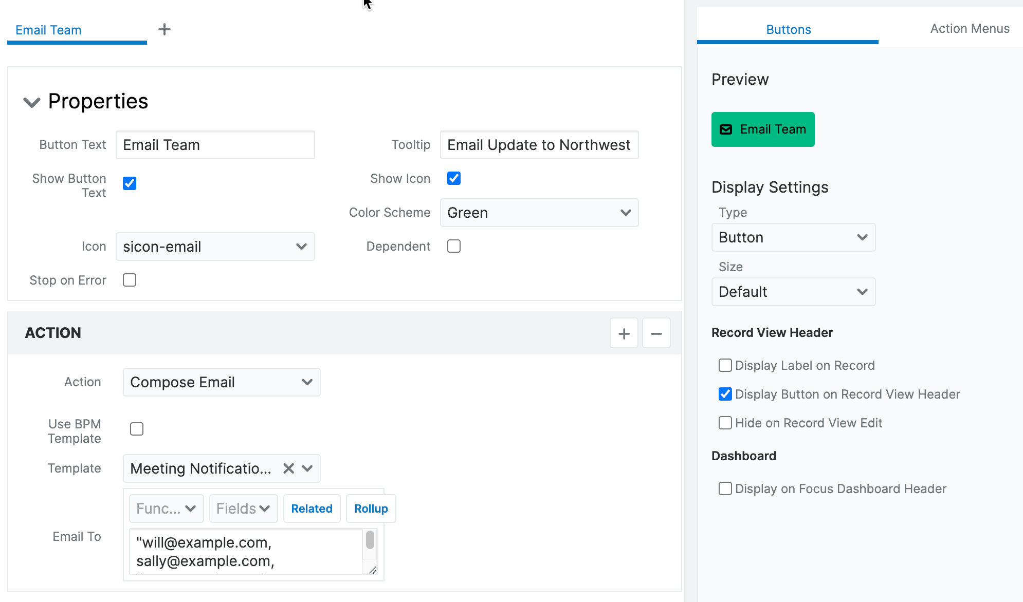
- Properties: In this example, we set the following properties:
- Save the configuration and then save the field. The button now appears on the meeting record view.
- Create a new field in the Meetings module. For this example, configure the field with the following settings:
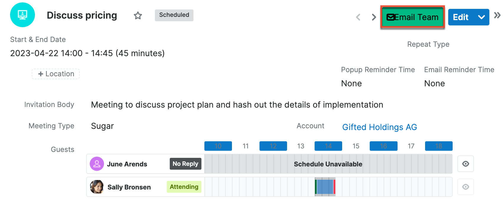
The new field is added to the module with "_c" appended to its name to identify it as a custom field. Users can now click the Email Team button in the header to automatically open their default email client with the designated email template and recipient list. After the email is sent, it will be linked in the record's Emails subpanel.
Use Case: Emailing a Contact Related to a Case
Including an email Action Button can be a time saver in any module. This type of Action Button enables users to quickly send an email to a contact's primary email using an email template or process email template.
To create a button that launches an email to a contact related to a case:
-
- Create a new field in the Cases module. For this example, configure the field with the following settings:
- Data Type: ActionButton
- Field Name: email_primary_contact
- Display Label: Email Primary Contact
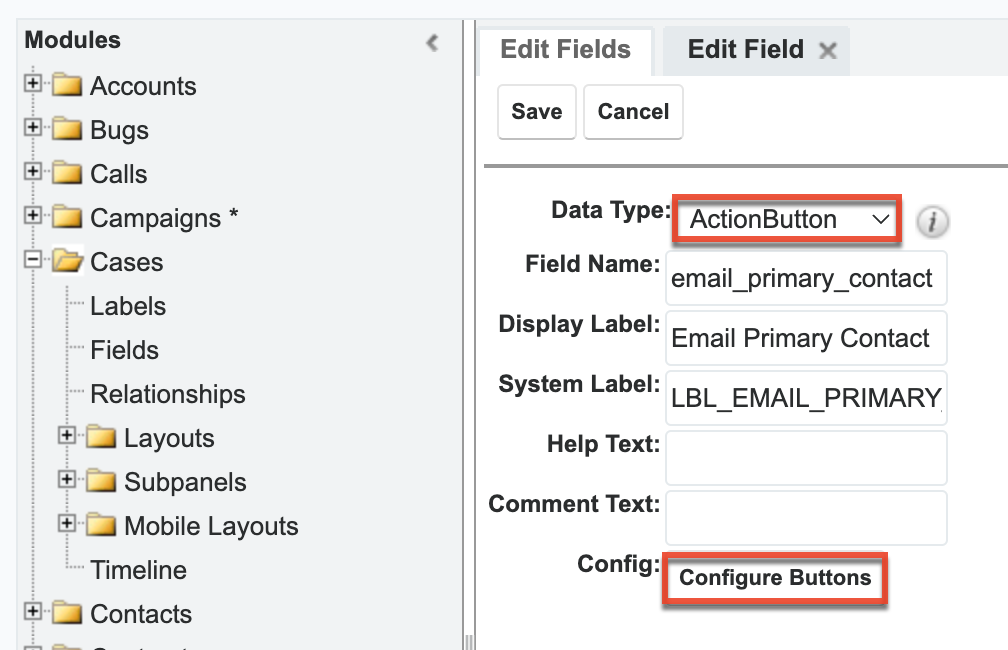
- Click "Configure Buttons" at the bottom of the field settings to open the button configuration drawer.
- Configure the button using the following settings:
- Properties: In this example, we set the following properties:
- Button Text: Email Primary Contact
- Show Button Text: Enabled
- Color scheme: Ocean
- Tooltip: Email this case's primary contact
- Show Icon: Enabled
- Icon: sicon-email
- Display Settings: In this example, we set the following display settings:
- Type: Button
- Size: Default
- Display in Header: Enabled
- Action: In this example, we set the following display settings:
- Action: Compose Email
- Template: "Case Status Template"
- Email to: Click the Related button above the Email To textbox and select "Contacts (Contacts)" as the related module. Click the Add button, which will add
related($contacts, "")to the textbox. Between the"", typeemail1to choose the primary email of the related contact. The final result isrelated($contacts, "email1").
- Properties: In this example, we set the following properties:
- Save the configuration and then save the field. The button now appears on the cases record view.
- Create a new field in the Cases module. For this example, configure the field with the following settings:
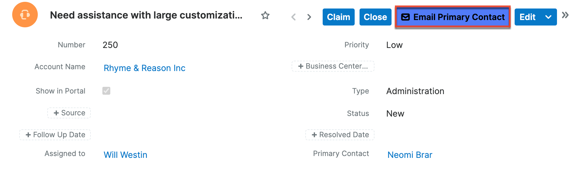
The new field is added to the module with "_c" appended to its name to identify it as a custom field. Users can now click the Email Primary Contact button in the header to begin composing an email in Sugar to the primary contact from the case.
Use Case: Including a Map to Account Location
Including an Action Button that links to a specific map location can provide your Sales team with directions to the account's location in one click.
To create a button that opens a map to an account location:
- Create a new field in the Accounts module. For this example, configure the field with the following settings:
- Data Type: ActionButton
- Field Name: map
- Display Label: Map
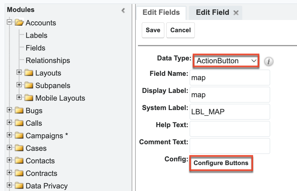
- Click "Configure Buttons" at the bottom of the field settings to open the button configuration drawer.
- Configure the button using the following settings:
- Properties: In this example, we set the following properties:
- Button Text: Map
- Show Button Text: Enabled
- Color scheme: Primary
- Tooltip: Display map of account location in a separate window
- Show Icon: Enabled
- Icon: sicon-settings
- Display Settings: In this example, we set the following display settings:
- Type: Button
- Size: Default
- Display in Header: Enabled
- Action: In this example, we set the following display settings:
- Action: Open URL
- Calculated: Enabled.
- URL: In the Functions dropdown, select "concat(" and then type
"https://google.com/maps/place/",. From the Fields dropdown, select the individual address fields, separating each with a comma and ending with a closing parenthesis). The resulting formula displays in the text box:concat("https://google.com/maps/place/", $billing_address_street, $billing_address_city, $billing_address_state, $billing_address_postalcode)
- Properties: In this example, we set the following properties:
- Save the configuration and then save the field. The button now appears on the meeting record view.
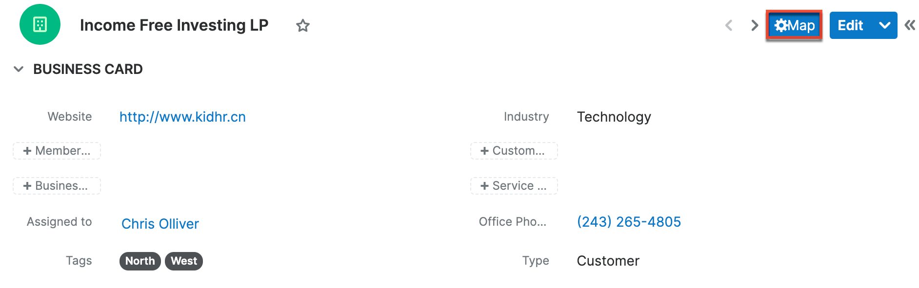
The new field is added to the Accounts module with "_c" appended to its name to identify it as a custom field. In account records, users can now click the Map button in the header to automatically open a map of the account's location in a separate browser window.
Use Case: Open a Dynamic URL
Use an Action Button to provide a link a related record. For example, link from an opportunity to the related account.
To create a button that links to a related account:
- Create a new field in the Opportunities module. For this example, configure the field with the following settings:
- Data Type: URL
- Field Name: link_to_account
- Display Label: Link To Account
- Generate URL: Enabled, then choose the
account_idfield from the dropdown and click "Insert Field"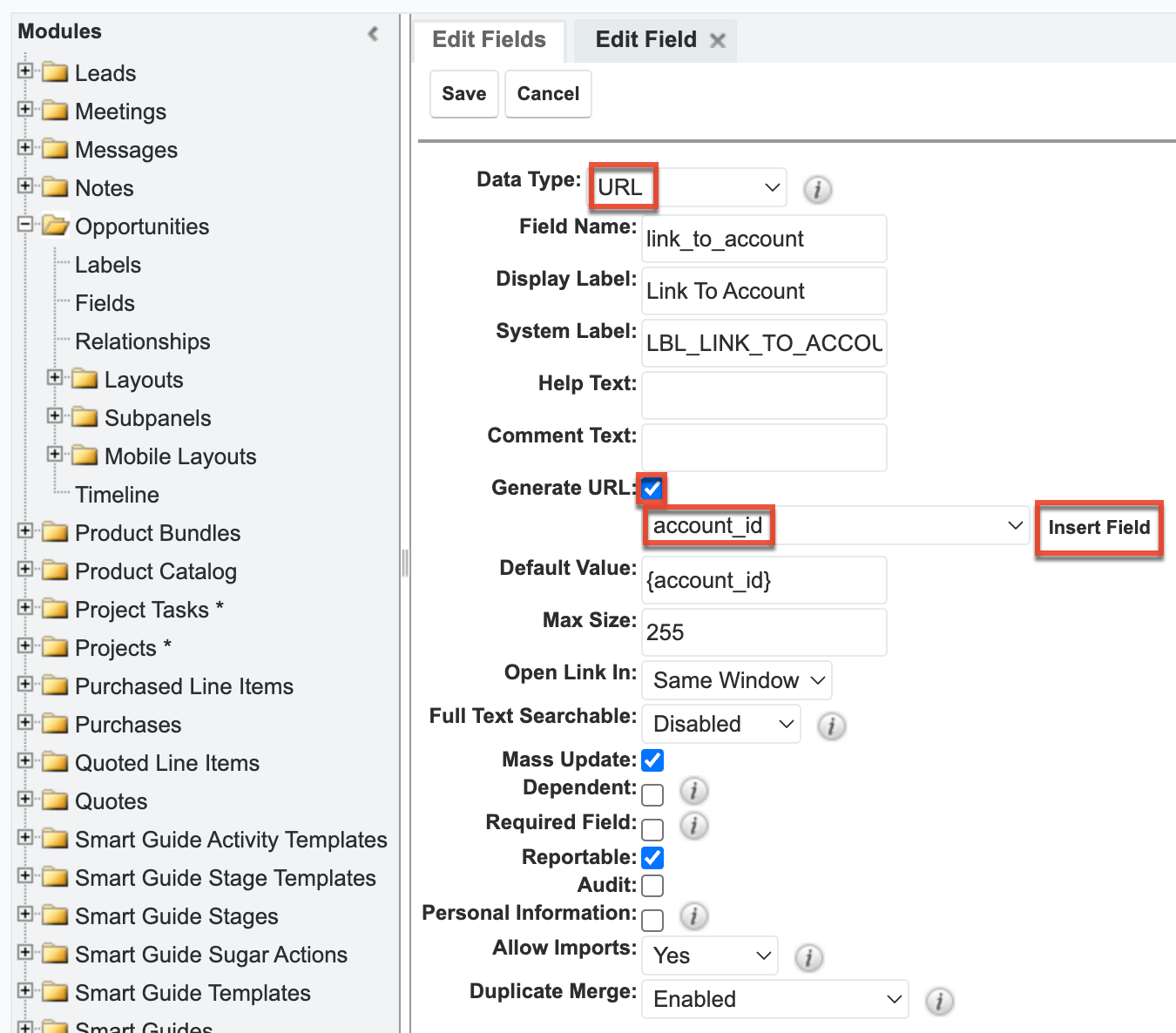
- Create another field in the Opportunities module. For this example, configure the field with the following settings:
- Data Type: ActionButton
- Field Name: view_account
- Display Label: ViewAccount
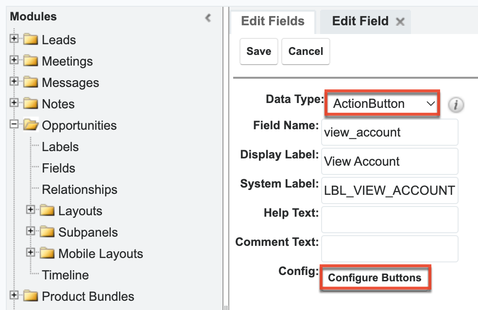
- Click "Configure Buttons" at the bottom of the View Account field settings to open the button configuration drawer.
- Configure the button using the following settings:
- Properties: In this example, we set the following properties:
- Button Text: View Account
- Show Button Text: Enabled
- Color scheme: Coral
- Tooltip: Open this opportunity's account
- Show Icon: Enabled
- Icon: sicon-launch
- Display Settings: In this example, we set the following display settings:
- Type: Button
- Size: Default
- Display in Header: Enabled
- Action: In this example, we set the following properties:
- Action: Open URL
- Calculated: Enabled
- URL: In the Functions dropdown, select "concat(", then select "toString" from the Functions dropdown. Now type the URL for the Accounts module on your instance (e.g., https://your-instance.com/#Accounts/) enclosed in quotation marks. Add
),and then select the custom field created above (e.g., link_to_account_c) from the Fields dropdown and then close the expression with a).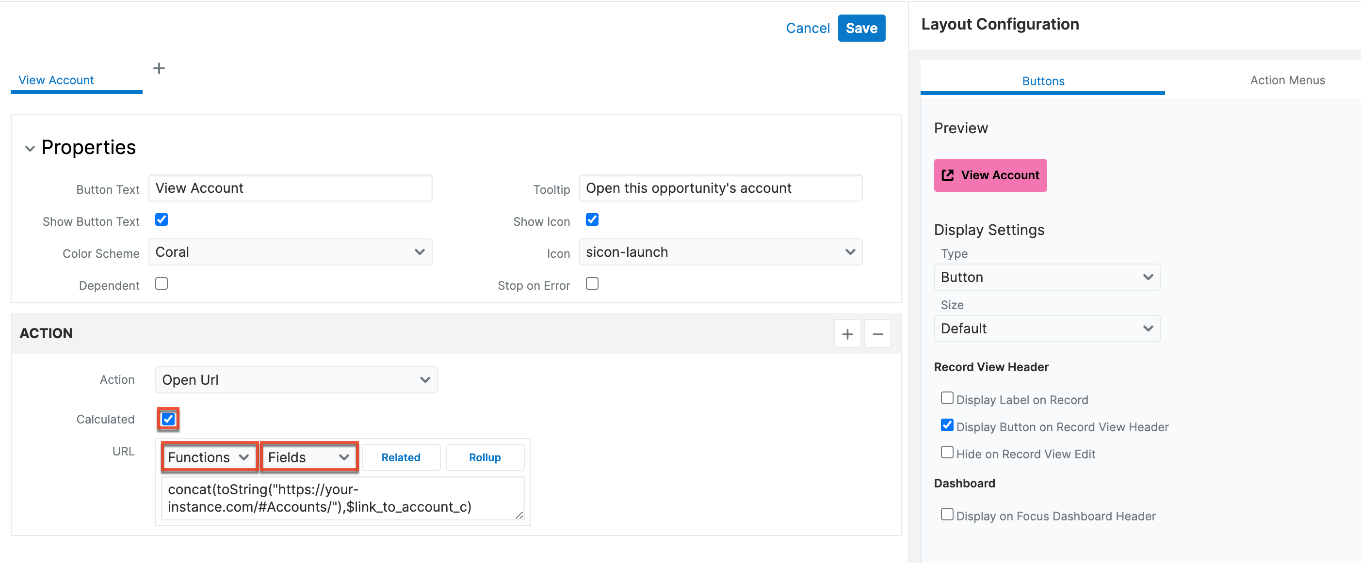
- Properties: In this example, we set the following properties:
- Save the configuration and then save the field. The button now appears on the opportunity record view.
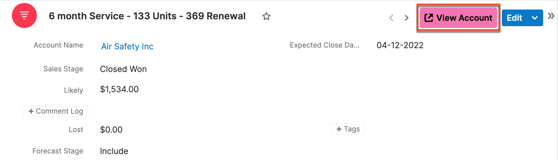
The new field is added to the Opportunities module with "_c" appended to its name to identify it as a custom field. In opportunity records, users can now click the View Account button in the header to automatically open a new browser window that directs to the related account record.