FAQ: Landing Page Styling
Overview
Here you find a few of the more commonly asked questions about styling landing pages.
Accessing Legacy Tools
To access legacy features:
- Click the open button at the top of the navigation bar to view all available modules.
- Click the Legacy Features module.

- Select the tool you need to access from the Legacy Features section.
Q and A
Q: Can I use custom Fonts on a Landing Page?
A: Yes. You can use open source fonts like Google Fonts or use a custom font that you have purchased. To use a purchased font, upload it to the Asset Library first. Once uploaded, you can use the URL assigned to it in the Asset Library to include it on your landing page. Here is an example of what the CSS might look like:
  @font-face {
   font-family:YourCustomFont;
   src: url(https://sf-asset-manager.s3.amazonaws.com/95612/67/11129.woff);
}
body {
    font-family:YourCustomFont;
}
Q: How do I style the questions on a Landing Page?
A: You will want to use CSS to target the question labels and fields. There are several different approaches you can take.
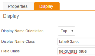
- Use CSS class names on the individual questions then define those classes in the HTML of your landing page. You can have more than one class name in the field if needed. Add class names to the Display tab of a question and then edit your HTML.

.labelClass { font-family:Arial, sans-serif; font-weight:bold; font-size:16px; } .fieldClass { width:100%; padding:2px; border-radius:5px; } .blue { color:#0000cc; } - Target the system generated field IDs with your CSS. It might look something like this:
.ctl00_ContentPlaceHolder1_RequestFields1_gvPreview_ctl02_FieldNameLabel { font-family:Arial, sans-serif; font-weight:bold; font-size:16px; } .ctl00_ContentPlaceHolder1_RequestFields1_gvPreview_ctl03_tbEntry1_1 { width:100%; padding:2px; border-radius:5px; } - Use a broader approach to targeting form elements and labels. If you want all of your fields and labels to look the same you might use something like this:
span[id*="FieldNameLabel"] {
   font-family:Arial, sans-serif;
   font-weight:bold;
   font-size:16px;
}
input {
   width:100%;
   padding:2px;
   border-radius:5px;
}
This approach is a more global approach so you do not have to target individual class names or field IDs.
With any of these approaches, you will want to be familiar with how we structure the generated code. It's very useful to use the "inspect element" feature of Chrome or Firefox to get an idea of how you can target each element.
Q: How can I make a two-column layout?
A: This can be achieved with some creative use of CSS. The system generates a landing page form within a set structure so you need to work around that structure to get it into two columns. We'll be using the method for styling individual questions to lay the columns out on the page.
First, make sure that the Display Name Orientation on all Questions is set to "Top" (found under the Display tab on each question). If it is set to "Left", the system generates a Table structure that places the field label in one cell and the input in another. That makes it hard to modify.
Next, we want to hide all the extra, system-generated <br> tags that show up between the label and the input field. That bit of CSS looks like this:
  table.Normal span br {
   display: none;
}
If you were to look at your landing page questions at this point you would see the label and input fields next to each other despite having been set to "Top" alignment.
With the system-generated structure out of the way, we are now ready to lay out the fields and labels as desired. We will use position:relative to move elements around relative to the container. We can target the individual fields with class names, pre-generated IDs, or programmatically. Here is a short example:
  .lastNameClass {
  position:relative;
  left:50%;
  bottom:56px;
}
.phoneClass {
  position:relative;
  left:50%;
  bottom:112px;
}
.emailClass {
  position:relative;
  bottom:56px;
}
.companyClass{
  position:relative;
  bottom:112px;
}
And here is another example that uses an advanced approach. It targets generic elements based on the automatically generated page structure. The advantage here is that you can later move questions around in order without having to update the CSS class names.
  table.Normal tr:nth-child(2) td:nth-child(3) {
  position:relative;
  left:50%;
  bottom:56px;
}
table.Normal tr:nth-child(4) td:nth-child(3) {
  position:relative;
  left:50%;
  bottom:112px;
}
table.Normal tr:nth-child(3) td:nth-child(3) {
  position:relative;
  bottom:56px;
}
table.Normal tr:nth-child(5) td:nth-child(3) {
  position:relative;
  bottom:112px;
}
Q: How can I style the "Submit" button?
A: You can target the submit button with CSS. Here is a sample that changes color on hover:
  input[type="submit"] {
  height: auto;
  width: auto;
  border: 2px solid #999999 !important;
  padding: .75em 1em;
  font-size: 1em;
  background-color: #ffffff !important;
  color: #999999 !important;
  border-radius: 30px;
  -moz-border-radius: 30px;
  margin-top: 12px;
  display: block;
  text-transform:uppercase;
  transition: background-color 0.25s ease;
}
input[type="submit"]:hover {
  background-color: #E4AE3A !important;
}