Using Tables in Email Text Components
The best way to create a mobile responsive email is to utilize the drag and drop components to designate unique text sections. Tables inserted into a text component are not mobile responsive. Mobile devices will compress the columns rather than stack them. If you must utilize a table we recommend that the table does not expand the entire width of the email. It will perform better if limited to 50% of width or less or inserted into a two or three column text component.
The following are a couple of examples of tables used in an email, and how they render in mobile.
Table in a text component that spans the entire width.
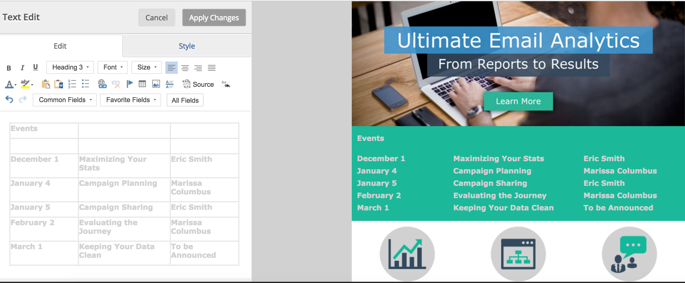

Table in a text component that is part of a multi-column email section.


This option will not render as well as our mobile responsive drag and drop components but because the width is limited to 50% or less the mobile formatting issues are less severe.