Styling your Email Buttons
The following options edit the button's appearance.
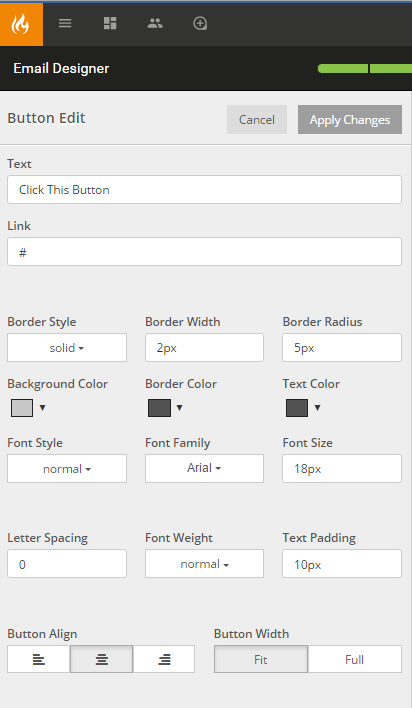
- Text: Displays the text inside of the button or call to action.
- Link: The url destination for the hyperlink.
- Border Style: Defines the look of the border.
- Border Width: Defines the width of the border around the button.
- Border Radius: Defines the corner radius of the button on your stage. If the number is inputted without a standard unit of measurement then it will default to 0 and show a 90° angle on the corners of the button.
- Background Color: Defines the color of the button. The color is selected from the color picker that is prompted once you select the color box or drop down arrow.
- Border Color: Defines the color of the border around the button.
- Text Color: Defines the color of the text inside of the button.
- Font Style: Choose between normal or italics.
- Font Family: Defines the font type of the text inside of the button.
- Font Size: Defines the size of the text inside of the button.
- Letter Spacing: Defines the horizontal space between letters of the text inside of the button.
- Font Weight: Defines the thickness of the text inside of the button. There are only two options bold and normal.
- Text Padding: The space between an element's border and the content within.
- Button Align: Defines the alignment of the button in the same way it defines the alignment of text inside a word processor.
- Button Width: Defines the width of the button.
- If Fit is selected - the Text Padding will define the width of the button.
- If Full is selected - the button will be full width.