Editing your Email Text
When dragged onto the stage, the text component will display a standard message. The text component has a native 10px padding on all sides. Select the text on the stage to activate editing on the control panel.
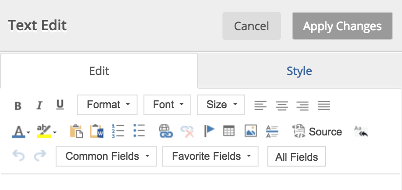
The Text Component will default to Global Styles. You may use the formatting option to designate the header classes defined by the Global Styles. Additional text editing options are available when exceptions to your standards are required.
Text Formatting
Users can select the appropriate global style to apply to the text or choose a unique font, size and format for the entire component or selected text.
- Standard bold, italicize and underline options are available in the top left of the editor and can also be applied by highlighting text and using short keys (e.g. Control B or Command B for bold).
- Text alignment options include left, center, right and justify.
- Standard text and background color selectors are also available.
Paste Tools
Paste from Clipboard will strip out all text formatting that could cause an issue with email clients. Paste from Word will maintain general formatting such as bullets, sub bullets, ordered lists, bold, underline and italicized text. Using paste from Word will remove all Word specific formatting that could conflict with email clients including font styles, color and size.
Bullets and Ordered Lists
There are two ways users can create bulleted and ordered lists:
- Type your list of items, highlight your list text and select the bullets or ordered list icon.
- Select the bullets or ordered list icon, type your first item and then hit Enter to create a new bullet or ordered list item.
Hyperlinks
- URL Links
- Link to Email Address
- Link to an Anchor in Text: anchor icon prevents users from having to switch to html to create and link to anchors.
Tables
The table icon will insert a table into the selected text component. The user has the ability to specify number of rows and columns upon setup. Additionally, the user can right click to insert, delete, merge and select a background color for cells, columns, rows and tables. Those who need to utilize tables should review this information on using tables in emails as they are not mobile responsive.
Image
The text editor allows the user to insert an image into a text component. Selecting the image icon will prompt the asset manager. You may choose an image from your library or upload a new image. Images used within the text component editor are not mobile responsive.
Horizontal Line
This icon will insert a light grey line at the location of the users icon in the text component providing a subtle text divider.
Source
The source icon will allow you to inspect and edit the HTML code of your email. When selected, source will activate the HTML edit panel over the text editor. To assist in reviewing your HTML, the editor will now highlight the line of your cursor. To return to the drag and drop text editor, the user will simply click the source icon again.
NOTE: Use of this mode may cause unexpected formatting issues. You are responsible for any HTML coding you may do in the Source view. We do not guarantee that whatever you place in this mode will be responsive or behave as you might think in a given email client.
Remove Formatting
The remove formatting icon allows the user to remove the formatting form their selected text.
Undo and Redo
Undo and redo options will revert up to the last 10 changes made to the text component. To move further back in edits, users should selected the desired version from revision history.
Merge Fields
Merge field drop down options are now Common, Favorite and All Fields.