Editing your Email Images
Image
Once an image has been selected in the Email Builder, the control panel will be activated with the image editing options. These options are also available after the image has been saved on the stage. Each image has a URL and that URL is displayed in the first form field.
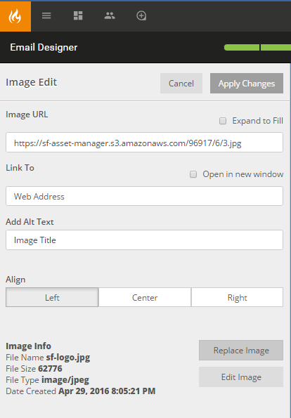
- Link To: The URL destination for the hyperlink.
- Add Alt Text: Defines the content that will display when hovered over the image.
- Align: Defines the alignment of the image in the same way it defines the alignment of text inside a word processor.
- Replace Image: Will prompt the Asset Library in a model.
- Edit Image: Will prompt in-app image editing.
- Save & Close will complete the edits and save the image onto your stage.
Image and Caption
This combines both the Image and Text components into one experience. Drag the Img + Caption component onto the stage and select the rendered display to actively edit in the control panel.
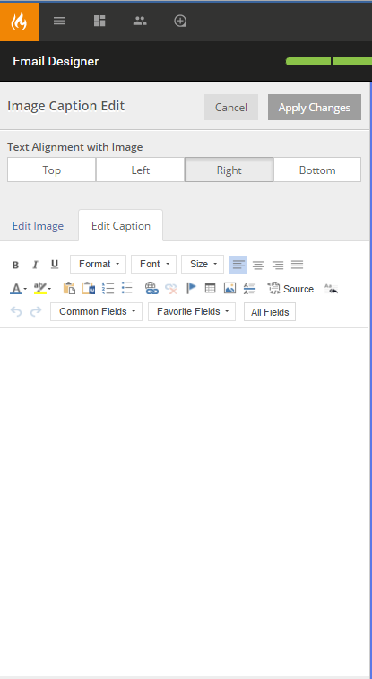
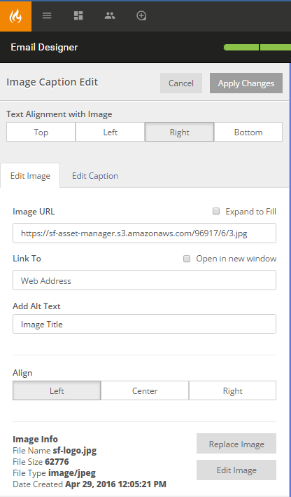
- Text Alignment with Image: Sets the positioning of the text window relative to the image.
- Edit Image: Selecting this tab will display the standard image editing panel.
- Edit Caption: Selecting this tab will display the standard text editing panel. This will be covered when discussing the Text component.
Img + Caption component manages both image and text editing on the same editing control panel.
Note: The qualities of this component are not responsive. The Image + Caption will scale appropriately down to fit the viewing screen.
Image Group
The image group component combines two image components into one experience. Drag the Image Group component onto the stage and select the rendered display to actively edit in the control panel.
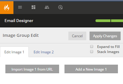
- Expand to Fill: selecting this option nulifies the 10px margin.
- Stack Images: selecting this option will stack the images vertically rather than display them side-by-side.
- Edit Image 1: Selecting this tab will display the standard image editing panel for the first image.
- Edit Image 2: Selecting this tab will display the standard image editing panel for the second image.
Image Group component manages two images in the same editing control panel.
Note: The qualities of this component are not responsive. The Image Group will scale appropriately down to fit the viewing screen.