Enhanced Forecasting Dashlets
Overview
The enhanced forecasting dashlets are available only to Sugar Sell Premier customers who have implemented Enhanced Forecasting. These dashlets provide you with a way to monitor changes to your pipeline, trends, and forecasts over time. The dashlets described on this page are used for demonstration purposes since your dashlets may vary depending on your key metrics.
Prerequisites
Enhanced forecasting dashlets are powered by Sugar Discover, a smart data discovery solution that continuously analyzes your sales metrics, learns normal patterns and relationships between attributes in your data, and surfaces insights into changes impacting those metrics. These capabilities are available exclusively to Sugar Sell Premier customers who are SugarIdentity-enabled, are leveraging the stock Opportunities or Revenue Line Items module, and have the "Sales Stage" field enabled for audit in Studio.
If you are a Sell Premier customer who would like to enable these capabilities, please reach out to your implementation partner or SugarCRM representative to get started with the qualification and onboarding process.
Notice: The examples provided on this page may vary slightly based on customizations made as part of your Enhanced Forecasting onboarding process. As part of onboarding, your dashlets are configured to align with the revenue metrics and critical business segments relevant to your usage of Sugar. This feature tracks changes in your Sugar instance from day to day by taking a snapshot of your instance once every 24 hours. If a record is updated multiple times within a 24-hour window, only the final edited record is synced (i.e., intermediate changes are not captured).
Dashlet Access Levels
By default, all SugarIdentity users are set to the "No Access" role for the dashlets. To set roles for SugarIdentity users, click on your profile icon in Sugar Discover, and then select "Administration" to access the Manage Users page.
The following Sugar Discover roles dictate the access level of the enhanced forecasting dashlets:
- NoAccess: Users with this role cannot view the enhanced forecasting dashlets on a Sugar dashboard.
- Admin: Users with this role have the added ability to edit default SugarCRM datasets and administer users.
- User: Users with this role can view public reports, build reports, and share new reports.
- ReadOnly: Users with this role have access to view public reports, share reports, and drill link through reports. These users see a simplified user interface that hides items to which they do not have access.
- DashletUser: Users with this role can view the enhanced forecasting dashlets on a Sugar dashboard.
Interacting With the Dashlets
These dashlets can be used on your Home or record view dashboards. To add the dashlet, choose Sugar Discover from the Add Dashlet list and then select the appropriate report.
You can interact with the dashlets to adjust the view. Hovering over the data on the charts displays data labels with more information about the data point. You can click an item or multiple items in the chart legend to highlight the data related to that label on the chart. Click the item again to deselect them or click anywhere in the chart legend bar to deselect all items. You can also click directly on the data in the chart to select or deselect the data series.
Depending on how your report is set up, you may have the option to drill into the report. Drilling into a report means that you can click on a segment of the chart and open a new chart to view details about that segment. When you drill into a report, you will be redirected to the Sugar Discover interface. Click any hyperlinked text in the report to open the corresponding record in Sugar.
At the bottom of each dashlet there are several options:
| Button | Description |
| Open a menu to choose whether to show or hide the chart legend or chart filters. | |
 |
Open the Slicer view where you can adjust which predefined slices of the data to include in the chart. For example, if your data is separable by sales region, the Slicer view would allow you to select which of the sales regions to include in the chart. Check the boxes next to the slices you want to include, click "Apply", then click "Back" in the top left corner to return to the chart. This button is visible only if there are slicers available for the dashlet. Note: The attributes used for segmenting data (slicers) may be configured as part of your Enhanced Forecasting onboarding process. |
 |
Open the Discovery Insights view. Discovery insights analyze the data series that are displayed in the chart and provide a glimpse of the biggest changes that are occurring to provide you with actionable insights. A blue dot on the icon indicates that there are unread insights to view. |
| Open the report in a new browser tab in the Sugar Discover interface. This button is not available for users with a Role of DashletUser. |
Enhanced Forecasting Dashlets
The following sections provide details about the dashlets that can be used for forecasting and optimizing your pipeline and revenue.
Average Deal Size Trend
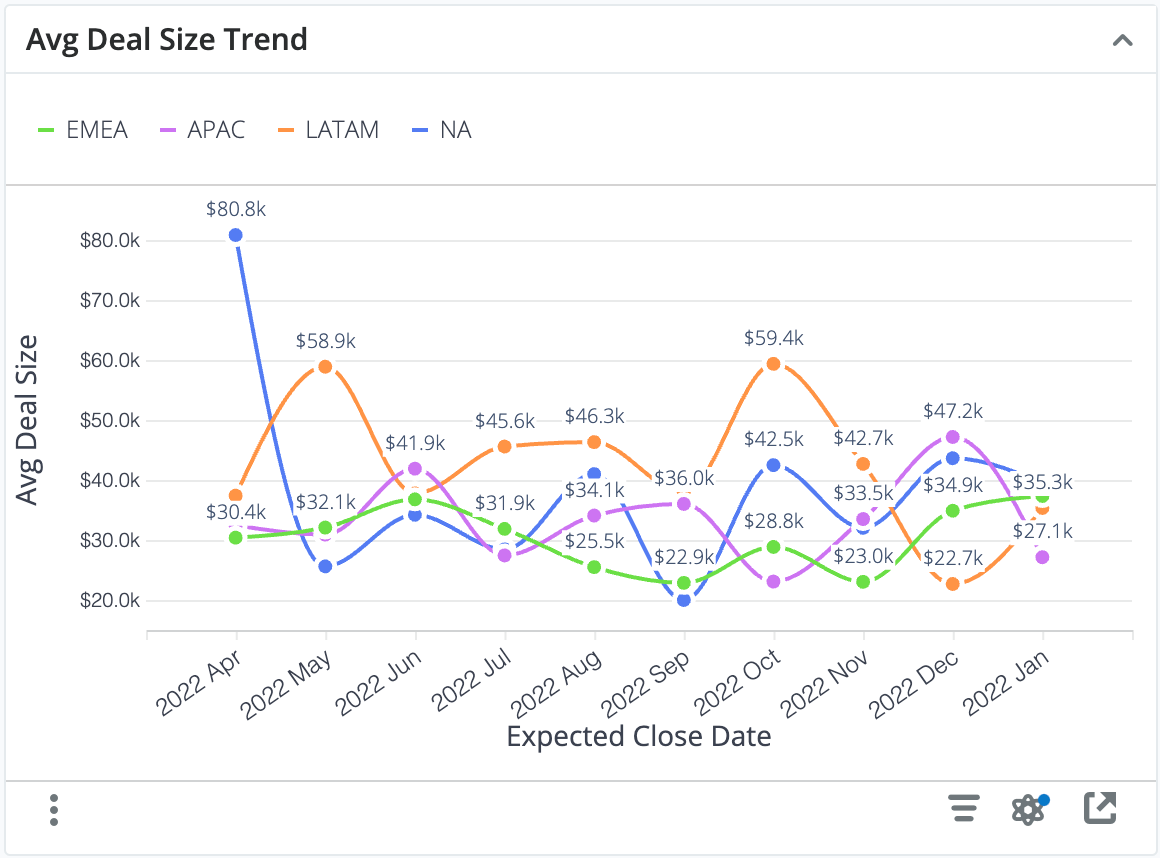
This dashlet shows the average deal size for each month so that you can find positive or negative trends within key business segments. The average deal size is the sum of revenue dollars in the indicated month and sector divided by the number of "Closed Won" opportunities or revenue line items in the indicated month and sector. For example, in the chart above, the total revenue from Closed Won opportunities in October 2022 with a sales region of LATAM divided by the total number of Closed Won opportunities in October 2022 with a sales region of LATAM is $59.4k.
Note: The attribute (field) used to segment the metric, Sales Region in the example above, may be customized as part of Enhanced Forecasting onboarding.
Examples of insights that can be gained from this dashlet include:
- In which segments of the business is our average deal size increasing or decreasing?
Win Rate Trend
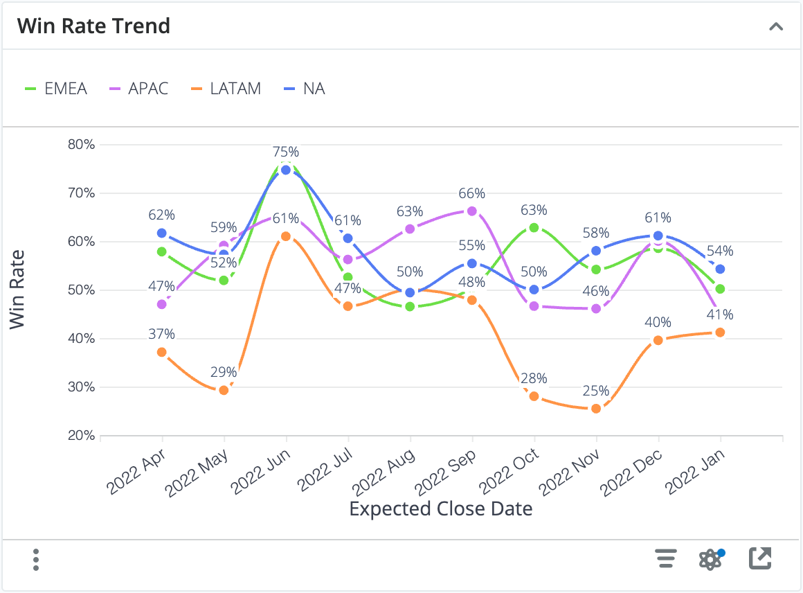
This dashlet shows the win rate for each month so that you can spot positive or negative trends within key business segments. The win rate is the number of "Closed Won" opportunities or revenue line items in the indicated month and segment divided by the total number of closed items in the indicated month and segment. For example, in the chart above, the number of Closed Won opportunities in April 2022 with a sales region of NA divided by the total number of closed items in April 2022 with a sales region of NA is 62%.
Note: The attribute (field) used to segment the metric, Sales Region in the example above, may be customized as part of Enhanced Forecasting onboarding.
Examples of insights that can be gained from this dashlet include:
- In which segments of the business is our win rate increasing or decreasing?
Sales Cycle Trend
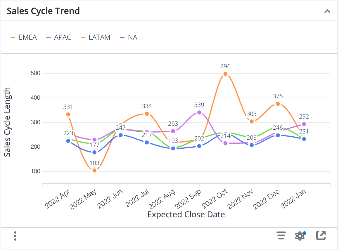
This dashlet shows the sales cycle trend for each month so that you can spot positive or negative trends within key business segments. The sales cycle is the average sales cycle length in days for "Closed Won" opportunities or revenue line items in the indicated month.
Note: The attribute (field) used to segment the metric, Sales Region in the example above, may be customized as part of Enhanced Forecasting onboarding.
Examples of insights that can be gained from this dashlet include:
- In which segments of the business is our average sales cycle length increasing or decreasing?
Sales Velocity by Stage
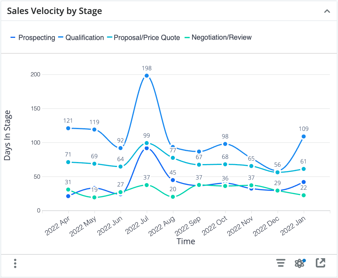
This dashlet shows the average days spent in each stage of your sales process for opportunities or revenue line items that transitioned through those stages for each month. The average is calculated by dividing the sum of the days spent in a given stage in the indicated month by the number of opportunities or revenue line items in that stage in the indicated month. This allows viewers to spot trends where sales velocity is increasing or decreasing in specific areas of the sales process.
Examples of insights that can be gained from this dashlet include:
- Where are deals spending the most time in the sales process?
- Are our efforts to increase velocity around the qualification process having success?
Idle Opportunities Trend Monthly
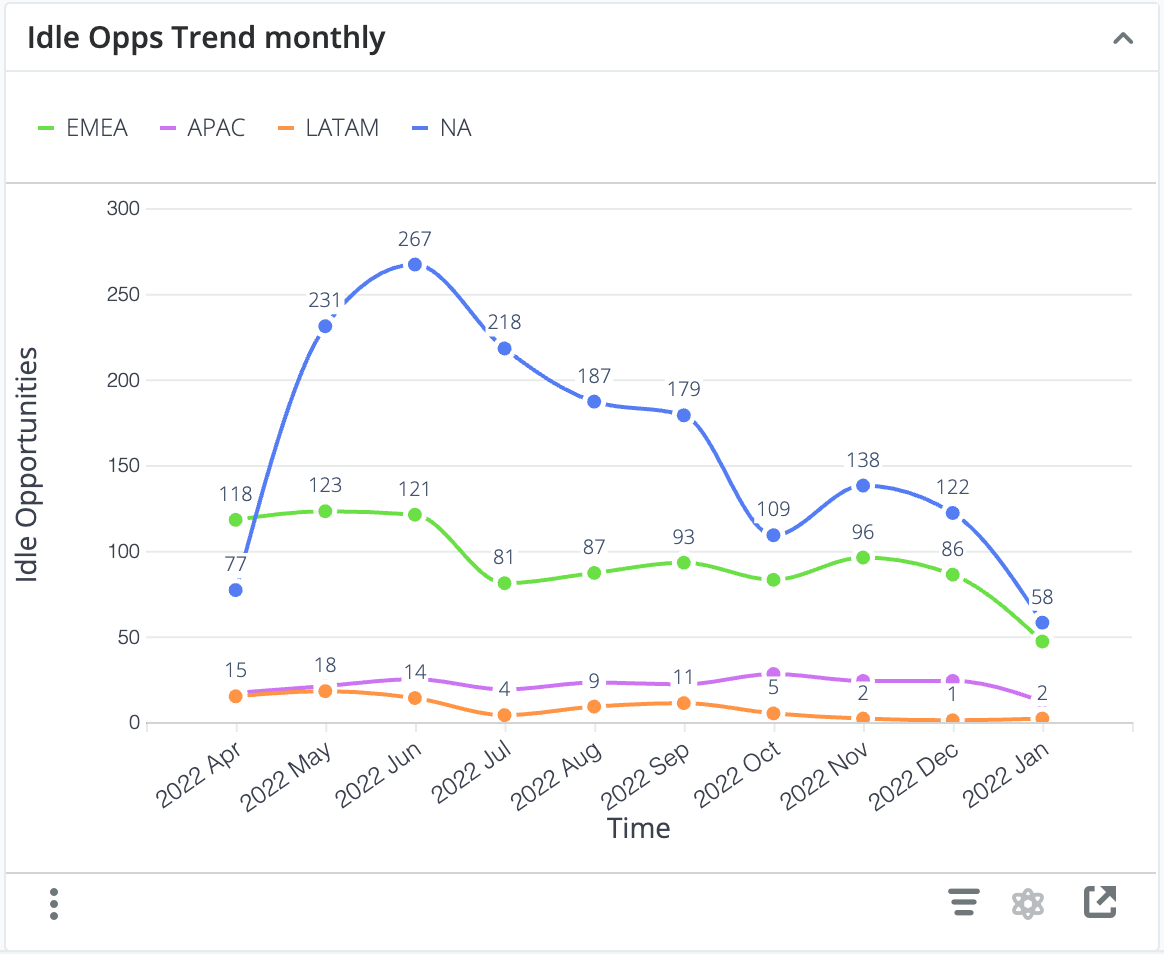
This dashlet shows the number of idle opportunities or revenue line items on the last day of the trailing twelve months. By default, idle opportunities are defined as the slowest ~5% of records within each sales stage for opportunities expected to close in the current or next period. This analysis allows viewers to spot trends where the number of idle records is increasing or decreasing within key business segments. For example, on the last day of April 2022, there were 77 idle opportunities within the sales region of NA.
Note: The rules defining what qualifies as an idle opportunity or revenue line item and the attribute (field) used to segment the metric, Sales Region in the example above, may be customized as part of Enhanced Forecasting onboarding.
Examples of insights that can be gained from this dashlet include:
- Is the number of stalled opportunities trending up or down within key business segments?
Top 10 Reps for Idle Opportunities
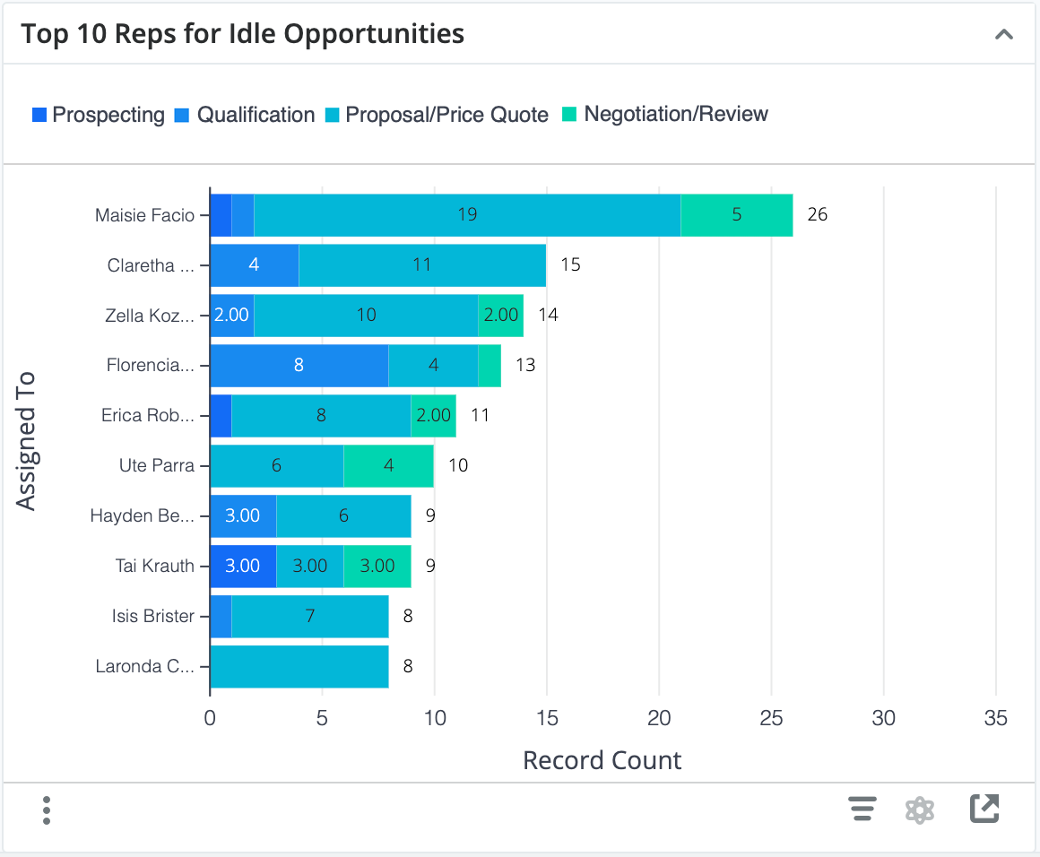
This dashlet shows the 10 sellers with the highest number of idle opportunities or revenue line items expected to close within the current and next periods. By default, idle records are defined as those that remain in a single sales stage for longer than ~95% of other records in the same sales stage, but the rules defining what qualifies as an idle opportunity or revenue line item may be customized as part of Enhanced Forecasting onboarding. This analysis helps you identify individuals who may be struggling to progress their sales deals.
Examples of insights that can be gained from this dashlet include:
- Which reps have the greatest number of stalled opportunities expected to close in the current and next quarter?
Forecast: Current vs Prior Quarters
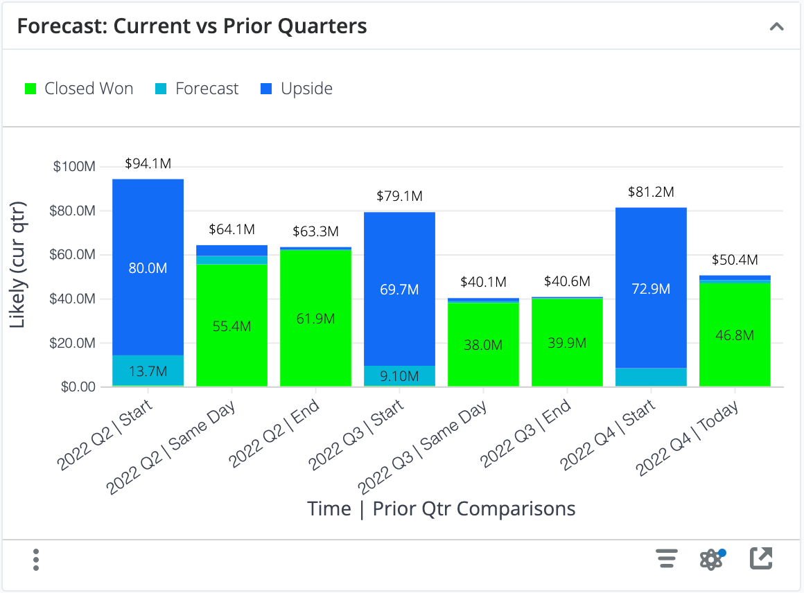
This dashlet shows a historical comparison of your total pipeline for the current period (e.g., this quarter) compared to your pipeline as it looked at the beginning, end, and same-day from prior periods.
Each column stack represents the sum of the likely revenue for all opportunities in your Sugar instance at the indicated date with an expected close date in the same period as that date. For example, the column labeled "2022 Q2 | Start" represents that, at the beginning of 2022's second quarter, all opportunities that had an expected close date in Q2 of 2022 had a likely revenue of $94.1M.
Each bar is further segmented by Closed Won versus open pipeline (e.g., Forecast and Upside) so that you can see how your open pipeline changes throughout the time period.
Examples of insights that can be gained from this dashlet include:
How does the total pipeline for this quarter compare to the same day from prior quarters? 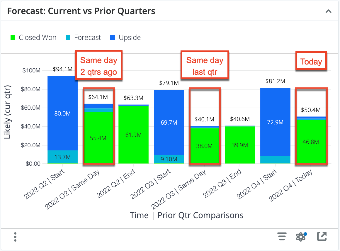
How much of our beginning pipeline did we convert in prior quarters?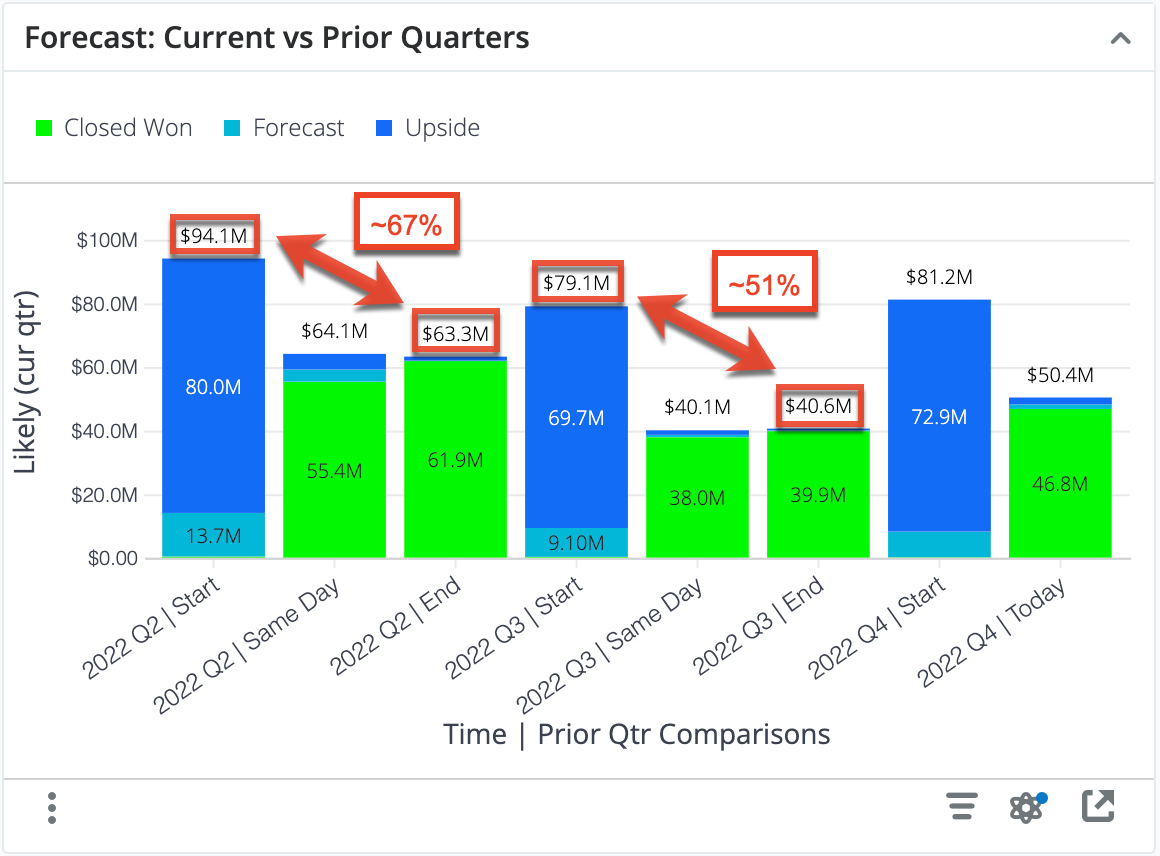
By comparing the pipeline at the beginning and end of prior quarters, you can estimate the pipeline coverage needed to reach current targets. For example, in the chart above, we can estimate that we need between 1.5x and 2x pipeline coverage going into a quarter in order to hit targets.
Similarly, you could compare the Same Day and End pipeline from prior quarters to estimate if you have enough remaining open pipeline today in order to hit your targets for the end of this quarter.
Pipeline: Current & Next Quarter
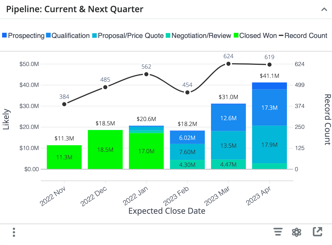
This dashlet provides visibility into the total pipeline remaining for the current period and the total pipeline for the next period in terms of revenue (bar graph) and opportunity or revenue line item count (line plot). Pipeline revenue is further broken down by Sales Stage to indicate pipeline maturity.
Each column represents the total likely revenue for opportunities in your Sugar instance with an expected close date in that month. For example, the opportunities with an expected close date in February 2023 have a total likely revenue of $18.2M, where $6.02M worth of opportunities are still in the Qualification stage.
Examples of insights that can be gained from this dashlet include:
- Do we have enough remaining pipeline to hit our targets?
- Do we have adequate pipeline coverage to hit next quarter's targets?
- Are we focusing enough effort on maturing next quarter's pipeline?
Pipeline Creation Trend
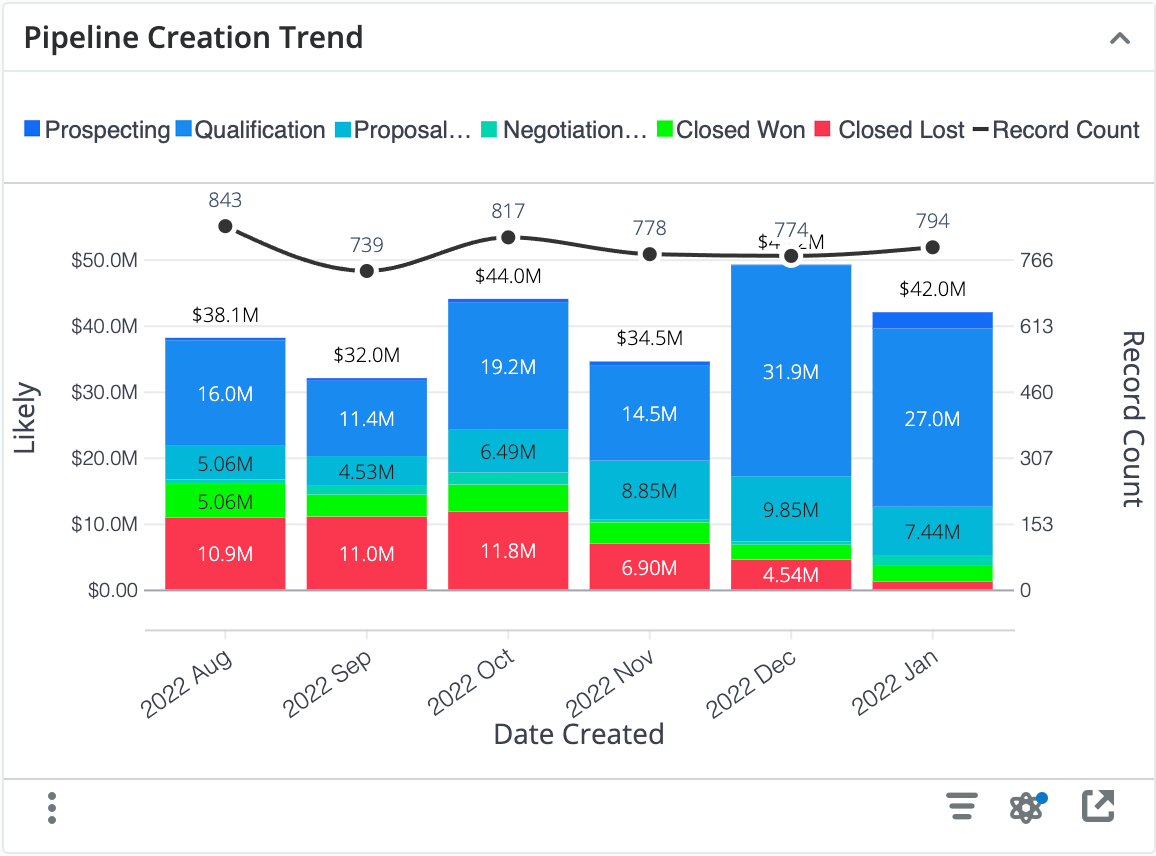
The Pipeline Creation Trend dashlet shows how much total pipeline was generated in the last 6 months and in how many potential deals. Pipeline revenue (bar graph) is broken down by Sales Stage to provide an indication of how quickly the pipeline matures relative to when it was created. The count of opportunities or revenue line items (line graph) provides a visual representation of how many records were created in each month and allows the viewer to quickly assess the relationship between the pipeline amount and the number of sales opportunities generated, while also facilitating a relative comparison of deals and pipeline generated from month to month.
The height of each column represents the total pipeline created in the specified month and the line chart represents the number of opportunities or revenue line items that were created in that month. The breakdown of sections within the column represents what Sales Stage those opportunities are currently in. For example, in August 2022, $38.1M of Pipeline was generated. Since then, $5.06M has converted to Closed Won, $10.9M is Closed Lost and the rest remains as open pipeline.
Examples of insights that can be gained from this dashlet include:
- Is our pipeline generation trending up or down over the past 6 months?
- Are sales deals progressing with adequate velocity after creation?
Funnel Velocity & Conversion
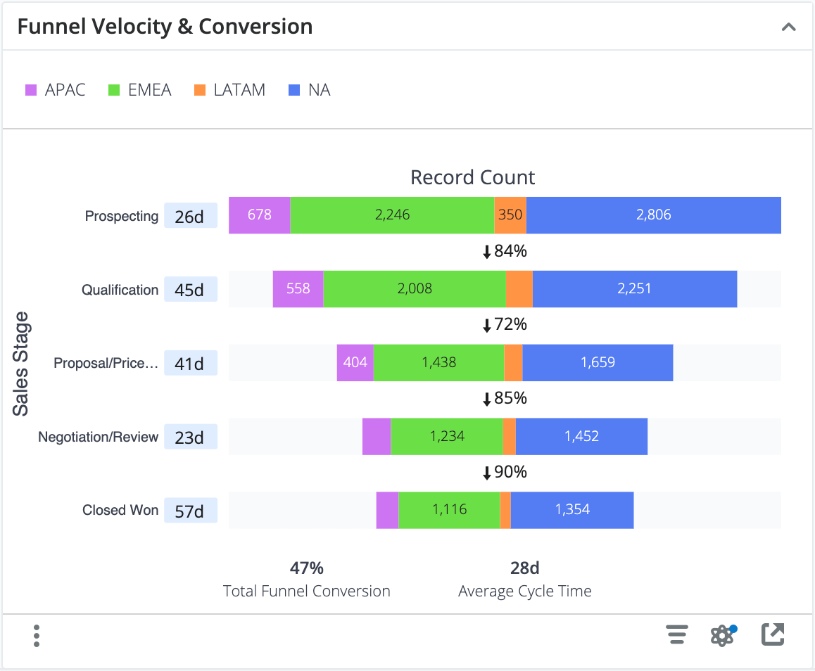
The Funnel Velocity & Conversion dashlet provides a type of "cohort analysis", which looks at what happens to a collection of opportunities or revenue line items as they pass through the Sales Stages from top to bottom.
The values along the left side of the funnel show the average number of days that the opportunities or revenue line items spent in that stage of the sales cycle. These values consider only the records that flowed through a given stage and ignore records that either have not progressed that far, skipped that stage in the sales process, or spent less time in the stage than is required to be synced to Discover.
Each funnel stage (horizontal bar) provides the number of records that progressed at least that far in the sales cycle, optionally segmented by an attribute (field). The attribute used for segmentation, Sales Region in the chart above, may be customized during your Enhanced Forecasting onboarding process. Records do not need to have spent time in the stage to be considered in this count (e.g., all records that are in the Qualification stage are also included in the Prospecting record count because the records have advanced beyond the Prospecting stage). The percentage between the stages indicates what percent of the previous stage made it at least as far as the next stage.
For example, consider the chart above that displays how all opportunities that were created last year progress through the sales cycle. The data is segmented by Sales Region so that we can see how records progress based on the sales region. On average, all records that are in or have been in the Prospecting stage (top stage) have spent 26 days in that stage. Any opportunities that skipped that stage do not impact the 26-day calculation. For the APAC region, there are a total of 678 records since the first stage (Prospecting) contains 678 records. Any record created in the Prospecting stage or a later stage is included in this count. 404 of these opportunities reached at least the Proposal/Price Quote stage. Any records that did not reach the Proposal/Price Quote stage were closed lost at some earlier point in the cycle. Also, 85% of the opportunities that reached the Proposal/Price Quote stage progressed at least as far as the Negotiation/Review stage.
The summary metrics at the bottom of the funnel show:
- Total Funnel Conversion = Number of Closed Won/Total Number of Records in the cohort
- Average Cycle Time = Average sales cycle length in days for Closed Won Opportunities/Revenue Line Items
In the chart above, the 47% funnel conversion value indicates that 47% of the opportunities that entered the funnel at any stage reached the final (i.e., Closed Won) stage. The amount of opportunities that were closed lost will impact this calculation. All the opportunities that reached the final stage, regardless of where they started, spent an average of 28 days in the sales funnel. The cycle time does not include any opportunities that were closed lost.
If the funnel is segmented, you can also analyze one or more segments of the funnel at a time by either clicking on the label in the legend or one of the segments in the dashlet. The unselected data will fade, and the statistics will update to show a comparison of the statistics for the segment versus the aggregate data, as shown in the image below. This feature allows you to see how a segment of the data compares with the whole. For example, the APAC region shows a slightly lower than average funnel conversion rate and a longer than average cycle time.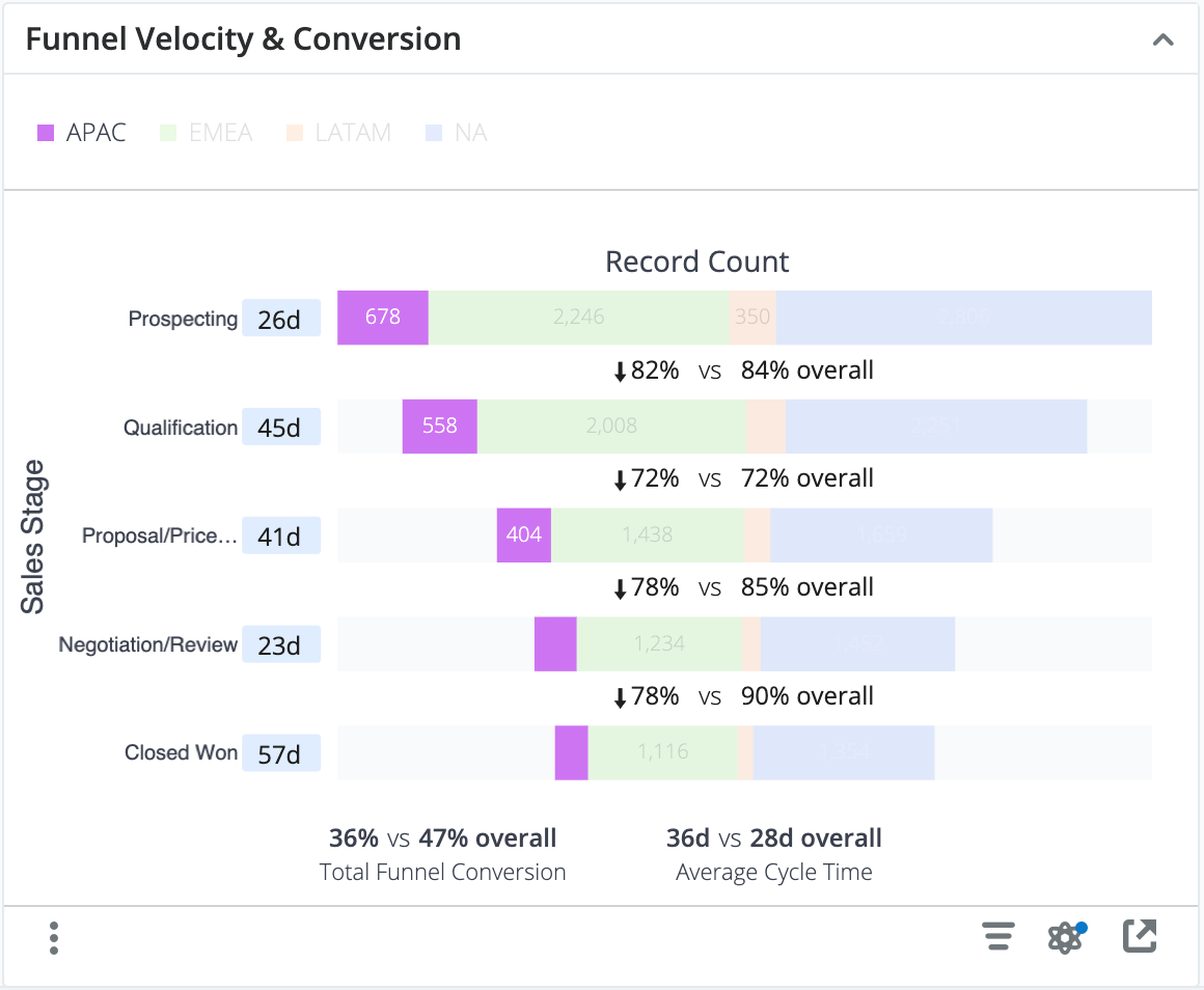
Examples of insights that can be gained from this dashlet include:
- What are our conversion rate (count) and average sales cycle length for opportunities created last year?
- Where are deals spending the most time in the sales cycle?
Funnel Velocity & Revenue Conversion
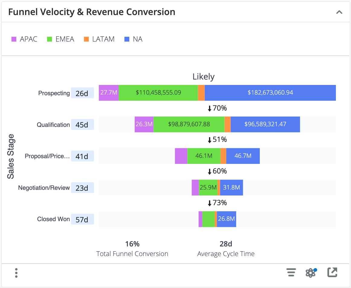
This dashlet is similar to the Funnel Velocity & Conversion Dashlet, except instead of viewing conversion based on opportunity or revenue line item count, they are based on the sum of revenue dollars. The revenue associated with each record is the revenue when the record entered the stage. For example, if an APAC opportunity has a Likely value of $25,000 then is transitioned to the Qualification stage, that opportunity is contributing $25,000 to the $26.3M total for the APAC Qualification stage. If that opportunity is then changed to have a Likely value of $50,000, the $26.3M value will not update. If the opportunity is later transitioned to the Proposal/Price Quote stage, the opportunity contributes $50,000 towards the total Likely for the APAC region.
Examples of insights that can be gained from this dashlet include:
- What are our conversion rate (revenue) and average sales cycle length for opportunities created last year?
- Where are deals spending the most time in the sales cycle?
For a more detailed explanation of funnel metrics, see the description for the Funnel Velocity & Conversion Dashlet above.
Funnel Flow Analysis
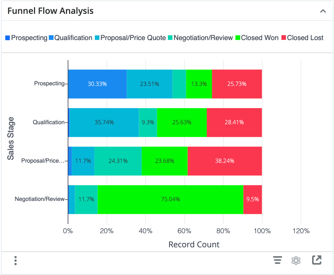
This dashlet illustrates how opportunities or revenue line items flow through your sales cycle. The y-axis represents each stage of your Sales Process and the color stacks represent which stage the opportunity or revenue line item transitioned to for all activity over the past year.
For example, for all records that were in the Prospecting stage, 13.3% transitioned directly to Closed Won, 25.73% transitioned to Closed Lost, and the rest remained as open pipeline. For the records that spent time in the Proposal/Price Quote stage, a small percentage transitioned back to the Qualification stage while 38.24% went directly to Closed Lost.
Examples of insights that can be gained from this dashlet include:
- Where are deals dropping out of the sales process?
- Are we investing too much time on deals that we eventually lose? (i.e., a high percentage of transitions to Closed Lost in late stages of the sales process)
Forecast Accuracy
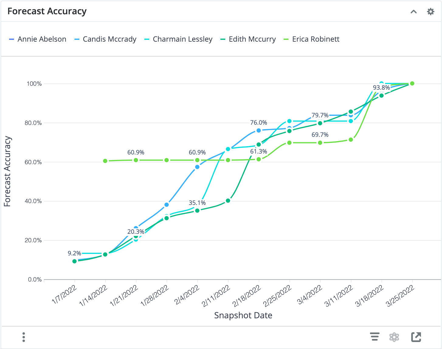
This dashlet shows a simple forecast accuracy metric over time. The accuracy of the forecast is the expected likely revenue for the period divided by the expected likely revenue on the last snapshot date included in the report. The last snapshot date on your plot will therefore always show 100% expected, and the earlier data points will adjust as more snapshots provide more information.
Examples of insights that can be gained from this dashlet include:
- How does our forecast accuracy improve over the period?
Forecast Tracker
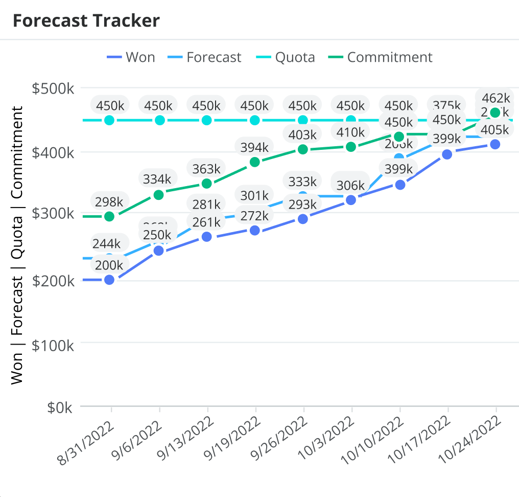
The Forecast Tracker dashlet allows you to visually track how your forecast, commitment, and sales won evolve throughout the time period in relation to your quota. Seeing these metrics on one chart helps you understand how close you are to reaching your quota and whether you have enough opportunities in your forecast to achieve it. In the example above, 8/31/2022 is the first day of the time period you are forecasting on and 10/24/2022 is today's date.
Examples of insights that can be gained from this dashlet include:
- How close am I to reaching my quota for the quarter?
- Do I have enough opportunities in my forecast to be able to reach my commitment and quota?
- How have my sales won changed over time?
Current Quarter Forecast Changes Since Last Week
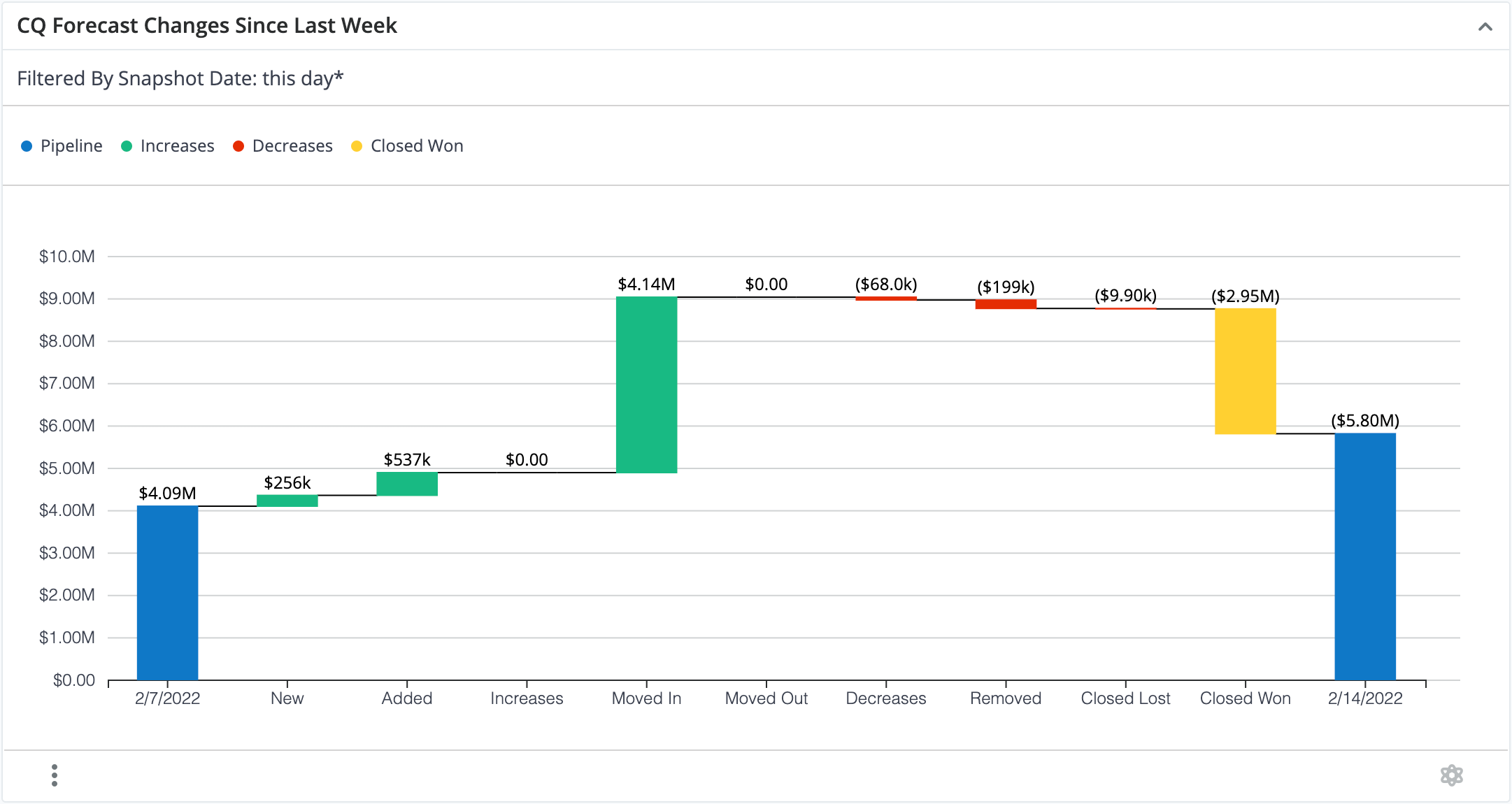
This dashlet shows how your forecast has changed since the last report date (e.g., since last week), which can be particularly helpful for sales leaders who want to keep track of what changes are happening within their forecast over time (e.g., from week to week). With this type of data and visualization, sales leaders can identify risks, spot upside opportunities, and make accurate forecast commitments. The Forecast Changes dashlet shows the total pipeline at the beginning and end of the reporting period (e.g., week) as blue bars on the left and right of the chart, respectively. Between the blue bars, green, red, and yellow bars display increases, decreases, and closed won opportunities, respectively. Increases and decreases are further subdivided based on the type of activity that increased or decreased value from the forecast. The categories for forecast changes include:
- New: Opportunities created since the last report date that are included in the forecast and expected to close this period.
- Added/Removed: Opportunities where sellers chose to include a previously excluded opportunity into the forecast, and vice versa. These opportunities are expected to close this period.
- Increases/Decreases: Opportunities where the revenue amount increased or decreased since the last report date.
- Moved In/Moved Out: Forecasted deals where the expected close date changed, moving it in or out of the current forecast period.
- Closed Won/Closed Lost: Deals that were open in the forecast on the starting date and have since closed as either Closed Won or Closed Lost.
For example, there was $4.09M in the open pipeline at the beginning of the week, and $4.14M worth of opportunities were moved into the forecast, $9.9k worth of opportunities were closed lost, and $2.95 M worth of opportunities were closed won. These changes, along with the others, lead to $5.8M remaining pipeline at the end of the week.
Examples of insights that can be gained from this dashlet include:
- How did my pipeline change over the last week?
- Where am I gaining or losing the most opportunities from my pipeline?
Forecast Changes Since Last Week Dashlet in Forecasts Module
If you have this dashlet present on the Forecasts module dashboard, you can filter the forecast by using the team or person selector or the time period selector at the top of the Forecasts module. When you change the quarter, note that you are not changing the start and end date of the visualization. The start and end dates remain the same and you will see what happened between those dates to the opportunities with an expected close date in the selected time period. The following table provides an example using the time frame February 7, 2022 - February 14, 2022:
| Time Period Selector | Visualization | Explanation |
| Current (Q1 2022) | |
On 2/7/2022 there was $4.09M of open pipeline in the current (Q1 2022) quarter. Between 2/7/2022 and 2/14/2022, $256K worth of opportunities were created and included in the forecast for the current quarter (i.e., "New" bar). |
| Q2 2022 | 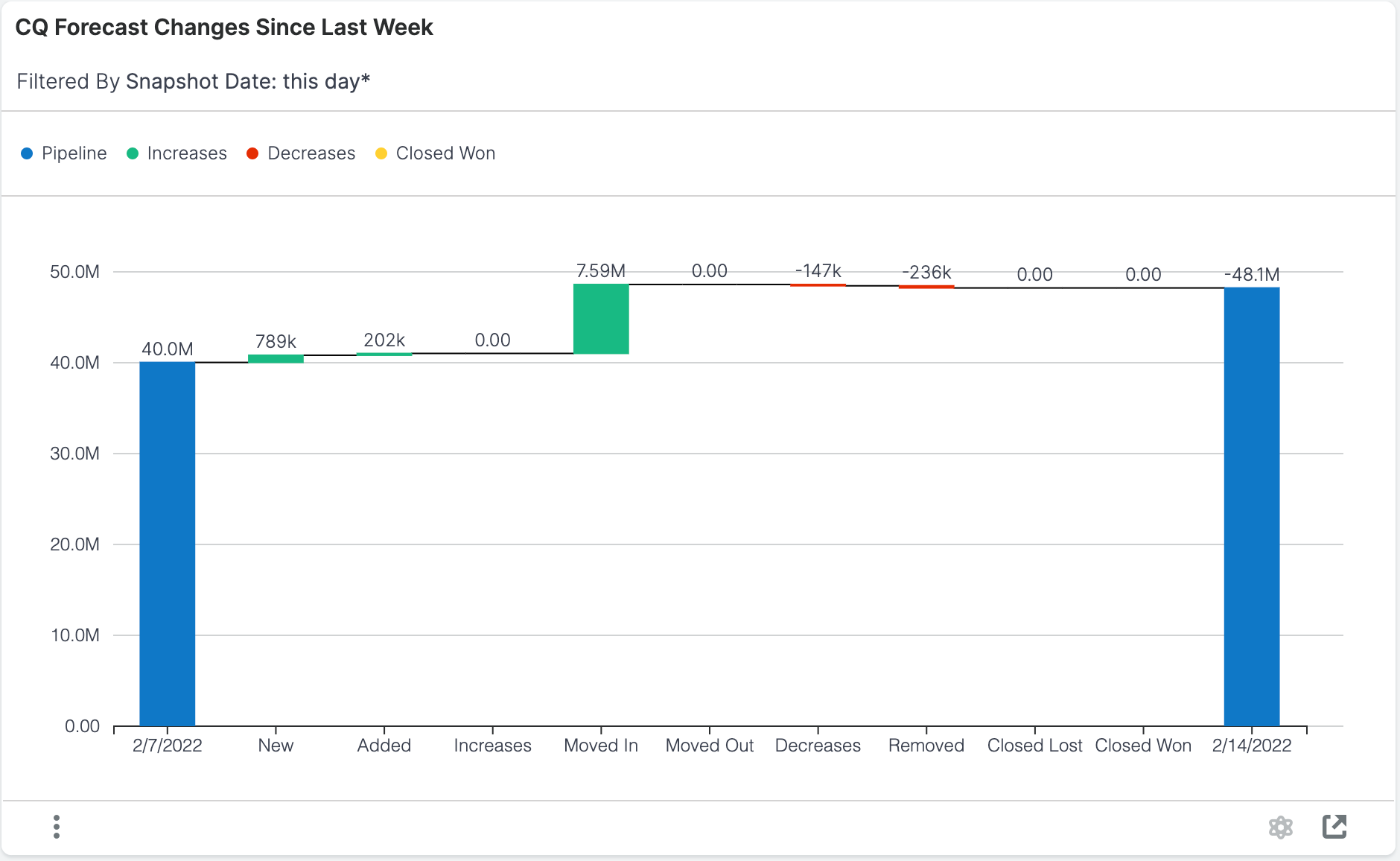 |
On 2/7/2022 there was $40.0M of open pipeline in Q2 2022. Between 2/7/2022 and 2/14/2022, $789K worth of opportunities were created and included in the forecast for Q2 2022 (i.e., "New" bar). |
You can click on the bars in the visualization to drill into the report and see more details.
Top 20 Committed Opportunities This Quarter
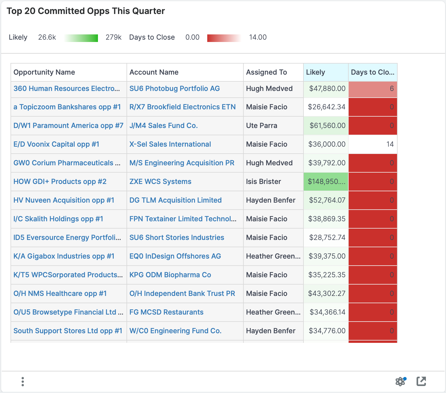
This dashlet displays the committed opportunities or revenue line items with the highest total likely revenue for the current period (e.g., this quarter). These are opportunities that have an expected close date within the current period (e.g., quarter) and are committed (i.e., included) in the forecast.
Examples of insights that can be gained from this dashlet include:
- Which opportunities are going to produce the most revenue?
- How long until the top opportunities are expected to close?
Top 20 Upside Opportunities This Quarter
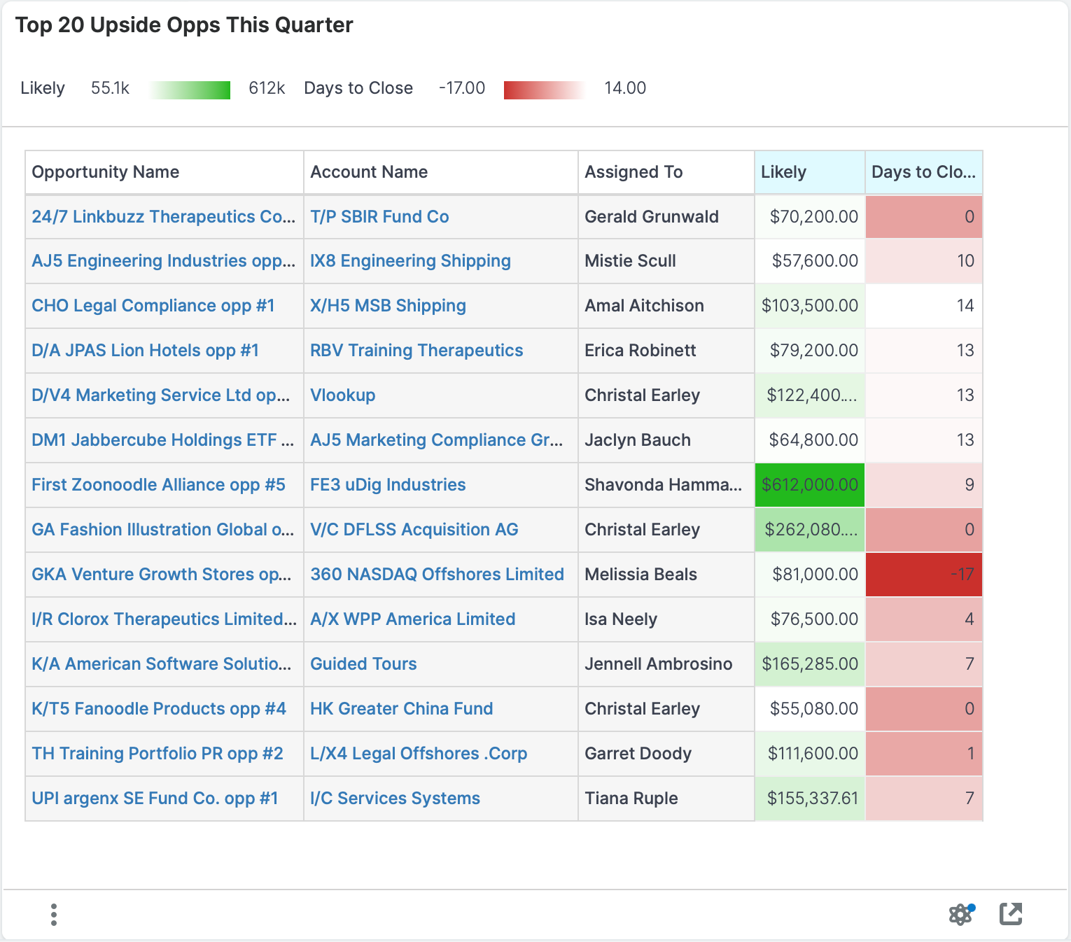
This dashlet displays the upside opportunities or revenue line items with the highest total likely revenue for the current period (e.g., this quarter). These are opportunities that have an expected close date within the current period (e.g., quarter) but were previously not committed (i.e., excluded) to the forecast.
Examples of insights that can be gained from this dashlet include:
- Which opportunities that were not previously forecasted are going to produce the most revenue?