Sugar Portal
Overview
The Sugar Portal is a powerful tool that allows Sugar users to interact with customers and share information related to multiple modules (Bugs, Cases, Knowledge Base). The portal allows customers to log in and review information directly from your Sugar instance and perform actions such as submitting cases and bugs, communicating with your employees regarding the cases and bugs, as well as reviewing knowledge base articles. To enable the portal for your instance, the Enable Portal option must be enabled via Admin > Sugar Portal. This will enable a Portal API User in Admin > User Management which must be left enabled in order for portal users to authenticate. This documentation covers the basics on how to configure the various portal settings, the look and feel of the portal, as well as configure the layout for the available modules (e.g., Cases) in the portal.
For more information on how a Sugar user can interface with the portal, refer to the Portal Deployment User Guide.
For more information on how your customers can interface with the portal, refer to the Portal User Guide.
Configure Portal
The Configure Portal page allows administrators to enable the portal and configure different aspects of the portal interface such as enabling or disabling modules, defining the number of records to display per list view, etc. For more information on how these settings are applied in the portal, refer to the Portal User Guide.
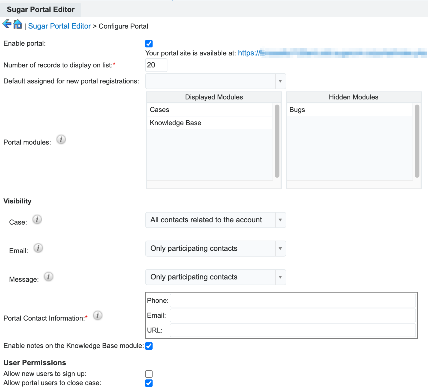
The following settings are available to configure when setting up your portal:
| Field | Description |
| Enable portal |
Enable the checkbox to have the portal enabled for customers. After enabling the portal and clicking "Save", the portal URL will appear under the checkbox which is where you can access the portal for your instance. |
| Number of records to display on list |
Enter the maximum number of records to display per list view results set in the portal. By default, this is set to 20 records per results set. |
| Default assigned for new portal registrations |
Select the Sugar user that will be assigned to the contact records created from the portal registrations. |
| Portal modules |
Select which modules will appear in the portal's navigation bar by dragging and dropping the module between the Displayed Modules and Hidden Modules columns. You can also designate the order of the modules displayed in the navigation bar by selecting the module in the Displayed Modules column and moving it up or down. |
| Visibility: Case |
Select which portal users you wish to be able to see cases in the portal. The following are the options:
Note: This setting only applies to instances with the Cases module enabled for the portal. |
| Visibility: Email |
Select which portal users you wish to be able to see emails in the case timeline in the portal. The following are the options:
|
| Visibility: Message |
Select which portal users you wish to be able to see messages in the case timeline in the portal. The following are the options:
|
| Portal Contact Information |
Enter the company's contact information (i.e., phone, email, URL) that will be available to portal users requiring additional assistance logging into their account. This information can be accessed by clicking the Forgot Username link on the Forgot Password screen or clicking the "Did not get an email?" link after the portal user submits their username to initiate their password reset. |
| Enable notes on the Knowledge Base module |
Enable this setting to allow portal users to view and create notes on Knowledge Base articles. When disabled, the Notes subpanel and Add a Note button are hidden. |
| Allow new users to sign up |
Enable this setting to allow new users to create a portal account from the portal login page. When disabled, the Sign Up link on the login page is hidden. This setting can also be controlled in the system |
| Allow portal users to close case |
Enable this field to display the Request To Close button on open cases in the portal. Customers can click the button to request to have the case closed, which sets the Request Close and Request Close Date fields on the case. See the Sugar Portal User Guide for more details. Note: This setting only applies to instances with the Cases module enabled for the portal. |
Enabling the Sugar portal will create a Customer Self-Service Portal Role and enable a Portal API user in Admin > User Management which must be left enabled for portal users to authenticate. The information viewable in the portal can be updated and restricted by Sugar users as allowed by team membership, user access type, and assigned roles. For more information on teams and roles, please refer to the Team Management and Role Management documentation in the Administration Guide.
Do not delete the Customer Self-Service Portal Role or the Portal API user, as they are system-generated based on portal activation. If the portal role or user is accidentally deleted, you must disable and re-enable the Sugar Portal to recreate them.
Note: Hiding a module via Admin > Navigation Bar and Subpanels will not remove the module from the portal. You will need to disable access to the module via Admin > Role Management for the Customer Self-Service Portal Role in order to remove it from the portal. For more information on roles, refer to the Role Management documentation.
Theme Portal
The Portal Theme Preview page allows you to customize the look and feel of the portal, such as changing the logo, banner, text, and colors, to match your organization's theme and message. Certain settings on this page only take effect if they are available in your product. The following lists outline the settings available for each product:
Sugar Serve:
- All settings on the page, including the dashboard in the bottom left corner
Sugar Sell:
- Login Page Image URL
- Navigation Bar Logo URL
- Button Color
- Text Link Color
Sugar Enterprise:
- Login Page Image URL
- Navigation Bar Logo URL
- New Case Button
- New Case Message
- New Case Button Text
- Button Color
- Text Link Color
Making changes to a setting that is not available in your product will have no impact on the portal.
The Portal Theme Preview page is divided into three sections. On the left, you can see a preview of the portal Home page. Specifically, the top half is a preview of configuration changes you make on the right side and the bottom half is a dashboard that you can configure in place. On the right, you can update a variety of settings to change the portal experience. The left-hand-side preview is updated in real-time so you can quickly see the results of your changes on the right.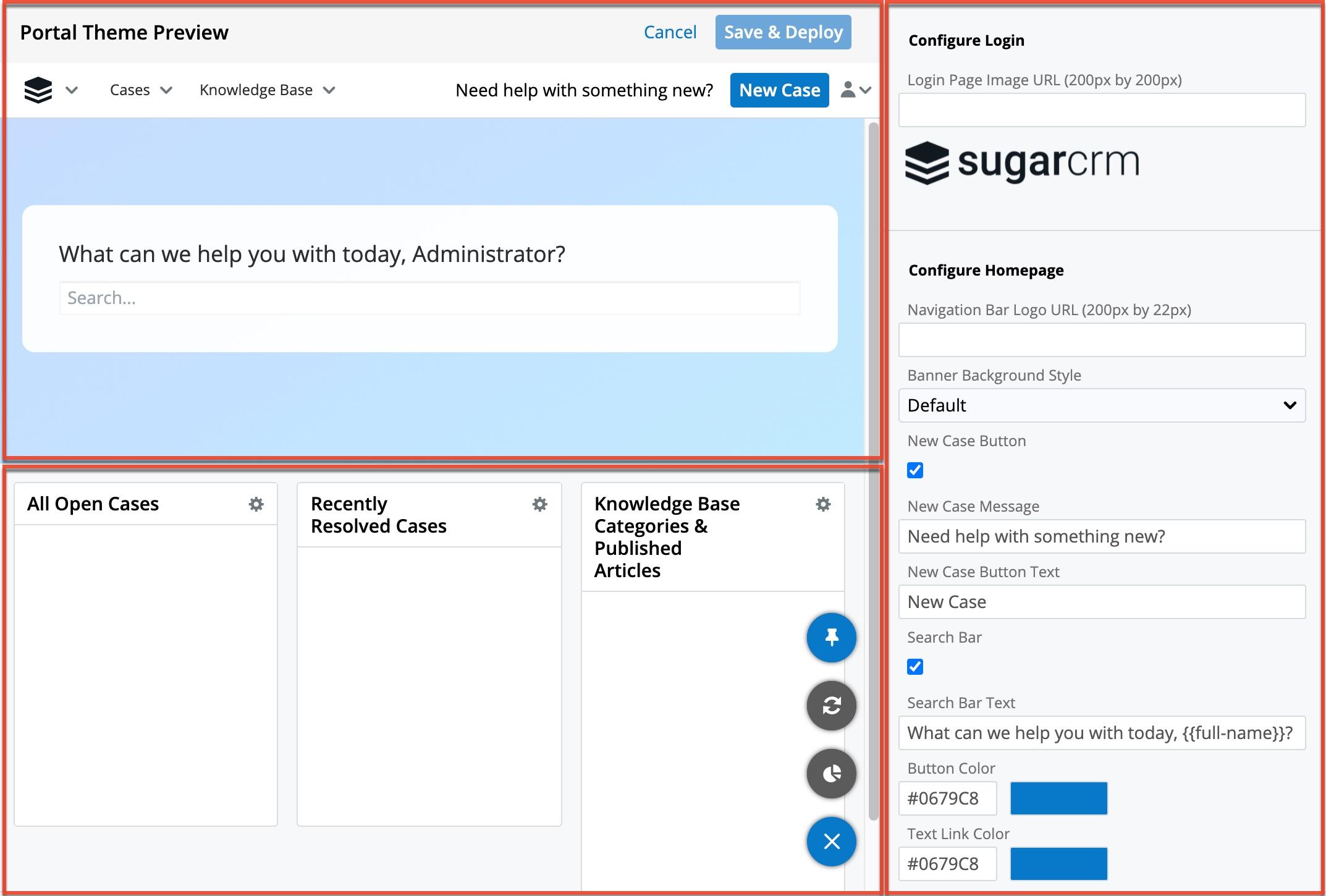
The right-hand-side panel includes the following settings:
- Login Page Image URL: Enter the URL of the image you wish to display on the portal login page. The image is scaled down if necessary to fit in the login box.
- If you do not enter a URL, the SugarCRM logo is displayed by default.
- For reference, the SugarCRM logo that is used by default has dimensions of 1000 x 189 px and is scaled down on the login page.
- When you enter a URL, a preview of the image is displayed directly below the field; if you do not see a preview, the image cannot be found using the URL and will not appear in the portal.
- Since the login page is not shown in the preview on the left, it is recommended to open the portal login page to verify that the image is displayed as you would like and to resize the image if it is not.
- Navigation Bar Logo URL: Enter the URL of the image you wish to display in the top left corner of the portal. The image is scaled down if necessary to fit in the navigation bar.
- If you do not enter a URL, the SugarCRM logo is displayed by default.
- For reference, the SugarCRM logo that is used by default has dimensions of 22 x 22 px. Either a small, square image or a short but wide image is recommended to ensure it scales down nicely.
- Banner Background Style: Choose the style of background to use. The following options are available:
- Default: This is the default blue gradient that is used if you do not change the background.
- Color: This allows you to specify any color. Selecting it causes the Background Color field to appear, where you can choose a color by entering the hex color code or clicking in the text field to open the color picker.
- Image: This allows you to use an image. Enter the URL of the image you wish to use; the image is scaled down if necessary.
- When you enter a URL, a preview of the image is displayed directly below the field; if you do not see a preview, the image cannot be found using the URL and will not appear in the portal.
- New Case Button: Enable this checkbox to add a button to the navigation bar for users to create a case.
- New Case Message: Enter the text you would like to display next to the New Case button.
- New Case Button Text: Enter the name you would like to use for the New Case button, if not "New Case". If you leave this value blank while the New Case button is enabled, the default value of "New Case" will be used.
- Search Bar: Enable this checkbox to display a search bar on the Home page to allow users to search knowledge base articles.
- Search Bar Text: Enter the text you would like to display above the search bar. You can use the following variable to display the full name of the portal user within the message:
{{full-name}}. - Button Color: Choose a color for all portal buttons by entering the hex color code or clicking in the text field to open the color picker.
- Text Link Color: Choose a color for the text of all links in the portal by entering the hex color code or clicking in the text field to open the color picker. Link text is not represented in the preview on the left, so it is recommended to log in to the portal to verify that the color you have chosen meets your expectations.
Once you are happy with your changes to the settings on the right-hand side, click "Save & Deploy" to push the changes to all portal users. If you want to reset all the settings to their default values, click the link at the bottom of the section. Note that this does not affect the dashboard section at the bottom left; there is a separate Restore Default Dashlets option in the floating actions button in the dashboard.
The note at the bottom of the right section also contains a link to open the Amazon Connect Settings page to set up Sugar Portal Chat.
On the left-hand side, the top section shows a live preview of the changes you make in the right panel. The bottom section is a dashboard that can be configured in the same way you edit any dashboard, by dragging, resizing, adding, editing, and removing dashlets. This includes defining filters for List View dashlets to limit which records portal users see, in addition to the basic restrictions that are already applied to portal users (e.g. case visibility defined in Configure Portal). Note that custom filters saved in the Portal Theme Preview page are only available for use in configuring the portal and are not available in the rest of Sugar. Likewise, existing custom Sugar list view filters cannot be used in the portal.
Changes you make in the dashboard are immediately visible to all users without using the Save & Deploy button. To avoid disruption to your portal users, it is recommended to make portal dashboard configuration changes outside of regular business hours. If you want to reset the dashboard and all of its dashlets to the default layout and settings, click the Restore Default Dashlets option in the floating actions button, but note that this cannot be undone. This does not impact the settings on the right-hand side of the page.
Layouts
The Sugar Portal Editor also allows you to configure the record view and list view layouts for the Cases, Bugs, and Knowledge Base modules in the portal. You can also configure the Contacts record view layout to control what fields to display in the portal user's profile. Please note that both stock and custom fields that appear in Admin > Studio are available to add to the portal layouts.
Record View
The portal record view displays key record information including all relevant fields for the module (e.g., Knowledge Base) and the user's profile. The editor allows you to add a field to the Record View layout by dragging the field from the list of fields in the Toolbox to a "(filler)" location on the layout per your preference. You can also change the location of existing fields in the layout by dragging and dropping the field to a different location on the layout. To remove a field from the layout, simply drag and drop the field(s) from the layout to the trash bin in the Toolbox. Please note that changes to the Record View layout will also affect what fields appear when a portal user previews a record (e.g. knowledge base) in the portal. Once the layout is finalized, click "Save & Deploy" to preserve your changes and deploy them to the portal. You can also click "Save" if you wish to preserve the changes but not deploy the changes to the portal. For more information on editing the record view layout, refer to the Studio documentation. 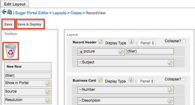
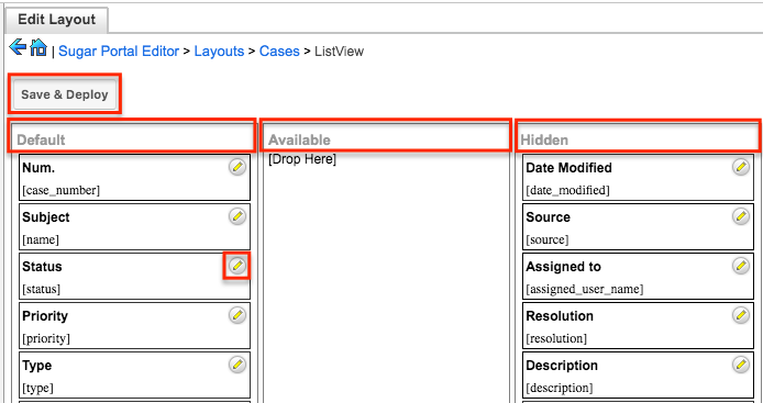
List View
The portal list view displays all records that meet the current search criteria in the Cases, Bugs, and/or Knowledge Base modules that the portal users can access. The editor allows you to drag and drop fields between the Default, Available, and Hidden columns as follows:
- Default: Drag fields into the Default column to display them in the default List View layout. To change the left-to-right order of the fields displayed on the list view (or right-to-left for users viewing an RTL language), drag and drop the fields up or down within the Default list.
- Available: Drag fields into the Available column to make them available for portal users to personalize their view of the list view layout without making them part of the default layout. Portal users will be able to click the Column Selection icon to the far right of the list view column headers to see the list of available fields.
- Hidden: Drag fields into the Hidden column to hide them from portal users in the module's list view.
You can also modify the label and width for a field by clicking the Pencil icon to the right of each field and entering the new field label and selecting the width (e.g., small, medium) of the field column in the list view.
Once the list view layout is finalized, click "Save & Deploy" to preserve your changes and deploy them to the portal. For more information on editing the list view layout, refer to the Studio documentation.