Module Builder
Overview
Module Builder enables administrators to create, deploy, and maintain custom modules in Sugar. Modules can be created in Module Builder and then deployed within your instance of Sugar or exported for additional development and deployment to other instances of Sugar. This is convenient for testing new modules and for distributing a module to many different instances. Please note that only users with administrator access can create and manage custom modules via Admin > Module Builder. This documentation will cover how to use Module Builder as well as the various actions and options available from within Module Builder.
Navigation
Sugar's Module Builder is divided into three main sections which consist of the main panel, packages panel, and footer. You can easily create, access, and manage the custom modules via the main panel and Packages panel. The footer of Module Builder allows you to access different areas (e.g., Studio, Dropdown Editor) of the Developer Tools section by clicking the corresponding buttons at the bottom of the page.
Main Panel
The main panel in Module Builder is where you can create a new package, access existing packages, deploy a package, etc. As you create and configure the module(s) within the package, the various sections (e.g., layouts, fields, etc.) you access will open inside tabs on the main panel. Additional tabs that open up can be closed by clicking the "X" within the tab. 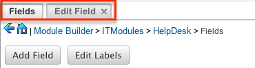
The main panel also displays the breadcrumbs bar showing your current location in Module Builder. You can navigate to a specific section by clicking the link within the breadcrumb bar. 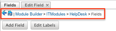
To go back to the previous page you were viewing, click the Left arrow on the breadcrumbs bar. Clicking the Home icon will navigate you back to the Developer Tools home page.
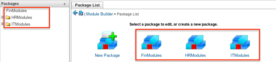
Packages Panel
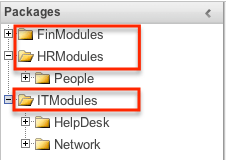
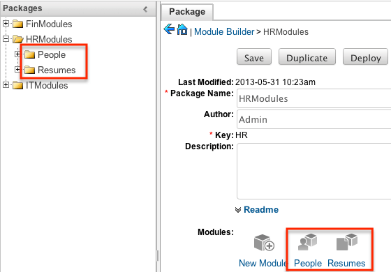
The Packages panel is located to the left of the main panel and displays a list of existing packages and associated custom modules that are accessible via Module Builder. The custom modules are grouped under a package and the fields, layouts, subpanels, etc. specific to each module appear when you expand out the tree for the module. 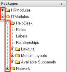
Select an item in the Packages panel to load it into the main panel. Please note that if you do not see the Packages panel, it may be collapsed. Simply locate the gray bar to the left of the main panel and click the Right arrow to expand the Packages panel. 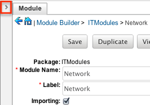
Footer
The footer is located on the bottom left of Module Builder and displays buttons that enable you to navigate to the different areas (Studio, Dropdown Editor, etc.) of Developer Tools. 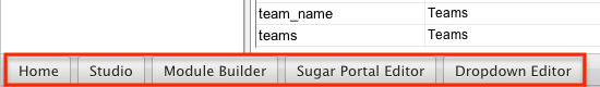
The options in the footer allow you to navigate to the following locations:
| Menu Item | Description |
| Home | Navigates to the home page of Developer Tools. |
| Studio | Navigates to the home page of Studio. |
| Module Builder | Opens Module Builder to create and manage custom modules. |
| Sugar Portal Editor | Opens the Sugar Portal Editor to configure the Portal. |
| Dropdown Editor | Opens the Dropdown Editor to create and edit dropdown lists. |
Packages
Packages in Module Builder allow you to create and house multiple modules of different types. Please note that a package must first be created in order to create a custom module via Module Builder. While packages can be useful to group similar or dependent modules together to ensure they are deployed together, it is generally recommended that a separate package be created for each module. This can help prevent potential issues down the road since if you ever need to uninstall a module and it is part of a larger package, then all modules in that package must be uninstalled. Keeping modules isolated to their own package allows greater flexibility in the future if a module is no longer needed.
Creating Packages
Use the following steps to create a new package via Module Builder:
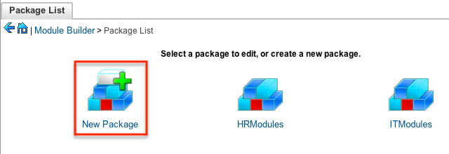
- Navigate to the Module Builder's main panel and click "New Package".
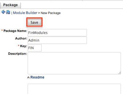
- Enter appropriate values for the following fields:
- Package Name: The name or designation of the package. The package name is what displays in the Packages panel and in Module Loader when installing packages.
- Author: The author who is creating the package. The author displays in Module Loader when installing packages.
- Key: The key is an alphanumeric text to distinguish modules with similar names. The system will prefix all class names, directories, and table names with this key.
- Description: A description or other information about the package.
- Readme: Click "Readme" to display an open text box where you can enter additional information about the package or modules contained in the package.
- Note: All required fields are marked with a red asterisk and must be completed prior to saving.
- Once the necessary information is entered, click "Save".
Deploying Packages
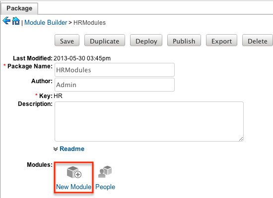
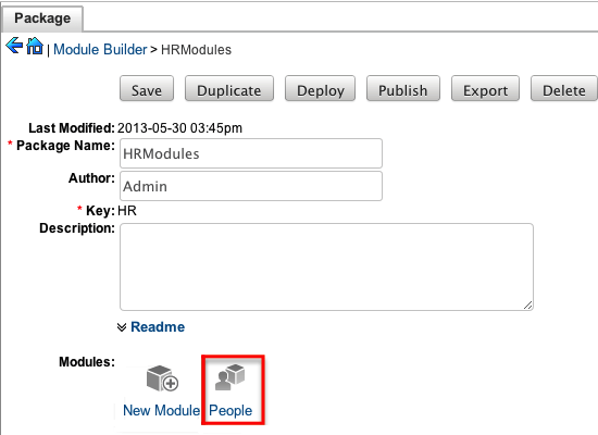
Once the package is created and saved, you can create custom modules by clicking the New Module icon. Please note that the package must contain at least one module in order to properly publish and deploy the package, as well as export the customizations. There are various options (e.g., deploy, publish, export, etc.) available when viewing the package which allows you to perform various actions. 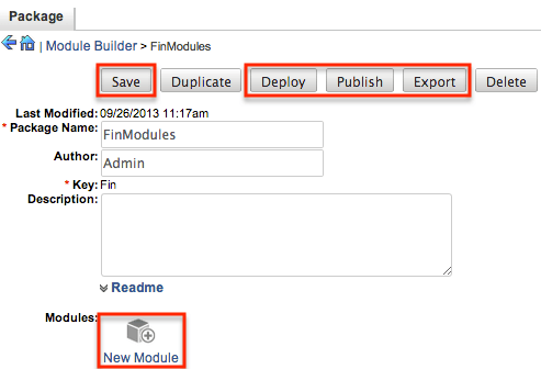
The Package options allow you to perform the following operations:
| Action | Description |
| Save | Click "Save" to preserve any changes made to the Package details (Package Name, Author, etc.). |
| Deploy | Installs the package into the current instance. Any modules in the package will be created or updated in the current instance. Note: Do not re-deploy a package once deployed from Module Builder as any workflows, code-level customizations, or changes made through Studio for the custom modules will be lost. It is recommended that module packages be deleted from Module Builder after a successful deploy to avoid an accidental re-deploy. Please use Studio to perform any additional configurations to your module once deployed. |
| Publish |
Saves the package into an installable zip file containing all customizations. Upload the file via Module Loader to install the package into a different instance. Note: Sugar Sell Essentials customers do not have the ability to upload custom file packages to Sugar using Module Loader. |
| Export |
Saves the package into an importable zip file containing all customizations. Upload the file via Module Loader to view the package in Module Builder on a different instance where it can then be further developed and deployed. Note: Sugar Sell Essentials customers do not have the ability to upload custom file packages to Sugar using Module Loader. |
Deleting Packages
If a package is invalid or should no longer appear in your organization's Sugar instance, it may be deleted from Module Builder. Please note that deleting a package will delete all files contained in the package, but will not remove the package from any instance where the package was deployed. For more information on how to uninstall a deployed package from an instance, please refer to the Module Loader documentation in the Administration guide.
Note: We recommend deleting packages from Module Builder after they have been deployed in a production instance to prevent them from accidentally being re-deployed. The only exception to this rule is in a development environment as you may want to continue working and testing until you are ready to move the module to your production environment.
Use the following steps to delete a package via Module Builder:
- Select the desired package from either the Packages panel or from the main panel.
- Click "Delete" to remove the package.
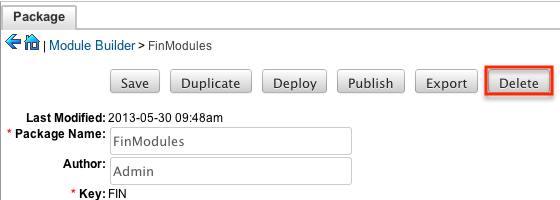
- A pop-up message will display asking for confirmation. Click "Ok" to proceed.
Modules
Various types of modules can be created and configured within the package in Module Builder. Although multiple custom modules can be created in a package, it is generally recommended that only one module be created per package. This will help prevent potential issues down the road and allow greater flexibility in the future if a module is no longer needed.
Note: Activity streams are not available for custom modules.
Module Types
Module Builder comes with a few predefined module templates for creating modules. Select the module type that best fits your organization's use of the new module and then customize the module to further fit your needs.
The following module types are available by default in Module Builder:
| Type | Description |
| Basic | Generic module with only the most basic fields defined by default. All other module types build on top of the basic module type. |
| Company | Contains fields designed for company, account, or organization type records. Includes billing and shipping addresses, email address, phone numbers, industry, website, and more. |
| File | Contains fields designed for file upload or document records. Includes category, expiration date, status, filename, and more. |
| Issue | Contains fields designed for bug, issue, or case record types. Includes issue number, status, priority, work log, and more. |
| Person | Contains fields designed for people, contacts, or lead records. Includes first and last name, primary and alternate addresses, email addresses, phone numbers, and more. |
| Sale | Contains fields designed for sales, transactions, or opportunities. Includes, amount, currency, probability, sales stage, and more. |
Module Options
When creating modules in Module Builder, the following configuration options are available:
- Module Name: The name (e.g. HelpDesk) or designation of the module. The module name is what displays in the Packages Panel as well as in Studio after deploying.
- Plural Label: The plural label (e.g. HelpDesks) for the module name. The label is what displays when using the module within Sugar.
- Singular Label: The singular label (e.g. HelpDesk) for the module name. The label is what displays when using the module within Sugar.
- Importing: Select this option to enable importing for the module.
- Team Security: Select this option to enable team security for the module. If this option is unchecked, records in this module will not be assigned to a team and will be restricted by roles only. For more information on teams and roles, please refer to the Team Management and Role Management documentation in the Administration Guide.
- Navigation Tab: Select this option to add the module and module actions to the navigation bar.
- Type: Select the module type to use as a template when building the module. Each module type includes a list of stock fields by default which can be added and removed in the layout as necessary. Please note that the module type can only be selected when initially creating the module. For more information regarding the module types, please refer to the Module Types section of this page.
Creating Modules
While you have the option to create multiple types of modules within a package, it is generally recommended that only one module be created per package. This will help prevent potential future issues and allow greater flexibility if a module is no longer needed.
Creating Modules Via Package
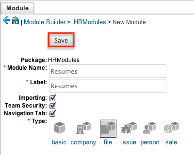
One of the most common methods of module creation is via the New Module option in the package. When the New Module icon is selected, it opens up the New Module screen that allows you to enter the module's details (e.g., name, label, etc.) and to select the module type to use as a template.
Use the following steps to create a custom module in the package:
- Select a package from the Packages Panel to create a new module.
- In the main panel select "New Module".
- Enter the appropriate values for the Module options. All required fields are marked with a red asterisk and must be completed prior to saving.
- Select a module type (e.g. file) to use as a template when configuring your module.
- Once the necessary information is entered, click "Save".
Creating Modules Via Duplication
You can also create a new module by duplicating an existing module within a package. The duplicate option is useful if the module you are creating has similar information or structure to an existing module.
Use the following steps to create a module by duplicating an existing module:
- Select a package from the Packages panel to create a new module.
- In the main panel, select a module to duplicate.
- Click "Duplicate" to create a copy of the module.
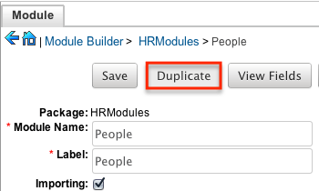
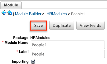
- The selected module is duplicated to a new module with a "1" appended at the end of the module name. Update the necessary fields, then click "Save".
Modifying Modules
The associated fields, labels, layouts, subpanels, etc. for each module can be modified within each package. Click the plus sign (+) preceding the module name to expand the module and view the associated items (e.g. Layouts, Fields, etc.). Selecting the module from the Packages panel will load the view into the main panel. You can modify the Module options for the selected module via this page.
Modifying Labels
Labels are used throughout Sugar for items like buttons, field headers, subpanel titles, error messages, and more. To modify the labels for a module, select "Labels" from the Packages panel under the desired module. 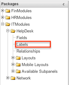
The Labels tab will open up in the main panel where you can change the names for specific labels associated to the module. Please note that you can also define the primary language to use per the language packs currently installed in Sugar when changing the labels. Select the desired language from the dropdown to view and modify the labels according to that language. 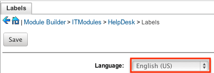
Modify the labels for the selected language and click "Save" to preserve your changes. 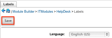
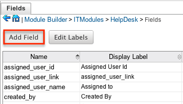
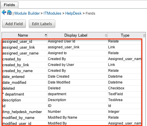
Fields
The Fields section in Module Builder allows administrators to create new fields as well as change properties on existing fields within a module. To access the Fields section in Module Builder, select "Fields" from the Packages panel under the desired module and the view will open up in the main panel to the right. 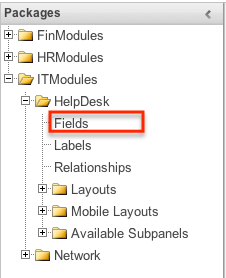
Field Types
The Fields section for each module contains a number of stock fields that come out of the box with Sugar. Please note that each data type has various options and properties available to configure.
The following data types are available to be added to modules in Module Builder:
| Data Type | Description |
| Address | Creates fields for street, city, postal code, state, and country. Note: Custom address fields cannot be grouped together like the stock address fields. |
| Checkbox | Creates a checkbox for data fields with a Yes/No action. |
| Currency | Creates a field to enter a currency value. The system automatically creates a dropdown of the currency type if the field does not already exist in that module. |
| Date | Creates a field to enter a date. Includes a button for a calendar popup. |
| DateTime | Creates a field to enter the date and time. Includes a button for a calendar popup as well as dropdowns for the time. |
| Decimal | Creates a field to hold a number rounded to a specified decimal precision. Sugar stores the exact representation of the number in the database (e.g., For a precision of 2: 1.236 is stored as 1.24). |
| DropDown | Creates a field that you can associate with a dropdown list of values. |
| Encrypt | Creates a field for sensitive information, such as social security numbers, whose value is to be encrypted in the Sugar database. The value is encrypted in the database but is visible in the user interface to users. |
| Float | Creates a field to hold a number rounded to a specified decimal precision. Sugar stores the value differently based on the database platform Sugar is running on. |
| HTML | Creates static HTML-formatted text to display in record views. |
| IFrame | Creates a field to store or generate a URL to display an iFrame in record views. Note: To load content from an external website in the iframe field, administrators will need to add the URL (e.g. https://www.example.com) as a trusted site via Admin > Content Security Policy Settings. |
| Image | Creates an image field to upload an image to display on a record. |
| Integer | Creates a field to specify positive or negative numbers with no decimal places. |
| MultiSelect | Creates a dropdown list of values where multiple values can be selected at once. |
| Flex Relate | Creates a dropdown list from which you can relate a single record from a variety of modules. Only one Flex Relate field is allowed per module. If the module already has a Flex Relate field, this option does not display in the Data Type dropdown list. |
| Phone | Creates a field to enter a phone number. |
| Radio | Creates a radio button for a user to select one value from a dropdown list. |
| Relate | Creates a field to associate a record with another module's record as a one-way relationship. You can add multiple Relate fields to a module. Note: Relate fields and custom relationships are independent of each other. Changes made to either one are not reflected in the other. Relate fields can be added to a report, but any data on the related record cannot be accessed in the report. To access related record data in a report you will need to create a custom relationship. |
| TextArea | Creates an open text area field for multiple lines of text. |
| TextField | Creates a field for a single line of text. |
| URL | Creates a field to store or generate a URL and display as a link. |
Field Options
Fields provide ways to store different data types in Sugar. While many fields come out of the box with Sugar by default, there can be instances where your organization needs to store additional data.
When creating or modifying fields via Module Builder, there are some properties that exist across all field types, and there are some that are unique to only a few types.
The following field properties and options are available in Sugar:
- Audit: Select this checkbox to audit the field for changes made in Sugar.
- Users can view the changes made to audited fields via the View Change Log option in the module's record view (for Sidecar modules).
- Note: The Audit option is available for all data type fields.
- Boost value: Enter a boost value for the field to enhance the relevancy of the field for full-text search.
- The default boost value is 1.0 which indicates a neutral boost. To apply a positive boost, set the boost value higher than 1. To apply a negative boost, use values lower than 1. For example, a value of 1.35 will positively boost a field by 135%. But using a value of 0.60 will apply a negative boost.
- Note: It is not necessary to perform a full system index when boost values are changed for fields.
- Border: Select this checkbox to add a border around the image for this field.
- Note: The Border option is only available for Image data type fields.
- Calculated Value: Select this checkbox to designate this field as a calculated field.
- This opens up the Formula option and disables the Default Value and Importable options. For more information regarding entering a formula for a calculated value, please refer to the Formula option listed in this section.
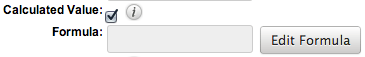
- The result of the formula will be entered into the field for any new or modified records. When selecting this option, the field value cannot be modified by users.
- Note: The Calculated Value option is only available for the following data type fields:
Checkbox Currency Date Datetime Decimal Encrypt Float Integer Phone TextArea TextField
- Columns: Enter the number of columns to specify the width of a TextArea data type field.
- Note: The Columns option is only available for TextArea data type fields.
- Comment Text: Enter a comment or description about the field. The comment text is only viewable via Module Builder and Studio.
- Note: The Comment Text option is available for all data type fields except Flex Relate.
- Default Value: Specify or select a default value for this field when a record is created. Default values for the record are populated by default on the record view layout but can be modified by users.
- Note: The Default Value option is available for all data type fields except HTML, Image, Flex Relate, and Relate.
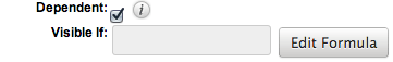
- Dependent: Select this option to designate this field as being dependent on a formula or a parent dropdown.
- For DropDown data type fields you can select "Parent Dropdown" or "Formula" for the dependency.
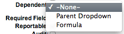
- Selecting "Parent Dropdown" will open the Parent Dropdown option as shown below. Selecting "Formula" will open the Visible If option to create a dependency formula. For other field data types (e.g. Date), select the Dependent checkbox to open the Visible If option. For more information regarding entering a formula to make a dependent field visible, please refer to the Visible If option listed in this section.
- Note: The Dependent option is available for all data type fields except Address.
- Disable Format: Select this checkbox to disable number formatting such as the thousands separator.
- Note: The Disable Format option is only available for Integer data type fields.
- Display Label: Enter a value to display as the field label and header in layouts. Normally defaults to the Field name entered when creating the field.
- This value is also modifiable in the packages panel under Labels.
- Note: The Display Label option is available for all data type fields except Flex Relate. Flex Relate uses the Label Value option.
- Drop Down List: Select a list of values to associate to the field.
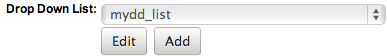
- Only values in the chosen list will be available for selection in the field. Click "Edit" to change the values for the currently selected list, or click "Add" to create a new list.
- Note: The Drop Down List option is only available for the DropDown, MultiSelect, and Radio data type fields. For more information on editing dropdown values via the Dropdown Editor, please refer to the Editing Dropdown Lists section of the Developer Tools documentation.
- Duplicate Merge: Select one of the following options to determine the field's functionality when records are being merged:
- Disabled: Selected by default. The field will not appear in the Merge Duplicates feature and will not be available to use for the filter conditions in the Find Duplicates feature.
- Enabled: The field will appear in the Merge Duplicates feature, but will not be available to use for the filter conditions in the Find Duplicates feature.
- In Filter: The field will appear in the Merge Duplicates feature, and will also be available in the Find Duplicates feature.
- Default Selected Filter: The field will be used for a filter condition by default in the Find Duplicates page, and will also appear in the Merge Duplicates feature.
- Filter Only: The field will not appear in the Merge Duplicates feature but will be available in the Find Duplicates feature.
- Note: The Duplicate Merge option is available for all data type fields except Image.
- Field Name: Enter the name of the field being created. Once a field has been created, the field name cannot be changed.
- Field names can contain only alphanumeric characters as well as the underscore character.
- The Field Name option is required for all data type fields.
- Please do not name a custom field "processed", as this will cause the web logic hooks to fail to trigger because it conflicts with Sugar's internal logic hook handling. Be sure to use a different, un-reserved string as the field name to avoid any unexpected behavior in Sugar.
- Full Text Searchable: Specify whether or not the field should affect Global Search results.
- Disabled: Select "Disabled" if you do not want this field to be captured when the database is indexed for searches. Search indices collect the values of searchable fields for evaluation by the Global Search.
- Searchable: Select "Searchable" to include this field's value in search indexes.
- Selecting "Searchable" will reveal the Boost value field, which allows you to set a relevance weight for searches.
When a user's search query matches the value of a field with a higher boost level, the record will appear higher in the search results. For more information regarding boost values in Full Text Search, please refer to the Search documentation in the Application Guide. - Note: The Full Text Searchable option is only available for the following data type fields:
Phone TextArea TextField URL
- Selecting "Searchable" will reveal the Boost value field, which allows you to set a relevance weight for searches.
- Formula: Contains the current formula to return a calculated value.
- Click "Edit Formula" to launch the formula builder and change the formula. For more information on how to build a formula using the formula builder, please refer to the Using Sugar Logic section of this page.
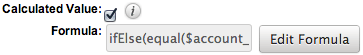
- Note: The Formula option is only available when the Calculated Value option is selected.
- Generate URL: Select this checkbox to allow variables from the current module to be placed into the Default Value option for creating dynamic URLs.
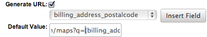
- This is useful for providing links or iFrames to internal systems such as an ERP or to external systems such as Google Maps.
- Select the desired field to add from the dropdown and click "Insert Field" to add the field to the Default Value. When selecting this option, the field value cannot be modified by users.
- Note: The Generate URL option is only available for IFrame and URL data type fields.
- Height: Enter the number of pixels to vertically scale the image for this field. Enter only the Width or Height options to retain the aspect ratio of the image.
- Note: The Height option is only available for Image data type fields.
- Help Text: Enter basic instructions for populating this field. The text entered here will display when users hover their mouse on the field in record view.
- Note: The Help Text option is available for all data type fields.
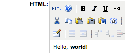
- HTML: Enter in static rich text with formatting or HTML code to display on a record. For more information on how to use the text editor please refer to the TinyMCE section of the User Interface documentation in the Application Guide.
- Note: The HTML option is only available for HTML data type fields.
- IFrame Height: Enter the number of pixels for the height of the IFrame field. The width of the IFrame field is always the width of the field container.
- Note: The IFrame Height option is only available for IFrame data type fields.
- Importable: Select one of the following options to determine the field's functionality when records are being imported:
- Yes: The field can be included in an import operation.
- No: The field cannot be included in an import.
- Required: A value for the field must be provided in any import.
- Label Value: Enter a value to display as the field label and header in layouts. This value is also modifiable in the packages panel under Labels. Defaults to "Flex Relate".
- Note: The Label Value option is only available for Flex Relate data type fields.
- Mass Update: Select this checkbox to add this field as an option to mass update.
- Note: The Mass Update option is only available for the following data type fields:
Date Datetime DropDown MultiSelect Radio
- Note: The Mass Update option is only available for the following data type fields:
- Max Size: Enter the maximum amount of characters allowed for this field. Defaults to 255.
- Note: The Max Size option is only available for the following data type fields:
Address Decimal Float IFrame Integer Phone URL TextField
- Note: The Max Size option is only available for the following data type fields:
- Max Value: Enter the highest value allowable for this field. If a user enters a higher value in the field than the specified value, a notification will appear upon save informing them of the set maximum value.
- Note: The Max Value option is only available for Integer data type fields.
- Min Value: Enter the lowest value allowable for this field. If a user enters a value in the field that is lower than the specified value, a notification will appear upon save informing them of the set minimum value.
- Note: The Min Value option is only available for Integer data type fields.
- Module: Select a module from the dropdown to relate to the current module.
- A module can relate back to itself, a good example of this would be a relate field on Contacts to relate back to Contacts for a referred by field. This will allow users to select which contact record referred a different contact. The chosen module cannot be modified once the field is created.

- Note: The Module option is only available for Relate data type fields.
- Open Link In Select one of the following options to determine how a URL will open:
- New Window: Opens the URL in a new Tab or Window depending on your browser and settings.
- Same Window: Opens the URL in the same window as the record you are currently browsing.
- Note: The Open Link In option is only available for URL data type fields.
- Parent Dropdown: Select an option from the dropdown to specify the parent that controls the visibility of this dropdown field.
- The Parent Dropdown option is populated with the other dropdown data type fields in the current module.
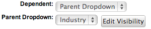
- Note: The Parent Dropdown option is only available when the Dependent option has "Parent Dropdown" selected.
- Click "Edit Visibility" to specify which options are available from the current dropdown for each value of the parent dropdown. In the Visibility Editor window, drag values from the current dropdown list to the value sections of the parent dropdown.
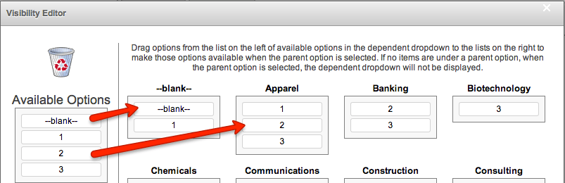
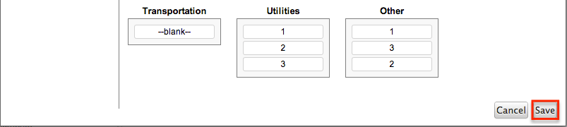
- This will determine which options in the dropdown list are available when the parent dropdown is set to the specified value. In this example, if the parent dropdown is set to "Apparel", then the current dropdown will have options 1, 2, and 3 where if the parent dropdown is set to "Banking", then the current dropdown will only have options 2 and 3 available. If there are no available options for a parent dropdown value, then the dependent dropdown will not display. To remove an item from the list, simply click and drag the value to the Trash bin on the left. Once the values are set, click "Save" to preserve your changes.
- Precision: Enter a number to specify the number of digits to the right of the decimal point the value should be stored as in Sugar.
- Note: The Precision option is only available for Decimal and Float data type fields.
- Reportable: Select this checkbox to allow the field to be used in reports.
- Note: The Reportable option is available for all data type fields except Encrypt, Flex Relate, HTML, IFrame, and Image.
- Required Field: Select this checkbox to mark the field as required in Sugar. The user will be required to enter a value for the field before saving the record.
- Note: The Required option is available for all data type fields except Checkbox and HTML.
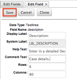
- Rows: Enter the number of rows to specify the height of a TextArea data type field.
- Note: The Rows option is only available for TextArea data type fields.
- System Label: Enter the system value for storing the label of the field. This defaults to the name of the field preceded by "LBL". Any lowercase characters entered will be converted to an uppercase upon saving. Once the field has been created, the system label cannot be changed.
- It is recommended that administrators avoid naming fields with the same system label in order to prevent the same label and header values from existing in the system.
- Note: The System Label option is available for all data type fields.
- Note: Only single-byte characters are supported for system labels for fields.
- Visible If: Contains the current formula to determine if a field is visible on the layout or not.
- Click "Edit Formula" to launch the formula builder to change the formula.
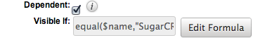
- The formula must result in a Boolean (true/false) response. For more information on how to build a formula using the formula builder, please refer to the Using Sugar Logic section of this page.
- Note: The Visible If option is only available when the Dependent option is checked or "Formula" is selected from the dropdown.
- Width: Enter the number of pixels to horizontally scale the image for this field. Enter only the Width or Height options to retain the aspect ratio of the image.
- Note: The Width option is only available for Image data type fields.
Creating Fields
Use the following steps to create a new field via Module Builder:
- Expand out the tree under the desired module in the Packages panel and select "Fields".
- In the main panel click "Add Field".
- Enter appropriate values for the Field options. Please note that Field Name is required.
- Once the necessary information is entered, click "Save".
- Once a field is created it must be placed on the record view layout in order for users to enter data into that field. For more information on editing layouts, please refer to the Editing Layouts section of this page.
Editing Fields
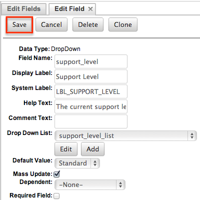
Use the following steps to edit an existing field via Module Builder:
- Expand out the tree under the desired module in the Packages panel and select "Fields".
- In the main panel, select a field to edit. Sorting the fields by the column header will help in locating the field faster.
- Note: Fields created via Module Builder will display an asterisk (*) in front of their name.
- Update the necessary Field options and click "Save" once complete.
Deleting Fields
Use the following steps to delete an existing field via Module Builder:
- Expand out the tree under the desired module in the Packages panel and select "Fields".
- In the main panel, select a field to delete. Sorting the fields by the column header will help in locating the field faster.
- Fields created via Module Builder will display an asterisk in front of their name.
- Note: Fields added via the module type template cannot be deleted.
- Select "Delete" to remove the field.
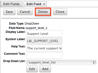
- A pop-up message will display asking for confirmation. Click "Ok" to proceed.
- Before deleting a field please verify and resolve the following issues:
- Field must be removed from any report filters or displays.
- Field must be removed from any workflows that filters or displays the field.
- Field must be removed from any dashlet that filters or displays the field.
- Field must be removed from any Sugar Logic formulas.
- Field must be removed from any email templates.
- Field must be removed from any saved searches.
- Before deleting a field please verify and resolve the following issues:
- The field will automatically be removed from any module layouts when deleted.
- Note: When deleting fields in a module and re-deploying the package, the data related to the field in the database will not be removed.
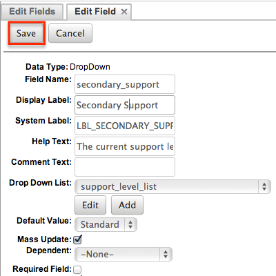
Cloning Fields
Use the following steps to clone an existing field via Module Builder:
- Expand out the tree under the desired module in the Packages panel and select "Fields".
- In the main panel, select a field to delete. Sorting the fields by the column header will help in locating the field faster.
- Note: Fields created via Module Builder will display an asterisk (*) in front of their names.
- Select "Clone" to duplicate the field.
- Note: Some non-standard stock fields (e.g. Name) do not have the ability to clone.
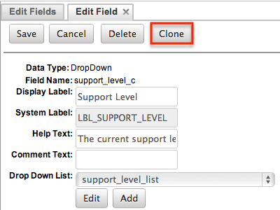
- Enter appropriate values for the Field options.
- Once the necessary information is entered, click "Save".
Relationships
Relationships define the links between different modules in Sugar and allow records between those modules to be related. Related records display in fields or subpanels on a module's detail page depending on the relationship type. When you create a new relationship between two modules, the system automatically creates the necessary subpanels, related fields, and metadata relationships. Relationships provide the added benefit in reports to allow access to a related records fields in addition to the base module's fields.
The relationships section in Module Builder allows administrators to create new relationships between custom and stock modules as well as change some properties on existing relationships. To access the relationship section in Module Builder, select "Relationships" from the Packages panel under the desired module. 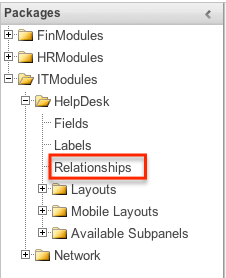
Note: Relationships created through Module Builder cannot be deleted in Studio after being deployed. Due to this, it is recommended that relationships be created in Studio after deploying the module instead of via Module Builder. As a best practice, never re-deploy the module from Module Builder as it will remove all customizations made to your module via Studio, code customizations, etc.
Relationship Types
Sugar contains a few different types of relationships you can create between modules. The relationship type will determine what fields or tables will be created in the database as well as what interface the user will see to manage the relationship.
The following relationship types are available in Module Builder:
- One-to-One: Records in the primary module and the related module are uniquely related to each other. For a one-to-one relationship between Accounts and Contacts, an account can be associated with only one contact and a contact can be associated with only one account. The relationship will show as a field in each module's record view where changing the relationship from either module will also change the value in the other module.
- From the primary Accounts module:
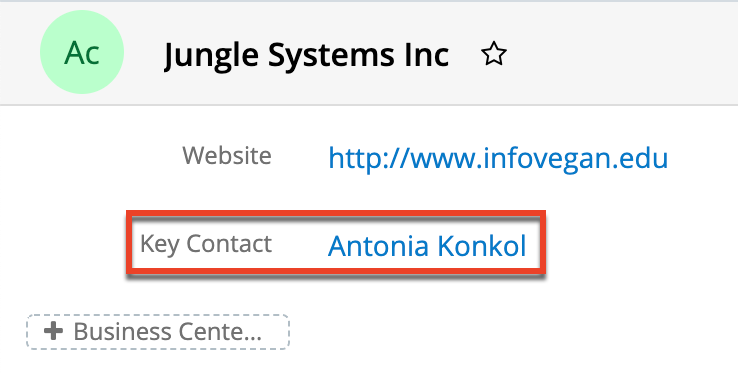
- From the related Contacts module:
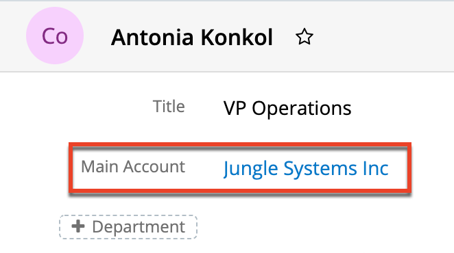
Note: You can create a one-way relationship between modules using relate fields. For more information regarding relate fields, please refer to the Field Types section of this page.
- From the primary Accounts module:
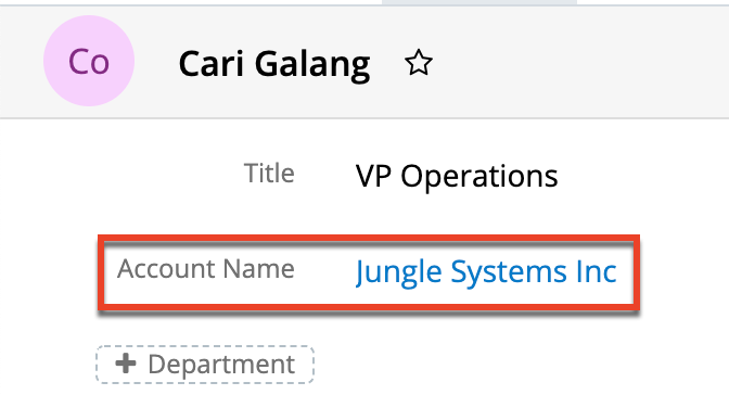
- One-to-Many: Records in the primary module can have relationships with many records in the related module. For a one-to-many relationship between Accounts and Contacts, an account can be associated with many contacts, but each contact can be associated with only one account. The record view of the primary module will display a subpanel for the related module, and the detail view of the related module will display a field containing a link to the related record.
- From the primary Accounts module:
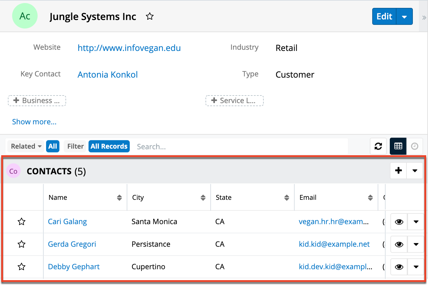
- From the related Contacts module:
Note: A one-to-many relationship is the same as a many-to-one relationship except the Primary and Related modules are reversed. Adding a custom one-to-many relationship to "Activities" will add custom relationships to calls, meetings, messages, notes, tasks, and emails. This will also automatically add these subpanels to the record view.
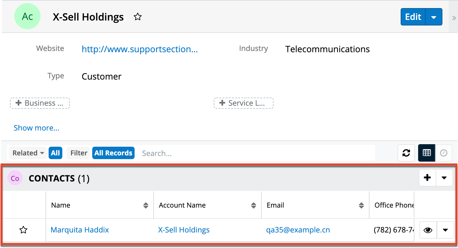
- Many-to-Many: Records in both the primary module and the related module can have multiple records related in each module. For a many-to-many relationship between Accounts and Contacts, an account can be associated with many contacts, and a contact can be associated with many accounts. Both module's record view will display a subpanel for the opposite module.
- From the primary Accounts module:
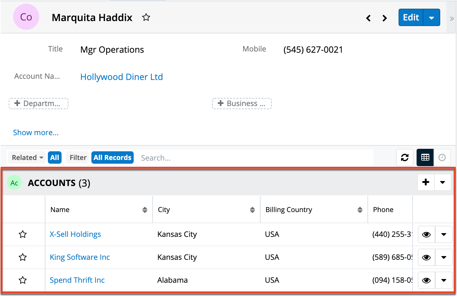
- From the related Contacts module:
Note: Only modules with subpanels available can be on the "Many" side of a relationship. For example, the Product Catalog module lacks a subpanel; therefore, Product Catalog can only be selected on the "One" side of a relationship.
- From the primary Accounts module:
When you create a relationship for a module, the selected module is considered to be the primary module and the module that you relate it with is the related module.
You can also create a relationship between a module and itself. In this case, the relationship becomes a parent-child relationship. For example, you can create a relationship from Accounts to Accounts in order to create sub-accounts within the primary account.
Creating Relationships
Use the following steps to create a new relationship via Module Builder:
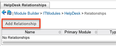
- Expand out the tree under the desired module in the Packages Panel, and select "Relationships".
- In the main panel, click "Add Relationship".
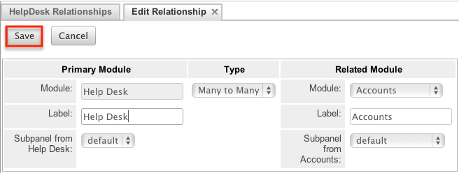
- Enter appropriate values for the following options:
Type: Select the type of relationship to create from the options in the Relationship Types section.
Module: The Primary module is set to the moduleto which you are adding the relationship. Select the Related module from the dropdown. The Primary and Related modules can be the same to create a parent-child relationship.
Label: Enter a label to reference the Primary module or Related module's subpanels for this relationship. This option is only available for the "Many" side of a relationship.
Subpanel from: Select a subpanel option in which to display the Primary or Related module's records. This will determine the fields displayed in the subpanel. This option is only available for the "Many" side of a relationship. - Once the necessary information is entered, click "Save".
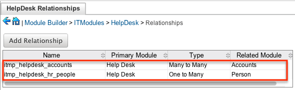
- The required fields and subpanels are instantly created and saved in the package.
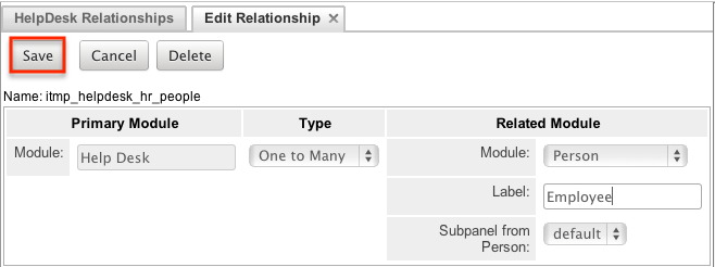
Editing Relationships
Use the following steps to edit a relationship via Module Builder:
- Expand out the tree under the desired module in the Packages Panel, and select "Relationships".
- In the main panel, select a relationship to edit. Click the column headers to sort the grid by different columns to assist in locating the relationship.
- The only editable field on a relationship is the Label field for naming the Primary or Related module subpanels. Please note that this option is only available for the "Many" side of a relationship.
- Once the necessary information for the Label field is entered, click "Save".
Deleting Relationships
Use the following steps to delete a relationship via Module Builder:
- Expand out the tree under the desired module in the Packages panel and select "Relationships".
- Select a relationship to delete in the main panel. Click the column headers to sort the grid by different columns to assist in locating the relationship.
- Click "Delete" to remove the relationship.
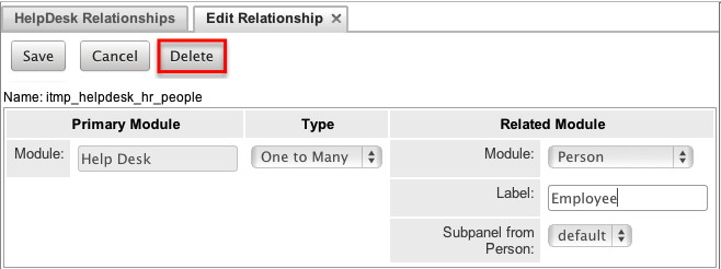
- A pop-up message will display asking for confirmation. Click "Yes" to proceed.
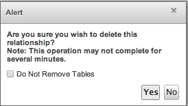
Note: If you wish to retain the data and table structure that currently exists for the relationship, select the "Do Not Remove Tables" option. Leaving the "Do Not Remove Tables" unchecked will delete the relationship data and remove the tables for the relationship from the database when the package is installed.
Before deleting a relationship please verify and resolve the following issues:- Relationship must be removed from any report filters or displays.
- Relationship must be removed from any workflows that filters or displays fields from the relationship.
- Relationship must be removed from any Sugar Logic formulas referencing the relationship.
Layouts
Layouts are used to represent many screens in Sugar. The layouts section in Module Builder allows administrators to add fields and configure layouts. To access the layouts section, expand "Layouts" from the packages panel under the desired module. The available layouts for the selected module will appear below. 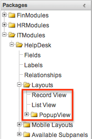
Layout Types
Sugar comes with different types of layouts to represent different sections of Sugar. Please note that not all layouts are available in every module.
The following layouts are available to configure in Module Builder:
- Record View: Record view layout is used to modify, create, or view a record within the specified module. Please note that this layout is specific to modules using the Sidecar user interface.
- List View: List view layout is used to view multiple records within the specified module and displays all results meeting the current search criteria.
- Popup List View: Popup list view layout is used to view multiple records via a popup window used to locate and select records in the specified module.
For Sidecar modules:
- Popup Search: Popup search layout is used to allow users to perform a search via the popup window used to select records in the specified module.
For Sidecar modules:
Layout Options
Administrators have the ability to configure the various layouts (e.g. record view, list view, etc.) available via Module Builder. Please note that the layouts can be configured via Admin > Studio as well once the module has been deployed. For more information on configuring layouts, please refer to the Studio documentation.
The following are some of the options available to administrators when configuring layouts via Module Builder:
- Panels: Every field on a layout is contained within a panel. Panels can be open or collapsed by default and have a title defining the panel. Panels can be organized to contain groups of similar or related fields to assist in organization.
Select the Pencil icon next to the Panel title to modify the title. Select the Collapsed? checkbox to default the panel as collapsed. Users can open and close panels as they prefer.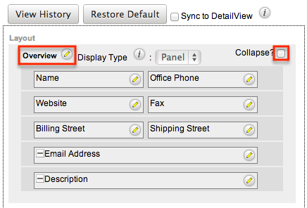
Note: The default panel name cannot be modified in Module Builder. - View History: Sugar preserves a history of the changes made to each layout. Click "View History" and the History dialog box will display the timestamp of when changes occurred and allow you to preview the layout then restore if you wish. For more information on viewing the history of layouts, please refer to the Viewing Layout History section of this page.
- Restore Defaults: Sugar provides the option to restore a layout to its original default configuration. For more information on how to restore the default layout, please refer to the Restoring Layout Defaults section of this page.
Editing Layouts
You can add, remove, hide, etc. the fields for the available layouts in the module by selecting the specific layout under the Packages panel to edit. Please note that the List View and Popup View layouts have columns where you can designate fields users can and cannot see.
Once a module is deployed, record views may be configured in Studio to display differently based on the viewing user's role.
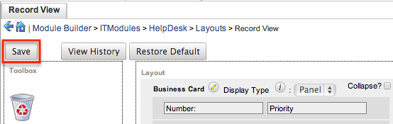
Editing Record View Layout
The following steps cover editing the Record View layout as an example:
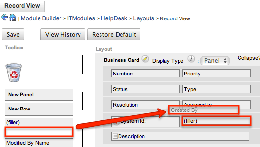
- Expand "Layouts" from the Packages panel under the desired module and select the layout (e.g. Record View) you wish to edit. The Record View layout will display in the main panel to the right.
- To add a field to the Record View layout, drag the field from the list of fields in the Toolbox to a "(filler)" location on the layout per your preference.
- You can also drag a field to a location on the layout that already has a field in place. The newly added field and the existing field on the layout will swap places.
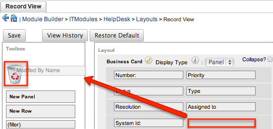
- To remove a field from the layout, drag and drop the field from the layout to the trash bin in the toolbox to remove the field from the layout. You may remove an entire row in the layout using the same method.
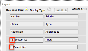
- To expand or minimize the field column in the layout, click the Plus icon (+) to stretch the field over two columns or click the Minus icon (-) to fit the field into one column.
- Note: The layout will display a "(filler)" if there is no field in that location.
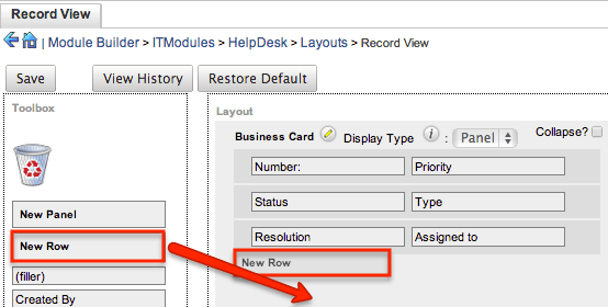
- To add a new row, drag the "New Row" item in the Toolbox to the layout to allow additional fields or blank spaces to be added.
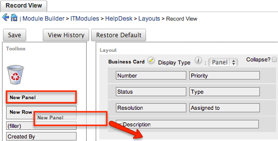
- To add a new panel, drag the "New Panel" item in the Toolbox to the layout to group different sets of fields together in the Record View layout.
- Once the layout is finalized, click "Save" to preserve your changes.
Note: It is recommended that dependent fields be placed below and/or to the right of the independent field in order to preserve the correct display of fields on the layout.
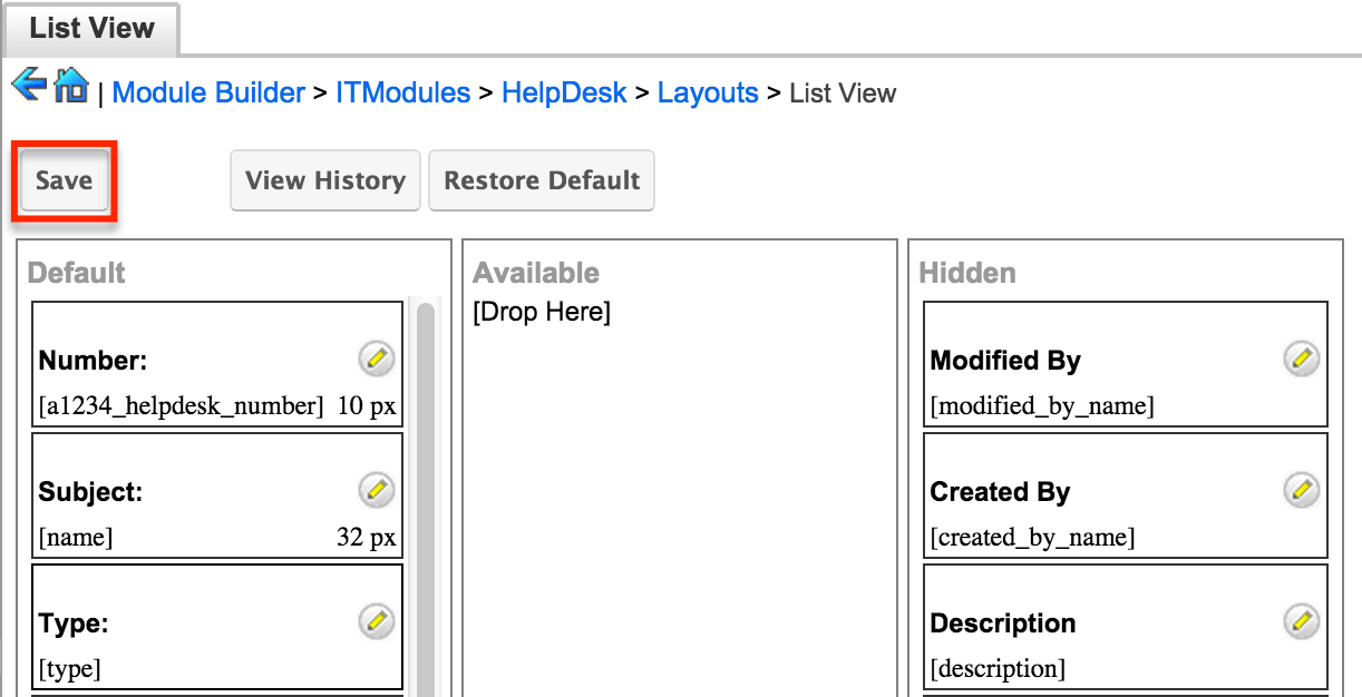
Editing List View Layout
Unlike the Record View layout, the List View layout has columns where you can designate fields users can and cannot see. When configuring the List View layout, you will see three columns (Default, Available, Hidden) where fields can be dragged and dropped accordingly.
Please note that editing the List View layout affects the list of available fields for the module's list view dashlet as well since both are controlled by the same layout (List View). Once the custom module is deployed, the configurations made to the list view layout in Module Builder will be reflected in the Columns fields of the corresponding module dashlet's Configuration Options page. After the custom module is deployed, all succeeding changes to the List View layout can be made via Studio. Please keep in mind that the custom module dashlet will not automatically reflect the Studio changes and users must edit the dashlet in order to view the changes, add new fields to the layout, etc.
Administrators can easily set the column widths for specific fields when configuring the List View layout. You can choose from a pre-defined list of width sizes (e.g., small, medium, large, etc.) that are available out-of-the-box with Sugar or enter a custom width value in pixels (e.g. 200) for Sidecar modules.
Note: When defining the column width for currency fields (e.g., Likely, Best, etc.), only "large" and above will apply because there is a minimum width requirement in Sugar for this field type. In addition, when defining a custom width for currency fields, the value must be 141px or wider.
The following table lists the available column width sizes in Sugar along with the corresponding width in pixels: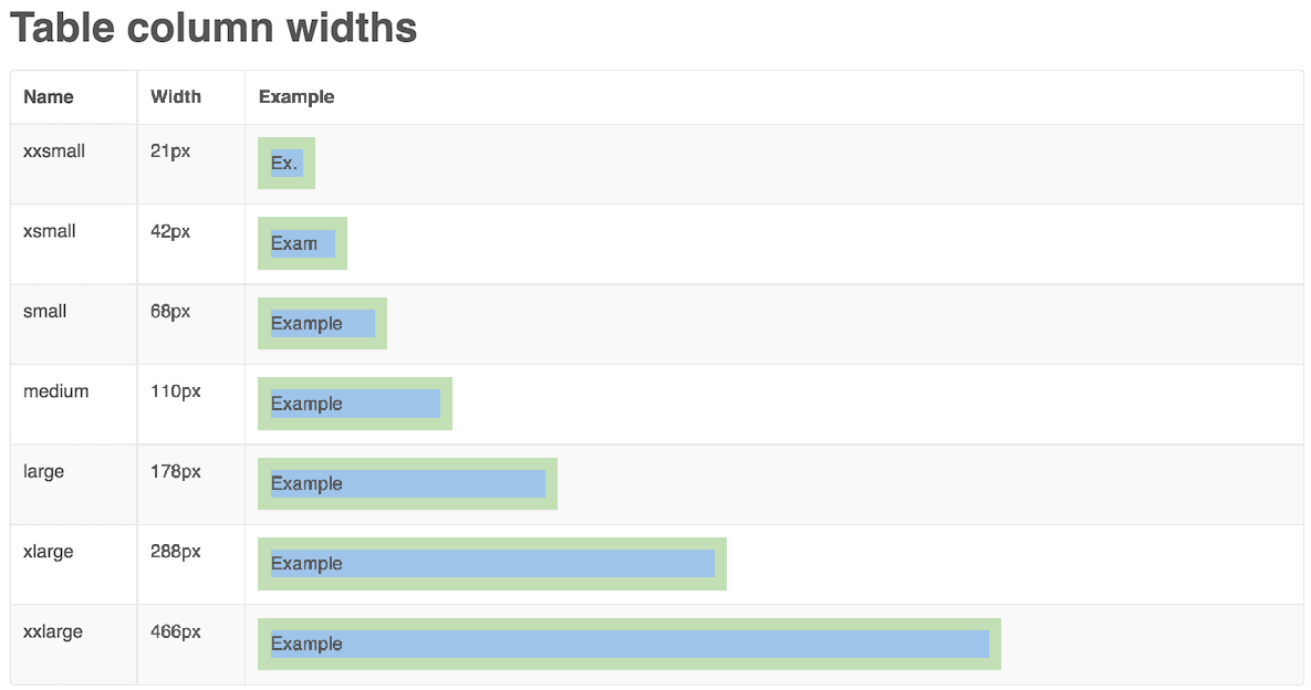
- Default: This column contains fields that are displayed in the layout.
- Available: Available fields are fields that will not show by default in the layout, but if the layout can be personalized, users can add these fields to their view of the layout. Not all list type layouts have an available fields section.
- Hidden: This column contains fields that will not be displayed in the layout.
The following steps cover editing the List View layout as an example:
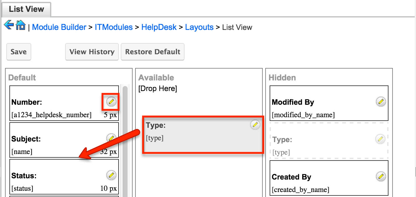
- Expand "Layouts" from the Packages panel under the desired module and select "List View".
- To add a field to the List View layout, drag and drop the fields from the Hidden column to the Default column.
- Note: The fields in the Default column will be available to add as display columns in the corresponding custom module dashlet (e.g. My HelpDesk).
- To remove a field from the layout, drag and drop the field from the Default column to the Hidden column.
- To change the left-to-right order of the fields displayed on the list view, drag and drop fields up or down within the Default list.
- Note: The order of fields designated for the List View layout also affects the order for the list of available fields in the corresponding custom module dashlet (e.g., My HelpDesk).
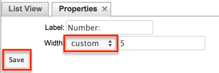
- To modify the label of the field, as well as the width of the field, click the Pencil icon next to each field.
- Enter the new label or select the width (e.g. small, medium, large, etc.) then click "Save". Please note the modified label will display in all List View layouts for this module.
- Note: Administrators can choose from a pre-defined list of width sizes (e.g., default, small, medium, etc.). Please note that selecting the Default width will set the list view column to equal the Medium width size. Selecting "custom" from the list will allow you to enter a custom width value in the open box. The custom width value should be entered in pixels (e.g., 200) for the fields.
- Once the layout is finalized, click "Save" to preserve your changes.
Mobile Layouts
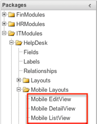
Mobile Layout Types
There are various mobile layouts in Sugar to represent the different areas of the SugarCRM mobile application. Please note that not all layouts are available in every module and the different mobile applications will use the information defined here differently.
The following mobile layouts are available in Sugar:
- Edit View: Edit view layout is used in Sugar to modify or create records in the specified module.
- Detail View: Detail view is used in Sugar to view the current data for a record within the specified module. Certain fields are translated to the SugarCRM mobile app as buttons instead of data. For example, instead of seeing the phone number, there is a phone icon to be able to call the number on the record.
- List View: List view layout is used in Sugar to view multiple records within the specified module. Only the first two fields in the list view section will be displayed in the mobile app.
Mobile Layout Options
Administrators have the ability to configure the various layouts available via Module Builder. Please note that the mobile layouts can be configured via Admin > Studio as well once the module has been deployed. For more information on configuring layouts, please refer to the Studio documentation.
The following are some of the available options when configuring mobile layouts via Module Builder:
- View History: Sugar preserves a history of the changes made to each layout. Click "View History" and the History dialog box will display the timestamp of when changes occurred and allow you to preview the layout then restore if you wish. For more information on viewing the history of layouts, please refer to the Viewing Layout History section of this page.
- Restore Defaults: Sugar provides the option to restore a layout to its original default configuration. For more information on how to restore the default layout, please refer to the Restoring Layout Defaults section of this page.
Editing Mobile Layouts
You can add, remove, hide, etc. the fields for the available layouts in "Mobile Layouts" by selecting the specific layout under the Packages panel to edit. Please note that the Mobile EditView and DetailView layouts are modified in similar fashions. The Mobile ListView layout has columns where you can designate fields users can and cannot see.
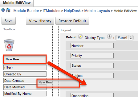
The following steps cover editing the Mobile EditView layout as an example:
- Expand "Mobile Layouts" from the Packages panel under the desired module and select "Mobile EditView". The selected layout will display in the main panel to the right.
- To add a field to the Mobile EditView layout, drag the field from the list of fields in the Toolbox to a "(filler)" location on the layout per your preference.
- You can also drag a field to a location on the layout that already has a field in place. The newly added field and the existing field on the layout will swap places.
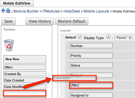
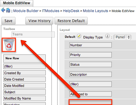
- To remove a field from the layout, drag and drop the field from the layout to the trash bin in the Toolbox to remove the field from the layout. You may remove an entire row in the layout using the same method.
- To add a new row, drag the "New Row" item in the Toolbox to the layout to allow additional fields or blank spaces to be added.
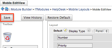
- Once the layout is finalized, click "Save" to preserve your changes.
Unlike the Mobile EditView layout, the Mobile ListView layout has columns where you can designate fields users can and cannot see. When configuring the Mobile ListView layout, you will see three columns (Default, Available, Hidden) where fields can be dragged and dropped accordingly.
- Default: This column contains fields that are displayed on the list view.
- Available: Available fields are fields that will not show by default in the layout, but if the layout can be personalized, users can add these fields to their view of the layout. Not all list type layouts have an available fields section.
- Hidden: This column contains fields that will not be displayed on the list view.
The following steps cover editing the Mobile ListView layout as an example:
- Expand "Layouts" from the Packages panel under the desired module and select "Mobile ListView".
- To add a field to the Mobile ListView layout, drag and drop the fields from the Hidden column to the Default column.
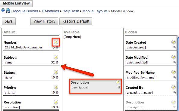
- Click the Pencil icon to modify the label of the field as well as the width percentage the field will take up in the list view. Please note that the modified label will display in all List View layouts in the SugarCRM mobile app.
- Once the layout is finalized, click "Save" to preserve your changes.
Available Subpanels
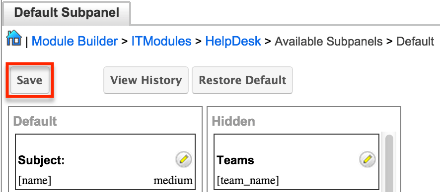
Related records between modules in Sugar are commonly displayed in Subpanels. Similar to list type layouts, administrators can modify the available subpanel layouts to change which fields are shown in a module's subpanel. You can add or remove fields for these subpanels depending on the information that you want to display to users. To access the subpanels section in Module Builder, expand "Available Subpanels" from the Packages panel under the desired module. The available subpanel for the selected module will appear to the right of the screen. 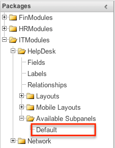
Subpanel Options
When configuring the Subpanel layout in Module Builder, there are some available options that allow you to view historical layout changes as well as restore the default layout. Please note that the subpanel layout can be configured via Admin > Studio as well once the module has been deployed. For more information on configuring layouts, please refer to the Subpanels section of the Studio documentation.
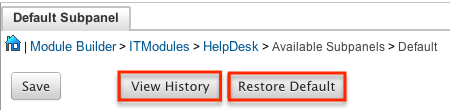
- View History: Sugar keeps a history of the changes made to each subpanel. These changes and when they occurred can be viewed and restored via "View History". For more information on viewing the history of subpanels, please refer to the Viewing Layout History section of this page.
- Restore Defaults: Sugar also contains the ability to restore a subpanel to its original default configuration. For more information on how to reset a subpanel to default, please refer to the Restoring Layout Defaults section of this page.
Editing Subpanel Layout
Use the following steps to modify a subpanel via Module Builder:
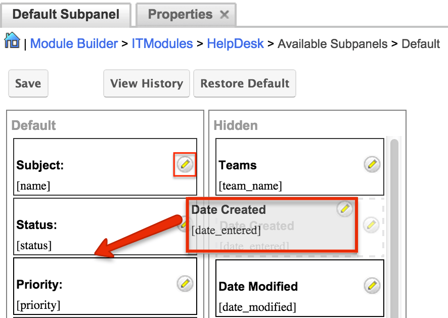
- Expand "Available Subpanels" from the Packages panel under the desired module and select the subpanel you wish to edit. The selected subpanel layout will display to the right in the main panel.
- To add a field to the Subpanel layout, drag and drop the fields from the Hidden column to the Default column.
- You can drag the field up and down the list to change the position of the field in the subpanel.
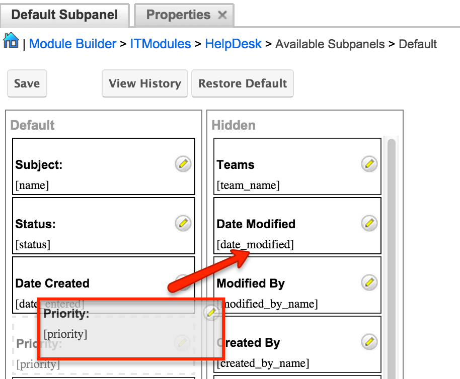
- To remove a field, drag and drop the fields from the Default column to the Hidden column.
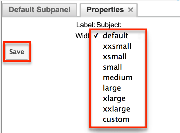
- Click the Pencil icon to change the column width of the field in the subpanel.
- Note: Administrators can choose from a pre-defined list of width sizes (e.g. default, small, medium, etc.). Please note that selecting the Default width will set the list view column to equal the Medium width size. Selecting "custom" from the list will allow you to enter a custom width value in the open box. The custom width value should be entered in pixels (e.g. 200) for the fields.
- When defining the column width for currency fields (e.g. Likely, Best, etc.), only "large" and above applies because there is a minimum width requirement in Sugar for this field type. In addition, when defining a custom width for currency fields, the value must be 141px or wider.
- Once the subpanel layout is finalized, click "Save" to preserve your changes.
Using Sugar Logic
Sugar Logic allows administrators to write simple formulas and logic checks to provide a calculation for a field or to set the visibility of a field. A formula specifies one or more field values along with operators and functions that are mathematical or logical. When you execute a formula, Sugar performs the calculation to derive the value. When a field is used in a formula, Sugar recalculates the value whenever a user updates it and saves the record. Similarly, if you update a formula, Sugar recalculates the field value based on the updated formula. For the complete list of Sugar Logic functions and how to use them, please refer to the Studio documentation.
For more information regarding the types of fields that support the use of Sugar Logic, please refer to the Field Options section of this page.
Viewing Layout History
Layouts, subpanels, and mobile layouts keep a history of the last ten changes made to each layout. To view the history for any of these layouts, simply click "View History" on the layout editor view in Module Builder. 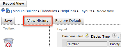
The History dialog box will open up displaying the timestamps of when changes occurred and allow you to preview the layout by clicking the Preview button. 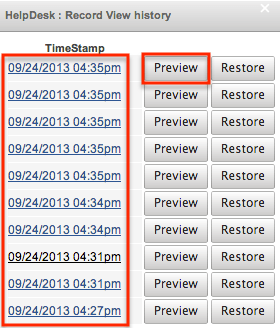
The preview will show the details of the layout as of the specific time it was saved. To restore the layout to the particular version you are viewing, simply click the Restore button from under the Preview tab or in the History dialog box. The restored layout will load into the layout editor allowing you to make any additional changes as necessary. Click "Save" to preserve your changes. 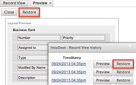
Restoring Layout Defaults
Many layouts, subpanels, and mobile layouts can be restored to their original default configuration. To restore the default for any of these layouts, simply select "Restore Default" from the edit layout screen in Module Builder.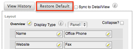
The default layout will load into the editor allowing you to make changes as necessary. Click "Save" to preserve your changes.
Deleting Modules
If a module is invalid or should no longer appear in a package, it may be deleted from Module Builder. Please note that deleting a module from a package will not remove the module from any instances where the package was deployed. For more information on how to uninstall a deployed package from an instance, please refer to the Module Loader documentation.
Use the following steps to delete a module from a package via Module Builder:
- Select the desired package and module from the Packages panel or the main panel.
- Click "Delete" to remove the module.
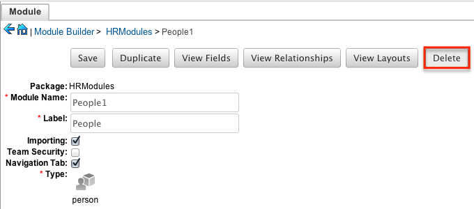
- A pop-up message will display asking for confirmation. Click "Ok" to proceed.