Sugar Self-Service Center Administration Guide
Overview
The Sugar Self-Service Center is a robust self-service portal for users (e.g., customers). Through the Self-Service Center, users can track the progress of their cases, communicate directly with service agents working within Sugar, and view records from the Documents module marked as externally available. Creating your Self-Service Center is done by SugarCRM.
This guide will assist admins with how to configure the Self-Service Center. Please see the Sugar Self-Service Center Agent Guide for help for agents on how they can communicate with customers or the Sugar Self-Service Center User Guide for generalized help for end users (i.e., users and account managers) on how they can use the Self-Service Center to communicate with your company.
Note: It is possible to be an administrator in the Self-Service Center but not the CRM (Customer Relationship Management application), although it is not recommended.
Configuring the Self-Service Center
The navigation bar is a blue bar that appears at the left of the Self-Service Center and is seen by administrators only. It persists across all pages and allows the admin to configure the look and feel of the portal.
Theme
Clicking the Theme button in the navigation bar allows administrators to set the theming of the Self-Service Center. 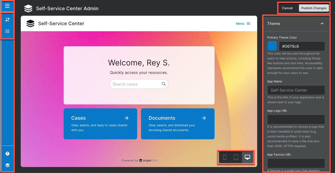
- Navigation bar: The navigation bar is the blue bar seen on the left-hand side of the screen and mirrors the navigation bar seen in Sugar Serve. For more information on the navigation bar, please see the User Interface documentation in the Application Guide.
- Publish Changes: Click the Publish Changes button to push out the changes to all users in the Self-Service Center.
- Cancel: Click the Cancel button to leave the configuration view. Any unsaved changes will be lost.
- Preview area: The preview area allows you to see what the Self-Service Center will look like to all users once you click "Publish Changes".
- Layout switcher: The layout switcher allows you to toggle between what the preview will look like on a phone, tablet, or desktop view.
- Side panel: The side panel is a bar to the right that allows you to modify the theme and home background of the Self-Service Center.
Theme
The theme section is in the side panel and controls the branding and the look and feel of the user interface elements.
- Primary Theme Color: This color affects the color of links and buttons, including the login screen and the Menu link in the upper right-hand corner of the Self-Service Center. For accessibility and readability, it is recommended that a darker color is chosen for this.
- App Name: This is the name of the application that will appear on the menu next to the logo as well as the login screen. The name "Self-Service Center" is the default. App name requires at least 3 characters to be saved.
- App Logo URL: Paste a direct link to an image you wish to use as a logo in the menu bar as well as the login screen. Direct links to static images are supported. If left blank, the default SugarCRM logo will be used. HTTPS protocol is required.
- App Favicon URL: Paste a direct link to a favicon image. A favicon is a very small icon shown in the title of a browser window or tab. It is recommended that a .ico file is used. HTTPS protocol is required.
Home Background
The home background is the second section in the side panel and controls what the background of the Self-Service Center will look like when users view the Home page.
- Background Types:
- Default: This is the default background image with the Self-Service Center.
- Solid Color: This solid color will be used for the entire background. When this option is chosen, a color picker appears allowing you to choose the color.
- Custom Image: This is an image used as the background. When this option is chosen, a field called "Background Image URL" appears, allowing you to enter the direct link to the image you wish to use. HTTPS protocol is required.
- Background Alignment: Choose how the background image will be centered. The following options are available: Fill Screen, Repeat, Top Left, Top Right, Bottom Left, Bottom Right, Fixed.
Features
The Features section, accessed by the features icon on the navigation bar, allows you to enable and disable various features of the Self-Service Center. 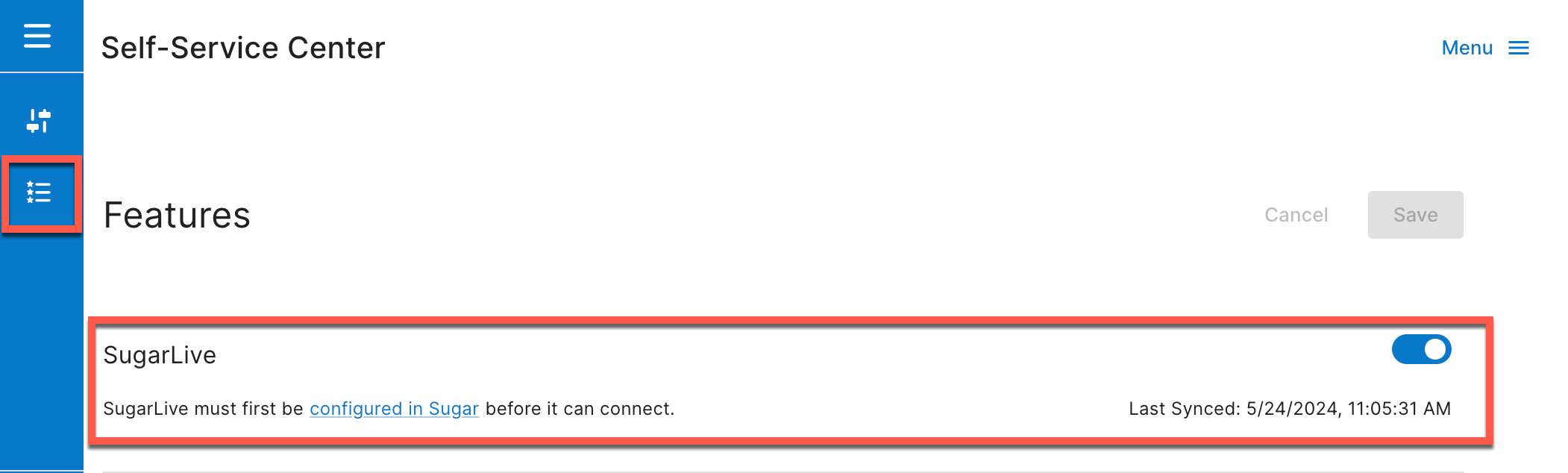
Here, you will see a toggle switch for SugarLive. The Self-Service Center has a live chat widget that allows users to communicate with an agent and is opened by clicking on the chat bubble button in the lower-right corner. This button will only appear if the chat is set up between the CRM and the Self-Service Center.
To set up live chat in the Self-Service Center, it must be set up in your CRM first. Then, open "Features" and click the SugarLive toggle. When successful, you will see a notification that says "Your settings have been saved." and you will see the Last Synced field populate. If it fails, you will be notified that SugarLive is not currently set up in the CRM and the Last Synced field will not appear.
For more information on how end users use the SugarLive interface, please see the Sugar Self-Service Center User Guide. For information on how agents will use SugarLive to communicate with customers, please see the Sugar Self-Service Center Agent Guide. Lastly, for more information on configuring live chat in the CRM, please see the SugarLive documentation in the Application Guide.