Fields
Overview
Fields are component plugins that render and format field values. They are made up of a controller JavaScript file (.js) and at least one Handlebars template (.hbt). For more information regarding the data handling of a field, please refer the data framework fields documentation. For information on creating custom field types, please refer the Creating Custom Field Types cookbook example.
Hierarchy Diagram
The field components are loaded in the following manner:
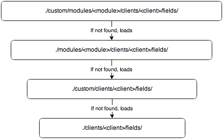
Note: The Sugar application's client type is "base". For more information on the various client types, please refer to the User Interface page.
Field Example
The bool field, located in ./clients/base/fields/bool/, handles the display of checkbox boolean values. The sections below outline the various files that render this field type.
Controller
The bool.js, file is shown below, overrides the base _render function to disable the field. The format and unformat functions handle the manipulation of the field's value.
./clients/base/fields/bool/bool.js
  ({
    _render: function() {
        app.view.Field.prototype._render.call(this);

        if(this.tplName === 'disabled') {
            this.$(this.fieldTag).attr("disabled", "disabled");
        }
    },
    unformat:function(value){
        value = this.$el.find(".checkbox").prop("checked") ? "1" : "0";
        return value;
    },
    format:function(value){
        value = (value=="1") ? true : false;
        return value;
    }
})
Attributes
| Attribute | Description |
| _render | Function to render the field. |
| unformat | Function to dynamically check the checkbox based on the value. |
| format | Function to format the value for storing in the database. |
Handlebar Templates
The edit.hbs file defines the display of the control when the edit view is used. This layout is for displaying the editable form element that renders a clickable checkbox control for the user.
./clients/base/fields/bool/edit.hbs
  {{#if def.text}}
    <label>
        <input type="checkbox" class="checkbox"{{#if value}} checked{{/if}}> {{str def.text this.module}}
    </label>
{{else}}
    <input type="checkbox" class="checkbox"{{#if value}} checked{{/if}}>
{{/if}}
Helpers
| Helpers | Description |
| str | Handlebars helper to render the label string. |
The detail.hbs file defines the display of the control when the detail view is used. This layout is for viewing purposes only so the control is disabled by default.
./clients/base/fields/bool/detail.hbs
<input type="checkbox" class="checkbox"{{#if value}} checked{{/if}} disabled>
The list.hbs file defines the display of the control when the list view is used. This view is also for viewing purposes only so the control is disabled by default.
./clients/base/fields/bool/list.hbs
<input type="checkbox" class="checkbox"{{#if value}} checked{{/if}} disabled>
Cookbook Examples
When working with fields, you may find the follow cookbook examples helpful: