Inquiries
Overview
Inquiries or enquiries are used to dig deeper into your customers' purchase behavior and performance, identify and respond to negative trends, and celebrate positive swings. It is a powerful tool allowing you to explore your data thoroughly. An inquiry is a way to view all of your sales data in an easy-to-read format and helps answer questions you may have about your customers, products, and profits. It is similar to a report; some inquiries even have graphs to help visualize your data.
User Interface
When viewing an inquiry, you will find the following user interface elements: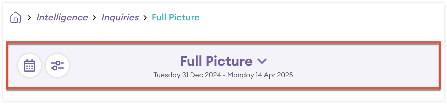
- Inquiry toolbar: The toolbar at the top of all inquiries has the following elements:
- Title: The bold title shows what type of inquiry you are looking at. The triangle to the right of the title opens a new inquiry. Navigating this way will continue to use the dates set and any filters applied.
- Date Range: The range of dates used in the inquiry can be seen below the title.
- Calendar button: The calendar icon is used to change the date range. After selecting a new date range, the inquiry will reload.
- Filter button: The filter button adds additional filters to the data. When a filter is applied, a small red circle indicates the number of filter(s). Please note that filters on specific days will not be reflected in the date range visible in the inquiry toolbar. Additionally, this button is not available for trends inquiries.
The body of inquiries also has similar elements:
- Sort: Click any column header to sort. You can sort ascending and descending.
- Search: Use the search bar to search for data in inquiries in real time.
- Checkboxes: Checkboxes can be clicked next to each row of data, which allows you to drill further into that specific row of data. You may even select multiple checkboxes and dig deeper into multiple rows.
- Breadcrumbs: As you drill further into the data, breadcrumbs will appear at the top of the inquiry, allowing you to click back or even change the bubbles you are filtering with. You can drill further into data as much as you would like until you run out of data to drill into. If you hover over a specific breadcrumb, you can see exactly what item(s) you chose to drill further into.
- Customer Name: Click any link in a row to open the customer in a new tab. This is only possible when the customer name is used as a bubble.
The bottom of your inquiry will have additional tools: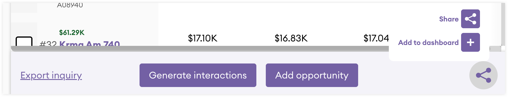
- Export Inquiry: Clicking this link allows you to export the inquiry as a .csv, .xlsx, or .pdf file. Please note that Matrix inquiries cannot be exported to .pdf and trend inquiries cannot be exported at all.
- Generate interactions: Clicking this button will create interactions for the customers of your choosing. Interactions can be a call, meeting, or email. This button is only available when customer name is chosen as a bubble for the rows in the inquiry. As a result, this button is never available in a trends inquiry.
- Add opportunity: Clicking this button will allow you to create an opportunity record, allowing you to track the opportunity and if it is won or lost.
- Share: Clicking the share icon reveals two options:
- Share: Clicking this button allows you to send this inquiry within sales-i. You must write a title and description and then choose the colleague(s) you wish to send the inquiry to. The colleague(s) will then get a notification within sales-i, inviting them to view the inquiry or save it to their dashboard.
- Add to dashboard: Clicking this option allows you to add a title and description for the inquiry, thus saving it and adding it to the dashboard of your choosing.
Bubbles
Bubbles are dimensions of data that are used to delineate, organize, and filter inquiries. When creating an inquiry it is best to start with a question you want answered. Some examples are:
- Who is our largest customer?
- Who has purchased from us, but has not been assigned a sales manager?
- What was our most profitable quarter?
There are five major categories of bubbles you can choose from, and each help answer your questions:
- CRM: These bubbles are pulled from fields in your sales-i's CRM module.
- Customer: These bubbles are pulled customer related fields from your integrated ERP.
- Product: These bubbles are pulled product related fields from your integrated ERP.
- Sales: These bubbles are pulled sales related fields from your integrated ERP.
- Calendar: These bubbles are common date ranges, allowing you to quickly configure a specific date range for your inquiry.
The customer, product, and sales bubbles are pulled from your data entered into sales-i from your ERP, so they may vary from the ones shown in the screenshot above. After you click your first bubble, it becomes highlighted to reflect your choice. In most inquiries, selecting only one bubble is sufficient, however, you can choose a second as well; two is the maximum amount of selected bubbles. The first bubble selected typically acts as the rows in the results, however in a matrix inquiry, the first bubble selected will be the columns, while the second bubble will be the rows. You can change the selected bubbles before you click "Run Inquiry".
Once you have run your inquiry, you can drill further into your data by using the checkboxes to select rows of data and then choose up to two additional bubbles to drill further into the row selected. For example, after looking at a row for a specific customer and its revenue, you may want to select the checkbox, click "Next", and then choose a product bubble to see what that customer has purchased. 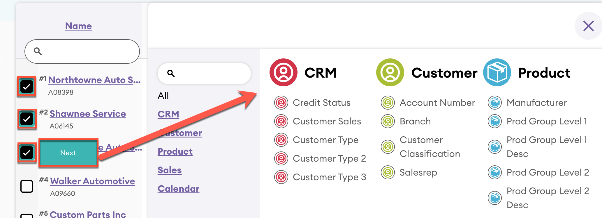
Key Performance Indicators
Key Performance Indicators (KPIs) are typically a column or columns in reports. Sometimes, the KPI may be changed with a dropdown in the inquiry toolbar, added or subtracted as a column, or can even be completely unchangeable. While how you interact with KPIs can change in an inquiry, the definitions of each KPI remain the same:
- Sales value: Sales revenue made
- Cost: Costs of that sale
- Profit: Profit made
- Gross Profit: Margin made on the sales
- Average Price: Average price of each item sold
- Quantity: Volume of items sold
- Count: Number of transaction lines on the invoice
- Invoice Count/Invoices: Number of invoices
- Avg. Items Per Invoice/Invoice items: Average number of items on an invoice
Types of Inquiries
When first viewing Inquiries, you will choose one of the following types:
Full Picture
The full picture inquiry shows all of your data and is a popular choice when creating an inquiry because it shows a lot of data in an easy to read format. For example, choose the Name bubble under the Customer bubbles and click "Run Inquiry". This is an example of an easy way to see your customers and their value, cost, and profit generated in an easy-to-read table format.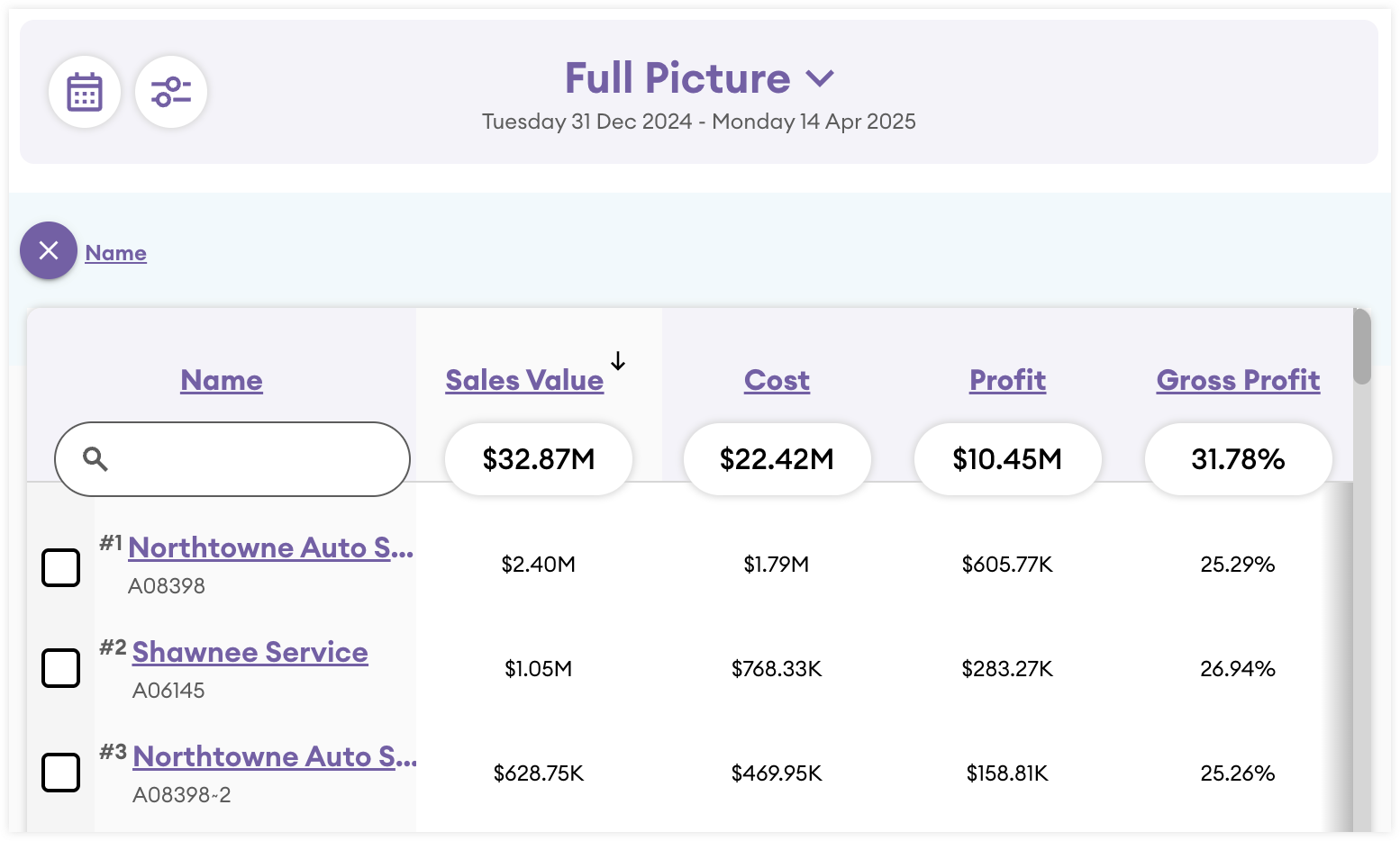
Along the inquiry toolbar, a full picture inquiry will have the following columns: Sales Value, Cost, Profit, Gross Profit, Average Price, Quantity, Count, Invoice Count, and Avg. Items Per Invoice. To learn more about these columns, please see the Key Performance Indicators (KPIs) section.
Variance
The variance inquiry is the perfect inquiry to assess where your business is financially by comparing and contrasting various financial periods. This inquiry plots two periods of time against each other to easily show the difference in the current period versus the last. The calendar icon on the toolbar can be clicked and any date range can be set. The default sort applied to variance inquiries is ascending (i.e., worst variance to best) to highlight issues to investigate further. In addition, and unique to variance inquiries, you can sort within the date ranges so that you have complete control over the data returned to highlight issues or celebrate wins.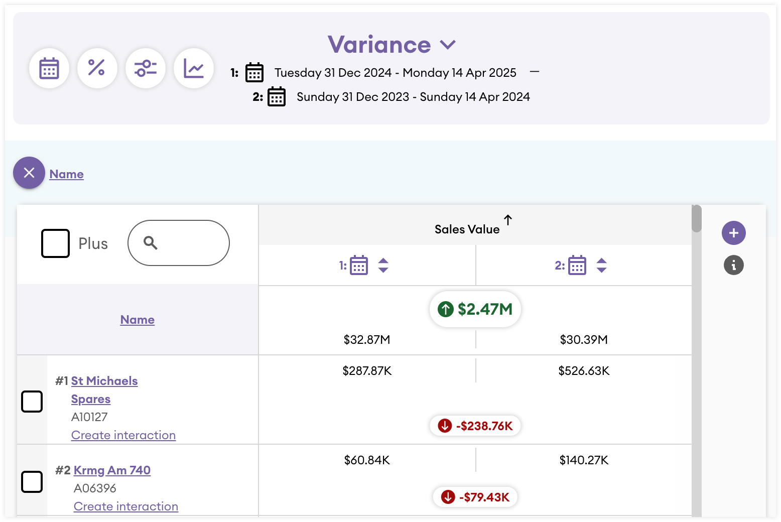
The inquiries toolbar also has buttons unique to Variance inquiries. The Percent button changes the monetary value to the degree of variance shown as a percentage. The Chart button, when clicked, displays the data as a treemap chart.
In the upper-left corner of the inquiry is the Plus checkbox. If you click this checkbox, it adds three additional columns: Cost, Profit, and Gross Profit. However, if the Plus checkbox is not checked, there is a plus (+) button on the right side of the inquiry that allows you to add your own columns so you may customize the key performance indicators and see the data you want to see. If you wish to remove any columns, click the "X". The following columns are available: Sales Value, Cost, Profit, Gross Profit, Average Price, Quantity, Count, Invoice Count, and Avg. Items Per Invoice. To learn more about these columns, please see the Key Performance Indicators (KPIs) section.
Matrix
Matrix inquiries are a type of inquiry that allows you to cross-reference the relationship between two dimensions of data (i.e., bubbles). As a result, two bubbles are required when creating this inquiry. The first bubble selected will become the columns, and the second lists the rows.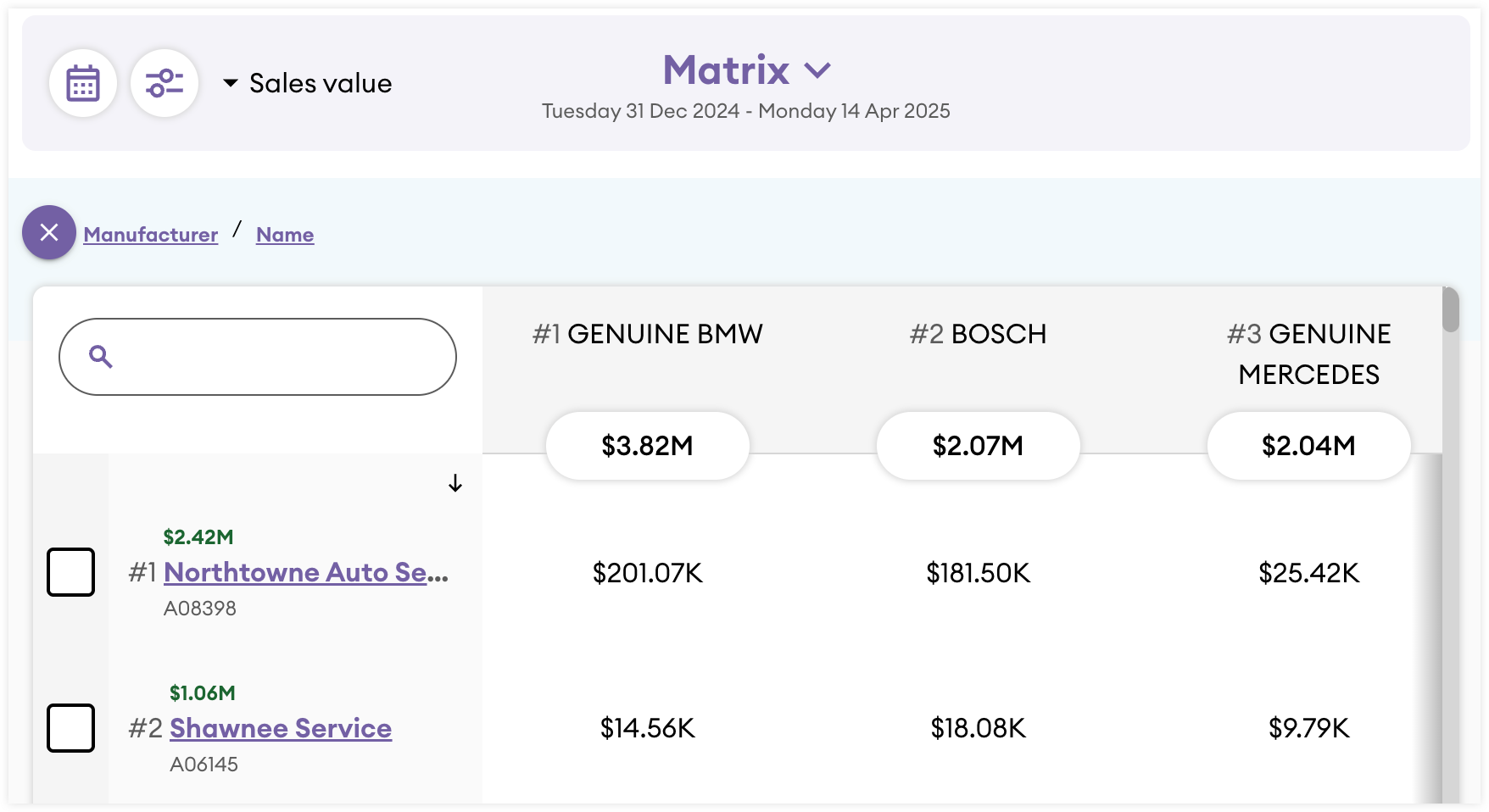
The body of the inquiry shows whichever Key Performance Indicator (KPI) is selected from the dropdown in the inquiry toolbar. The default view shows Sales Value, however, you can change this to one of the following: Sales Value, Cost, Profit, Gross Profit, Average Price, Quantity, Count, Invoices, and Invoice items. To learn more about these columns, please see the Key Performance Indicators (KPIs) section.
Note: Columns are not sortable in matrix inquiries.
Trends
The trends inquiry is an at-a-glance view of how you preform yearly in terms of sales value. Its broad scope allows you to look at greater patterns in your data. No bubbles need to be selected when viewing this inquiry type. Additionally, the Key Performance Indicators (KPI) cannot be changed; it will always show the Sales Value.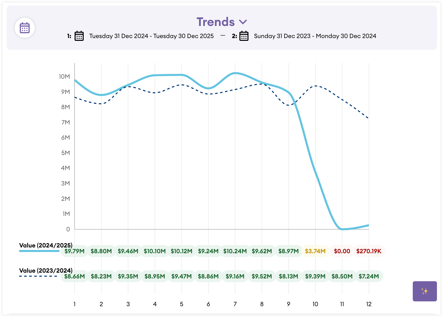
By default, the inquiry will show the current Year to Date (YTD) versus the last year. Clicking the date picker button allows you to choose only two years to compare; you cannot view trends at a monthly, weekly, or daily level.
Sales vs Gaps
Sales vs gaps inquiries allow you to see customer buying patterns over a selected date range and see where some customers have stopped spending so you can reach out to them. This inquiry is a great way to build a campaign to have your sales team reach out with proof that a customer's purchasing has decreased, present opportunities for them to purchase other items their competitors purchase, or allow you to build a stronger relationship with your customer by fixing any issues they may have.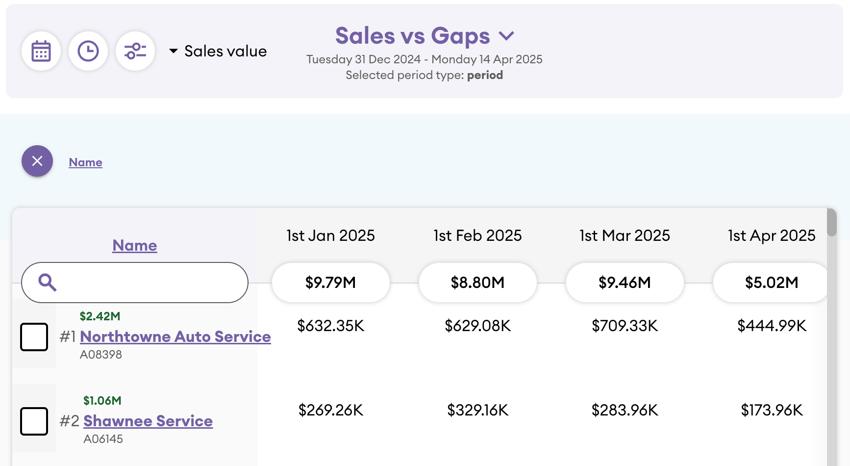
This inquiry also has a unique button in the inquiry toolbar for periods, allowing you to investigate the buying patterns of your customers further. Clicking the button that looks like a clock will enable you to see this data against the following timeframes: day, half (i.e., half-year), quarter, week, or year period.
Just like the matrix style inquiry, the columns cannot be sorted. Additionally, the inquiry toolbar will have a KPI dropdown allowing you to switch the columns to one of the following: Sales Value, Cost, Profit, Gross Profit, Average Price, Quantity, Count, Invoices, and Invoice items. To learn more about these columns, please see the Key Performance Indicators (KPIs) section.