Designing Pages
Overview
The Page Builder lets you quickly style your pages with its drag-and-drop editor. Access the editor on Step 3 of the Page Builder.
Design Methods
You can choose from two methods for designing pages:
The first part of this page walks through the Page Builder using the drag-and-drop editor, and the second part of this page describes the Code-Your-Own method.
Working in the Editor
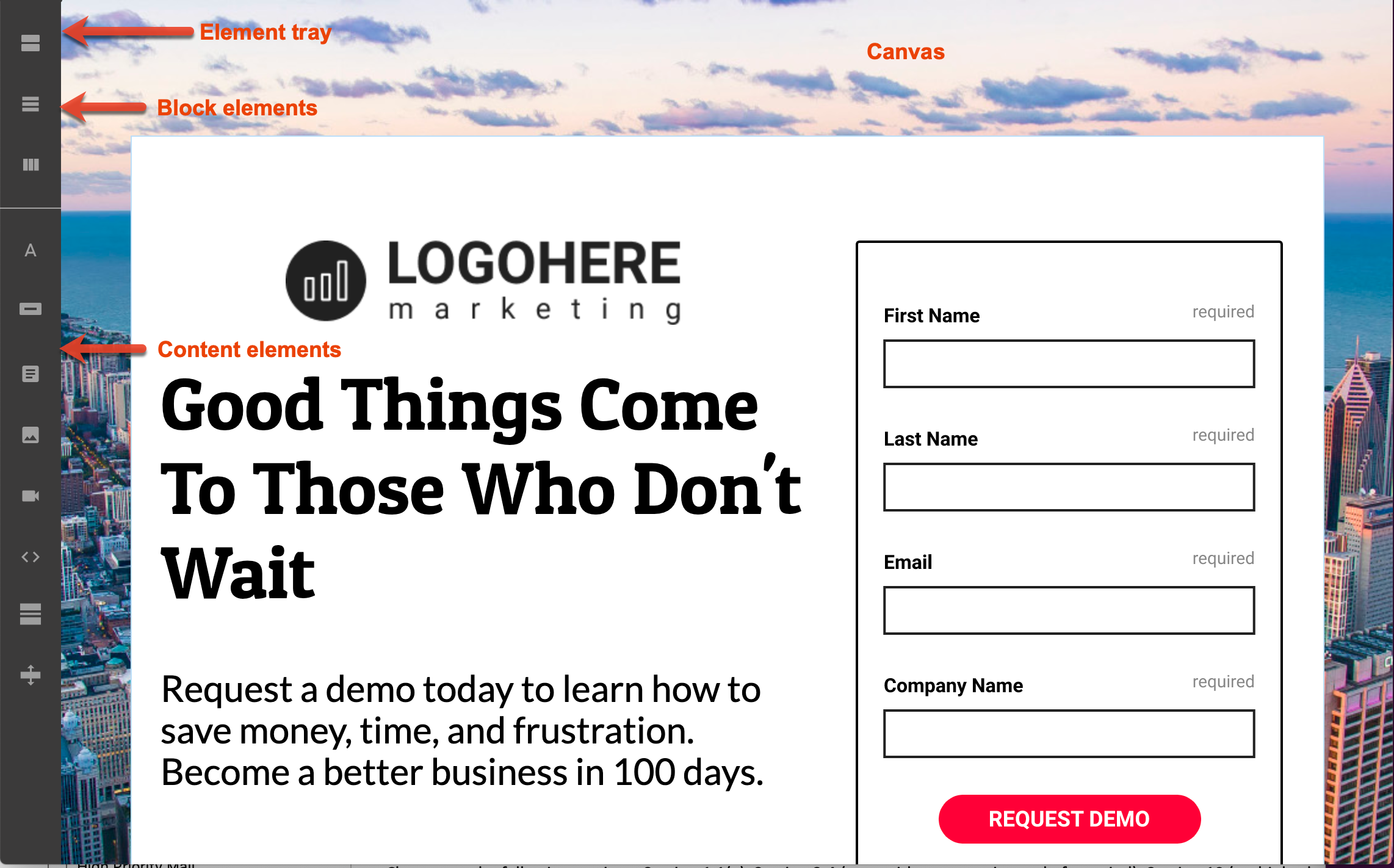
The editor is comprised of the main canvas area where your page is displayed, a tray containing style elements, and the Page Builder toolbar. The editor canvas is divided into sections. Within these sections, you can add blocks (rows and columns) for text and page elements.
Adding Blocks
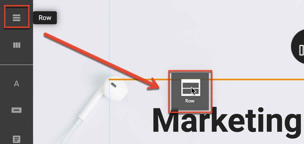
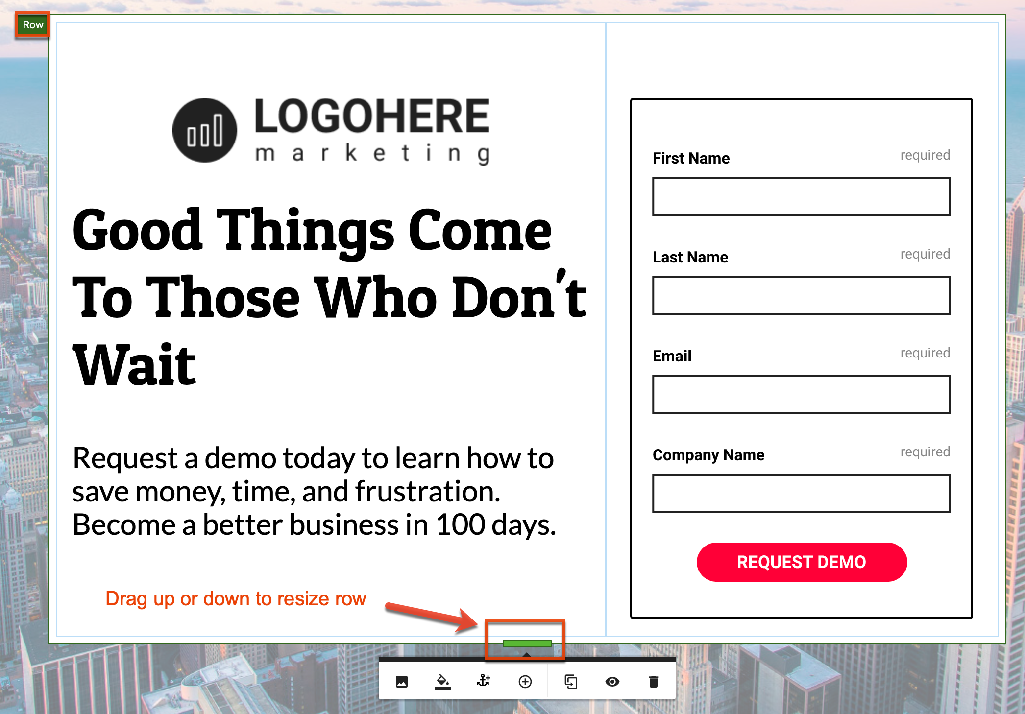
Each page is made up of blocks that contain Sections, Rows, and Columns. Sections are the parent container of rows, and rows are the parent container of columns. Mouse over the page to locate the various blocks:
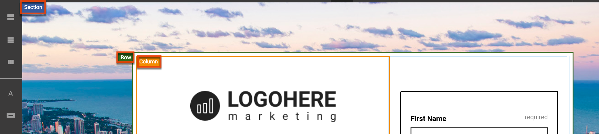
Each page can contain any number of sections, which span the full width of the page. Each section can contain any number of rows, and each row can contain up to six different columns. Rows span 980 pixels and contain all the columns in a page. Columns contain content items.
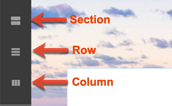
To add sections, rows, and columns to your page, click the icon in the element tray and drag it to the canvas. An orange line displays on the canvas in the location where the block will be added.
You can also click the + Section button on the canvas to add new sections. This button is displayed at the bottom of designed pages and at the top of blank pages:

Sections, rows, and columns can have different background images, background colors, and sizing options. See the Editing Blocks section for more on editing blocks.
Adding Page Elements
Page elements include various content types that you can add to your page. Click a content element in the tray and drag it into the desired location.
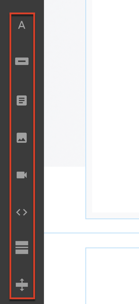
Content Elements
The following content elements are available in Page Builder. See the Editing Page Elements section for information on editing these elements.
Text
The Text Item is a versatile component that handles styling text for your pages and contains a number of unique features, including the ability to embed a Table directly in your page.
Button
The Button Item allows you to create calls to action across your page with buttons of all shapes and sizes. You can link to external URLs and create links to other areas of your page using anchor link functionality.
Form
Embed your Form Builder forms directly into your pages.
Important: Event type forms can only be used when associating the form with Event type landing pages.
When you drag a Form item onto your page, a placeholder form image is displayed, not an actual form. To add your form, select the Choose Form option from the context menu to display your previously published forms. This list includes only forms that have been fully published.
Note: Any pre-built theme that contains a form only contains a placeholder image representing the form. You need to swap out this placeholder image with a fully defined form from Form Builder.
Image
Beautiful imagery is key to building an engaging landing page. Page Builder's Image item allows you to add those images to your page. Note that the image element differs from the background image that you can include in blocks.
Video
Video is a powerful marketing tool. The Video item allows marketers to import videos directly from YouTube or Vimeo onto the canvas. When added, the Video item loads a simple default video that you will need to replace with the video of your choice.
Code Block
The Code Block item allows you to create your own custom code within a page. You can customize your own HTML and inline CSS if there is a particular design, widget, or presentation you want to add.
Note: You cannot embed <script> or <iframe> tags in code blocks. These tags will be automatically removed from the code.
Horizontal Line
The Horizontal Line item is a staple of web design, providing a distinct separator between content.
Spacer
The Spacer item gives the flexibility to add vertical spacing to any column. When added, the Spacer does not have any unique options in its context menu; however, it does have a grab handle at the bottom of the Spacer to allow you to change its height.
Editing Blocks
Mouse over each block to display the edit options available to that block, including:
- Background Image : Add a background image to the section, either via image upload, reference to an external image, or from the Sugar Market Asset Library. Note that this is different from using the image element, which is limited to the dimensions of the row or column in which it is contained.
- Background Color : Add a background color to the entire section.
- Edit Anchor : Name an object to be used as an anchor link for links from text and button items. This option is only available in sections and rows.
- Add : Add a child element (either a row or column) from the parent. This option is only available in blocks that have children, like sections or rows.
- Duplicate : Duplicate a block and all its contents.
- Hide / Show in Mobile : Hide or show the block on mobile devices. This feature is useful for optimizing designs across devices.
- Delete : Delete the block and all of its contents.
Resizing Blocks
You can customize section and row height, change the background image and color, duplicate, and set visibility for mobile devices. To resize sections and rows, mouse over the row and grab the bar at the bottom. Slide up or down to resize the section or row.
You can customize column width, change the background color, duplicate the column, and set visibility for mobile devices. To resize columns, mouse over the column and grab the bar at the left or right. Slide left or right to resize the column.

Note: While many features in the editor are the same as the Email Builder editor, the method for resizing blocks differs between the two builders.
Editing Page Elements
There are several options available for editing page elements individually.
To edit page elements:
- Mouse over the page element and check the label at the top left of the bounding box to ensure you have the correct element.
- Click into the element to display the editing options available for that element.
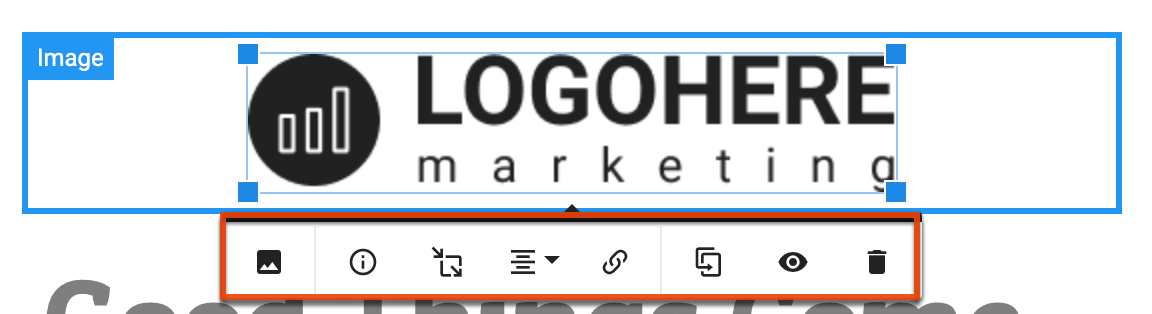
- To move the element, drag and drop to another location on the canvas.
Code Your Own Pages
If you need to build a truly customized landing page, coding your own page is a good option. You can leverage any existing code that you have for a landing page or you can start from scratch. This option provides the flexibility of designing the entire page from the ground up, personalizing every aspect of the page to your specifications.
Create your Code Page
When you create a new page in Page Builder, select the Code option in the first step of the builder.
Code Builder
The code builder is broken up into two sections: The Code Editor and the Design Preview Panel.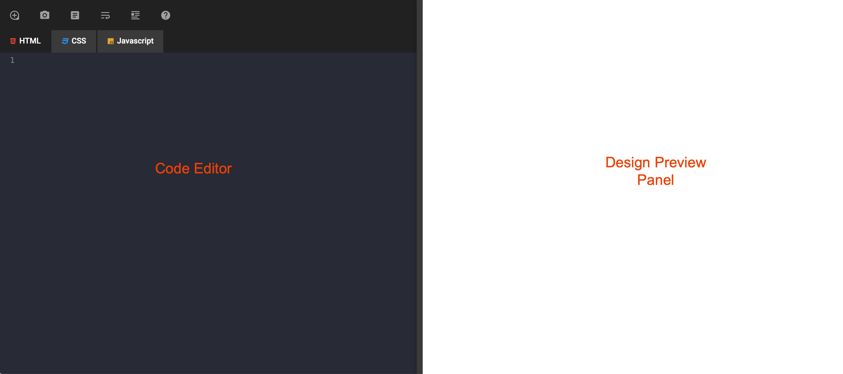
Code Editor
The code editor provides a coding experience similar to other code editors. Syntax highlighting, tag autocomplete, and error handling are just a few of the editor's features that simplify the coding experience. To help categorize and organize the code you need to build a page, the code editor is broken up into the following tabs:
- HTML : This is where most of the page designing occurs, where you build the structure and foundation of your page.
- CSS : Where you store all of your page styles and CSS classes.
- Javascript : For any complicated interactions or external functionality that you need your page to do via Javascript, you can code them in this tab.
Design Preview Panel
The preview panel is where you can see the design of your code in real-time, displaying how your page looks before you publish.
Code Toolbar Actions
The code editor toolbar provides a combination of Sugar Market functionality with code-specific tools to help you streamline your development process. The toolbar includes the following functions: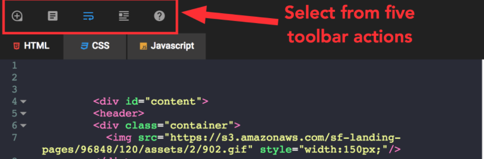
- Asset Library : Opens up the Asset Library view where you can select from any asset you have uploaded to Sugar Market and place it directly into your page.
- Form Builder : Opens up the form selection view where you can grab any form you have built with Form Builder and embed it directly into your code.
Note: Updates to any forms on your code page will not automatically update the code. You will need to remove and re-add the code to update the form with the latest changes on your code page. - Line Wrap : Allow the code to spill over to the next line to allow for greater code legibility.
- Auto Format Selection : After highlighting a section of code and selecting this option, the editor will automatically and properly reformat your code.
- Code Information : Opens a view explaining how the editor works and what you can expect when trying to copy and paste code into the editor.
Pasting in Code
A typical use case for marketers is to take an existing code base for a previously built page and paste it into a code editor. Pasting into our code editor, you can expect it to render your HTML, CSS, and any Javascript as best as it can, but we need to be able to have some control on how your code is arranged. When you paste code into the editor, a message displays informing you that some tags, including the code within the tags, have been moved to either the CSS & Javascript tabs, or to the external style and scripts section in the settings. This is done automatically to ensure that your page will publish correctly.