Designing Emails
Overview
The Email Builder lets you quickly style your email with its drag-and-drop editor. Access the editor on Step 3 of the Email Builder.
Working in the Editor
The editor is comprised of the main canvas area where your email is displayed, a tray containing style elements, and the Email Builder toolbar. The editor canvas is divided into the header, body, and footer sections. Within these sections, you can add blocks (rows and columns) for text and page elements.
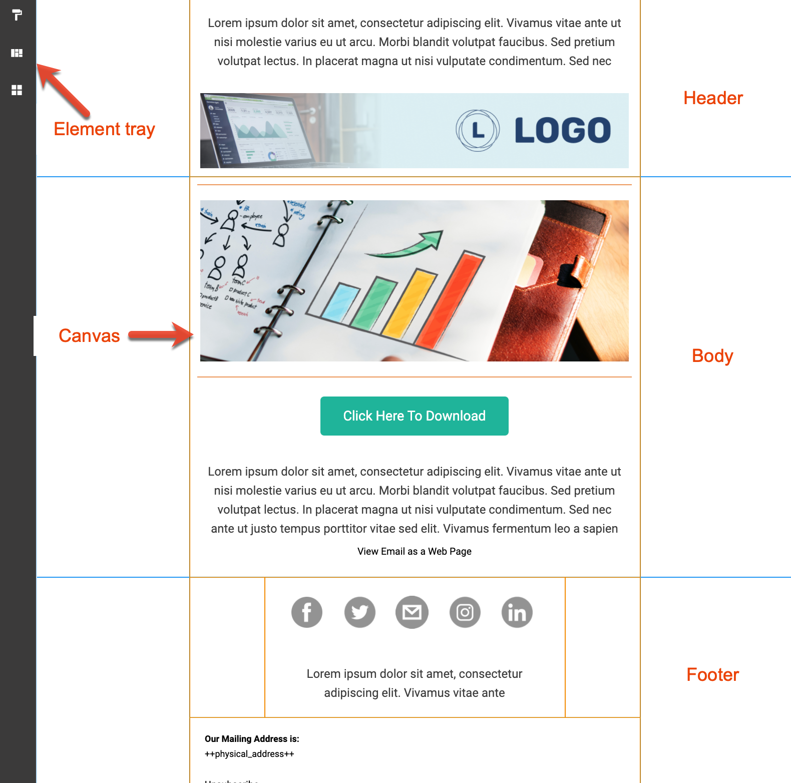
Click an element in the left sidebar to expand the tray. When expanded, click the X to collapse the tray.
Setting Global Styles
Global styles affect your entire email, though you can override some individual styles by editing in the block (e.g. email text). We strongly recommend you set your global styles as the first step in your email styling and to save your preferences as a template.
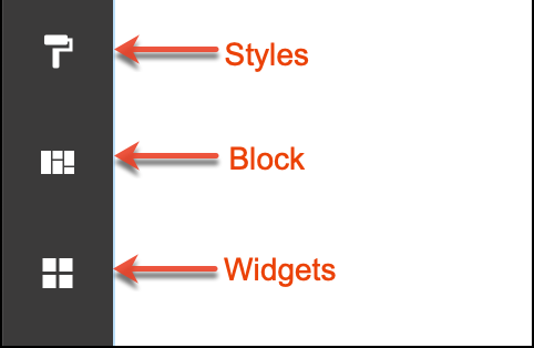
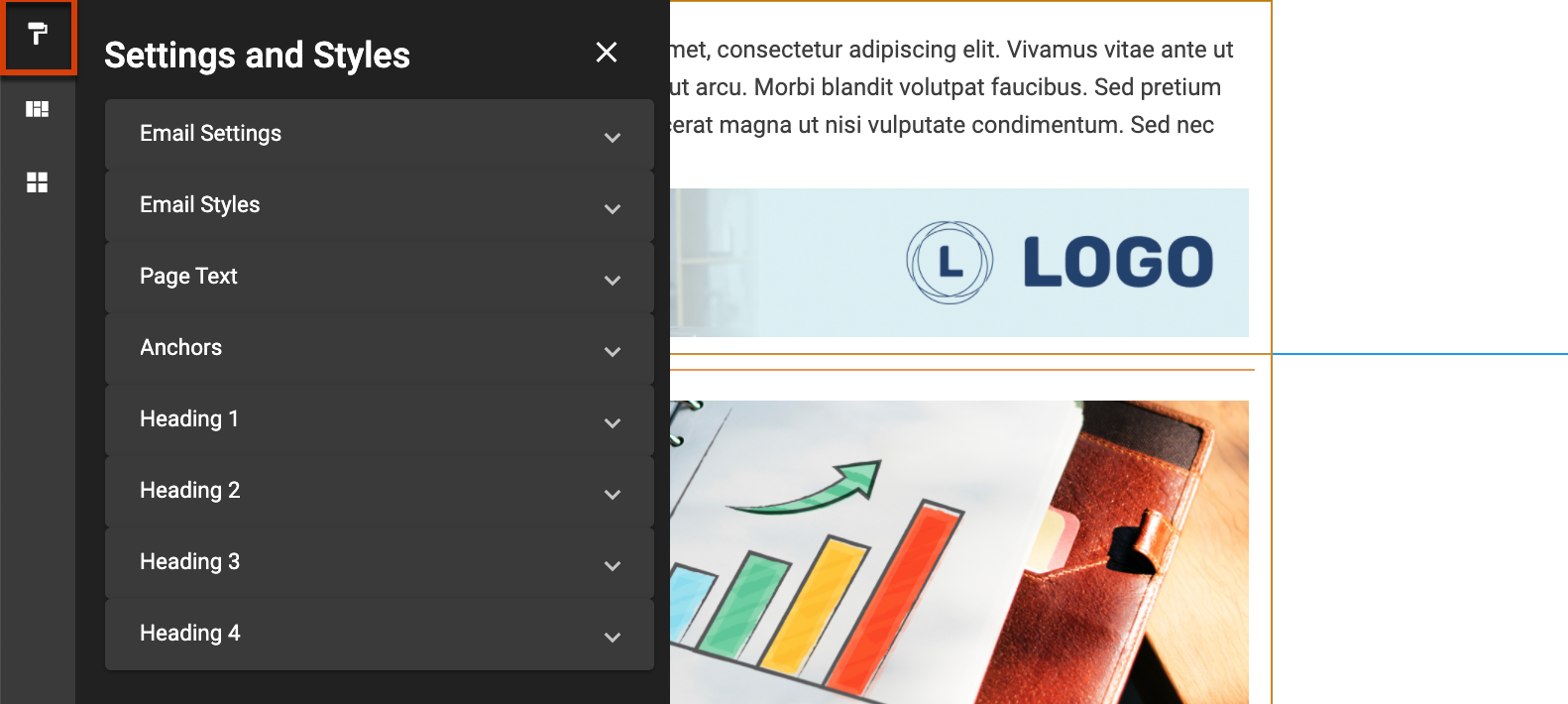
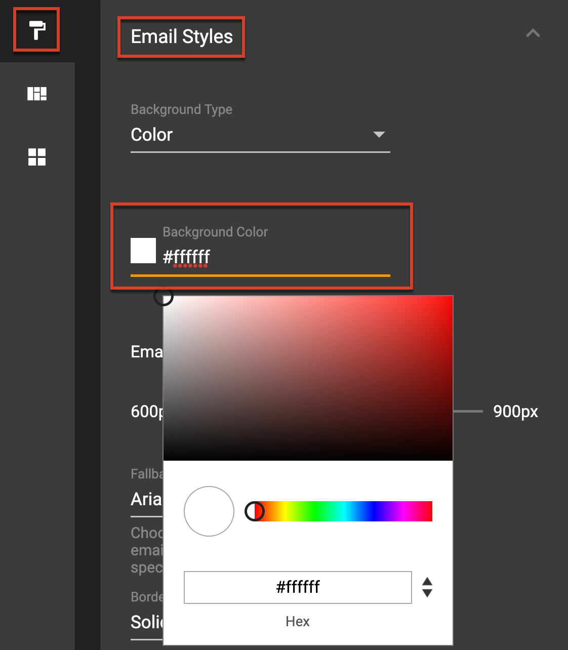
Click the Styles icon in the left sidebar to customize the global styles of your email, as described below.
Email Width
The default width is 600 px, which is optimal for all email clients. A larger width may force a horizontal scroll in many email clients.
Background
Choose a color or image to stretch across the entire message. Pay attention to where you are adding background colors and images: if a column is selected when you add a background, it will only display in that column. If you add the background to the whole row, then it will display across both columns.
Note: Some older email clients do not support background images; please use the Advanced Testing Center to see how your email will display in various clients.
Color
The background color sets the color for the entire message (outside of the content area). Click in the Background Color field to select a color from the picker or type a specific hex, RGB, or HSL code.
Image
Identify a background image by uploading a file, linking by URL (preferably one you own), or choosing from the Asset Library or a stock photo.
Border
Identify a style, width, and color for a border to display around the entire email.
Fallback Font
Some fonts available in Email Builder are not considered "web-safe" fonts, which means they may not render in an aesthetically pleasing manner in some email clients. To combat this, select an alternative font from the fallback font list that matches your selected font as closely as possible.
Page Text/Anchors/Headings
Define default text font settings for email text, anchors, and headings separately. These settings apply to the entire email message and will update any existing text when you make changes to these settings. You can override these settings on an individual basis as described in the Editing Elements section. We recommend a 14 point font size for optimal viewing.
In addition to font styles, you can set the following text spacing options:
- Line Height : The spacing between the lines of text as a percentage relative to the font size.
- Letter Spacing : The spacing between letters in pixels.
- Margin : The space between the text and the edge of the text box.
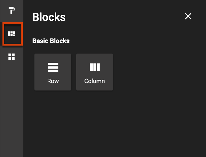
Adding Rows and Columns
Sections, rows, and columns can have different background images, background colors, and sizing options. Click the Blocks icon in the left sidebar and drag rows and columns to your email.
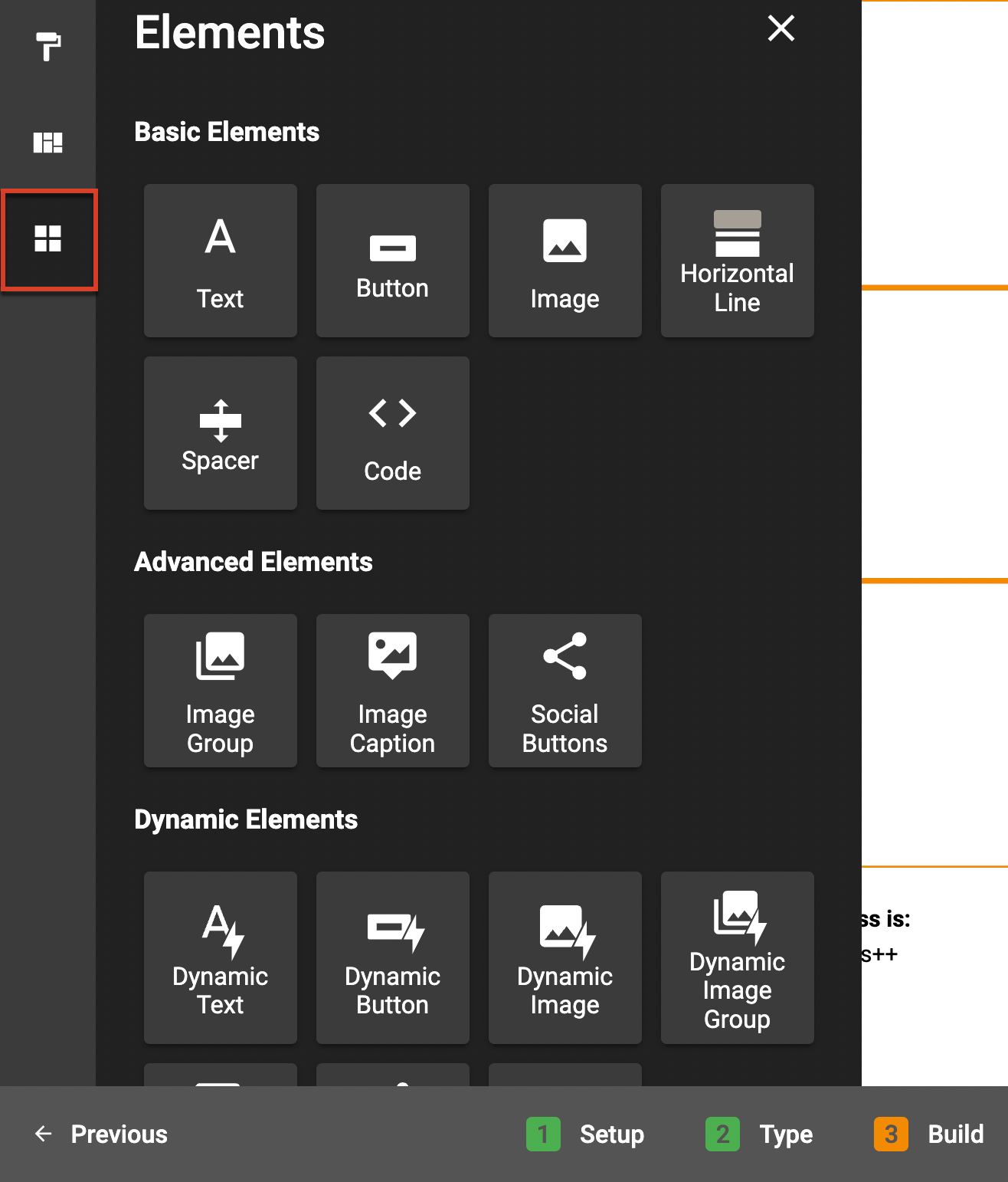
Adding Elements
From text to code, content widgets allow you to use your creativity to fully customize your email. Click the Widgets icon in the left sidebar, and then drag and drop the widget to add content to your email. Wait until the blue line appears on the canvas before you drop the widget.
Text
Choose from multiple fonts (including Google fonts), styles, colors, alignments, and line height. Make your email connect more with your customers by using merge tags and hiding specific content on mobile devices.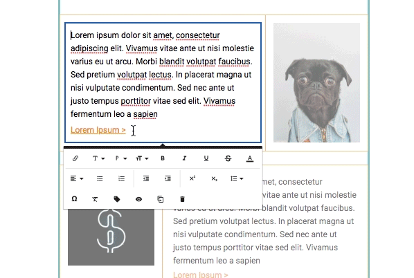
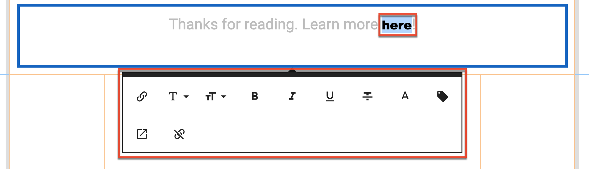
Note: To set inline styling for link text, click the link text to display the available editing options.
Images
Upload images from the Asset Library, your computer, or add high definition photos via Unsplash to make your email stand out.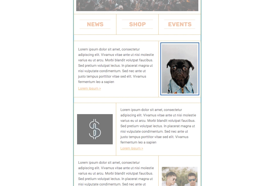
Once your image is added, you can crop, rotate, flip, zoom, and change the image's aspect ratio by selecting the Image Editor option from the element's setting options. 
You can click and drag the corners of the image to adjust the image size or set an exact width via the Change Size option from the element's setting options.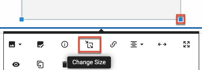
Note: You should always include alt text for your image (via the "Alternative Text element settings option) to keep your emails accessible and keep the size of your image below 200k to improve your deliverability.
Spacers and Horizontal Lines
A spacer is a blank, adjustable content block that allows you to control the white space and positioning of content in your email. A horizontal line is a fixed-size content block that contains a centered line that you can use to divide the content in your email.
Buttons
Customize the size, shape, color, border, font, style, and alignment of buttons to ensure your calls to action are not missed.
Code Blocks
Add custom content by using the inline HTML/CSS code widget.
Social Buttons
Grow your social channels by drawing your customers' eyes to the social buttons typically found in the email footer. Specify which channels to use and customize the order, links, color, size, border, and other styles of your social buttons.
Image Group
The Image Group widget lets you add several images as a set to a specific block. These images are treated as one when styling and editing. Image groups are useful for mobile responsiveness since the group will compress and stay side-by-side in mobile view, while separate images placed side-by-side on the canvas will be stacked in mobile.
Image Caption
The Image Caption widget lets you add an image grouped with an associated caption inside a text box. To add a caption to an image that already exists on the email, delete the image and then drag the image caption widget to the image's previous location, and then add the image. Image captions are also useful for mobile responsiveness since both the image and caption will remain together in mobile view.
Dynamic Elements
With dynamic email content, you can configure select elements in your email to have dynamic content displayed to specific recipient segments. A user must have the "Marketing Admin - Dynamic Email Content" permission enabled to create dynamic email content. Dynamic elements are not available when creating and A/B Test email.
Follow these steps to add and configure dynamic elements in your email:
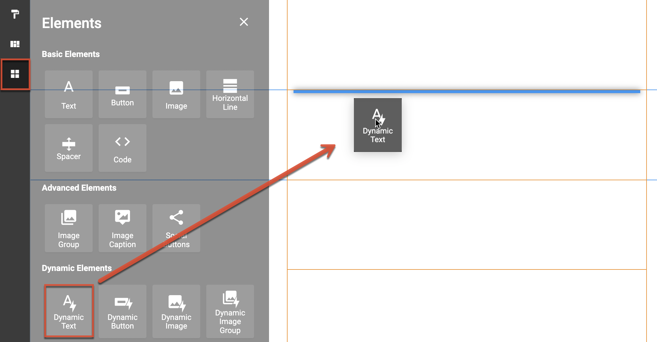
- Click the Widgets icon in the left sidebar.
- From the Dynamic Elements section, drag and drop a dynamic element into your email.
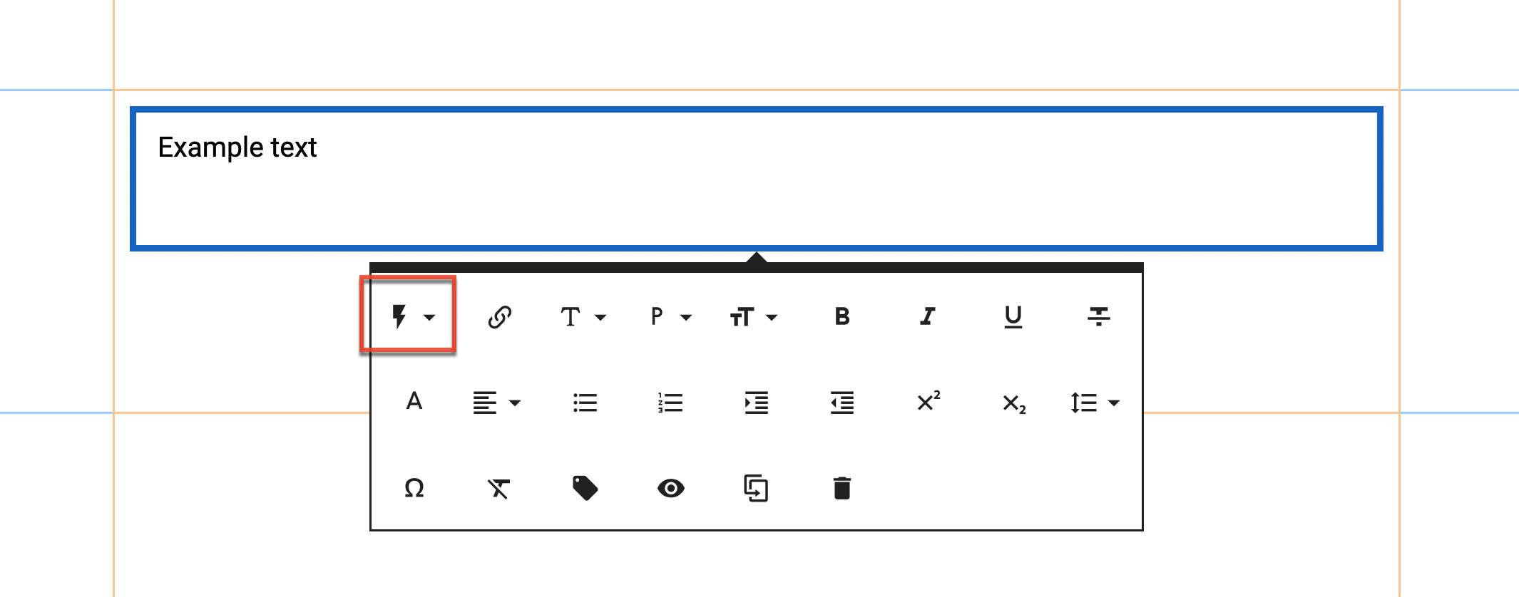
- Once the dynamic element is added, click the element to display the available element edit options.
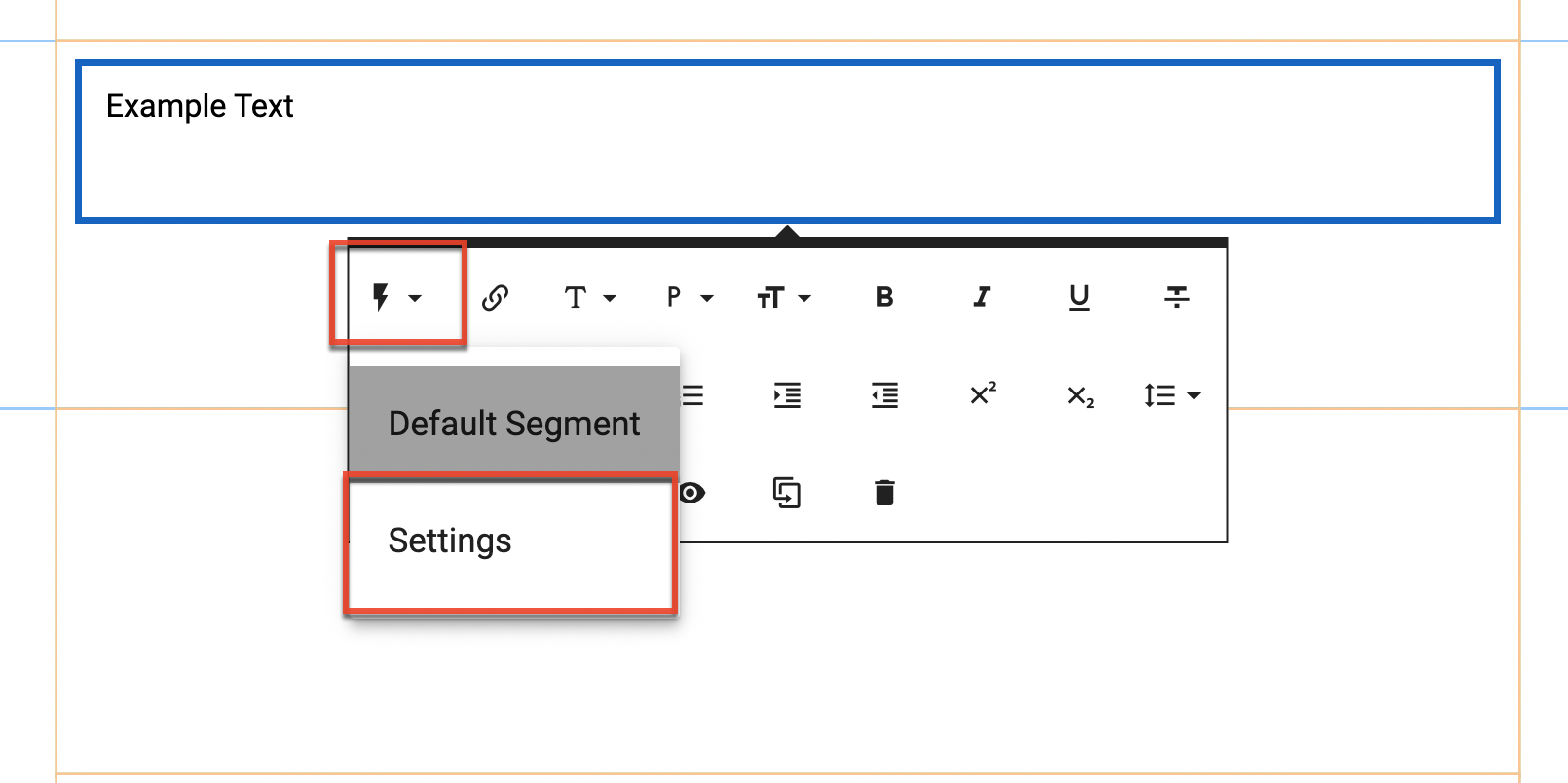
- Click the lightning icon to configure the element's dynamic content.
- From the dropdown, click the Settings option to manage the dynamic element's segments.
- To create a new segment, click the "Create Segment" button to create a new segment or click the "Use Existing Segment" button to choose an existing segment. For more information on defining segments in Sugar Market, refer to the Defining Segments section of the Working With Segments user guide.
Note: Users must have the "Marketing Admin - Segment Creation/Editing" permission enabled to create and edit segments.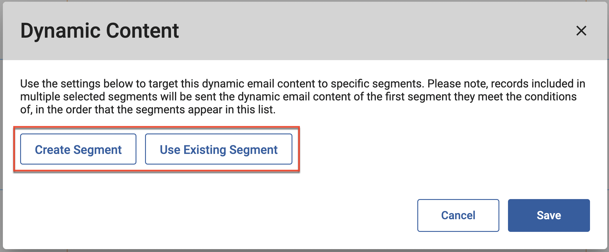
- Once a segment is saved it will appear as a line item in the element's dynamic content settings. You can change the order of your saved segments by dragging and dropping.
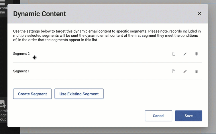
Note: Records included in multiple selected segments will be sent the dynamic email content of the first segment they meet the conditions of, in the order that the segments appear in the list. - Additionally, you can copy, edit, and delete saved segments as needed by clicking the respective icons within each line item.
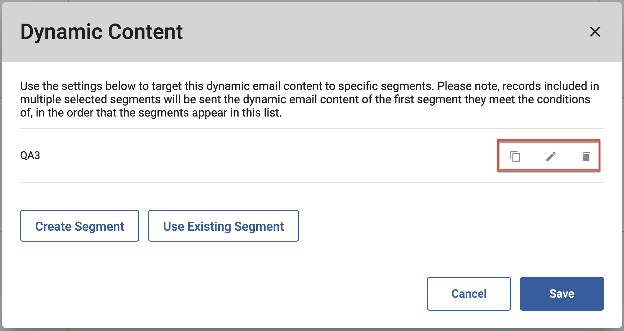
- Once a segment is saved, it will also be listed in the lightning icon dropdown.
- Clicking a segment from the dropdown will allow you to review and edit the element's dynamic content for that segment.

- Click the Default Segment option from the lightning dropdown to edit the element's default dynamic content. This content will be displayed to any recipients not included in your saved segment or segments.
Editing Rows and Columns
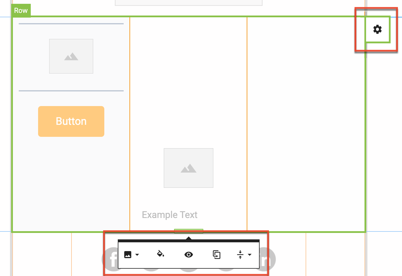
To edit a row, hover your cursor to the right of the row and click the settings icon that appears. In addition to setting a row background image or color, the row edit options allow you to duplicate the row, set visibility for mobile devices, and to sync the vertical alignment of the elements in a row. You can also slide the row border to resize the row.
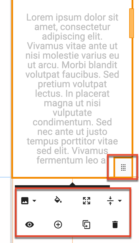
To edit a column, hover your cursor over the bottom right corner of the column and click the drag-and-drop icon. In addition to setting a column background image or color, you can set the spacing for the column, adjust the alignment of elements in the column, duplicate the column, and set visibility for mobile devices. You can also slide the column border to resize the column.
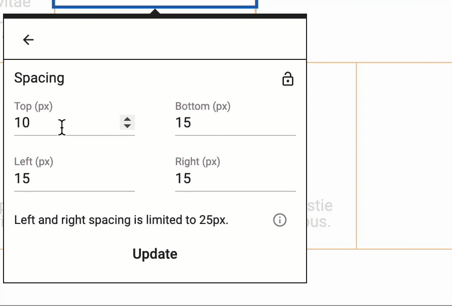
To adjust column spacing:
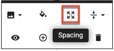
- Click the Spacing icon from the column edit options.
- Set the needed spacing for each side independently or click the lock icon to set all sides to match the Top spacing value by default and any future spacing value changes on any side.
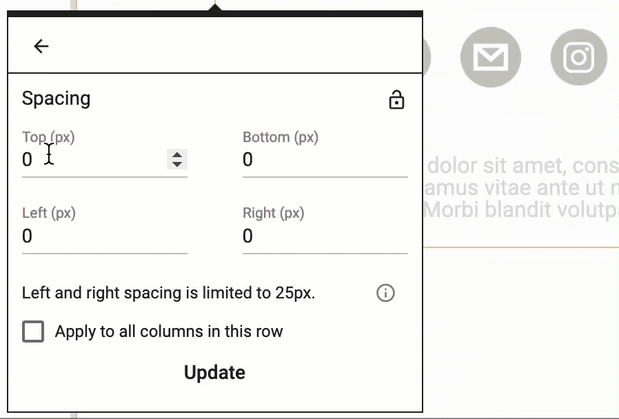
- To sync the spacing set in the column you are editing to match all other columns in the row check the "Apply to all columns in this row" checkbox.
- Click "Update" to save your changes.
Note: Left and right column spacing is limited to 25px to safeguard your email's structure and readability across email clients and devices.
Editing Elements
You can click on any element to show the edit options. There are several options available for editing elements individually and the options available are dependent on the element type.
To adjust element spacing:
- Click the Spacing icon from the column edit options.
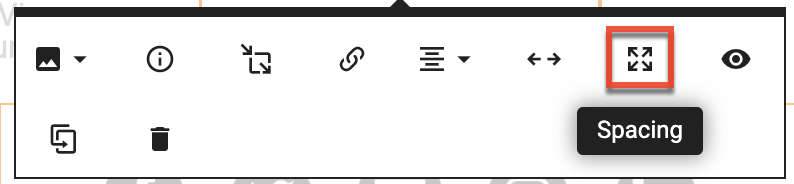
- Set the needed spacing for each side independently or click the lock icon to set all sides to match the Top spacing value by default and any future spacing value changes on any side.
- Click "Update" to save your changes.
Note: Left and right column spacing is limited to 25px to safeguard your email's structure and readability across email clients and devices.
Creating Calls-to-Action
Call-to-action (CTA) elements can help your email stand out in your recipients' inbox and quickly drive them to your website, email address, or phone number. This section describes how to easily add these CTA elements to your emails.
To add a CTA element to your email:
- Add a text, image, or button button element to your email.
- Select the element on the canvas to display its context menu, and then click the link icon.
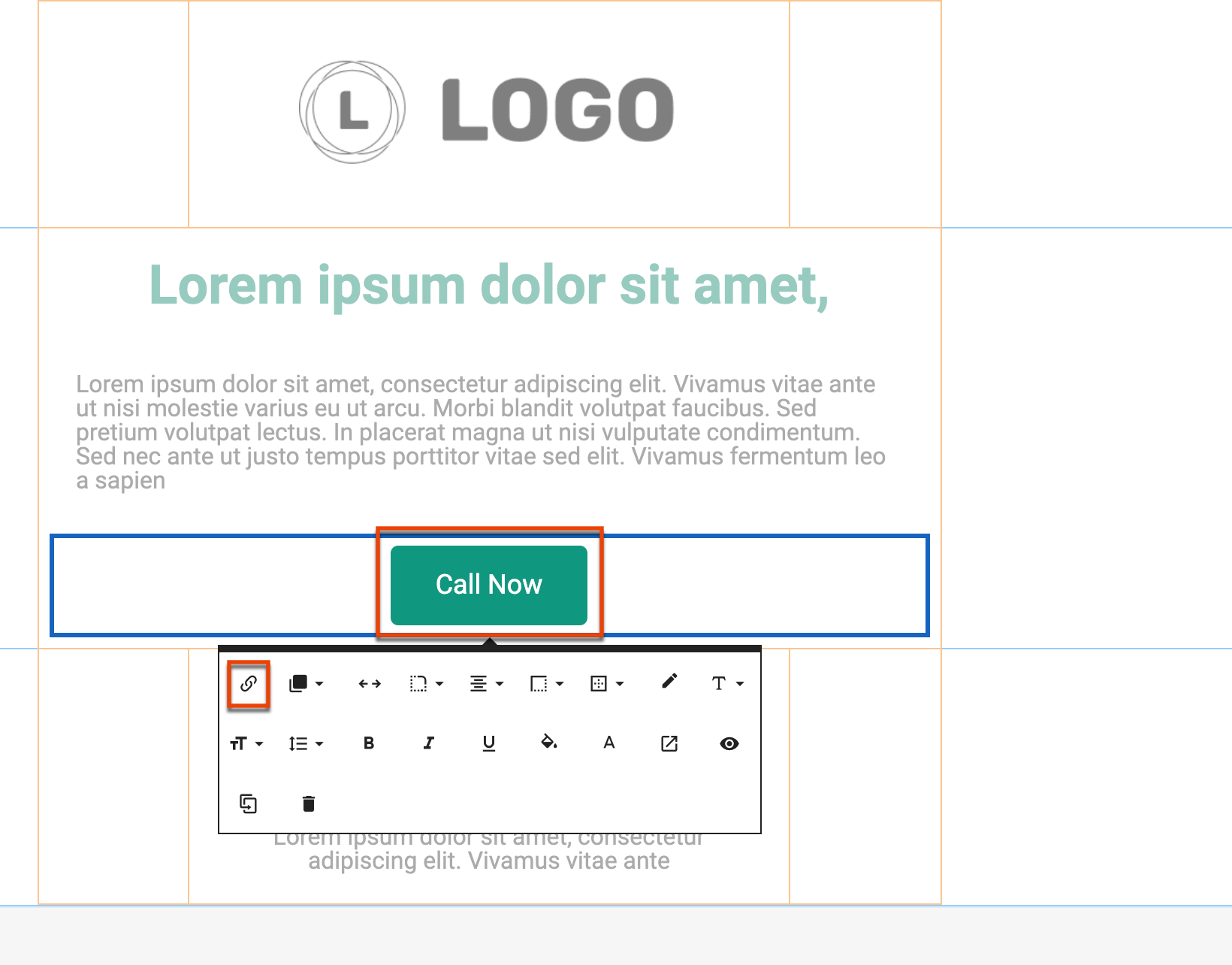
- Identify the URL, email address and content, or phone number to which you want the element to link, and then click the Update button.
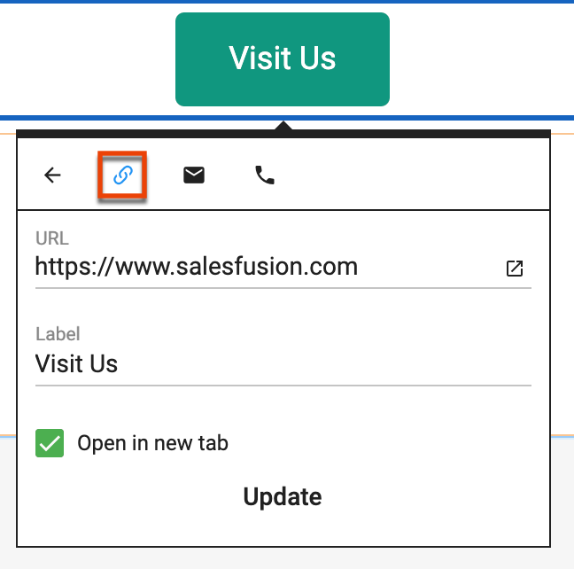
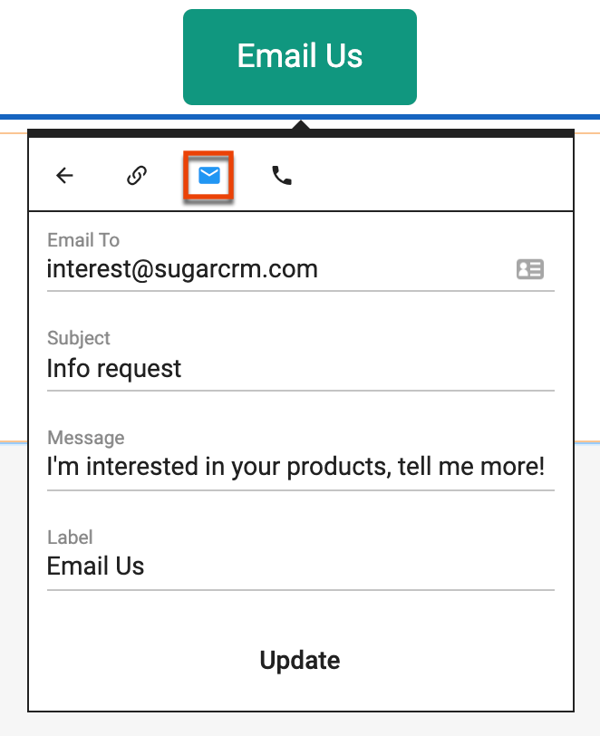
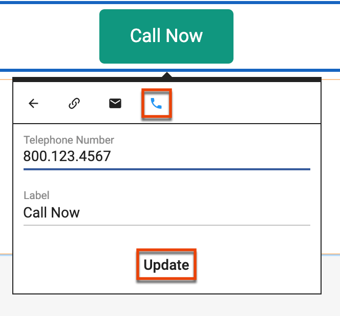
- To confirm your settings, use the Preview option to mouse over the element and display the value at the bottom right of the page.
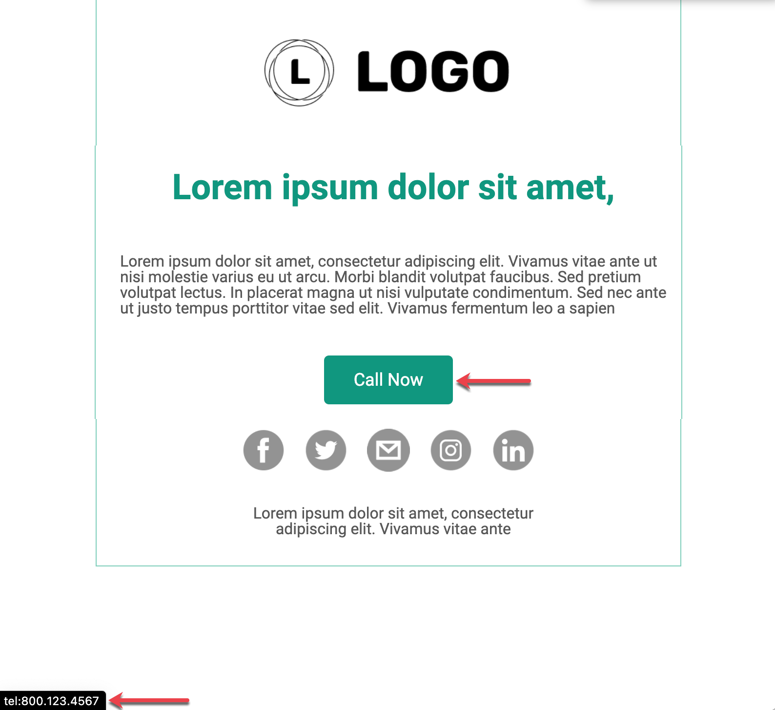
When your recipient clicks the CTA element, the associated application launches populated with the value defined (e.g., phone, browser, email client).