Reports Section
Overview
The Reports section displays open reports in separate tabs. This section of the user interface allows you to create, modify, and view reports.
Prerequisites
To view the Reports section, you must have access to Discover and have a Discover role of Admin, Report Creator, or Read Only. Read Only users are not allowed to create or modify reports, but may view and drill into reports.
Reports Section Interface
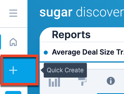
Open the Reports section by clicking on the Discover tab in the navigation bar. You can jump to any open report by clicking the three-dots menu on the Discover tab in the navigation bar and selecting from the open reports. You can create a new report in the Reports section by clicking the plus icon to the right of any open reports.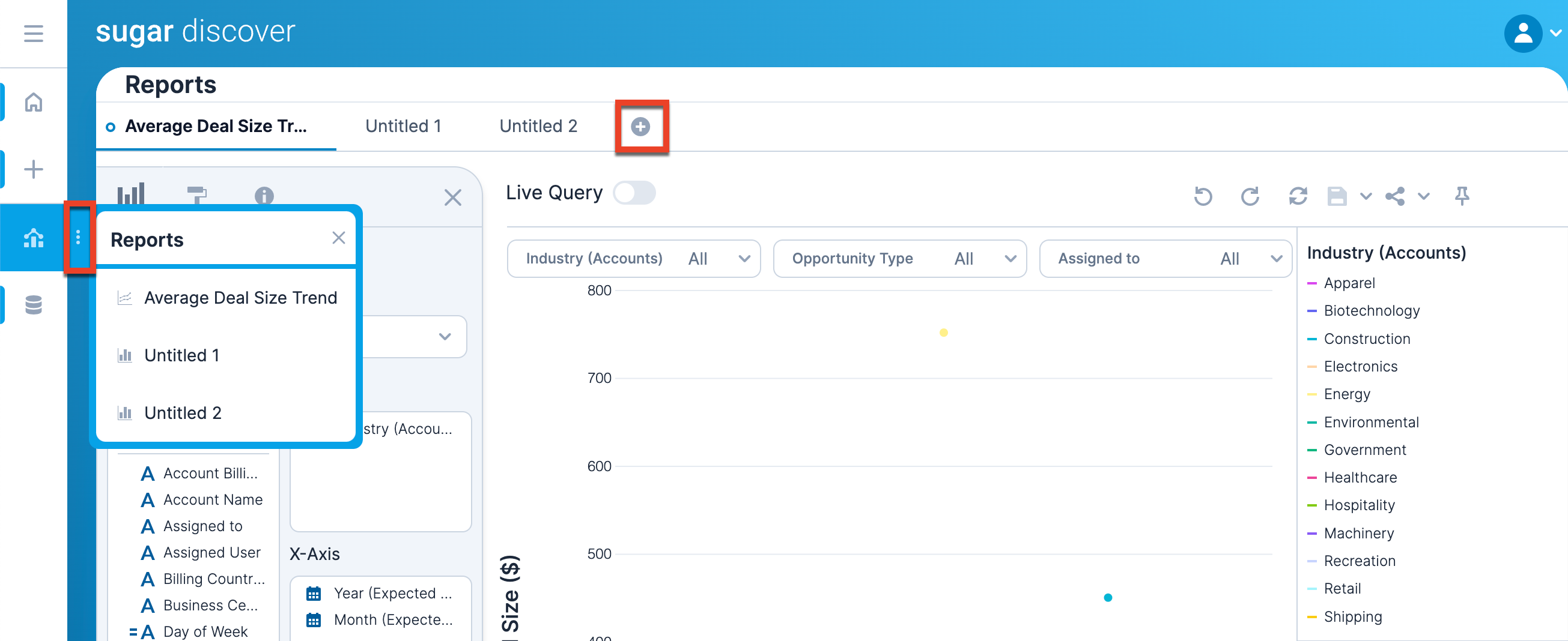
There are several controls along the top of the Reports section.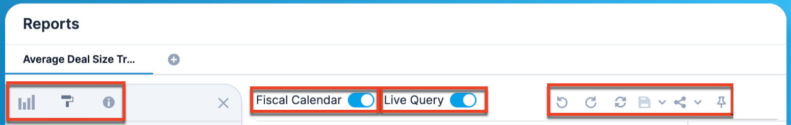
| Option | Description |
 |
Open the Query Layout panel. |
 |
Open the Formatting panel. |
 |
Open the Report Details panel. |
 |
Turn on or off the fiscal calendar. |
 |
Turn on or off the live query. When Live Query is on, the report automatically refreshes with each change. If the live query is turned off, the chart is not visible and you must click "Apply Changes" to apply changes and show the resulting chart. Live query is turned off by default when creating a report and the Apply Changes button appears only once your report is in a valid state. |
 |
Undo the last change. |
 |
Redo the last change. |
 |
Refresh the report results. |
 |
Save the report. If your report has been previously saved, clicking the Save icon or choosing "Save" from the dropdown menu saves changes to the report. Clicking "Save Version" in the dropdown menu allows you to save a version of the report to the version history. Note that "Save Version" is available only after the report has been saved with a name. You must provide a version summary to save a version. The text in the Version Summary box will be shown in the Version History section so that you can identify the version. Note that this version summary cannot be edited or deleted. Clicking "Save As" in the dropdown menu allows you to provide a name for the report. All configurations (e.g., filters, slicer selections, formatting, query layout) are saved when you save your report. If you would like the report to be saved with an initial version, you may add a description to the Version Summary textbox. If no version summary is provided, the report is saved without adding a version to the Version History section and you will see an open circle indicator on your report tab. Note: All public reports must have unique names. All private reports for a user must also have unique names. It is possible, however, to have multiple users with private reports that share names (e.g., user 1 and user 2 both have a private report named "Report A"). Refer to the Sharing and Collaboration section to learn about public and private report types. |
 |
Share the report or edit the report's permissions. Copy a link to the report to your computer's clipboard by clicking the icon, or use the arrow to choose another sharing option. |
 |
Pin the report so that it opens upon login. Click the pin again to un-pin the report so that it does not open upon login. |
Unsaved Indicators
On each report tab, a closed dot to the left of the report name indicates that the report has unsaved changes.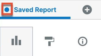
An open dot to the left of the report name indicates that the changes are saved, but that your report is not a saved version. Refer to the Version History section for more details on report versions.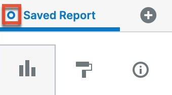
If there is no dot, your report is saved as a version with no unsaved changes.
Query Layout Panel
The Query Layout panel is on the left side of the screen. Open the Query Layout panel by clicking the bar chart icon in the upper left corner of the Reports section. To close the Query Layout panel, click the "X" in the upper right corner of the panel. The Query Layout panel allows you to create your report definition (e.g., type of visualization, fields to plot, layout). Note that at the bottom of the Query Layout panel, you can see and configure which dataset you are basing the report on.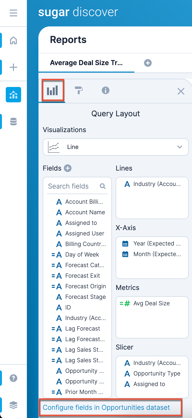
Visualizations
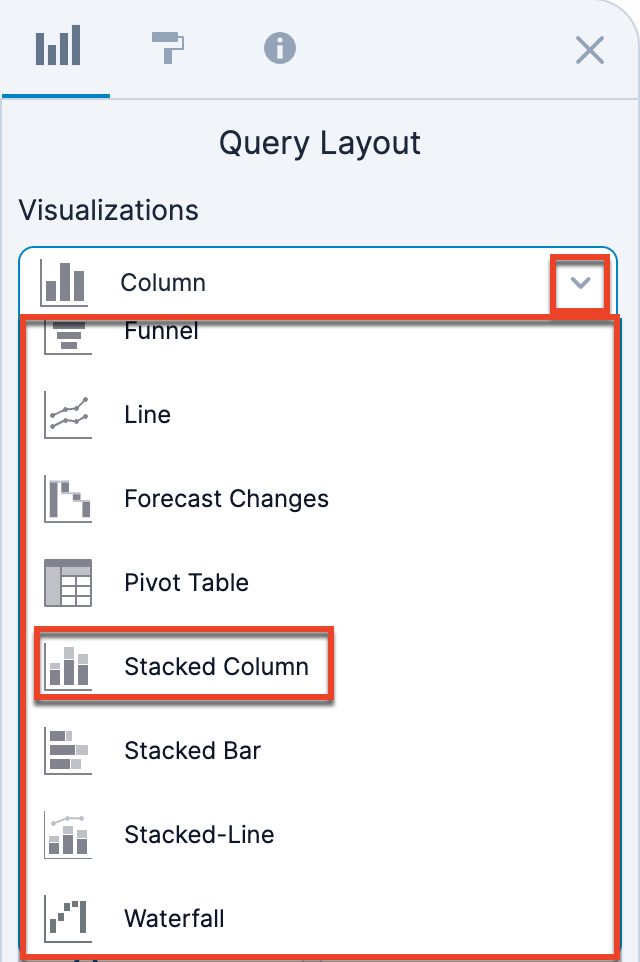
When creating a report, you must choose what type of visualization it will use. Which option you choose depends on the way you want to display your data. The visualization type also dictates what shelves you have available in the Query Layout panel.
The different visualizations are:
| Type | Icon | Description |
| Column |
Categorical data is displayed as columns. There are four shelves:
|
|
| Column-Line |
Categorical data is displayed as columns and trend data is displayed as a line. There are four shelves:
|
|
| Funnel |
Display values across multiple stages in a process. There are four shelves:
|
|
| Line |
Display a line of continuous data distributed across the x-axis. There are four shelves:
|
|
| Forecast Changes | Display how your forecasted pipeline has changed in the past week. This visualization type is meant to be used for the Current Quarter Forecast Changes Since Last Week report in Enhanced Forecasting. | |
| Pivot Table |
Display a table of data that also provides summaries. There are four shelves:
|
|
| Stacked Column |
Categorical data is displayed as columns and multiple data series are stacked on each other, emphasizing the total of all data series. Use the Formatting panel to change this to a 100% stacked bar chart, which emphasizes how each data series contributes to the whole. There are four shelves:
|
|
| Stacked Bar |
Categorical data is displayed as horizontal bars and multiple data series are stacked on each other, emphasizing the total of all data series. Use the Formatting panel to change this to a 100% stacked bar chart, which emphasizes how each data series contributes to the whole. There are four shelves:
|
|
| Stacked-Line |
A combination of the Stacked Column and Line visualizations. There are five shelves:
|
|
| Waterfall |
Show how records evolve over a timeframe. The order of the fields in the Entrance, Change Within, and Exit shelves determines the order of the columns on the report's x-axis. There are five shelves:
A filter for Snapshot Date in the current and previous 7 days is added by default for this report. If this filter is removed, you must add a slicer for Snapshot Date. If no filter or slicer for Snapshot Date is included on the report, the report will not render. The dates for the time period appear below the first and last bar on the report. Waterfall reports automatically display missing or excess values. When the final bar does not align with the x-axis, a gray bar will appear, showing the exact amount of discrepancy. When this bar is displayed, users may want to reconfigure their report to capture the missing or excess value. The formatting panel in the waterfall report allows users to categorize and group fields by color. For example, actions like "Moved In," "Added," and "Increased" can all be grouped under a single category such as "Increasing Value", displayed with a consistent color in the legend. When creating a drill link target report for a waterfall visualization, you must have Snapshot Date as the first field in the Rows shelf on the pivot report and use the "Clear existing and add new filters/slicers" setting. The pivot table should also have "Grand total" disabled in the Formatting panel. |
Fields
The Fields list contains all the visible fields in the dataset, including some special Discover fields. Only administrators are able to view hidden fields in a dataset. You can search for a field by using the Search bar at the top of the list. You can also create report-level calculated fields (i.e., calculated fields that are available only for the current report) by clicking the plus icon to the upper right of the Fields list. 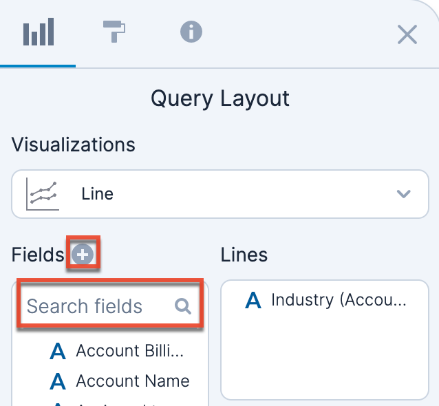
Field Data Types
Each field in Discover has a specific data type (string, number, or timestamp), as indicated by the icon next to the field name:
| Icon | Description |
| String fields. | |
 |
Calculated string fields. Hover over the field to display a preview of the calculation. An italicized name indicates that the field is a report-level calculated field. |
| Number fields. | |
| Calculated number fields. Hover over the field to display a preview of the calculation. An italicized name indicates that the field is a report-level calculated field. | |
 |
Timestamp fields. |
The data type of a field drives a number of related features such as the types of filtering and aggregation that can be performed when working with the field.
Note that timestamp fields are divided into different attributes of the date: year, quarter, month, week, week in quarter, day, exact date, and date. By default, only the year, quarter, month, and date attributes are shown. If you want to show the expected close date year on an x-axis, for example, you would add the Year attribute under Expected Close Date to the X-Axis shelf.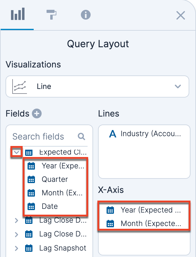
If you want to show all attributes for a date, click on the field and select "Show Time Hierarchy", then select "Show All Time Attributes". You can also choose from a list of preset attributes to show (e.g., only show the year, quarter, and month by selecting "Year : Quarter : Month").
Note: When the "Year : Week" time hierarchy is selected, an "ISO Year" field becomes available in the fields list. This field should be used instead of the calendar year to ensure weeks that span calendar-year boundaries are assigned to the correct ISO-8601 week number (e.g. Week 1 appearing under the prior calendar year).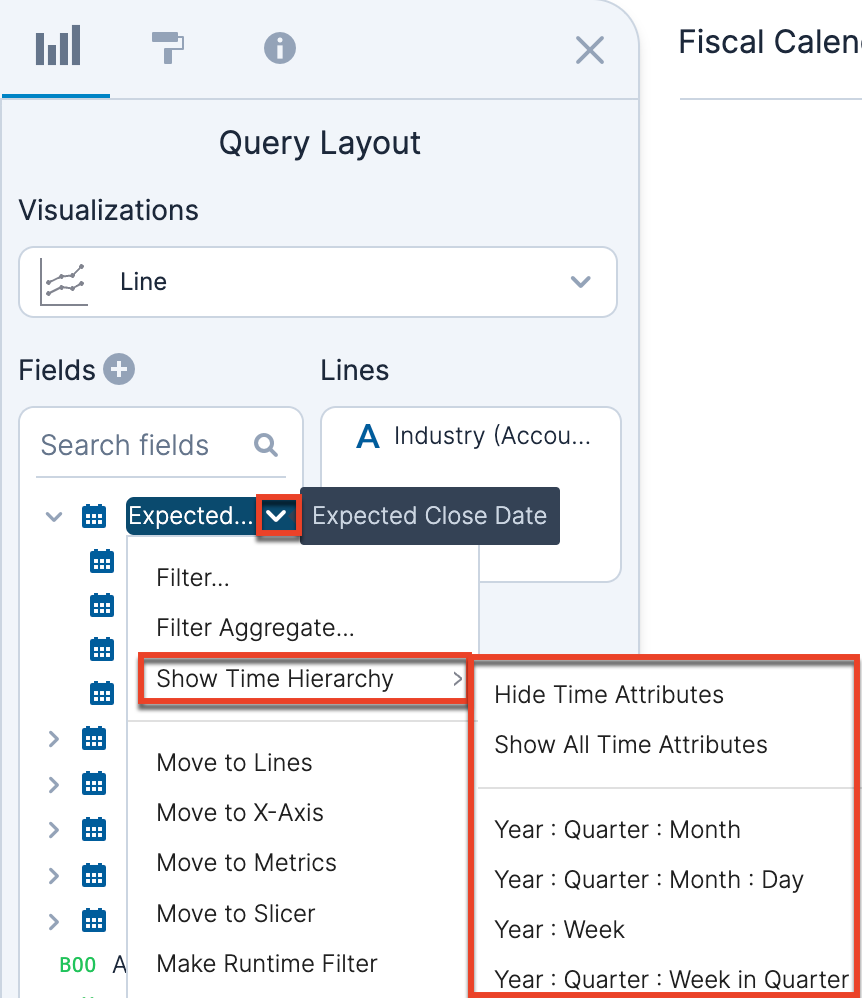
Calculated Fields
Discover provides the ability to create calculated fields either within a report (i.e., a report-level calculated field) or as part of the dataset definition (i.e., a dataset-level calculated field). Report-level calculated fields can only be used within the report they are created for while a dataset-level calculated field can be used on any reports using the dataset. To create a report-level calculated field, click the plus icon to the top right of the Fields list.
For more information on creating calculated fields, refer to the Create Calculated Fields section.
Missing Fields
When a field has been renamed or removed from the dataset or report, Discover is unable to use the field to create the visualization and will produce an error. The missing fields are listed in the visualization space and highlighted on the shelves. You can fix the issues by removing fields individually or clicking "Remove All Missing Fields" in the visualization area.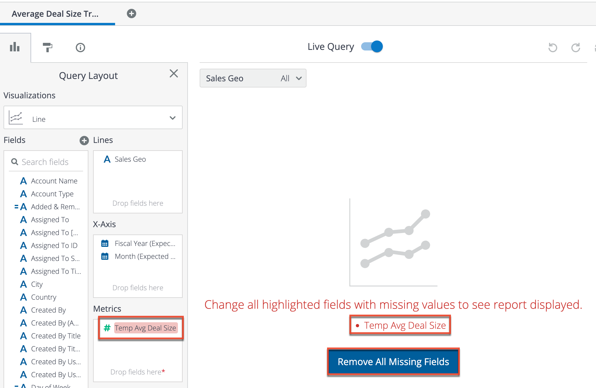
Shelves
The boxes in the Query Layout panel are referred to as "shelves" and provide a visual way for you to place your fields in a chart definition. The names on the shelves (e.g., Columns, X-Axis, Metrics) depend on which type of visualization you are using. Only shelves with asterisks (*) next to the "Drop fields here" text are required for any given visualization. 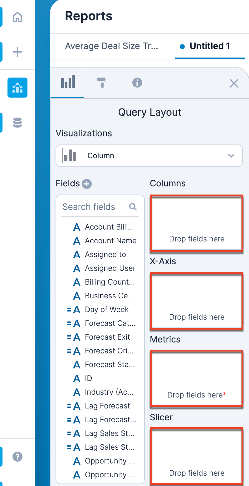
There are two ways to add fields to the shelves. You can click on a field name in the Fields list and then choose one of the "Move to" options from the dropdown menu to move it to the appropriate shelf. 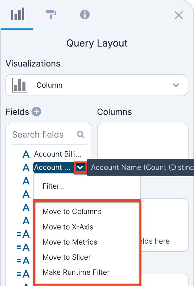
Alternatively, you can click the field name in the Fields list and drag it to the appropriate shelf and drop it on the shelf. 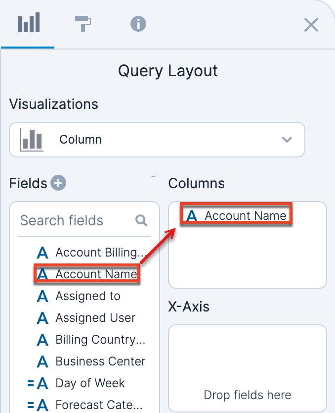
Once the field is on the shelf, note that the field remains listed in the Fields list because it can be used more than once in a report (e.g., as an x-axis and also a slicer).
Click on a field on a shelf to display a new menu. Depending on which shelf the field is on, the menu options may vary.
| Option | Description |
| Filter... | Filter the report based on this field. For more information on filters, refer to the Filters section. |
| Move to | Move the field to a different shelf by clicking one of the "Move to" options. You can also drag and drop the field to the new shelf. |
| Aggregation | Override the default aggregation for a field and choose another aggregation type. The aggregation type used for metrics displayed on the report axes are displayed as prefixes. The prefixes are: Average (AVG), Count (COUNT), Count Distinct (CNT DST), Maximum (MAX), Minimum (MIN), Sum (SUM). |
| Sort ascending/descending | Determine which field you want to sort the x-axis by. You can choose whether you want to sort in ascending or descending order. For example, click the Year (Expected Close Date) field and select "Sort ascending" to sort the x-axis by expected close date year in ascending order. |
| Move Up/Move Down | The order of the fields on the shelf determines how the report will be visualized. Use these options to move the fields up or down on the shelf, or drag and drop the fields to reorder them. For example, on an X-Axis shelf, if you place Year first and Month second, your x-axis labels will read "year month"; if you place Month first and Year second, the x-axis labels will read "month year". |
| Remove | Remove the field from the shelf. You can also drag and drop the field from the shelf to the Fields list. |
Formatting Panel
The Formatting panel is on the left side of the screen. Open the Formatting panel by clicking the paint roller icon in the upper left corner of the Reports section. To close the Formatting panel, click the "X" in the upper right corner of the panel. You can access the formatting options for a given visualization type by opening the Formatting panel while viewing a report. 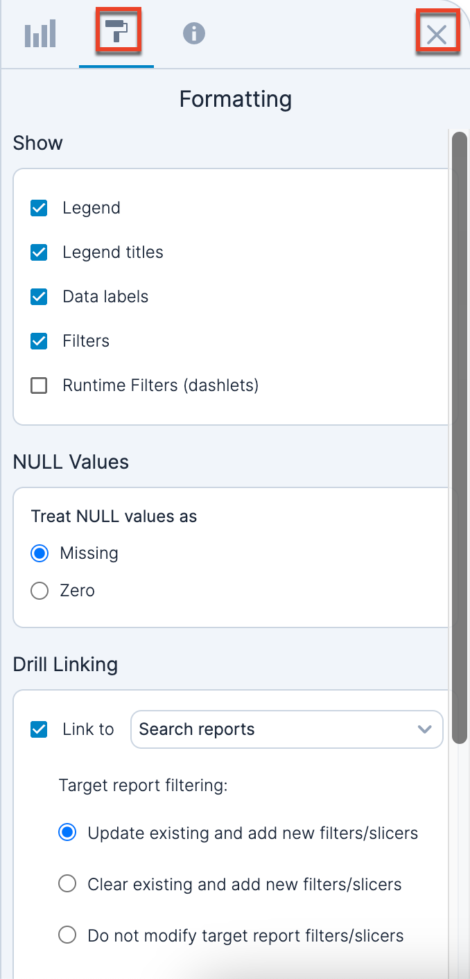
Below is a brief description of available formatting sections. Note that not all formatting options are available for each visualization type.
Show
The Show section of the Formatting panel contains options related to the visibility of elements.
| Option | Description |
| Legend | Show the Legend panel along the right side of the visualization. |
| Legend titles | Show the legend title. |
| Data labels | Show the data labels on the visualization. |
| Filters | Show the Filter By panel along the right side of the visualization, which shows currently-applied filters. |
| Runtime Filters (dashlets) | Show the Runtime Filters panel along the right side of the visualization, which shows applied run-time filters. |
| Dynamic Y-Axis Minimum | For a Forecast Changes visualization, if the Start or End column occupies more than ⅓ of the screen, show the Y-axis minimum as a non-zero value so that the in-between stages are easier to visualize. |
| Centered | Center the funnel bars on the visualization. This option is only available for funnel visualizations. |
| Conversion From Initial Stage | Shows the amount of records that progressed from one stage to another over a time period, displayed as a percent. This option is only available for funnel visualizations. |
| Average Days in Stage | Display the average amount of time each record spent in a given sales stage. This option is only available for funnel visualizations. |
| Average Cycle Time | Display the average cycle time for all records that made it to the final stage being shown in the funnel visualization. This option is only available for funnel visualizations. |
| Total Funnel Conversion | Display the percent of records that made it to the final stage being shown in the funnel visualization relative to the first stage. This option is only available for funnel visualizations. |
| Stages | For a funnel visualization, you can select which stages to include on the funnel chart. |
NULL Values
This section is available only for line, stacked-line, and column-line visualization. This setting allows you to specify how to treat NULL (i.e., missing) values. You can treat them as:
- Missing: Values should be treated as missing and displayed as gaps in the line visualization
- Zero: Values should be treated as present and with a value of zero.
Properties
This section is available only for column, stacked column, stacked bar, and stacked-line visualizations. Enable the 100% Stacked checkbox to specify that all stacks should fill 100% of the column/row height so that the value for each series in the stack represents the percentage of the overall sum of values for the stack.
For column and stacked column charts, enable the Trend Line checkbox to show a least squares regression trend line on the report.
Drill Linking
This section allows you to specify a pivot table to use as a drill link target for the report. When you drill into a visualization, you can see the data that matches that segment of the visualization by passing along the values as a filter to the linked report. Drill linking is not available on funnel visualizations.
There are 3 options available for controlling how filters get applied to the target report:
| Option | Description |
|
Update existing and add new filters/slicers |
This is the default option. This option creates new filters when the target report does not have existing filters on the given field, replaces the filter definitions when the target report already has filters applied to a field, and leaves existing filters in place in cases where the filter definition exists in the target report but is not being modified by drilling in from the source report. |
| Clear existing and add new filters/slicers | This option will remove all existing filters on the target report and add all filters from the source report. |
| Do not modify target report filters/slicers | This option will open the target report without modifying any filters based on conditions from the source report. |
Colors
This section allows you to manually assign colors to the series present in the report. Color customizations are only stored within a given report and default colors are assigned by report and field type. Items in the color panel that correspond to dropdown fields in Sugar (e.g., sales stage) will default to their assigned colors from Sugar, unless they were previously changed. For the most accurate alignment between your reports, it is recommended to reset the colors if they do not match. Click "Reset to default colors" at the bottom of the section to reset your colors to their default state.
Axis
This section is only available for column-line and stacked-line visualizations. Enabled the "Lock zero line for X and Y axis" checkbox to force the zero lines for metrics on the primary and secondary y-axis to be aligned. Disable this option to allow the primary and secondary y-axis to independently calculate their scale and range to best display the metrics.
Totals
This section is only available for pivot tables. Toggle these options to show or hide different totals, grand totals, and/or record counts within grand totals on the pivot table visualizations.
Report Details Panel
The Report Details panel displays information about the report. To close the Report Details panel, click the "X" in the upper right corner of the panel. From this panel, you can rename the report, edit the description, add tags, and view previous versions of the report. You can also view who created the report and the timestamp from the last modification. 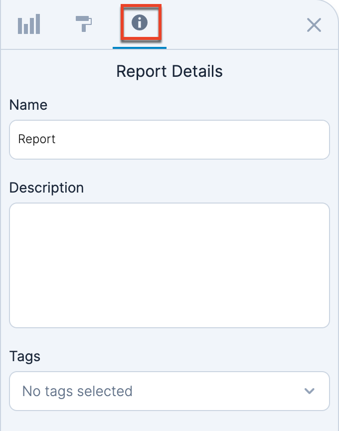
Report Tags
To add a tag to the report, click the arrow in the tag dropdown menu to open the tag search. Begin by searching for your tag name. If the tag does not exist, click the Add button (plus icon) to the right of the search query to add the tag to your report. If the desired tag is already available, click on the tag name to enable the checkbox. You may add multiple tags to a single report.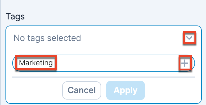
Once you add your tag, it will appear in the list and be enabled for this report. Click "Apply" to apply the tag.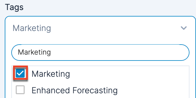
You must save the report after you apply a tag in order to use view and search the tag in the Library section. Saving a report with a newly created tag also enables the tag to be used for other reports. A tag is available to select in the dropdown when it is saved to at least one report.
To remove a tag from a report, disable the appropriate checkbox, click "Apply", and then save your report.
Once you have saved tags to reports, you can use the tags to search the reports in your Library.
Version History
Saved versions are added to the Version History section on the Report Details panel. Each entry in the Version History section includes the version summary, the user, and the date and time the version was saved.
To save a version, you must include a Version Summary, which is then used to identify the version in the Version History section. If the current version of your report is a saved version (i.e., no unsaved indicator is shown on the report tab), "Current Version" is listed under the version summary for the most recent entry in the Version History section. Once a version is saved, it cannot be removed and the summary cannot be edited.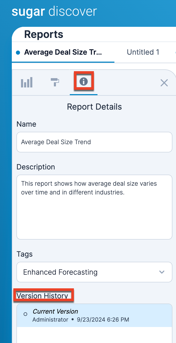
When viewing a report that is not a saved version, an open circle indicator appears on the report tab to the left of the report name and the version summary is replaced by "Current Version". An unsaved version is overwritten when new changes are saved.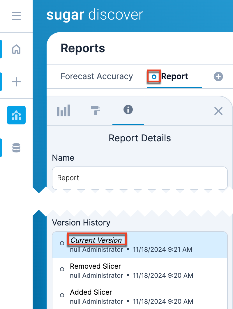
To open a previous report version, click on an entry in the Version History section. If you open a previous version when you have unsaved changes on your current version of the report, click the Undo button in the top right corner to return to your unsaved report.
Note: The Version History section only appears once you have saved a version. For reports created before this feature was implemented, the first entry in the Version History section contains the name of your report.
Note: Read Only users cannot access previous versions of a report.
Datasets
For information about special fields that are available with Discover datasets, refer to the Datasets Section documentation.
Edit Datasets
You can easily access the Field Configuration screen by clicking the edit link below the Query Layout panel in the Reports section. Note that you must have a Discover role of Admin to edit the dataset.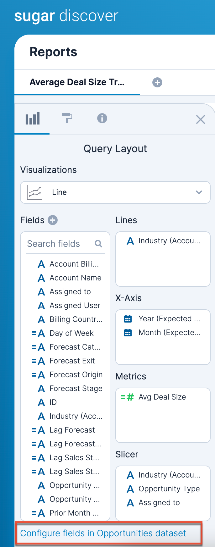
Create Calculated Fields
Whether you make a report-level calculated field or a dataset-level calculated field, you use the same process to define the calculated field. You must provide a unique name for the calculated field and a definition of the calculation. You can optionally provide a description, which will appear when you hover over the field in the Query Layout panel. Click the "View Function Reference" text in the upper right corner of the field definition box to view the complete reference of functions that are available.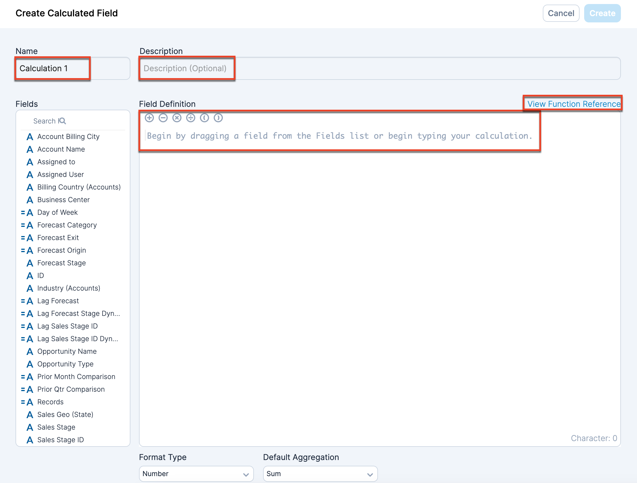
The calculation definition has several parts.
| Part | Description |
| Function | View the Sugar Discover Functions documentation for a complete list of available functions. |
| Operator | View the Sugar Discover Functions documentation for a complete list of available operators. |
| Field reference | Field references are the field name enclosed in square brackets. To add fields, either type the field name into the field definition box or drag and drop the field from the Fields list along the left side of the screen. |
As you write the calculation, you will see whether your calculation is valid by the text in the lower left corner of the field definition box. 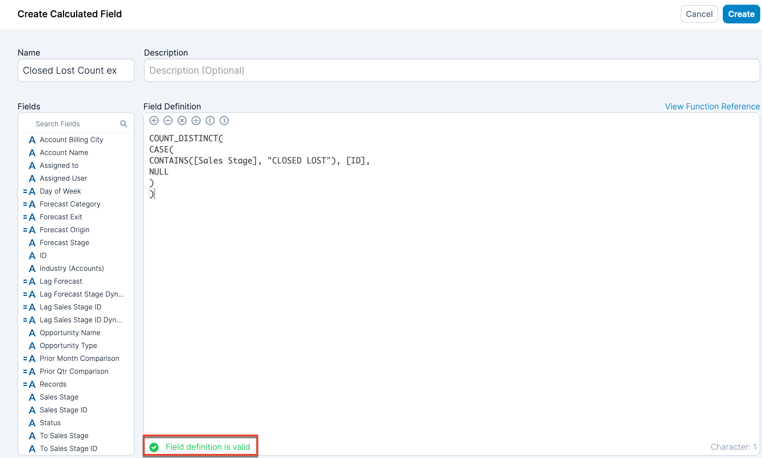
Use the Format Type dropdown menu to determine how the calculated values are formatted in a report. Note that the options vary based on the data type. If you format the field as a currency, the currency symbol is determined by your Sugar instance's system currency.
You can use the Default Aggregation dropdown to determine the default aggregation type for how Discover should aggregate the results when grouping them in a report. When you drag and drop a field from the Fields list to the field definition box, the field is added with the default aggregation. Note that you can override this default aggregation when the field is on a shelf.
Click the Apply button in the upper right corner to save your calculation. Click "Cancel" in the upper right corner to leave the screen without saving changes. Any unsaved changes will be lost. The new calculated field will now display in the Fields list.
Slicers
Slicers allow you to provide the person who views your report with a way to filter the data while viewing the report in Discover or a dashlet. Use the Slicer shelf to define what fields are available for slicing on the report in the same way as you add or remove fields from other shelves. When a slicer is added to a report, a dropdown list appears at the top of the report for you to control the slicer. The slicer list contains values that are:
- Distinct values for the field (i.e., values are listed only once)
- Refined by the filters applied to the report
- Refined by the selections applied by other slicers in the order the fields are arranged on the Slicer shelf.
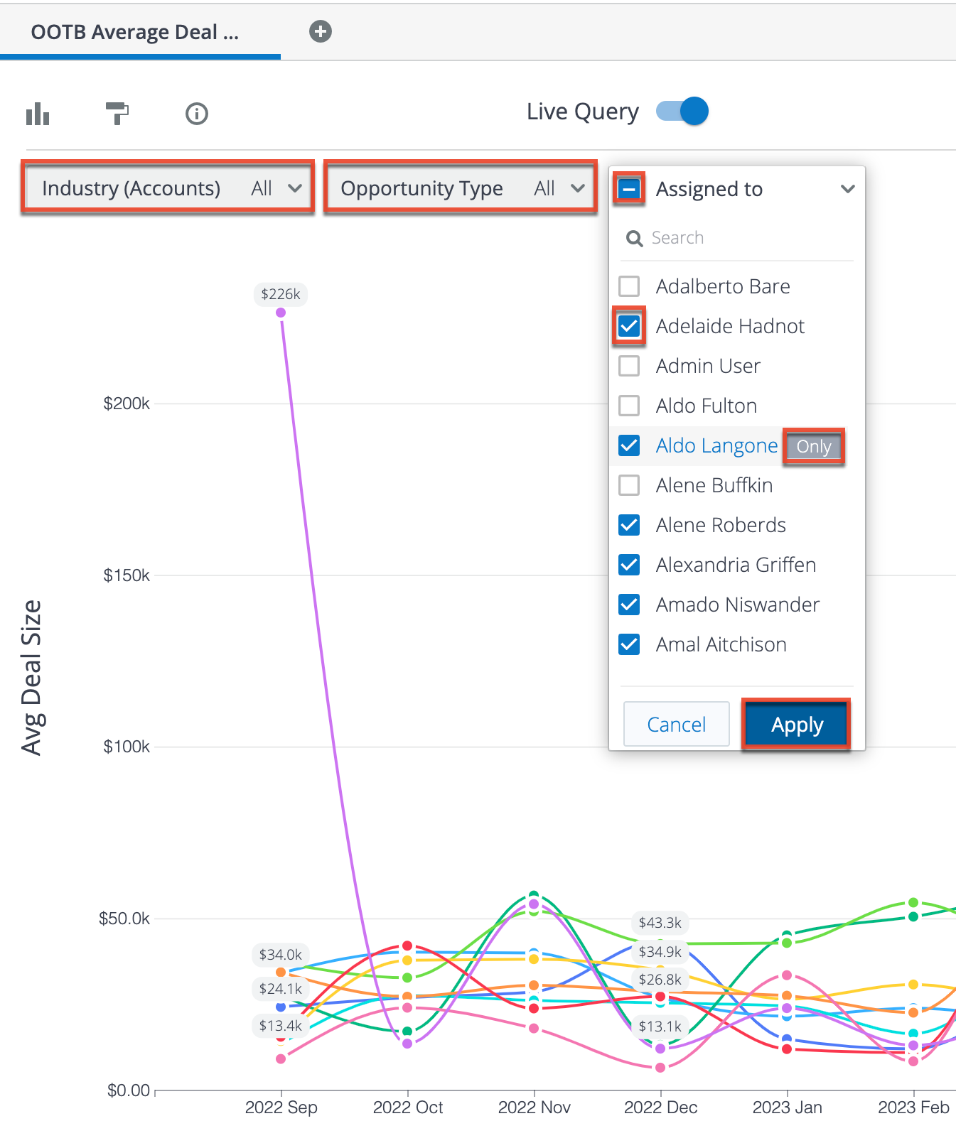
When you open the slicer list, there are several options:
- Checkbox to the left of the slicer name: Enable or disable all checkboxes in the list. A horizontal line in the checkbox indicates that some boxes are currently enabled and some are currently disabled. Click the box once to disable all checkboxes, then click it again to enable all checkboxes.
- Search bar: Search for a value in the list.
- Checkbox to the left of the value: Enable or disable the particular value (e.g., Assigned to name) in the list for use in the results displayed on your visualization.
- "Only" to the right of the value: Click this button to enable only this value (e.g., Assigned to name). All other options will be disabled.
- Apply button: Apply the slicer settings.
- Cancel: Reset the slicer settings and close the list.
Slicers for date and datetime fields have different options:
- Current and Previous: Set a value and a unit of time (minutes, hours, days, weeks, etc.). The report will include the current day (current snapshot) and the indicated number of minutes/hours/days/etc.
- In the Past: Set a value and a unit of time (minutes, hours, days, weeks, etc.). The report will include data from a specified number of complete past time periods excluding the current day, week, month, etc. You can also select a relative date which the slicer uses as a starting point to include only data from prior, complete time periods. If you choose the fiscal week/month/quarter/year unit, enable the "Include current partial time period" checkbox so that the report ends on the viewing date.
- Since: Select a start date. The report will include data from on or after the selected date through the current date.
- Between: Select a start and end date. The report will include data from on or after the start date until on or before the selected end date.
By default, all values are selected for a slicer. If you want to set the beginning state of the slicers for viewers, set the slicer values and then save the report.
Note: The best practice is that if a field is used as a slicer it should not be used as a run-time filter. If you have a field as both a slicer and a run-time filter, Sugar allows you to use the run-time filter in a dashboard filter and use the slicer in a Sugar Discover dashlet on that dashboard. This can result in conflicts cause by both the slicer and dashboard filter controlling the same field.
Filters
Discover provides extensive filtering options, which vary based on the type of data you are filtering. Applied filters are shown in the Filtered By panel in the lower right corner of the screen. If the Filtered By panel is not visible, enable the Filters checkbox in the Formatting panel.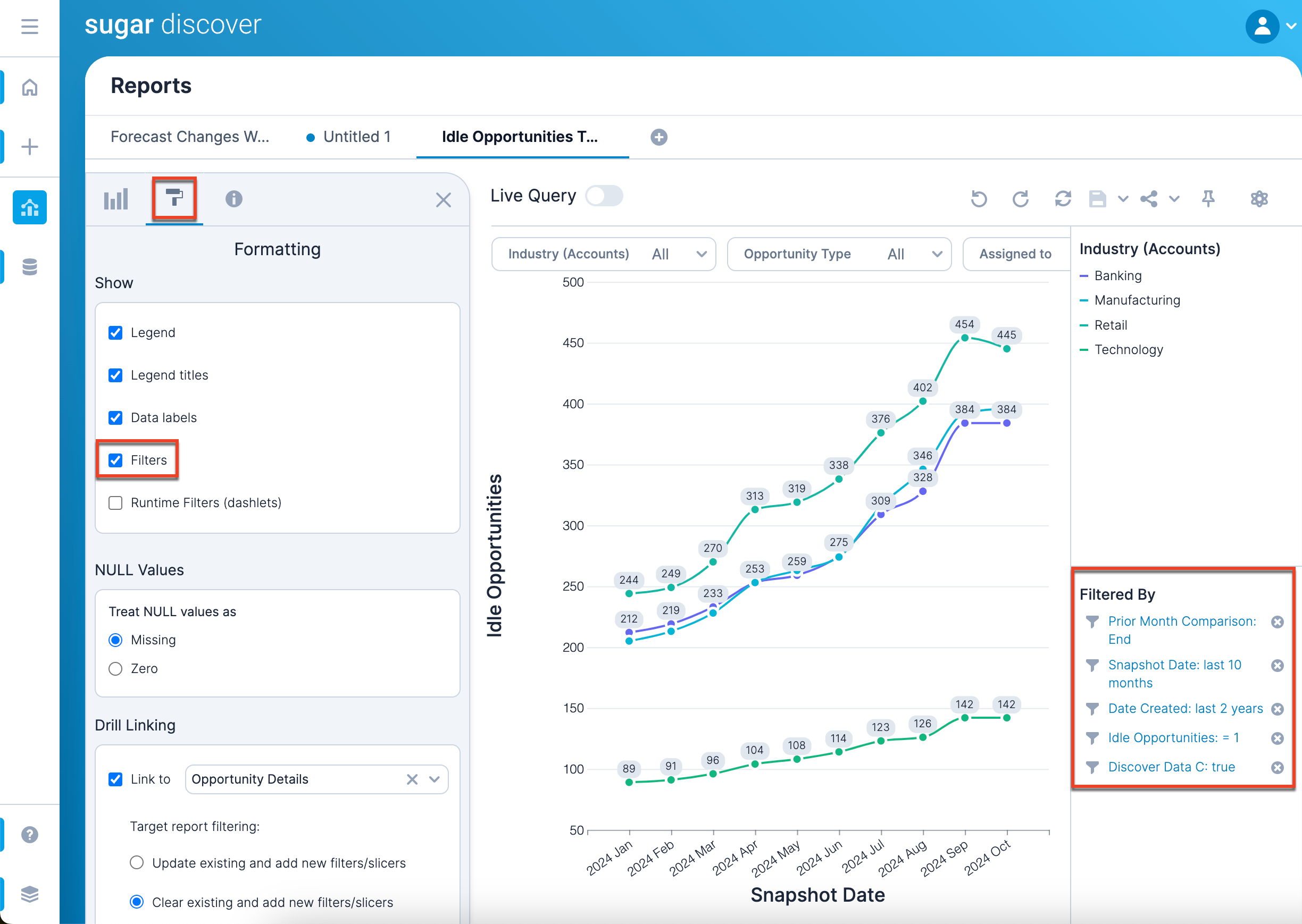
Adding Filters
Add a new filter by clicking the field that you want to apply a filter to in the Fields list or on a shelf in the Query Layout panel. Select "Filter..." from the menu to open the Filter [Field Name] screen, where "[Field Name]" is the name of the field you have chosen to filter (e.g., Filter Likely, Filter Snapshot Date). You can filter on any field regardless of whether it is used on a shelf and visualized on your report. You can also add multiple filters to your report to narrow your results further. 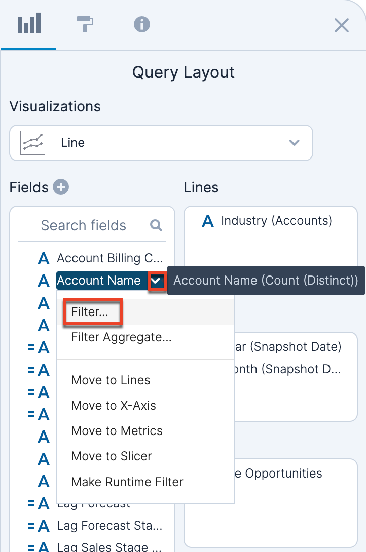
Editing Filters
You can edit a filter by clicking on the field in the Query Layout panel and choosing "Filter..." from the menu to open the Filter definition screen in the same way as adding a filter. You can also edit a filter by clicking the blue hyperlinked text in the Filtered By panel.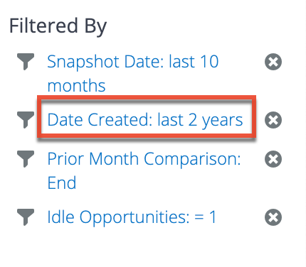
Removing Filters
To remove a filter from the report, click the "X" next to the filter in the Filtered By panel in the lower right corner of the screen. 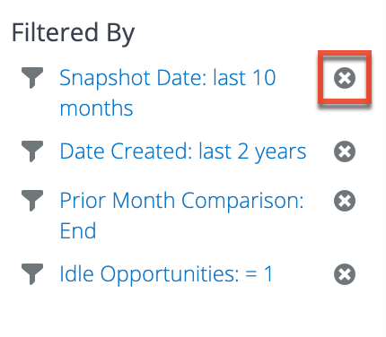
Filter Types
The types of filters that are available depend on the type of data you are filtering.
String Filters
When filtering on strings, there are two types of filters: Select Items or Set a Condition. Only one filter type can be used at a time for a field. For any filter type, once you are done defining your filter, click the Apply button in the upper right corner to apply the currently-viewed filter type. If you would like to close the screen without saving, click "Cancel" in the upper right corner.
Select Items Filter
For a Select Items string filter, you explicitly choose filtered values from a list by enabling the appropriate checkboxes. The list of options is filtered based on other existing filters for the report. To see a complete list of values for the field, disable the "Apply report filters to list" checkbox. You can also use the Search box above the list to search for certain values.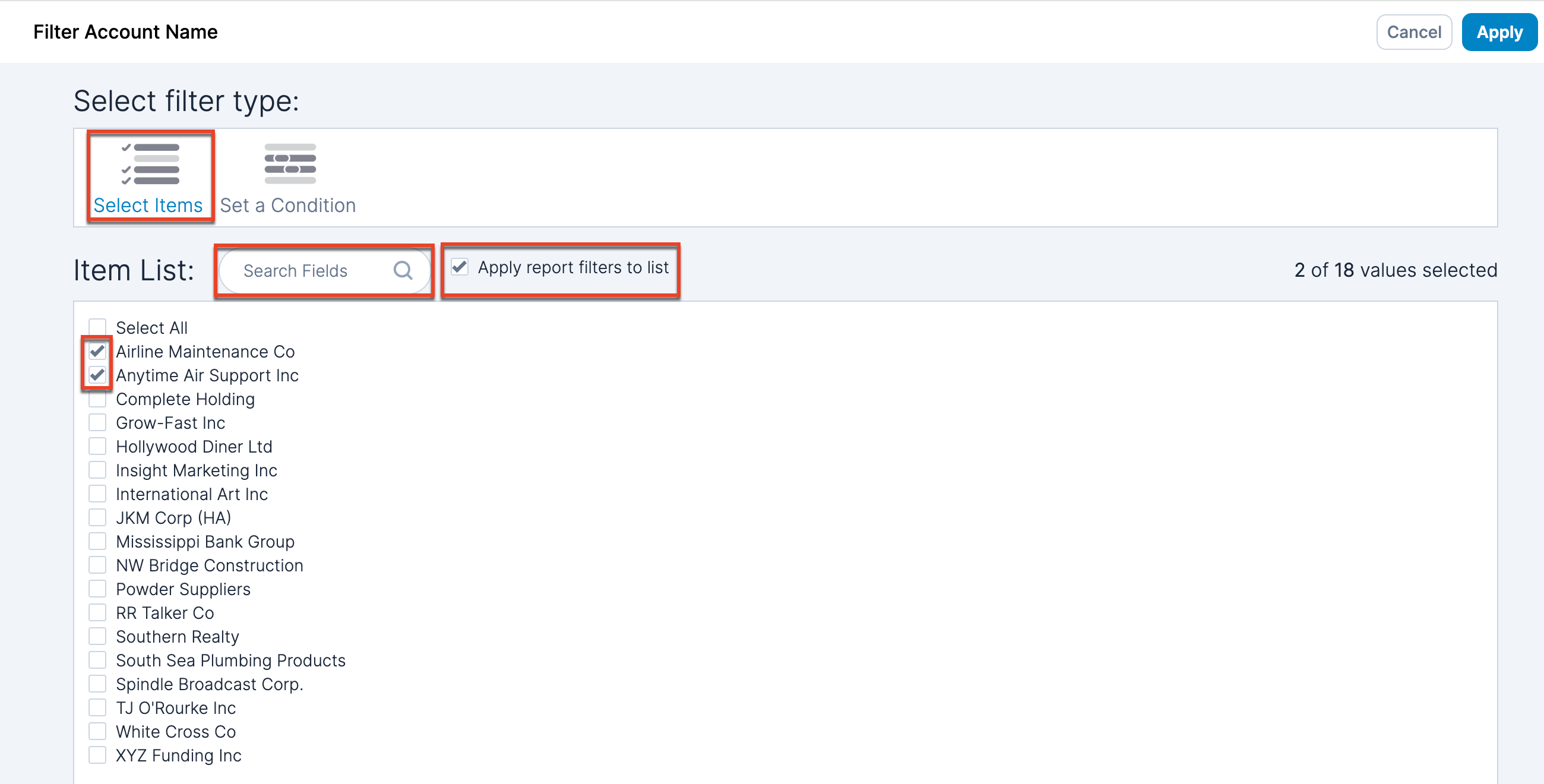
Set a Condition Filter
A Set a Condition string filter allows you to define one or more conditions that must be met. Under "Show items when the value" text, choose a condition from the dropdown menu and then add the text in the box to the right. To add another condition, use the plus icon to the right of the condition. To remove a condition, click the "X". When more than one condition is set, you can choose either "and" or "or" next to "Combine conditions using" at the top of the Set Condition box. 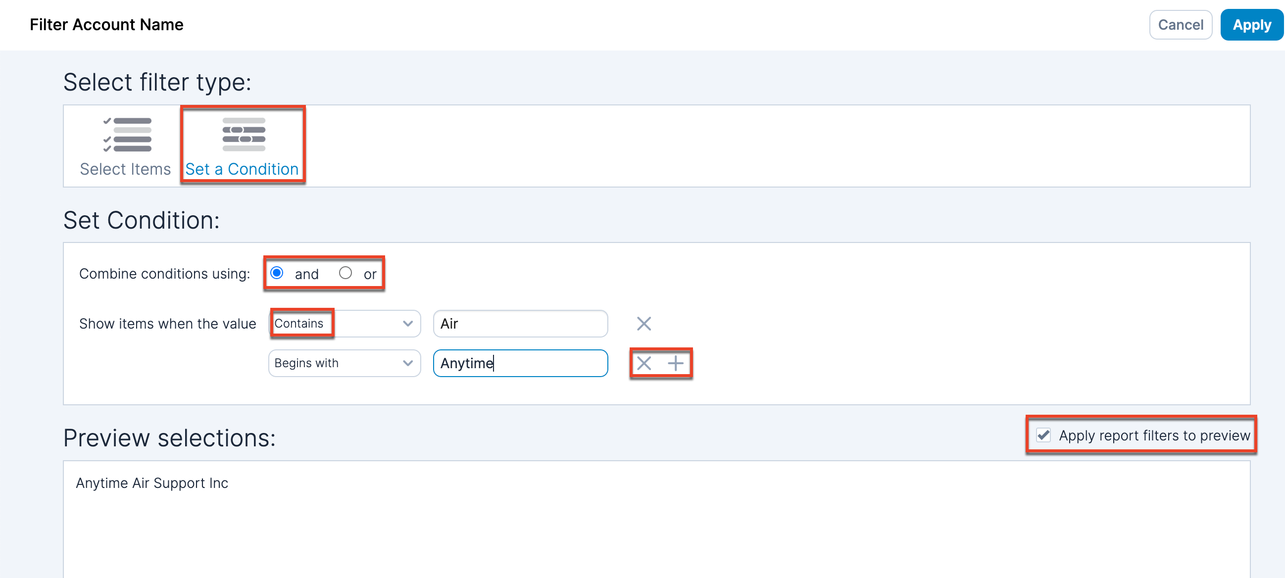
You can choose from the following conditions for filtering:
| Condition | Description |
| Is Current User | Available only for username fields. Return data where the field matches the currently logged-in user (e.g., using this filter on the Assigned User field returns records that are assigned to the currently logged-in user). |
| Contains | Case sensitive. The string must contain the provided text. |
| Begins with | Case sensitive. The string must start with the provided text. |
| Ends with | Case sensitive. The string must end with the provided text. |
| Equal to | Case sensitive. The string must exactly match the provided text. |
| Matches Pattern | Case insensitive. Use % as the wildcard character to search for case-insensitive strings (e.g., %gr% returns Grace, GRACE, and Agrace). |
| Does not contain | Case sensitive. The string does not contain the provided text. |
| Does not begin with | Case sensitive. The string does not begin with the provided text. |
| Does not end with | Case sensitive. The string does not end with the provided text. |
| Does not Equal | Case sensitive. The string does not exactly match the provided text. |
| Is NULL | Returns NULL strings (represented by a dash [-]). |
| Is not NULL | Returns strings that are not NULL. |
| Is Empty | Returns empty strings. |
| Is not Empty | Returns not empty strings. |
| Is in Tree | Use this filter on the Assigned To field in order to return data for records that are assigned to the direct reportees of a specific manager. In the "with parent field" dropdown, select "Reports to ID (OpportunitiesAssignedTo)". If this field is not available, you may have to unhide it in the dataset. In the "equal to" field, add the manager's user ID. The user ID is found in Sugar by navigating to the manager's Employee record in detail view and recording the string after "record=" in the URL. |
A preview of values that are returned by the filter is presented on the lower half of the screen. The preview is filtered by other existing report filters. To show all values that match the current filter, disable the "Apply report filters to preview" checkbox.
Number Filters
Numbers only have one type of filter, a Set Condition filter. Your filter may have one or two conditions.
You start by defining a single condition for the filter. If you would like to add another condition, click the plus icon next to the filter. 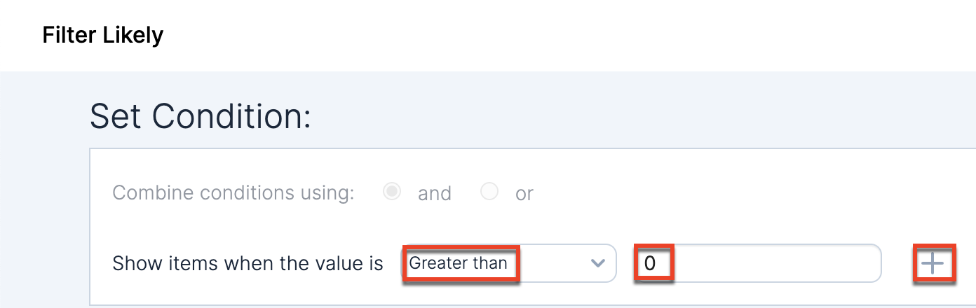
Once your filter has two conditions, you can decide how to combine the conditions by choosing either "and" or "or" next to "Combine conditions using" at the top of the Set Condition box. Click the "X" next to a condition to remove it. 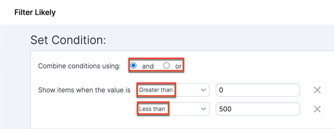
You can choose from the following conditions for filtering:
| Condition | Description |
| Greater than | Return all values greater than the specified value. |
| Greater than or equal to | Return all values greater than or equal to the specified value. |
| Less than | Return all values less than the specified value. |
| Less than or equal to | Return all values less than or equal to the specified value. |
| Equal to | Return all values equal to the specified value. |
| Not equal to | Return all values that are not equal to the specified value. |
| NULL | Return all NULL values. |
| Not NULL | Return all values that are not NULL. |
Once you are done defining your filter, click the Apply button in the upper right corner. If you would like to close the screen without saving, click "Cancel".
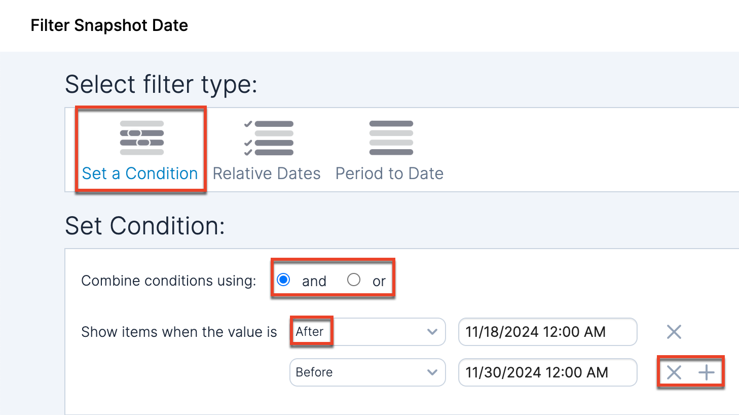
Timestamp Filters
When filtering on timestamps, there are three types of filters: Set a Condition, Relative Dates, and Period to Date. Only one filter type can be used at a time for a field. For any filter type, once you are done defining your filter, click the Apply button in the upper right corner to apply the currently-viewed filter type. If you would like to close the screen without saving, click "Cancel" in the upper right corner.
Set a Condition Filter
A Set a Condition timestamp filter allows you to define one or more conditions that must be met. Under "Show items when the value" text, choose a condition from the dropdown menu and then add the date and time using the box to the right. When you click in the box, a date and time selector opens. To add another condition, use the plus icon to the right of the condition. To remove a condition, use the "X" icon. When more than one condition is set, you can choose either "and" or "or" next to "Combine conditions using" at the top of the Set Condition box.
You can choose from the following conditions for filtering:
| Condition | Description |
| Exactly | Filter to the exact date and time. |
| On Day | Filter to a specific day. The time is not considered. |
| Not | Do not include the specified date and time in the results. |
| After | Include all results after a specified date and time. |
| On or After | Include all results on or after a specified date and time. |
| Before | Include all results before a specified date and time. |
| On or Before | Include all results on or before a specified date and time. |
| Is NULL | Include all results where the datetime field is NULL. |
| Is not NULL | Include all results where the datetime field is not NULL. |
| Is Empty | Include all results where the datetime field is empty. |
| Is not Empty | Include all results where the datatime field is not empty. |
| In Week | Filter to a specific week. In the dropdown menu to the right, choose the week of the year (1-52). Then in the dropdown menu on the far right, choose whether to include "All Years" or a specific year. |
| In Month | Filter to a specific month. In the dropdown menu to the right, choose the month. Then in the dropdown menu on the far right, choose whether to include "All Years" or a specific year. |
| In Quarter | Filter to a specific quarter. In the dropdown menu to the right, choose the quarter (1-4). Then in the dropdown menu on the far right, choose whether to include "All Years" or a specific year. |
| Week In Quarter | Filter to a specific week within a specific quarter. In the dropdown menu to the right, choose the quarter (1-4), then choose the week (1-13). Then in the dropdown menu on the far right, choose whether to include "All Years" or a specific year. |
| In Year | Filter to a specific year. In the dropdown menu to the right, choose whether to include "All Years" or a specific year. |
Relative Dates Filter
With a Relative Dates timestamp filter you can filter dates dynamically based on the current date on which you are viewing the report. For example, you may want to view all opportunities with a snapshot date in the past 10 calendar weeks from the date you are viewing. If you view the report today or in 3 weeks, you always want to show the 10 calendar weeks preceding.
Next to "Show items when the value is" text, choose a condition from the dropdown menu and then add a number in the box to the right. In the third box, choose the unit for the number. If you want to anchor the report to a specific date or day and not have it update dynamically based on your viewing day, enable the "Anchor relative to" checkbox. Select "Exact" from the dropdown and choose a date in the date selector to select an exact date anchor (e.g., always show the 10 calendar weeks preceding April 11, 2024). Select "Previous" from the dropdown, enter a number, and select the day of the week to choose which day in the past you want to anchor to (e.g., "Previous 1 Friday" anchors the report to the previous Friday relative to the viewing day and shows the 10 calendar weeks preceding).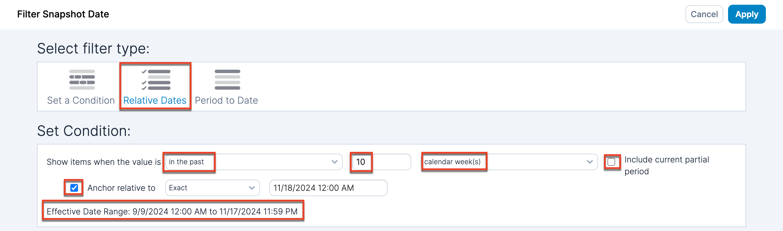
You can choose from the following conditions for filtering:
| Condition | Description |
| in the past | Filter to the past day, month, etc. |
| current and previous | Filter to the current and previous day, month, etc. |
| this | Filter to the current day, month, etc. |
| current and next | Filter to the current and next day, month, etc. |
| in the next | Filter to the next day, month, etc. |
The unit dropdown has calendar/fiscal time units (dependent on the Fiscal Calendar toggle) and regular time units (i.e., are not prefaced with "calendar" or "fiscal"). The difference between the calendar/fiscal time unit (e.g., calendar month(s)) and a unit such as "month(s)" is that the "month(s)" option selects a monthly range relative to the current day. For example, a filter that states "in the next 3 month(s)" when viewed on January 15th would show records in a time range of January 15 - April 15. A filter that states "in the next 3 calendar month(s)" when viewed on January 15th would show records in a time range of February 1 - April 30. If you choose a calendar/fiscal time unit, an "Include current partial period" checkbox appears for you to choose whether to include the current partial period.
At the bottom of the Set Condition box you will see the effective date range for the filter you have set up.
Period to Date Filter
A Period to Date timestamp filter allows you to filter based on a specific period up until the day you are viewing the report. At the bottom of the Set Condition box, you can see the effective date range for the filter.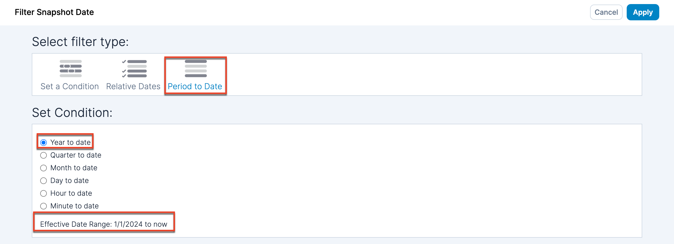
Filter Aggregated Metrics
For a string or timestamp field, you can filter by an aggregated metric (e.g., likely revenue). To do this, when adding a filter, select the "Filter Aggregate..." option from the dropdown instead of the "Filter..." option to open the metric aggregation filter screen. Note that the "Filter Aggregate..." option appears only when at least one field is on a shelf.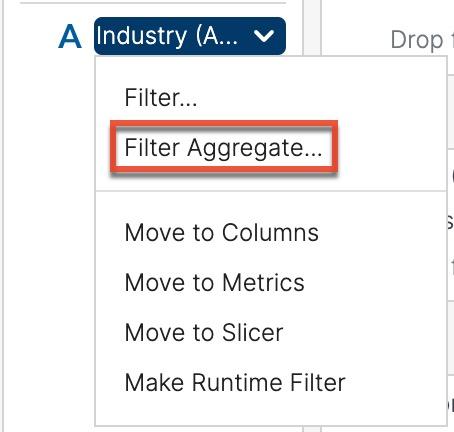
Set a Condition
A Set a Condition metric aggregate filter allows you to define the conditions to be met to show values for the field. Next to "Show items when the" text, choose a field from the shelves from the dropdown menu, select the metric (e.g., sum or average), the condition and the value. To add another condition, use the plus icon to the right of the condition. To remove a condition, use the "X" icon. When more than one condition is set, you can choose either "and" or "or" next to "Combine conditions using" at the top of the Set Condition box.
Top/Bottom Filter
The Top/Bottom string filter allows you to choose the top or bottom number of items when a specific metric is ranked. You can choose whether to show the top or bottom number or percent, the value for the number or percent, and then the metric to rank by. For example, you can find the top 10 opportunities by their likely revenue. 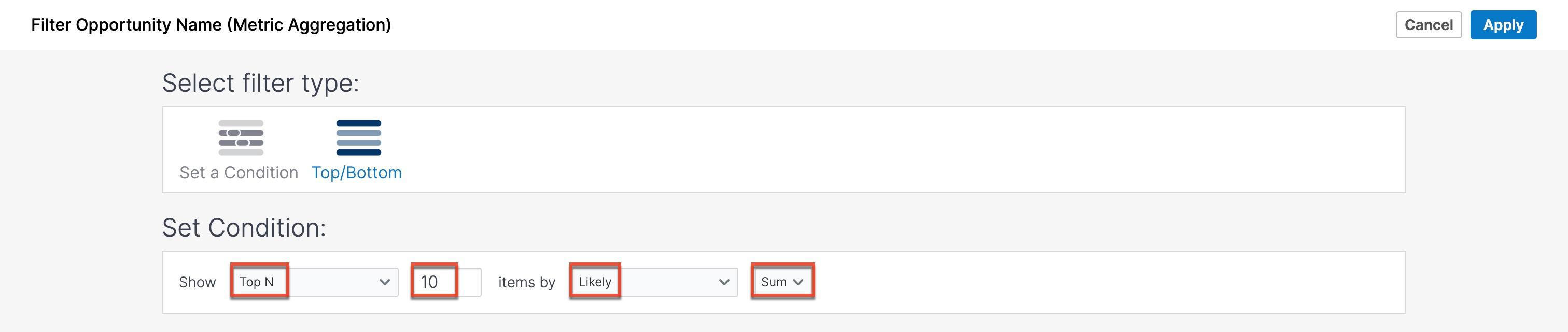
Run-time Filters
In order to leverage dashboard filters on Sugar's Home dashboards, you must add a run-time filter to your Discover report before adding the Sugar Discover dashlet to your dashboard. If you add a run-time filter to a report after adding the Sugar Discover dashlet to your dashboard, you must remove the dashlet and re-add it.
Applied run-time filters are shown in the Runtime Filters panel in the lower right corner of the screen. If the Runtime Filters panel is not visible, enable the "Runtime Filters (dashlets)" checkbox in the Formatting panel.
Note: You cannot manipulate a run-time filter from the Sugar Discover interface. If you want to filter results in the Discover interface, you must use Filters or Slicers.
Adding Run-Time Filters
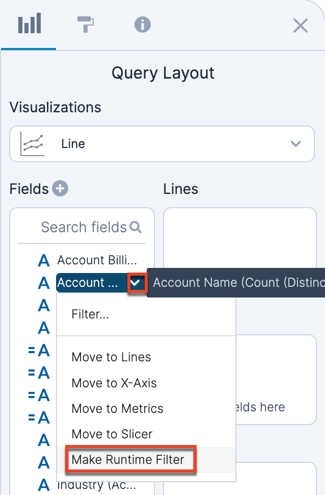
Run-time filters are available only for native Sugar fields (i.e., calculated Discover fields are not supported). Add a new filter by clicking the field that you want to apply a filter to in the Fields list or on a shelf in the Query Layout panel. Select "Make Runtime Filter" from the menu. You can filter on any field regardless of whether it is used on a shelf and visualized on your report. You can also add multiple filters to your report to narrow your results further.
Removing Run-Time Filters
To remove a run-time filter from the report, click the "X" next to the filter in the Runtime Filters panel in the lower right corner of the screen. 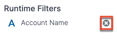
Fiscal Calendar
To display the results based on the fiscal calendar defined for the dataset, click the Fiscal Calendar toggle at the top of the visualization. When the fiscal calendar is turned on, there are several areas this affects.
Fiscal Calendar Visualizations
For visualizations, the grouping of years, quarters, and months will be based on fiscal year boundaries rather than calendar year boundaries.
Timestamp Fields
To display all the fiscal calendar-time related time attributes, click the timestamp field in the Fields list and select "Show Time Hierarchy". Then choose "Show All Time Attributes" to reveal attributes for fiscal year, fiscal quarter, fiscal week, and fiscal week in quarter.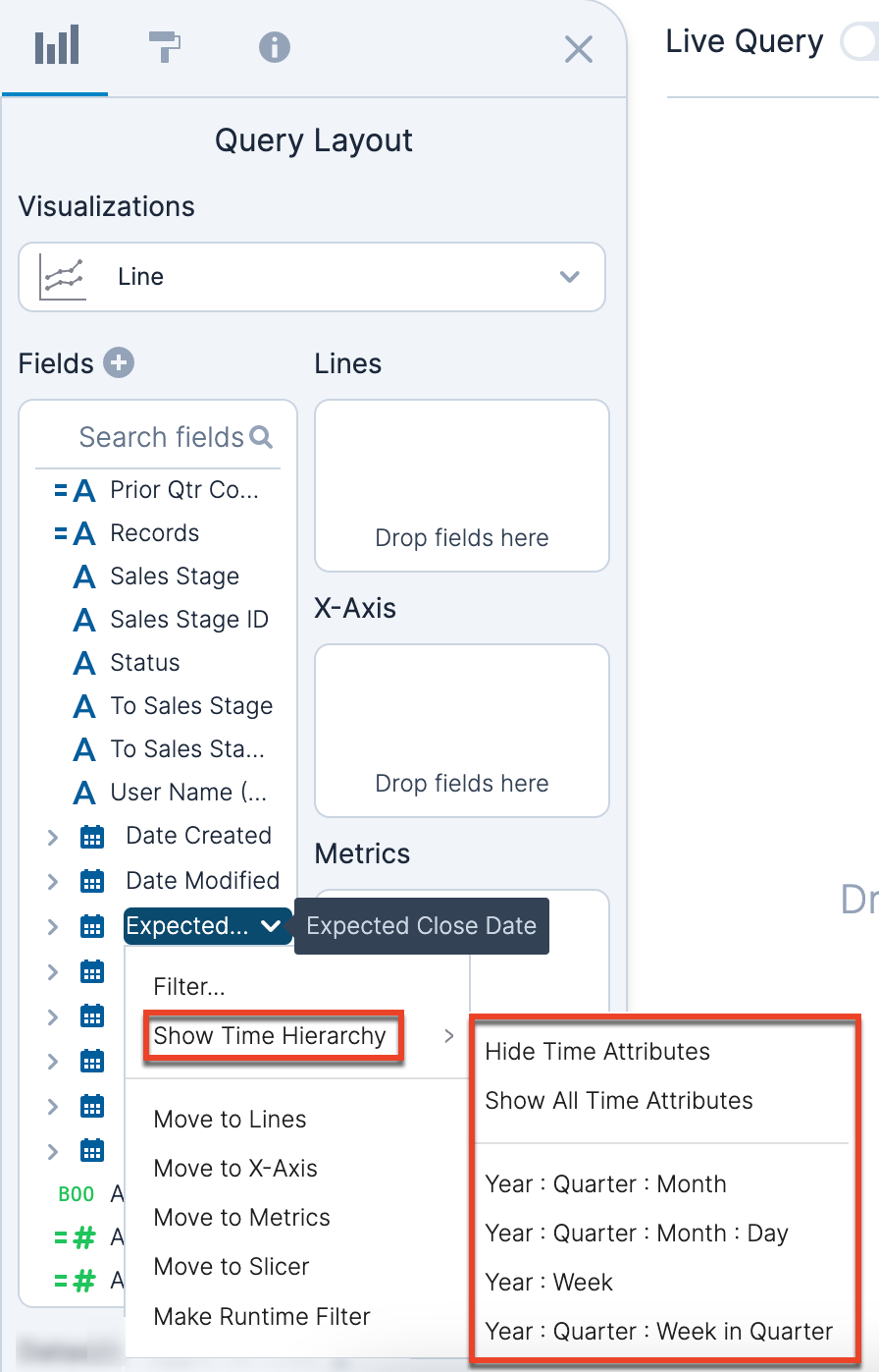
Timestamp Filters
When the fiscal calendar is enabled, the units for a Relative Dates filter become "fiscal year(s)", "fiscal week(s)", and "fiscal quarter(s)" instead of "calendar year(s)", "calendar week(s)", and "calendar month(s)".
Additionally, the Period to Date filter options become "Fiscal year to date" and "Fiscal quarter to date" instead of "Year to date" and "Quarter to date", respectively.
Any saved date filters are updated appropriately when the fiscal calendar is enabled.
Calculated Fields
There are several date-related functions that are affected by the fiscal calendar. For more information, refer to the Sugar Discover Functions documentation.
Sharing and Collaboration
Report Permissions
Sugar Discover provides the ability for you to have private and public reports. The options are defined as:
| Option | Description |
| Private | Only you can view and edit the report. |
| Public | This is the default for new reports. All users who have access to view and edit reports are able to view and edit public reports. |
To change the visibility of a report, click the arrow to the right of the Share button near the top right of the screen and select either "Private" or "Public". A checkmark next to one of the options indicates the current setting.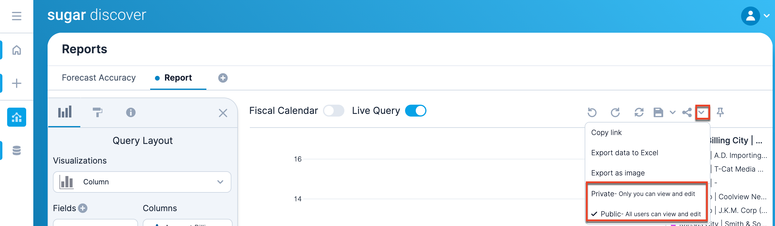
Report permissions can also be changed in the Library section.
Share Reports
To copy a direct URL link to a report, click either the Share icon or click the arrow and select "Copy link" from the dropdown menu. The link is copied to your computer's clipboard so that you can paste it elsewhere.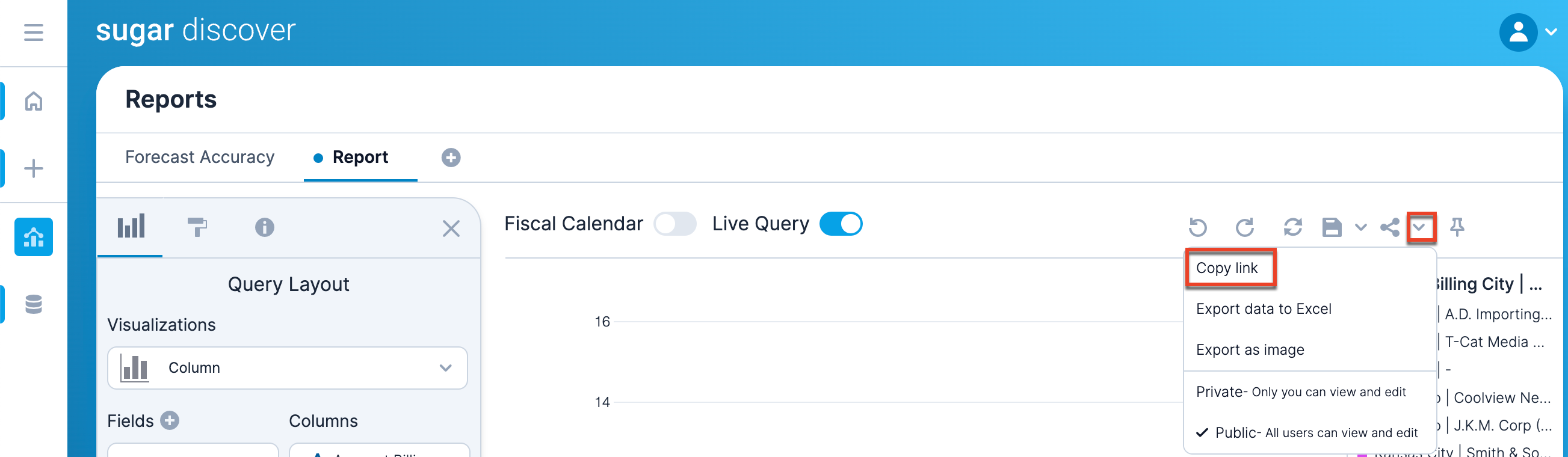
Note that the link will only work for another user if the report is a public report. If the report is private, the user will be directed to the Library section.
Export Reports
Reports can be exported either as data to an Excel file or as an image to a .png file. To share a report, click the arrow next to the Share icon and select either "Export data to Excel" or "Export as image", respectively. 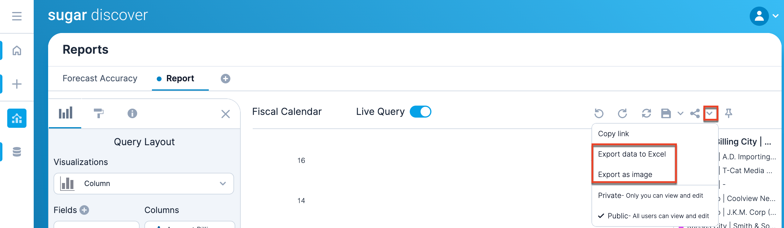
When you export the report as an image, the exported image contains the same data as is currently shown in your browser and the image has the same dimensions of your browser's viewing area. Resize your browser before exporting as an image if you would like the report image to have different dimensions.
When you export the data to Excel, you are also exporting only the currently visible data.
Display Discover Reports in Sugar Dashboards
Discover reports can be embedded into Sugar dashboards using the Sugar Discover dashlet. Please see the Dashboards and Dashlets documentation in the Application Guide for information on Sugar dashboards and how to use the Sugar Discover dashlet.
Report Creation Tutorial
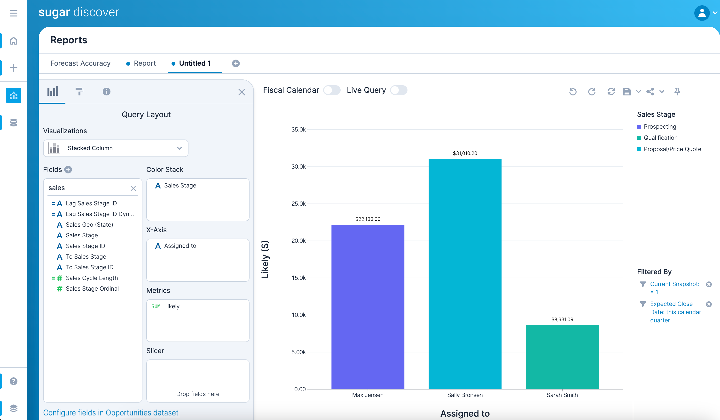
This tutorial provides the basic steps of building a report. The report will summarize the likely revenue for opportunities (i.e., Likely field in Sugar) with an expected close date in the current quarter grouped by the assigned to user. The opportunities will be divided by the current sales stage.
- Create a new report using the Quick Create button on the navigation bar.
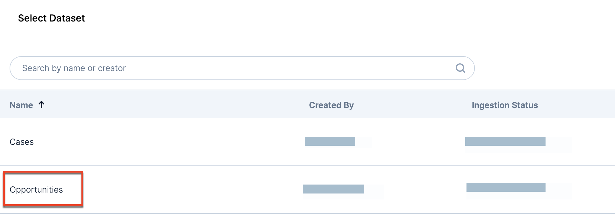
- If necessary, select the Opportunities dataset.
- In the Query Layout panel, select the Stacked Column visualization type:
Note: A filter for Snapshot Date = Today is automatically added to your report so that the report is showing the current state of the data. - Filter the report to show only opportunities with an expected close date in the current quarter:
- Find the Expected Close Date field in the Fields list.
- Click on Expected Close Date and choose "Filter..."
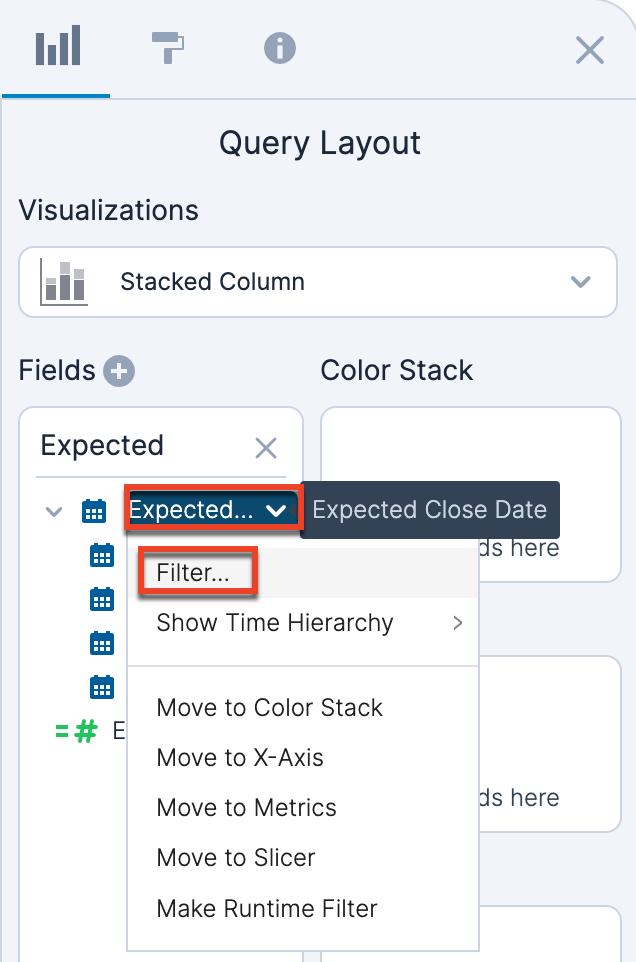
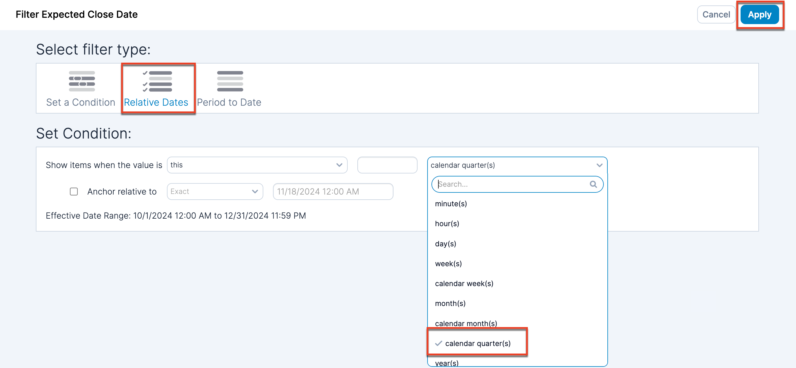
- With a Relative Dates filter type, set the condition to show items when the value is in this calendar quarter(s). Then click "Apply".
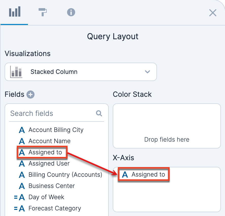
- Add the Assigned to field to the X-Axis shelf.
- Add the Likely field to the Metrics shelf.
- Add the Sales Stage field to the Color Stack shelf.
- You now have a report showing the likely revenue by assigned to user broken down by the current sales stage for the current quarter.
- Use the Save button to save your report.