Understanding Action Buttons vs wTools Custom Buttons
Overview
The ActionButton field type introduced in version 11.1.0 of Sugar Sell, Serve, and Enterprise was developed from the wTools Custom Buttons package from W-Systems. While Sugar Action Buttons incorporate most of the functionality that existed in the wTools Custom Buttons package, there are some differences that are important to understand. If you previously installed the W-Systems product and are upgrading to Action Buttons, this article describes the differences between the two solutions to help you determine whether you should continue to use your existing buttons, create new buttons, or both.
To learn more about Action Buttons in Sugar, please refer to the Action Buttons documentation in the Administrator Guide.
Comparison Tables
The following tables identify the feature and user interface differences between the ActionButton type field in Sugar and the wTools Custom Buttons package.
Feature Availability
| Feature | Sugar Action Buttons | wTools Custom Buttons |
| Field type name | ActionButton | wRecord Button |
| Availability in views |
|
All views |
| Available actions |
|
|
User Interface Changes
The Configure Buttons layout in Studio has been redesigned to improve usability over the original wTools product. The specific changes are identified in the table below.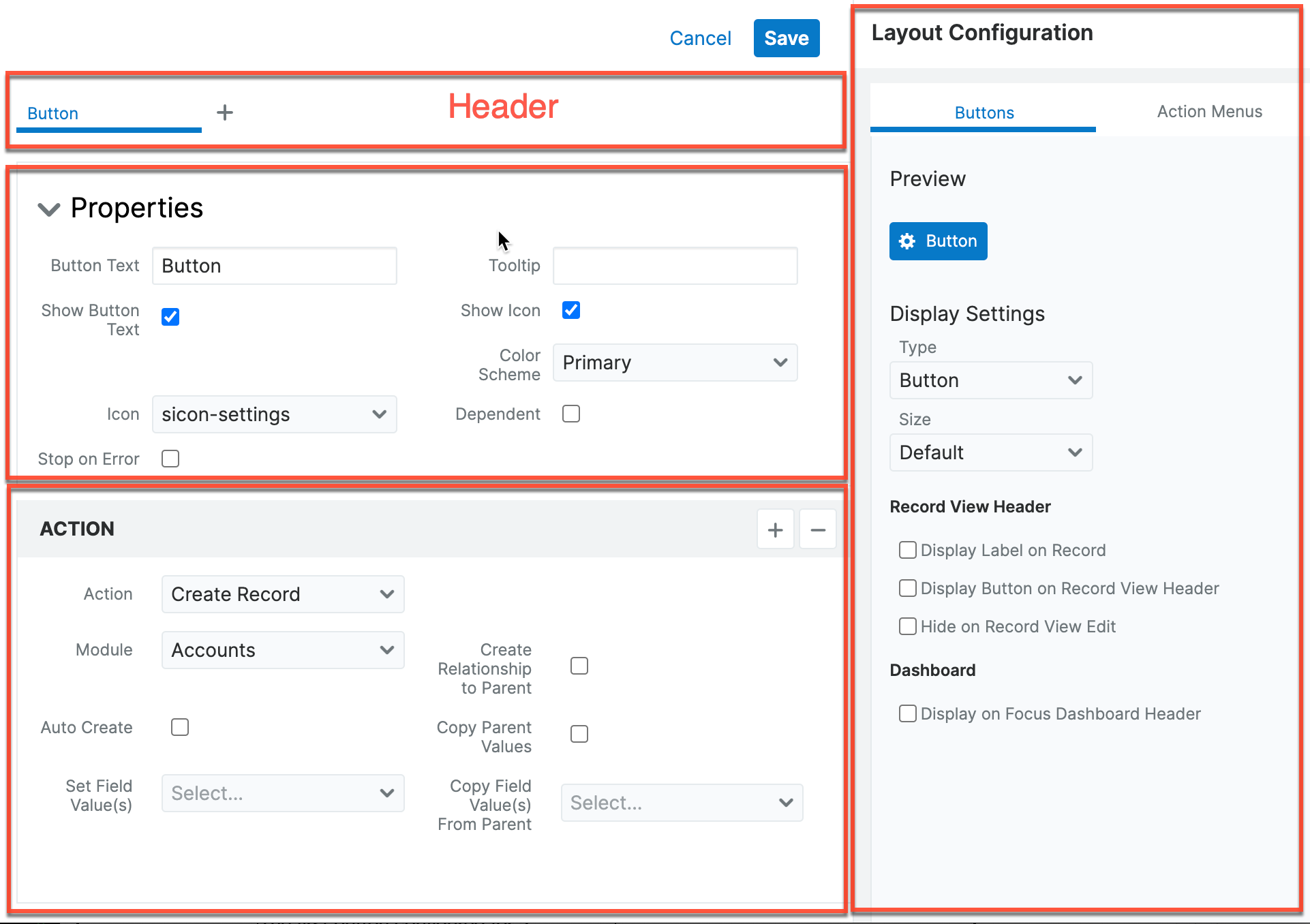
| Feature | Sugar Action Buttons | wTools Custom Buttons |
| Dropdown button style | The first button configured for a dropdown style button is functional, and the other button labels are listed in the dropdown list in the order in which they were created. | The topmost button for a dropdown style button is non-functional and displays the field's label, and the first button configured appears in the first position in the expanded dropdown list. The remaining button labels finish off the dropdown list in the order in which they were created. |
| Execute Immediately option | Not included | Included |
| Icon placement option | Not included | Included |
| Tooltip field | Added to Properties section to display button mouseover information. | Not included |
| Layout Configuration |
Button display settings moved to the Properties and Display Settings |
Button display settings included in drawer header: Button type, size, icon placement and visibility, "show in header", "show field label", and "hide on edit" options. |
| General Settings | This section of the drawer is now labeled "Properties". | This section of the drawer is labeled "General Settings". |
| Preview section | Display-only section grouped with display settings in a new "Design" panel. | Display-only with Tips subsection. |
Moving From wTools Custom Buttons to Action Buttons
If you previously installed the wTools Custom Buttons package and your instance is upgraded to Sugar versions 12.0 and higher, wTools Custom Buttons can still be used in parallel with Sugar Action Buttons, but users may experience some unexpected behavior in the user interface. Please note that if the wTools Custom Buttons package is uninstalled, you will need to re-create all buttons manually in Sugar.