Sugar Dashlets
Overview
Sugar dashlets allow users to build specific data, insights, and useful visualizations into their Sugar views. Dashlets live within dashboards that are available on the Home page, list view and record view intelligence panes, and focus drawers. Please note that the dashlets available to view and add will vary between the modules in Sugar. This documentation will cover information on the dashlets available throughout Sugar. For information specific to managing dashboards and dashlets in your Sugar instance, refer to the Dashboards and Dashlets documentation.
Note: You may not see dashlet Gear menus, including the Edit, Remove, and Refresh options, if you are not the containing dashboard's Assigned To user or system admin user. Any change to a shared dashboard will update the dashboard for all users.
Active Subscriptions Dashlet
The Active Subscriptions dashlet is available by default in the Sales Console and can be added to the record view dashboard of any module, custom or stock, that has one of the following:
- A one-to-one or many-to-one relationship to the Accounts module
- A relate field targeting the Accounts module
The dashlet shows a list of all of the current account's purchases that are marked "Service", have a start date in the past, and an end date in the future. The dashlet shows each purchase's name, quantity of units, and purchased line item calculated revenue amount next to "Total". A simple bar chart visualizes the time elapsed and time remaining for the subscription, which you can explicitly view by hovering your mouse over the bar. To learn more, review the Purchases and Purchased Line Items documentation.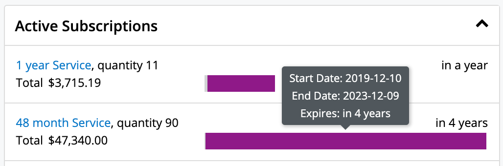
Active Tasks Dashlet
The Active Tasks dashlet allows users to view open tasks that require attention and need to be completed on a future or current date. Open tasks have a status of "Not Started", "In Progress", or "Pending Input". The dashlet is broken up into three tabs: "Due Now", "Upcoming", and "To Do", and displays a number on each tab to indicate the count of open tasks falling into each due-date range.
- Due Now: Open tasks that are due today and open tasks where the due date is in the past
- Upcoming: Open tasks that have a due date in the future
- To Do: Open tasks that have no due date specified
When placed on a user's Home page dashboard, the Active Tasks dashlet will show all active tasks assigned to the logged-in user or all active tasks that the logged-in user has team permission to view, depending on how the user has configured the dashlet's settings.
When the Active Tasks dashlet is placed on the record view for a related module (e.g., Accounts, Contacts), it will only show the active tasks that have a relationship with the current record. For example, if the Active Tasks dashlet is placed on the Account module's record view, when a user views ABC Account, the Active Tasks dashlet will only show the active tasks that are related to ABC Account.
You can close tasks as completed directly from the dashlet by clicking the Completed button to the right of the task's row. In addition, if the dashlet is on a record view dashboard, you can delete the task's relationship with the record by clicking the Unlink button to the right of the Completed button.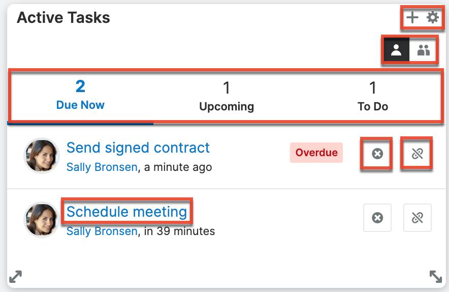
To access a task's record view, simply click the task's subject in the dashlet. You can also hover over the linked task subject and click the Focus icon to open the focus drawer, which displays a 360-degree view of the linked record through a set of dashlets containing pertinent information. There are two buttons on the upper right of the Active Tasks dashlet which allow you to toggle between viewing tasks assigned to you and all tasks to which you have access. You can click the one-person button to quickly view task records for which you are the assigned user. To remove this filter and view tasks assigned to others as well as yourself, simply click the group button to the right of the one-person button. You can also relate new tasks to the record by clicking the Plus icon on the upper right of the dashlet and selecting "Create Task". Complete the Tasks record view layout and save to create the new task. The Gear icon to the right of the Plus icon allows you to edit, refresh, close, and remove the dashlet. To collapse the dashlet, click the Gear icon then select the Close option. To expand the dashlet, simply click the Gear icon again and select "Open".
Calendar Scheduler Dashlet
The Calendar Scheduler dashlet allows you to conveniently view your calendars of choice within Sugar dashboards. The Calendar Scheduler dashlet behaves similarly to the Sidecar Calendar module.
When you add the dashlet, the following fields are available for configuration:
| Field | Description |
| Available Views | Select the calendar views that you want to have available for viewing. The selected views are available in a dropdown menu in the top right of the dashlet for you to easily switch the view. |
| Default View | Select the calendar view that you want to have as the default view. Refreshing the page or navigating to a new page resets the view to the default view. Refreshing the dashlet does not reset the view to the default view. |
| My Calendars | Check the calendars that you want to display. The calendars in the My Calendars list are the same as those in the My Calendars pane of the Calendar module. The behavior (e.g., Double-click event option) and settings (e.g., color) of these calendars also match the behavior and settings of the same calendar in the Calendar module. |
| User and Team Calendars | Check the calendars for other users and teams that you want to display. The Calendars listed in the User and Team Calendars list are the same as those in the User and Team Calendars pane of the Calendar module. You can add other user or team calendars by clicking the plus icon. See the Calendar documentation for more information. The behavior (e.g., Double-click event option) and settings (e.g., color) of these calendars also match the behavior and settings of the same calendar in the Calendar module. |
You can edit the configuration of these fields at any time by clicking the gear icon in the top right corner of the dashlet.
When viewing the Calendar Scheduler, there are several options along the top and bottom of the dashlet to help you navigate and adjust the appearance of the calendar. These options are defined as follows:
| Option | Description |
| Today | The Today button is located near the top left corner of the dashlet and lets you jump to today on the calendar. Click the left and right arrow buttons on either side of "Today" to move the calendar view backward or forward in time relative to today. For more information, refer to the Calendar documentation. |
| Date or date range | The date or date range is located along the top of the dashlet to the right of the Today button. Click the date or date range to open a date picker from which you can select a new date or timeframe. For more information, refer to the Calendar documentation. |
| View selector | Toward the upper right of the calendar view, choose which of your configured Available Views to use. For more information on the available views, refer to the Calendar documentation. |
| Users dropdown | To the right of the View selector, the Users dropdown shows a key that matches users with the colored stripes on the left side of the visible calendar events. This dropdown menu is populated only if visible calendar events include at least one internal user as a guest or owner. |
| Define Calendar Day (gear icon) | The button in the top right opens the Define Calendar Day dialog box. Set the "Start of Day" and "End of Day" to define the hours to show in day, week, work week, and timeline view. |
| Show full day | The "Show full day" button is located in the lower left corner of the dashlet. This button is shown only when your defined calendar day hours are visible in day, work week, week, and timeline view. This button expands the viewable hours beyond the calendar day that you define. Hours outside the workday are shaded blue. |
| Show Calendar Day | The "Show Calendar Day" button is located in the lower left corner of the dashlet. This button is shown only when the full day is visible in day, work week, week, and timeline view. This button collapses the viewable hours to the calendar day that you define. |
You can create, update, or delete events from the dashlet if allowed based on the calendar settings, which are defined in the Calendar module. Refer to the Calendars documentation for more information about configuring the behavior and appearance of calendars.
Cases Summary Dashlet
The Cases Summary dashlet also appears in the intelligence pane of the Accounts record view. It allows users to view status information for cases related to the specific account record. The case summary is broken up into multiple tabs (Summary, New, Pending Input, Assigned) and displays a number on each tab to indicate the relevant count of the open, closed, new, and pending cases. Please note that the record must have at least one related case in order for data to appear within the dashlet and the status tabs (Pending Input, New, Assigned) will appear if there is a related case meeting that particular status.
The dashlet is not available for Sugar Sell users. For more information on license types and the functionality available for each, refer to the User Management documentation.
The Gear icon on the upper right of the dashlet allows you to edit, refresh, and remove the dashlet accordingly. To collapse the dashlet, click the Up arrow to the left of the Gear icon. To open up the dashlet, simply click the arrow again.
Note: Dashlet Gear menus, including the Edit, Refresh, and Remove options in the Case Summary dashlet, are only available to the containing dashboard's Assigned To user and system admin users.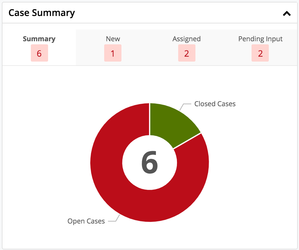
The Summary tab displays a donut chart that shows the breakdown of open cases versus closed cases. If you hover over the breakdown it will display the number of open and closed cases for the record. The Pending Input tab displays a list of all pending cases related to the current record. The New tab displays a list of all new cases related to the current record. The Assigned tab displays a list of all open cases related to the current record. Users can easily view the case details by clicking the record's subject link under each tab. Please note that you can also mark a case as a favorite by clicking the star icon to the left of the case subject under each tab (Pending Input, New, Assigned).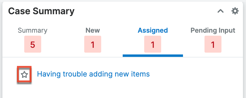
Cloud Drive Dashlet
The Cloud Drive dashlet provides users with a way to upload, download, and view documents in their connected Dropbox, Google Drive, or Microsoft OneDrive accounts. Admins must set up the Dropbox, Google, and/or Microsoft connector before end users can connect to their Dropbox, Google, or Microsoft accounts. For more information, please refer to the Cloud Drive documentation.
Comment Log Dashlet
The Comment Log dashlet is available to add to Sidecar record views and displays the contents of the Comment Log field for the current record. It lists the entries in descending order with the newest at the top. You can also quickly create new entries by typing in the open text box then clicking the "Add" button. The dashlet shows the three most recent entries but you can open the rest of the entries by clicking "View All". If another user adds an entry while you are viewing the dashlet, you must refresh the dashlet to see the new entry. The Comment Log dashlet is also included automatically in the Sales Console and SugarLive. For more information about comment logs including mentioning records and users, refer to the User Interface documentation.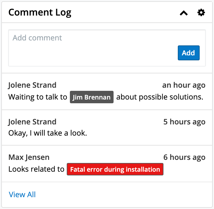
Console List View Dashlet
The Console List View dashlet is similar to the List View dashlet in that it displays a filtered list of records belonging to a specific module. However, clicking a record in the Console List View dashlet opens it within the context of the console it is placed in rather than opening its record view. This dashlet is only available in the Detail panel of SugarLive on the Search, Account, and Contact tabs. In these tabs, it is used to show a complete or contextual list of either contacts or cases that can be opened directly within SugarLive's Detail panel.
An admin can configure the list to be filtered by any out-of-the-box or saved custom filter on the Contacts or Cases module by editing the dashlet. In addition, the search bar allows you to search by keywords in certain fields on each module:
Contact fields:
- First Name
- Last Name
- Account Name
- Email Address
- Office Phone
Case fields:
- Case Number
- Subject
- Account Name
To find fields with your search text in the middle or at the end, use the wildcard character (%) at the beginning of your search. For example, enter "%operations" to find all records with the word "operations" in one of the searchable fields.
DocuSign Dashlet
The DocuSign dashlet provides users with a way to manage DocuSign envelopes and drafts and send new documents to DocuSign for electronic signature. For more information, please refer to the DocuSign Integration documentation.
History Dashlet
The History dashlet allows users to view a history of the record's related activities (e.g., calls, meetings, emails) that have already taken place. The activity types are broken up into three tabs (Meetings, Emails, Calls) and a number on each tab indicates the relevant count of historical activity records. You can also filter (Last 7 Days, Last 30 Days, Last Quarter) the History dashlet to only display a specific subset of the activities meeting the set time frame.
Clicking the Plus icon on the upper right of the dashlet displays the Archive Email option which allows users to manually enter received emails for historical purposes. An explicit relationship is formed between an archived email and the current record while implicit relationships are also created to other records based on any email addresses entered in the email. Simply enter the required information (e.g., Date Sent, From, Subject) along with the email body in the Compose Email window, then click "Archive" to save the email record. Please note that the archived email will display in the record's Emails subpanel as well as in the History dashlet. The Gear icon to the right of the Plus icon allows you to edit, refresh, close, and remove the dashlet accordingly. To collapse the dashlet, click the Gear icon then select the Close option. To expand the dashlet, you can simply click the Gear icon again and select "Open".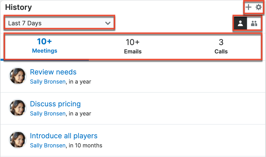
Hovering over the linked call, meeting, or email subject will display a Focus icon, which can be clicked to open the focus drawer. In addition, there are two buttons on the upper right of the History dashlet which allow you to toggle between viewing the record's activities assigned to you and activities assigned to users in other teams. You can click the one-person button to quickly view the record's calls, meetings, and emails for which you are the owner. To view the record's activities for all users on your team, simply click the group button to the right of the one-person button.
Inactive Tasks Dashlet
The Inactive Tasks dashlet allows users to view tasks that are on hold or have already been completed. The dashlet is broken up into two tabs, "Deferred" and "Completed", and displays a number on each tab to indicate the count of tasks falling into each status.
When placed on a user's Home page dashboard, the Inactive Tasks dashlet will show all inactive tasks assigned to the logged-in user or all inactive tasks that the logged-in user has team permission to view, depending on how the user has configured the dashlet's settings.
When the Inactive Tasks dashlet is placed on the record view for a related module (e.g., Accounts, Contacts), it will only show the inactive tasks that have a relationship with the current record. For example, if the Inactive Tasks dashlet is placed on the Account module's record view, when a user views ABC Account, the Inactive Tasks dashlet will only show the inactive tasks that are related to ABC Account.
When the dashlet is on a record view dashboard, you can delete the task's relationship with the record by clicking the Unlink button on the task's row. 
To access a task's record view, simply click the task's subject in the dashlet. You can also hover over the linked task subject and click the Focus icon to open the focus drawer, which displays a 360-degree view of the linked record through a set of dashlets containing pertinent information. There are two buttons on the upper right of the Inactive Tasks dashlet which allow you to toggle between viewing tasks assigned to you and all tasks to which you have access. You can click the one-person button to quickly view task records for which you are the assigned user. To remove this filter and view tasks assigned to others as well as yourself, simply click the group button to the right of the one-person button. You can also relate new tasks to the record by clicking the Plus icon on the upper right of the dashlet and selecting "Create Task". Complete the Tasks record view layout and save it to create the new task. The Gear icon to the right of the Plus icon allows you to edit, refresh, close, and remove the dashlet. To collapse the dashlet, click the Gear icon then select the Close option. To expand the dashlet, simply click the Gear icon again and select "Open".
Knowledge Base Search Dashlet
The Knowledge Base Search dashlet gives you quick access to published knowledge base articles in the Knowledge Base module via a search bar and a tree-based view and is available to add to any dashboard in Sugar. The search bar lets you find articles with matching titles or contents; to search, simply enter a keyword and a dropdown will appear containing matching articles. Below the search bar, you can see a tree-based view showing the structure of the knowledge base. Here, you can navigate through the folders to browse published articles in specific categories and click articles to open them. Clicking an article in the search results or the tree-based view opens it in a new browser tab.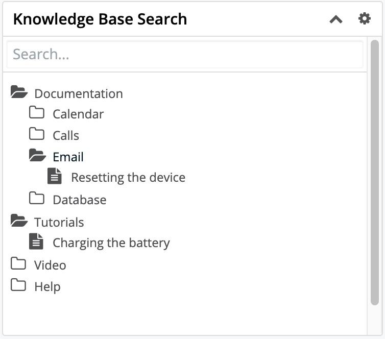
Leads Conversion Prediction Dashlet
When the Lead Prediction model is enabled for SugarPredict, the Leads Conversion Prediction dashlet is available to add to the Leads record view dashboard. The dashlet contains information specific to the lead you are viewing in terms of the likelihood it will convert. For information, refer to the SugarPredict User Guide for Sugar Sell documentation.
List View Dashlet
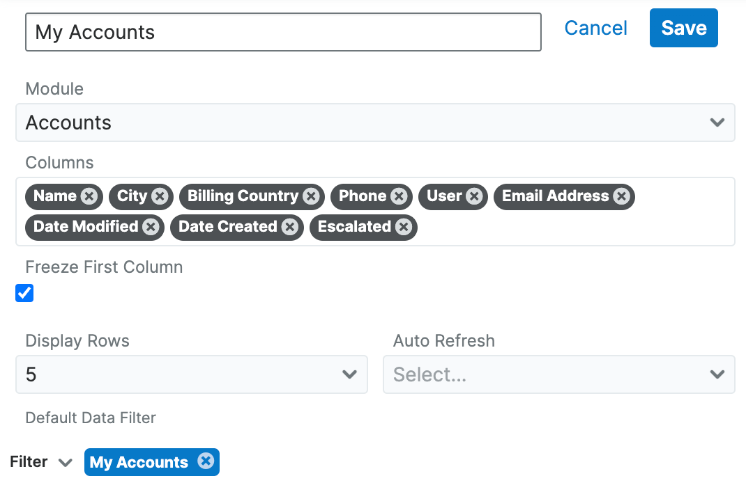
The List View dashlet enables users to view a filtered list of records belonging to a specific module (e.g., Accounts, Contacts, Leads). When configuring the dashlet, simply select the primary module (e.g., Accounts, Contacts, Leads) you wish to view a list of records for along with the filters (e.g., columns, display rows) you wish to apply. Please note that the dashlet title (e.g., My Accounts, My Contacts) will vary based on the primary module selected when adding the dashlet. Certain modules (e.g., Accounts, Contacts, Leads) in Sugar display the List View dashlet by default in their list view's intelligence pane. For example, if you navigate to the Contacts list view, the My Accounts dashlet will appear in the intelligence pane dashboard.
Once added, you can configure the dashlet as necessary by clicking the Gear icon on the upper right if you wish to change the designated module for the dashlet, apply predefined or custom filters, etc. Please note that any changes made by the administrator to the List View layout in Studio affect the list of available fields in the module's list view dashlet layout. The deployed changes will not display automatically in the corresponding module dashlet and users will need to edit the dashlet in order to view the changes in the Columns field, add new fields to the layout, etc. For more information on editing the List View layout in Studio, please refer to the Studio documentation in the Administration Guide.
The following are the most common options available when filtering and configuring the list view dashlet:
- Title: Change the displayed name of the dashlet.
- Module: Change the module that the dashlet is displaying records from by selecting a different module from the list.
- Columns: Choose the field columns you wish to display on the dashlet. To remove a field column, simply click the "x" to the right of the field name.
Note: The field columns available to add to the dashlet are based on the specified fields in the List View layout in Studio. Any changes made to the List View layout in Studio will be reflected in the Columns field. For more information on configuring the List View layout, please refer to the Studio documentation in the Administration Guide. - Freeze First Column: Specify whether or not the first column of the list should remain visible when scrolling horizontally within the dashlet. Note that an admin can disable this feature for the whole Sugar instance. See the User Interface page for details on column freezing and the System page for details on the system-wide admin setting.
- Display Rows: Specify how many rows or results this dashlet will display at once. Please note that the maximum is twenty rows.
- Auto Refresh: Choose a time frame to have the dashlet query automatically refresh.
- Filter: Click the Filter option to select a pre-defined filter or create a new filter to be applied to the List View dashlet.
Note: The My filter (e.g., My Accounts) is selected by default.
The following are options that are only available when configuring a list view dashlet on a record view:
- Relate to current record: Specify if the dashlet will be filtered to only list records related to the record you are viewing.
- Linked field: This field is shown only when "Relate to current record" is enabled; the dropdown will display all of the fields in the selected module that link back to the current record. In most cases, there will only be one field listed, but there are a few exceptions. For example, a Quotes list view dashlet on the Accounts record view can link to quotes where the account is either the billing account or the shipping account. Specify which of these account fields should link to the current record.

Creating a Filter
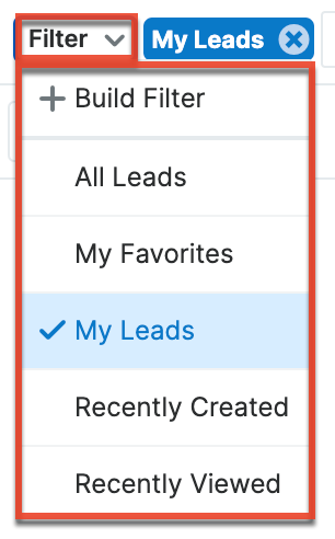
The Filters section of the Configuration Options page allows you to filter your dashlet based on pre-defined filters (e.g., My Favorites, Recently Created) as well as create custom filters. For example, if you select "My Contacts" in the Filter options, the List View dashlet will only display contact records that are assigned to you. To see all records to which you have access, simply select the All option in the filter.
The following Filter options are available to filter the List View dashlet:
- Create: Create a new custom filter that you can use to filter the List View dashlet
- All "Module": Select this filter to display all records in the module to which you have access
- My Favorites: Select this filter to only display records you have marked as favorites
- My "Module": Select this filter to only display records assigned to you
- Recently Created: Select this filter to only display records you created in the module within the last 7 days
- Recently Viewed: Select this filter to only display records you have viewed in the module within the last 7 day
Users can also create new filters via the Create option in the Filter list. This allows users to add custom, complex filter options when filtering the List View dashlet. You have the option to add multiple fields to your new filter by clicking the Plus button to the right of the filter selection dropdown lists. Please note that each one of the filter's criteria needs to be true for a record in order for it to appear in the List View dashlet. The fields available to filter the dashlet are based on specified fields in the Search layout in Studio. Any changes made to the Search layout in Studio will be reflected in the filter's field dropdown list. For more information on configuring the Search layout, please refer to the Studio documentation in the Administration Guide.
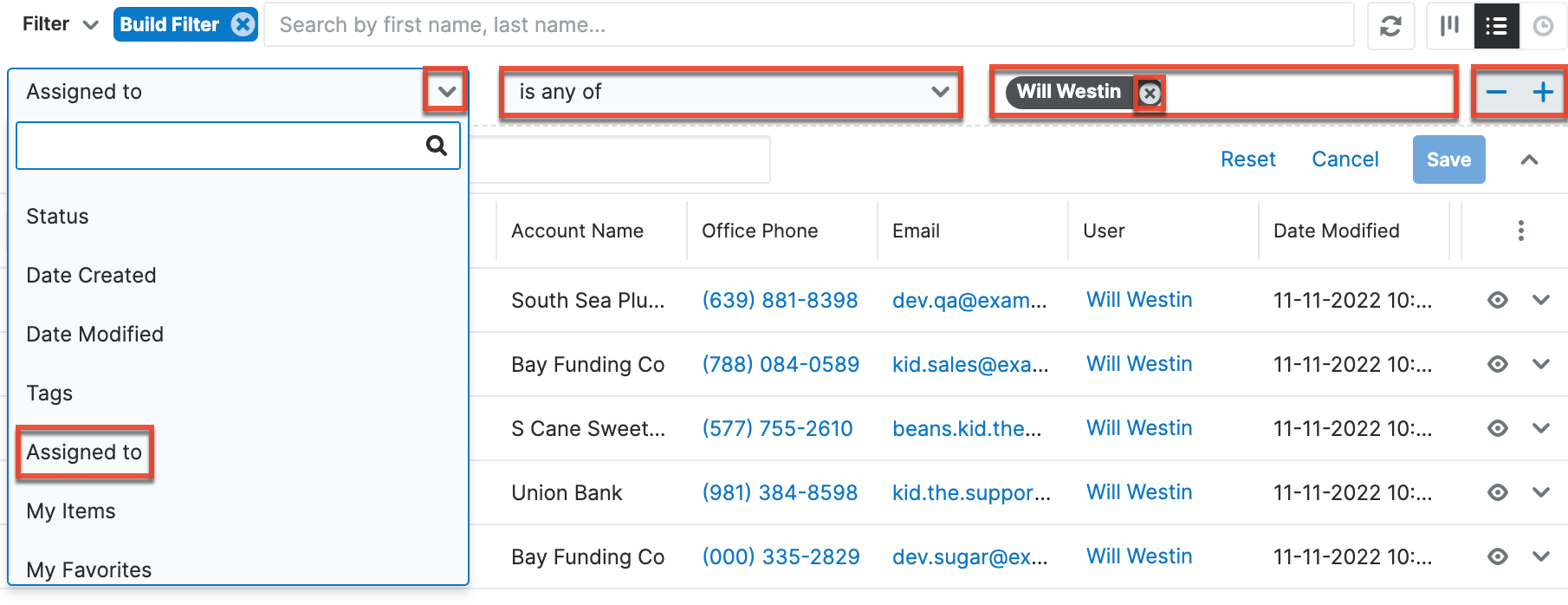
The following steps cover creating a new filter for contacts assigned to Will Westin as an example:
- Click the Filter option on the Configuration Options page then select "Build Filter".
- Select the field (e.g., Assigned to) you wish to add to your filter as well as the condition (e.g., is) and matching criteria (e.g., Will Westin).
Note: Only fields you have view access for will be available to add to the Filter list. - To add additional fields to the new filter, click the Plus button to the right of the filter.
- To remove fields from the new filter, click the Minus button to the right of the filter.
- To clear any filter values (e.g., Will Westin), simply click the "x" to the right of the value.
-
Enter a name for the new filter (e.g., "Contacts assigned to Will Westin").
-
Click "Save" to add this filter to the dashlet list view's Filter options.

The custom filter will automatically be applied to the dashlet upon saving and all records meeting the filter criteria will display. Please note that you can edit the custom filters at any time by selecting the filter (e.g., Contacts assigned to Will Westin) from the Configuration Options page, then clicking the name that appears to the right of the Filter option. Simply make the necessary changes to the custom filter then click "Save" to preserve and apply the changes to the dashlet.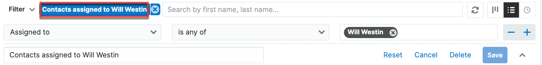
When viewing the List View dashlet, the first set of records meeting the filter criteria will be displayed, and you can use the pagination controls at the bottom of the dashlet to navigate to different pages of results. The number of records per page depends on the display row number (5, 10, 15, 20) selected in the Configuration Options page. See the User Interface documentation for details on the pagination controls in different list views.
Steps to Edit a Dashlet
Every user can configure their dashlet(s) to only display the information they wish to view via the display options and filters available in the Configuration Options page.
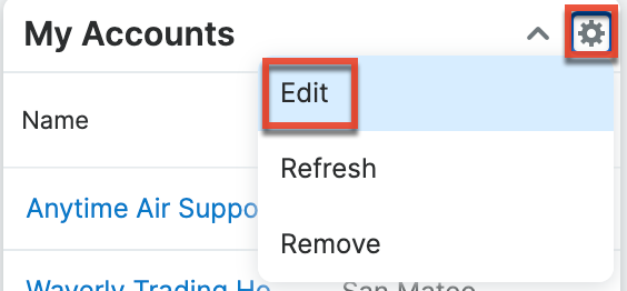
The following steps cover updating the title, display rows, columns, and only my favorites filter for the My Accounts dashlet as an example:
- Click the Gear icon at the top of the My Accounts dashlet menu bar then select "Edit".
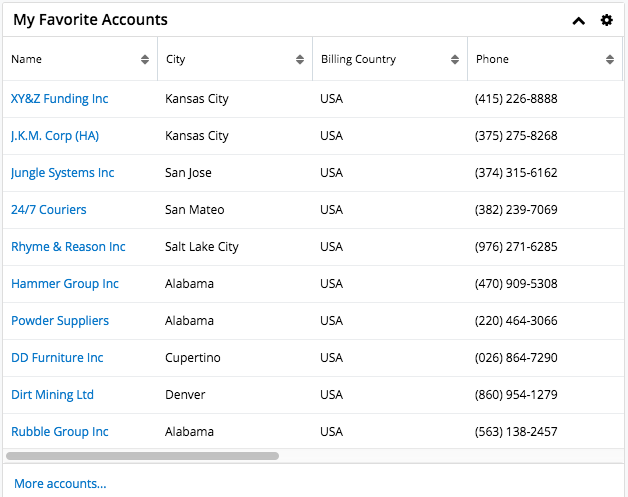
- Change the "Title" (e.g., My Favorite Accounts) and the display rows from 5 to 10.

- Click the "x" next to "Billing Country" to remove the field from the display column.
- To add columns, simply click your mouse in the Columns field then select from the list of available fields that appear below the dropdown list.
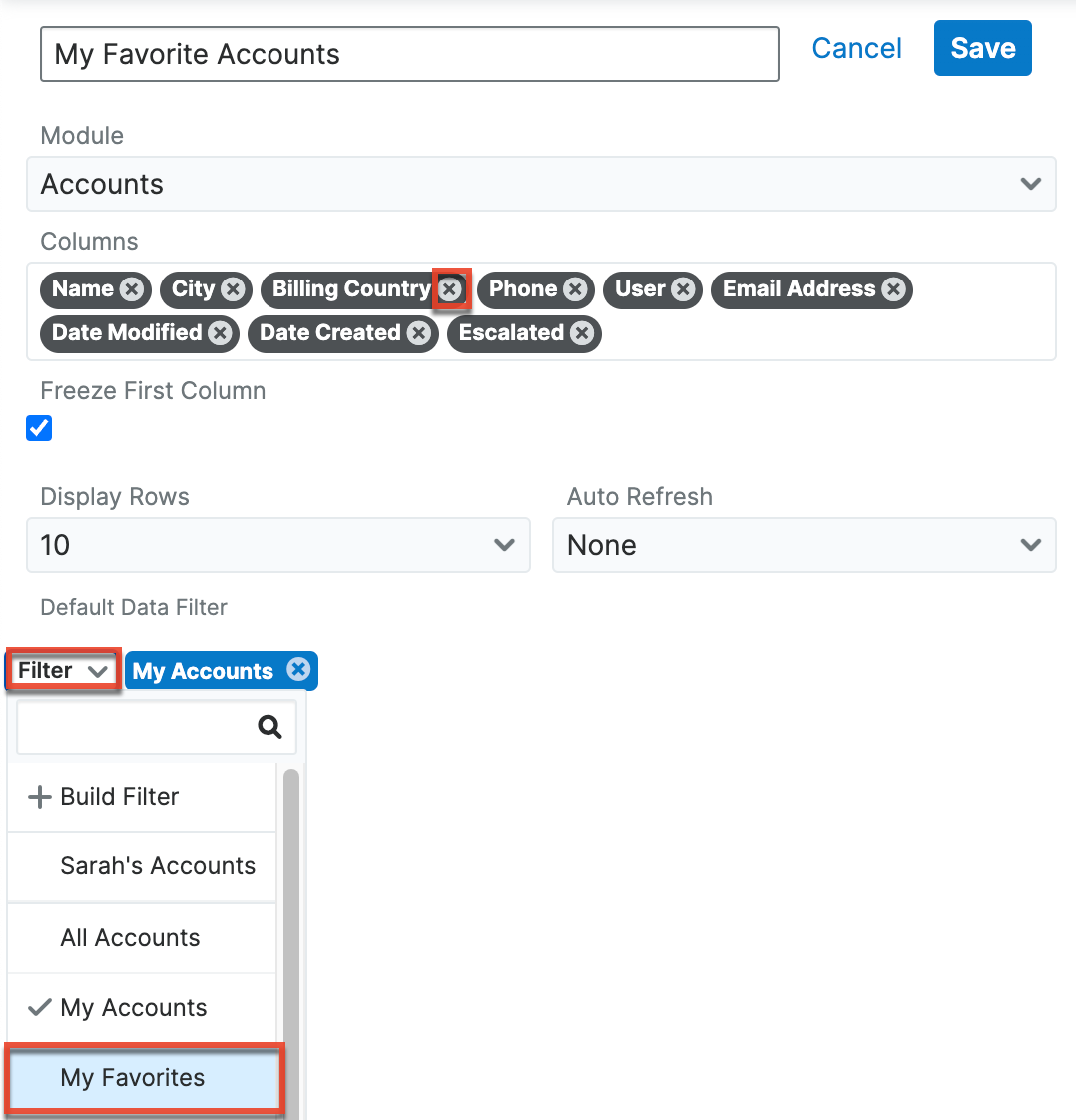
- Click the Filter option then select "My Favorites".
- Once the update is complete, click "Save" and the dashlet will reflect the changes made.
- Click "Save" on the dashboard's edit layout to apply the changes to your final dashlet view.
Multiple List View dashlets can be added to the intelligence pane as well if you wish to view the list of records for various modules. For more information on adding dashlets, please refer to the Dashboards and Dashlets page. You can also refresh and remove the dashlet by clicking the Gear icon. To collapse the dashlet, simply click the Up arrow to the left of the Gear icon.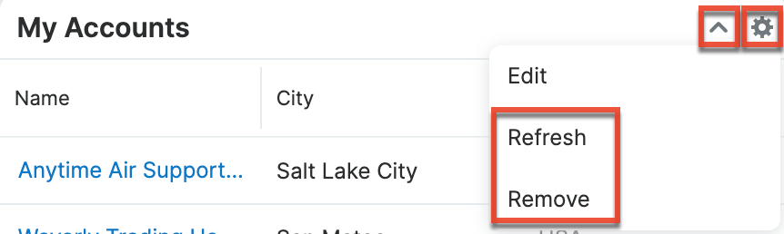
Maps Dashlet
The Maps dashlet is available for list view and record view intelligence panes. When it is used on a list view intelligence pane, the dashlet displays pins for the geocoded records in the current list.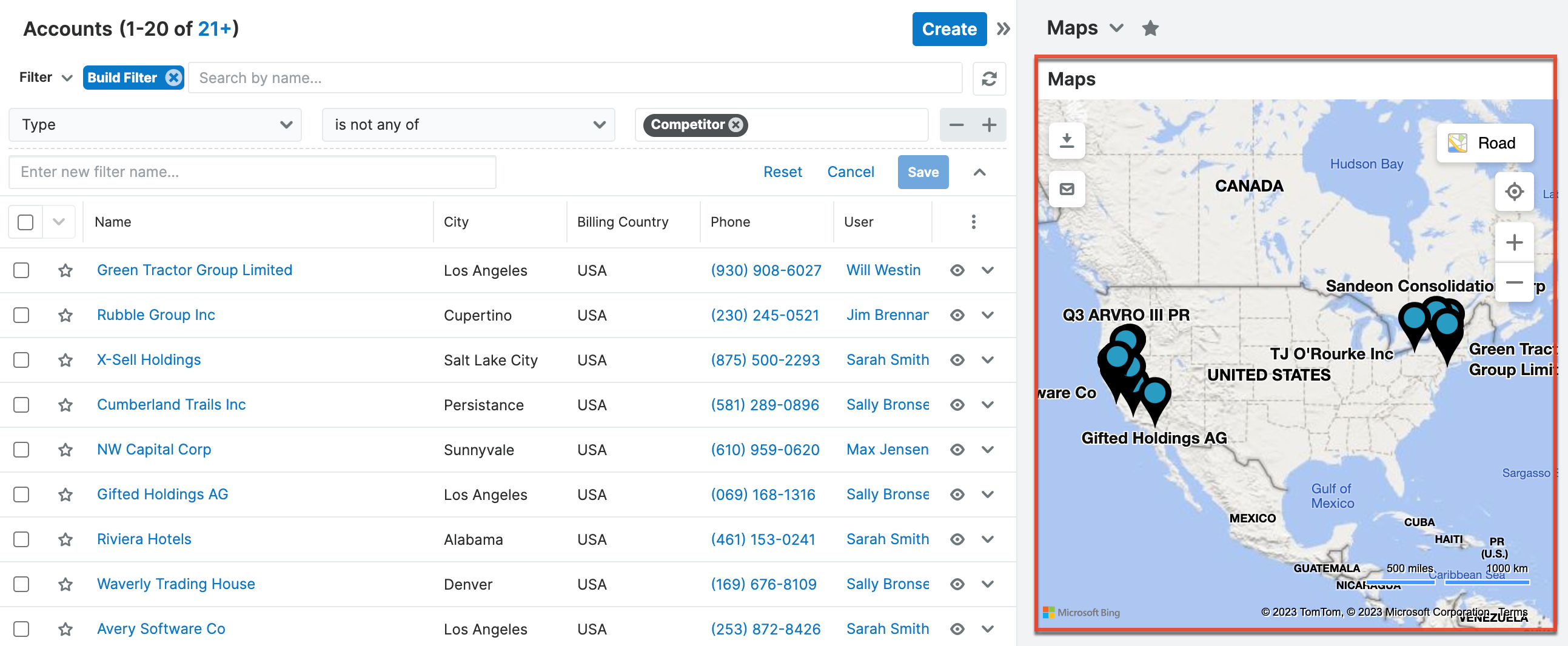
On a record view when the record is geocoded, the dashlet displays the location of the geocoded record.
When adding a dashlet to your dashboard, you can set the default map type and zoom level. The Map Type can be “Road” (display roads and some topographical shading), “Aerial” (satellite imagery), or “Dark Road” (dark mode of the Road style). 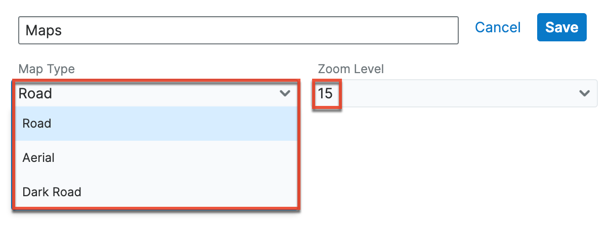
For information on how to interact with the options in the map interface, as well as general information on using maps in Sugar, refer to the Sugar Maps documentation.
My Activity Stream Dashlet
The My Activity Stream dashlet displays the user's main Activity Stream within a dashboard, eliminating the need to navigate to the Activity Streams view to monitor the most recent stream activities. Like other Activity Stream views, the dashlet supports inline commenting on specific stream activities, but it does not allow record previews. For more information on Activity Streams, please refer to the Activity Streams documentation.
Note: Activity Streams are disabled by default. If you cannot access activity streams, the feature may be enabled via Admin > System Settings. For more information, refer to the System documentation in the Administration Guide.
The Gear icon on the upper right of the dashlet allows you to edit, refresh, and remove the dashlet accordingly. To collapse the dashlet, click the Up arrow to the left of the Gear icon. To open up the dashlet, you can simply click the arrow again.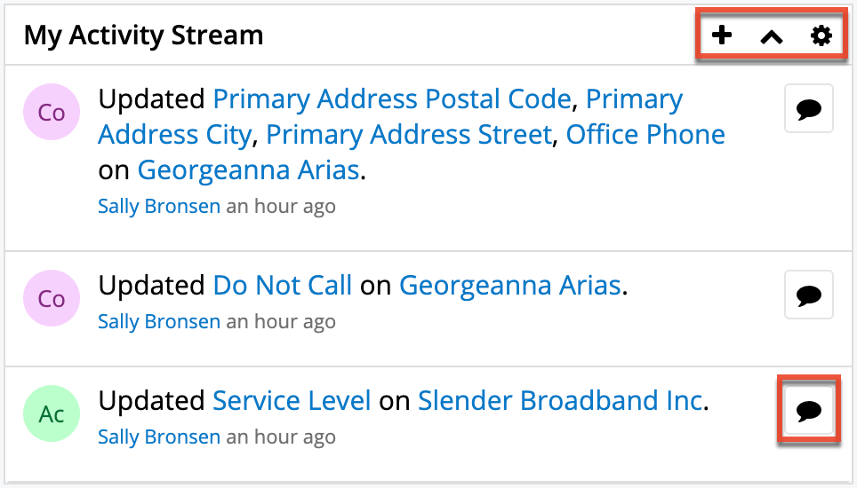
When added to an Intelligence Pane, the My Activity Stream dashlet will display stream items in context to the data within the main container of the page. For example, if you add the dashlet to a dashboard on the main Accounts module page, the main container of the page contains the Accounts list view. Therefore, the My Activity Stream dashlet will restrict activity stream items to only those activities related to the Accounts module. Similarly, if the dashlet is added to the Opportunity module's Intelligence Pane, the My Activity Stream dashlet will restrict activity stream items to only those activities related to the Opportunities module. If the My Activity Stream dashlet is added to any record view's Intelligence Pane dashboard, the dashlet will restrict activity stream items to only those activities related to the record displayed in the main container on the page.
To filter the My Activity Stream dashlet, edit the dashlet and click once on the Filter button. Choose any of the pre-defined Activity Stream filters, such as "Messages for Post", which will restrict the stream to only items that were posted by users, and then click "Save". For more information on Activity Stream filters, please refer to the Activity Streams documentation.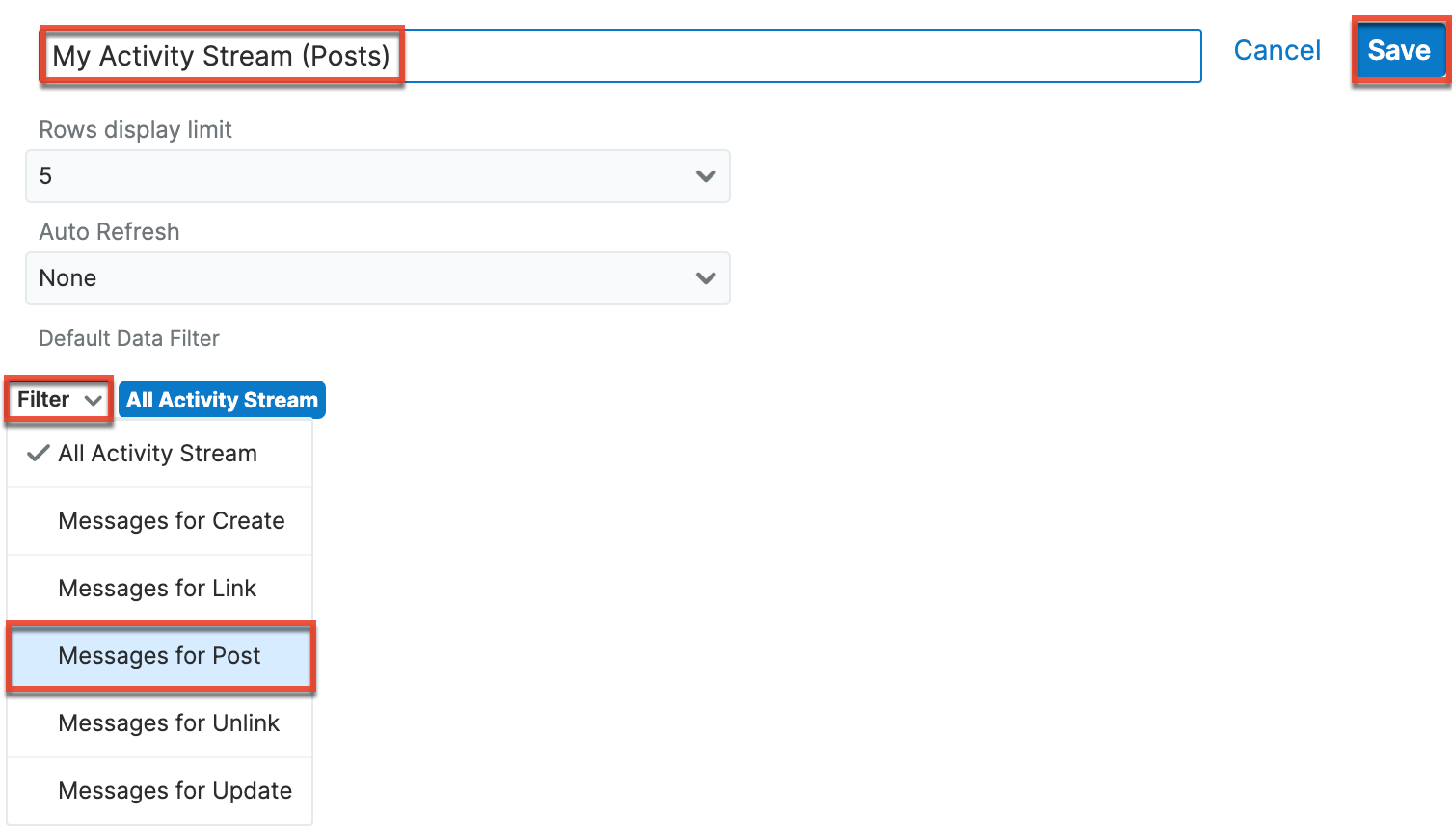
It is good practice to also rename an edited dashlet accordingly so that it is clear that this dashlet is displaying a filtered view. To change the dashlet's title, edit the dashlet, type a new name into the text box that contains the words "My Activity Stream", and then click "Save".
To add a comment or reply to the Activity Stream via the My Activity Stream dashlet, click on the Comment button next to the relevant stream entry, type your reply, and then press the Reply button. For more information about interacting with Activity Streams, please refer to the Activity Streams documentation.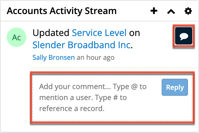
Notes & Attachments Dashlet
The Notes & Attachments dashlet allows users to relate an existing note as well as a new note record to the module record. To create a new note, click the Plus icon on the upper right of the Notes & Attachments dashlet then select "Create Related Record". Once the Notes record view layout opens, enter the necessary information then click "Save". For more information on creating notes, please refer to the Creating Records section of the User Interface documentation. To relate an existing note, click the Plus icon then select "Link Existing Record". The Search and Select Notes page will open allowing you to select the note record you wish to relate to the module record.
To delete the record's relationship to a note record, click the Unlink button to the right of the attached note post. Please note that this removes the relationship, but does not delete the record itself.
The Gear icon on the upper right of the dashlet allows you to edit, refresh, close, and remove the dashlet accordingly. To collapse the dashlet, click the Gear icon then select the Close option. To open up the dashlet, you can simply click the Gear icon again then select "Open". 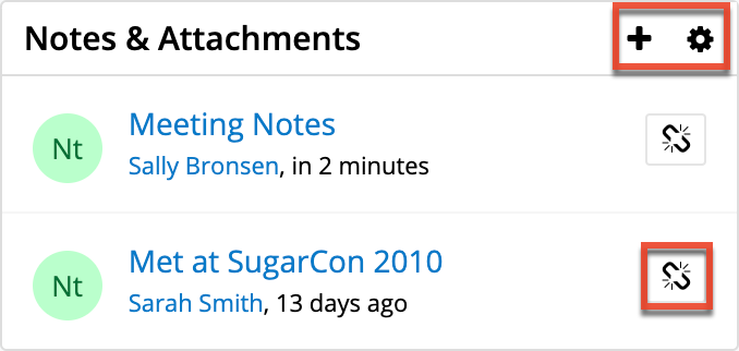
Opportunity Close Prediction Dashlet
When the Opportunity Prediction model is enabled for SugarPredict, the Opportunity Close Prediction dashlet is available to add to the Opportunities record view dashboard. When viewing an opportunity record, the dashlet shows the likelihood of the opportunity being closed-won. For information, refer to the SugarPredict User Guide for Sugar Sell documentation.
Opportunity Metrics Dashlet
The Opportunity Metrics dashlet appears in the intelligence pane of the Accounts record view. It provides information regarding opportunities related to the account that are won, lost, and active along with the relevant dollar amounts. The donut chart within the dashlet shows the breakdown of the opportunities by status and displays the total count of opportunities related to the current record you are viewing. The chart is color-coded based on the chart key to represent the won, lost, and active opportunity status.
Note: The Opportunity Metrics dashlet is not available for Sugar Serve users. For more information on license types and the functionality available for each, refer to the User Management documentation.
The Gear icon on the upper right of the dashlet allows you to edit, refresh, and remove the dashlet accordingly. To collapse the dashlet, click the Up arrow to the left of the Gear icon. To open up the dashlet, you can simply click the arrow again.
Note: Dashlet Gear menus, including the Edit, Refresh, and Remove options in the Opportunity Metrics dashlet, are only available to the containing dashboard's Assigned To user and system admin users.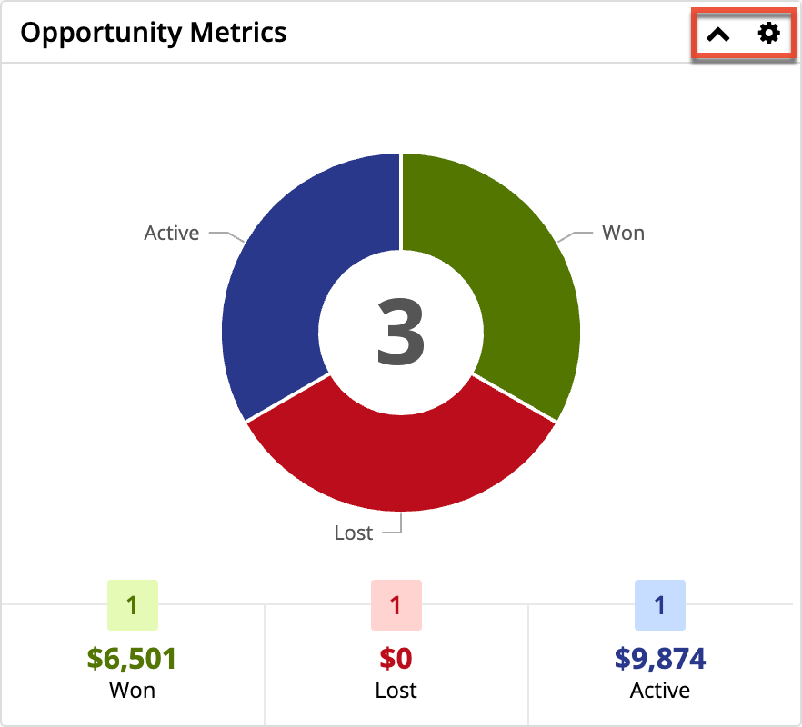
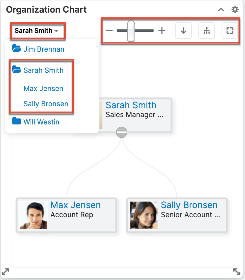
Organization Chart Dashlet
The Organization Chart dashlet illustrates the reporting structure of your organization as determined by the Reports To field in the employee records. You will only see the users who report to you and the users who report to them (i.e., two levels of employees). Click on the tile of an employee to be taken to the employee record or the minus icon on the tile to collapse their reportees' tiles. 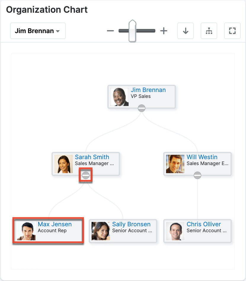
The icons along the top of the dashlet allow you to perform the following actions:
| Option | Description |
 |
Choose a user to focus the chart on. Names with a folder icon next to them have employees reporting to them; you can click their names to reveal the reportees' names. |
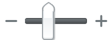 |
Zoom in and out on the chart. |
 |
Change the orientation of the organization chart from top to bottom to left to right. |
 |
Display all name tiles. |
 |
Fit the organization chart to the dashlet size. |
Pipeline Metrics Dashlet
Note: The Pipeline Metrics dashlet was known as the In Forecast dashlet in Sugar versions 13.0.x and lower.
The Pipeline Metrics dashlet appears in the Forecasts module at the top of the intelligence pane by default and gives a breakdown of how your or your team's deals match up to your quota. The dashlet may also be added to Home dashboards (e.g., Sales Console) where the metrics displayed are reflective of the current time period (e.g., 2023 Q3). When viewing the Pipeline Metrics dashlet within the Forecasts module, the metrics displayed are based on the time period selected on the worksheet. Additionally, the metric values are calculated based on the most recent updates to the worksheet(s) even if the changes have not yet been committed, and take all of the opportunities into account regardless of any filters currently being used in your worksheet. For more detailed information on forecasting, please refer to the Forecasts documentation.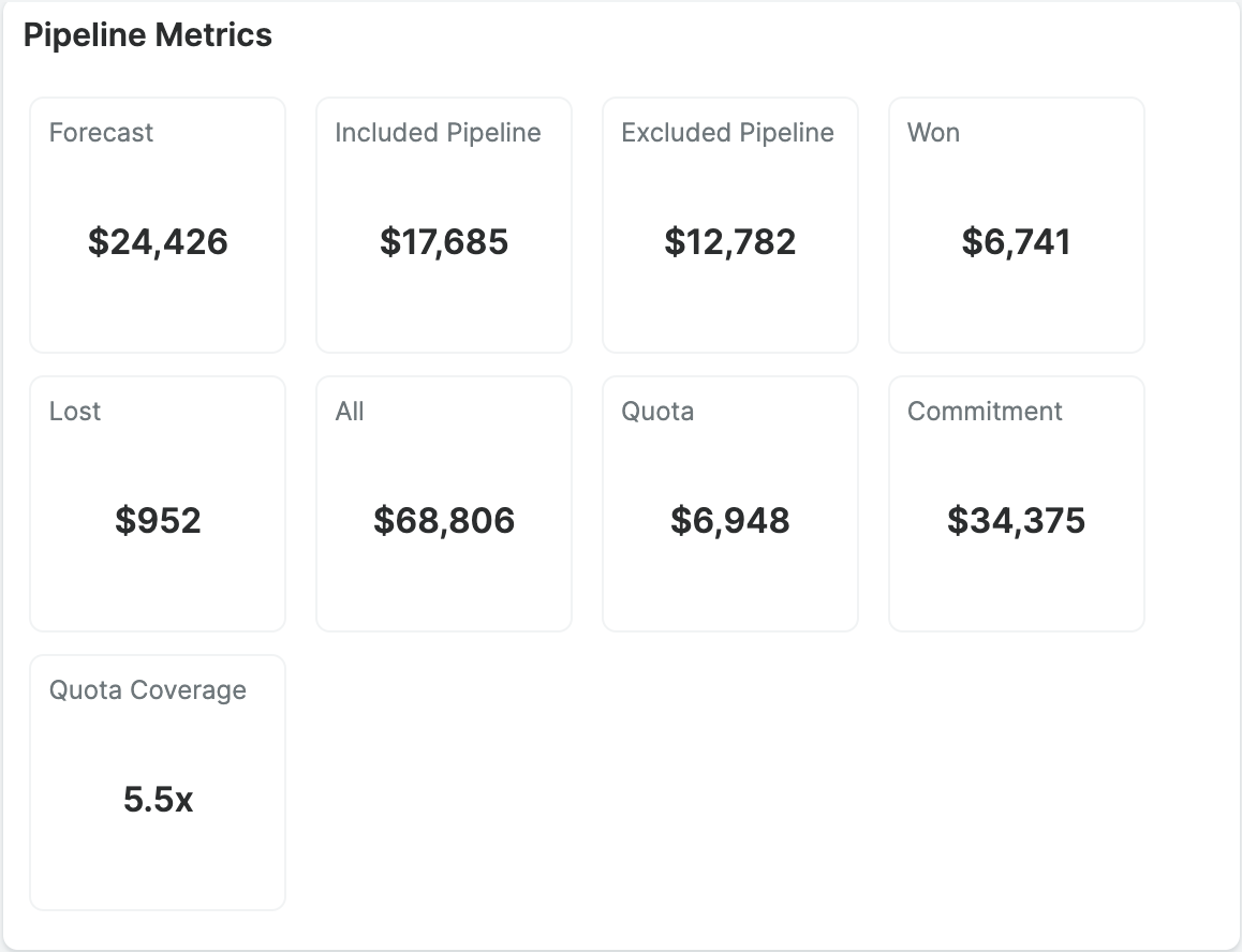
Please note, the Pipeline Metrics dashlet will only contain up to nine metric tiles, based on the configuration. The meanings of the displayed values are as follows:
| Field | Description |
| Forecast | Opportunities that have already been won or are in an included Forecast Stage. |
| Included Pipeline | Open opportunities with a Forecast Stage of Include. |
| Excluded Pipeline | Open opportunities with a Forecast Stage of Exclude. |
| Upside Pipeline1 | Open opportunities with a Forecast Stage of Upside |
| Won | The total amount of your Closed Won opportunities or, if viewing a team worksheet, those belonging to your team. |
| Lost | Opportunities that have already been lost. |
| All | All opportunities. |
| Quota | If viewing a seller worksheet, this shows the individual's personal quota for this sales time period as assigned by their manager. If viewing a team worksheet, it shows your team's quota. |
| Commitment | Likely commitment. |
| Quota Coverage | Calculated as the sum of your Included Pipeline, Won, and Lost values divided by your Quota value. |
| Gap to Quota | Calculated as the Quota value minus the Won value. |
| % Won of Quota | A percentage calculated as the Won value divided by the Quota value. |
| Quota Gap Coverage1 | Calculated as the sum of the Included Pipeline, Excluded Pipeline, and Upside Pipeline values divided by the Gap to Quota value. |
| Commitment Coverage1 | Calculated as the sum of the Included Pipeline, Excluded Pipeline, Upside Pipeline, Won, and Lost values divided by the Commitment value. |
| Gap to Commitment | Calculated as the Commitment value minus the Won value. |
| Commitment Gap Coverage1 | Calculated as the sum of the Included Pipeline, Excluded Pipeline, and Upside Pipeline values divided by the Gap to Commitment value. |
| % Won of Commitment | A percentage calculated as the Won value divided by the Commitment value. |
| Forecast Coverage1 | Calculated as the sum of the Included Pipeline, Excluded Pipeline, Upside Pipeline, Won, and Lost values divided by the Forecast value. |
| Gap to Forecast | Calculated as the Forecast value minus the Won value. |
| Forecast Gap Coverage1 | Calculated as the sum of the Included Pipeline, Excluded Pipeline, and Upside Pipeline values divided by the Gap to Forecast value. |
| % Won of Forecast | A percentage calculated as the Won value divided by the Forecast value. |
1Upside Pipeline is only included for instances configured with three forecast ranges.
The Gear icon on the upper right of the dashlet allows an admin user or the dashboard owner to edit, refresh, close, and remove the dashlet accordingly. To configure the Pipeline Metrics dashlet, click the Gear icon and select "Edit". You may choose to rename the dashlet and select up to nine metrics to display. The configuration window includes a guide on how each selected metric is calculated. Click the Save button at the top right to finalize the changes. Please note, the changes will apply to all users who have access to the dashboard where the Pipeline Metrics dashlet is being configured.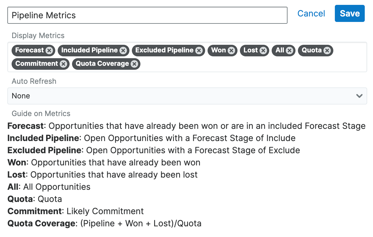
Planned Activities Dashlet
The Planned Activities dashlet provides users with a list of open or upcoming calls and meetings that are related to the current record you are viewing. The activity types are broken up into two tabs (Meeting and Calls) and a number on each tab indicates the relevant count of planned activity records. You can filter the dashlet to view either the current day's scheduled activities or upcoming activities in the future by toggling between the Today or Future button. Please note that any open activities where the start date is prior to the current date will display an Overdue status for the specific activity in the dashlet. Once the activities have taken place or are completed, they will appear within the History dashlet.
Note: Hovering over the linked call or meeting subject in the dashlet will display a Focus icon, which can be clicked to open the focus drawer.
In addition, there are two buttons to the right which allow you to toggle between viewing the record's scheduled activities assigned to you and activities assigned to users in other teams. Please note that you can use both sets of buttons (Today, Future, one person, group) concurrently to further filter and view the information you need. For example, you can click the one-person button plus the Future button if you wish to view all upcoming activities specifically assigned to you for the current record.
To create a new meeting or call, simply click the Plus icon on the upper right of the dashlet and select either "Schedule Meeting" or "Log Call". Once the Meeting or Call record view layout opens, enter the necessary information and click "Save" to create the activity. For more information on creating calls and meetings in Sugar, please refer to the Creating Records section of the User Interface documentation.
The Gear icon on the upper right of the dashlet allows you to edit, refresh, close, and remove the dashlet accordingly. To collapse the dashlet, click the Gear icon then select the Close option. To open up the dashlet, you can simply click the Gear icon again and then select "Open".
To the right of the meeting and call record's row is a set of buttons that allow you to mark the activity as held, delete the call or meeting's relationship with the current record, as well as accept, tentatively accept, or decline the call or meeting. 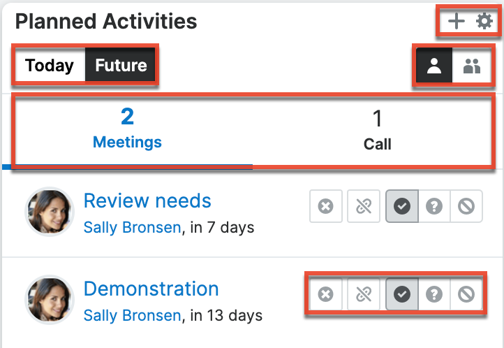
Product Catalog Dashlet
The Product Catalog dashlet allows users to easily access the Product Catalog and instantly add products from the catalog as line items on opportunities and quotes. The dashlet appears to the right of the page when creating a new opportunity or quote, and also in the Opportunities and Quotes record view intelligence pane. For more information on utilizing the Product Catalog dashlet in these modules, refer to the Opportunities and Quotes documentation.
Note: Only products with a status of "Active" are displayed in the Product Catalog dashlet.
You can also access the Product Catalog from other Sidecar modules (e.g., Home, Accounts) simply by adding the Product Catalog dashlet to the intelligence pane dashboard. Please note that unlike the Opportunities and Quotes modules, the Product Catalog dashlet will be read-only when added to other modules (excluding Accounts). You can search for products using the Search field on the dashlet as well as view details of the Product Catalog record by clicking the blue Preview icon to the right of a product's name. When viewing the details of the record, you can mark the product as a favorite by clicking the star icon on the upper left of the product catalog's record view. Once the product is marked as a favorite, it will appear in the Product Catalog Quick Picks dashlet on opportunities and quotes. When accessing the Product Catalog dashlet in the Accounts module, you can select a product from the dashlet to add as a revenue line item to the account's related opportunity. Simply click the card icon or product name in the dashlet then enter appropriate values in the Revenue Line Items record view form. Once the necessary information is entered, click "Save", and the revenue line item will appear in the Revenue Line Items subpanel in the account's record view. 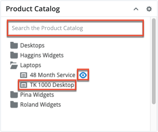
The following sections explain the various features and components of the Product Catalog dashlet.
Note: The Product Catalog records must be created before users can select products when adding line items. The Product Catalog, Product Categories, Product Types, and Manufacturers modules are accessible by all users. For more information on adding and modifying products in the product catalog, please refer to the Product Catalog documentation. When you select an item from the Product Catalog dashlet, the line item's tax class, cost, and manufacturer information will be pre-filled by values set by your administrator and therefore cannot be edited.
Viewing Products and Categories via Dashlet
In the Product Catalog dashlet, product categories are represented as folders and are organized to reflect the structure of the customer's category hierarchy. Users can search for products and categories and click on individual folders to reveal the products contained in each category. To close an expanded category folder, click on the open-folder icon.
Note: Only products with a status of "Active" are displayed in the Product Catalog dashlet.
Searching for Products and Categories via Dashlet
Users can also search for products with an active status using the Search field on the Product Catalog dashlet. Upon entering a search term, a list of matching product categories and matching products will be shown in the dashlet. If the user clicks on a category (e.g., a folder) in the list of search results, all products in the category are loaded, not only the products that match the search terms. 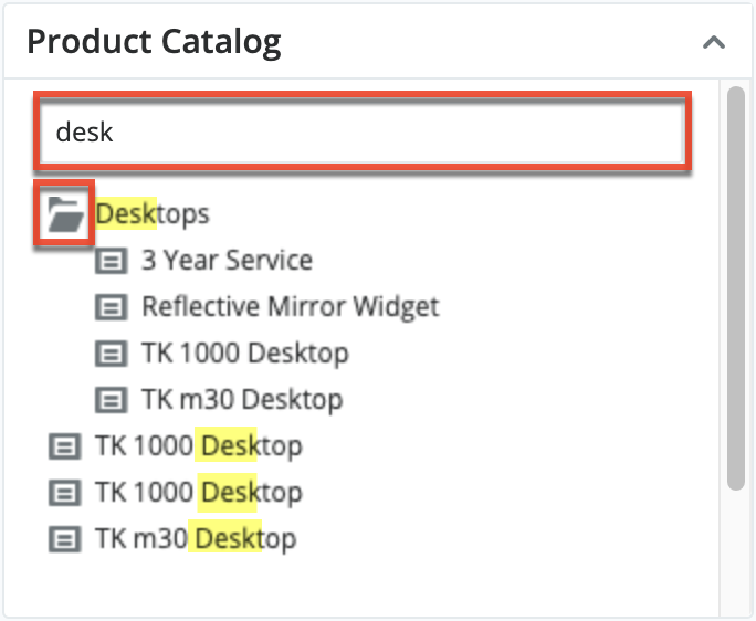
Previewing Products via Dashlet
Click on the Preview icon to the right of a product name to view the complete details of its Product Catalog record. After clicking the icon, the record's detail view opens. Click "Cancel" to close the Product Catalog record's details. 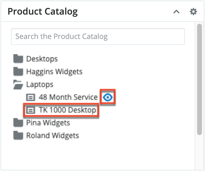
Favoriting Products via Dashlet
For products in the product catalog that you use often and would like easier access to, you can mark the product as a favorite when viewing the details of the record. Simply click the star icon to the right of the product's name in the upper left of the record view to designate it as a favorite. If you wish to remove the product as a favorite, click the star again to revert it to white. To close the product catalog record's details, simply click the Cancel button. After a product is marked as a favorite, it will appear under the Favorites tab of the Product Catalog Quick Picks dashlet. 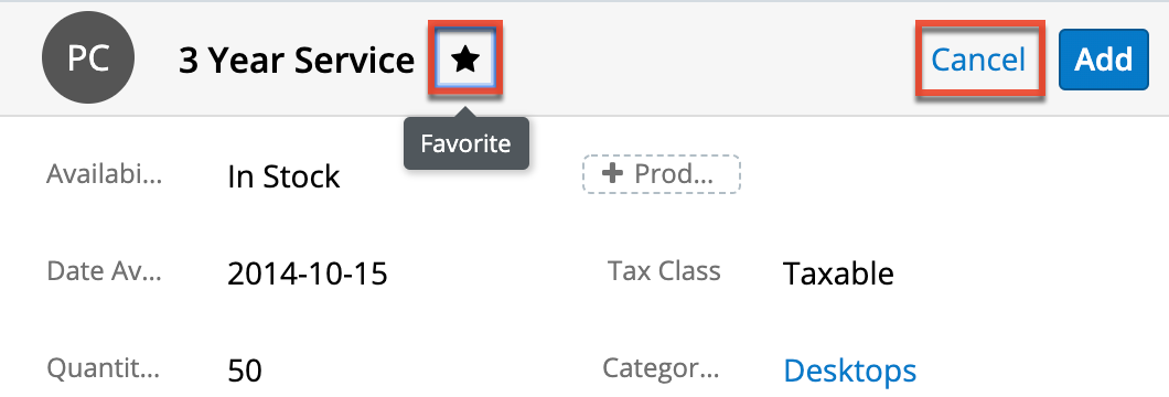
Product Catalog Quick Picks Dashlet
The Product Catalog Quick Picks dashlet provides easy access to product catalog records with a status of "Active" that you recently used or marked as favorites. The dashlet consists of two tabs (Recently Used, Favorites) and is located to the right of the page when creating a new opportunity or quote, as well as in the record view intelligence pane. The Recently Used tab allows you to see a list of active products from the product catalog that you most recently added to an opportunity or quote as a line item. While the Favorites tab displays a list of active products that you have marked as favorites. For more information on marking products as favorites, refer to the Favoriting Products via Dashlet section of this page. 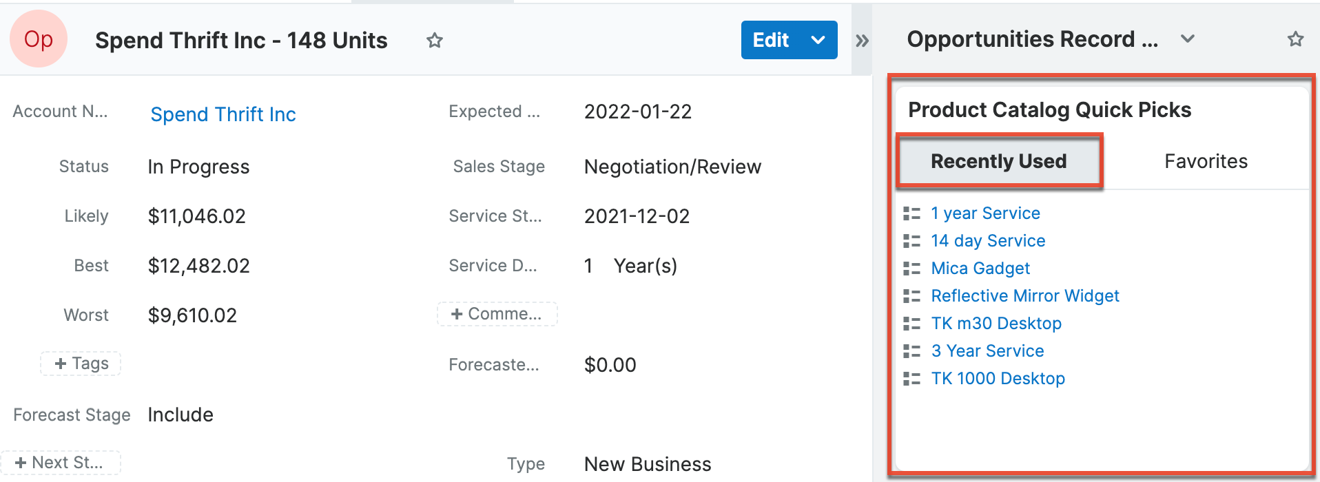
Once the product is added as a revenue line item, you can refresh the page and it will appear under the Recently Used tab of the Product Catalog Quick Picks dashlet. The dashlet will display up to 10 products that you most recently used across opportunity records.
Previewing Products via Dashlet
If you wish to view the record details of the product prior to adding it as a line item, you can hover over the product's name in the dashlet and click the preview icon. This will open the product catalog's record view. 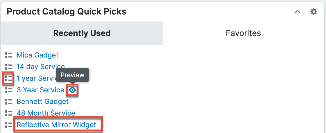
Click the Add button on the record view to add the product as a line item or click "Cancel" to close the product catalog's record view without adding the product. Please note that you can also add the product as a line item without viewing the record by clicking the card icon or the product name directly from the Product Catalog Quick Picks dashlet. 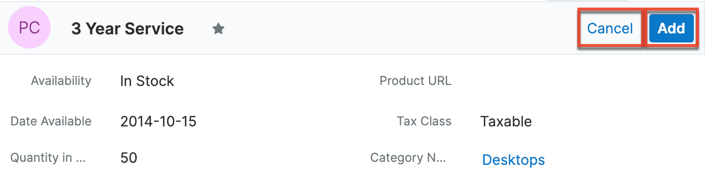
Favoriting Products via Dashlet
In addition to favoriting a product when viewing the details of the record via the Product Catalog dashlet, you can also mark a product listed in the Product Catalog Quick Picks dashlet as a favorite. Simply hover over the desired product's name (e.g., 3 Year Service) under the Recently Used tab and click the preview icon to access the product catalog record. 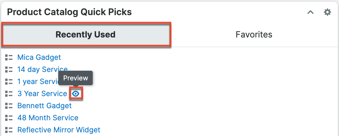
Click the star icon to the right of the product's name in the upper left of the record view to designate it as a favorite. If you wish to remove the product as a favorite, click the star again to revert it to white. To close the product catalog record's details, simply click the Cancel button.
After a product is marked as a favorite, it will appear under the Favorites tab in alphabetical order. By default, the dashlet displays 8 products per page, and you can click the left and right arrow buttons to view the next or previous list of favorited products. You can also click the card icon or the product name under the tab to add it as a line item to new or existing opportunities or quotes.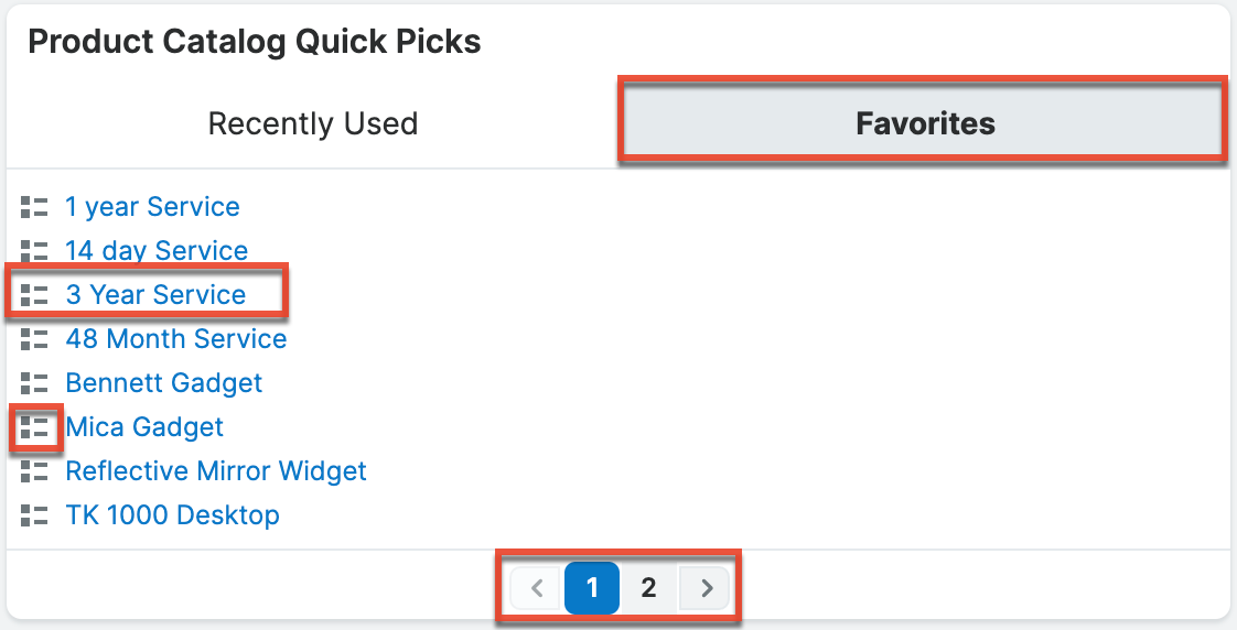
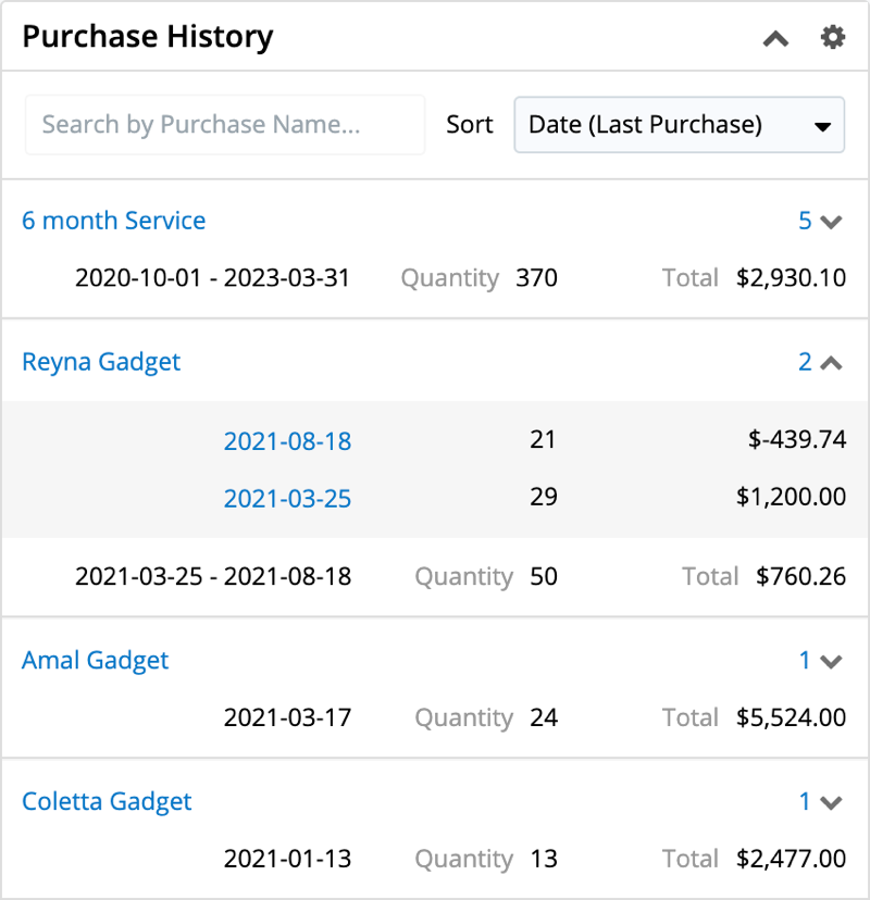
Purchase History Dashlet
The Purchase History dashlet is available to add to the Sales Console and can be added to the record view dashboard of any module, custom or stock, that has one of the following:
- A one-to-one or many-to-one relationship to the Accounts module
- A relate field targeting the Accounts module
The dashlet shows all of the current account's purchases regardless of the start or end date of the purchase record. The dashlet shows each purchase's name, date range, quantity, and total. Clicking the purchase name takes you to the purchase record view. The number of purchased line item records related to the purchase is shown above the total and can be expanded or collapsed to display or hide the purchased line item records. When expanded, the purchased line item records are displayed with their respective date ranges, quantities, and line item totals. Clicking the date ranges takes you to the purchased line item record view.
Note: You can hover over the linked purchase name or date (for purchased line items) and click the Focus icon to reveal the focus drawer dashboard, which displays a 360-degree view of the linked record through a set of dashlets containing pertinent information.
Searching and Sorting Purchase Records
The purchase records displayed in the Purchase History dashlet can be searched and sorted to make records easier to find. Search and sort can be used separately or together and will be applied to all of the related account's purchases, not only those visible in the dashlet's default view.
The dashlet search bar uses a partial string match, meaning it will return records that contain the letters you type anywhere in the name, and displays matching results as you type. For example, searching for the string "widget" would return both "Camping Widget" and "Fishing Widget". To clear the search results, click the "x" in the right side of the search bar.
When sorting the records, you have the option to sort by the following:
- Date (Last Purchase): The default sort order that displays purchases in descending order based on the value in the purchase's End Date field.
- Date (First Purchase): Displays purchases in ascending order based on the value in the purchase's End Date field.
- Price (Highest Total): Displays purchases in descending order based on the value in the purchase's Total Revenue field.
- Price (Lowest Total): Displays purchases in ascending order based on the value in the purchase's Total Revenue field.
Record View Dashlet
The Record View dashlet is available to add to all Sidecar modules except Emails and Forecasts. Admin users can configure the Record View Dashlet layout for all supported Sidecar modules as well as any custom modules via Admin > Studio. The Record View dashlet is also included automatically in the Sales Console and SugarLive. In SugarLive, it includes an additional Link button to allow agents to quickly relate a contact or case to the ongoing chat or call.
Working in the Dashlet
The Record View dashlet uses a tabbed view to allow users to see the current record view and records related to the one they are viewing. Users can configure up to six dashlet tabs including the current module (e.g., This Account) and related modules (e.g., Contacts). To open a different tab, click the name of the tab across the top. Depending on the nature of the relationship, you will see related record(s) as either a detailed record view or a list view layout.
Note: Hovering over links to Sidecar module records (e.g., contacts, emails, calls) in the dashlet will display a Focus icon, which can be clicked to reveal a focus drawer.
Single Record View
The single record view in the dashlet displays a detailed view of an individual record. This can be either the current record or a related record if the modules have a one-to-one or many-to-one relationship (i.e., there is only one possible related record to show). When viewing a single record tab, it can be edited directly in the dashlet by clicking an individual field or clicking the Edit button. Once you are done editing, click the Save button to preserve your changes. Additionally, an Actions menu is available in the Record View dashlet for modules that can be escalated (e.g., Accounts). For more information, refer to the Escalations documentation. If you wish to access the record's full-page record view, simply hover over the record's name in the single-record Record View dashlet tab, and click the arrow icon that appears to navigate to the record.
Related Records List View
If the current record may be related to many records in the dashlet's selected module (i.e., one-to-many and many-to-many relationships), a list view is displayed even if there is only one related record to show. When viewing a list of related records, records can be edited directly in the dashlet by clicking on the Edit button that appears to the right when hovering over the record or by double-clicking the row.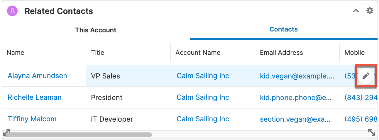
You can make in-line edits to the records and click the X icon to discard your changes or the Check icon to save your changes.
Configuring the Dashlet
To configure the tabs on the dashlet, click the Gear icon in the top right corner and select "Edit". On the screen that opens, you can specify which tabs you would like displayed in the dashlet by selecting the desired modules in the Tabs field on top. The first option will start with the word "This" and represents a record view tab of the record currently in focus. When applying the dashlet to a record view, it is recommended to remove the "This..." tab so that information is not duplicated on the screen and a related records tab can be shown first. Click the Tabs field to select more tabs or click a tab's X icon to remove it. Beneath the Tabs field, a preview of the dashlet is available. Clicking each tab allows you to view how the tab will be displayed and, for list view tabs, allows you to configure the tab. You can specify which columns to display, how many rows to display, and how often the list view data should be automatically refreshed. Tabs showing a single record cannot be configured in the dashlet as they are controlled by the module's Record View Dashlet layout which can be configured by admin users via Studio.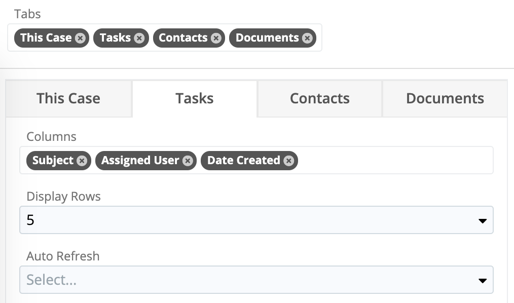
Report Dashlet
The Report Dashlet allows you to view your reports from any dashboard in Sugar. When adding a Report Dashlet, you can select any report to which you have access. Summation-type, summation with details-type, and matrix-type reports can be viewed as a chart or data table, while a rows and columns-type report can be viewed only as a data table.
When adding the Report Dashlet, you must first select your desired report via the Select a Report option on the General tab. You can either type the first few characters of the report's name and select from the type-ahead results or click "Search and Select..." below the search box to select your desired report from the Search and Select Reports drawer.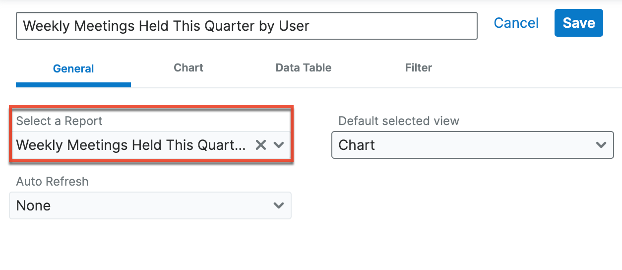
In addition, the following configuration options allow you to define how the dashlet will display. The available configuration options may vary slightly between the report types.
Note: Any time the originating report is modified, the dashlet's configurations are reset to the default values for all users and a notice is displayed the next time the dashlet is refreshed.
The General tab has controls for which report is displayed, the default view, and the refresh rate:
- Select a Report: The report to display. Type in the field or use the Search and Select Reports drawer to select a report.
- Default selected view: The default visible tab (Chart, Data Table, Filter) of the dashlet. The selected view is visible whenever the page with the dashlet is refreshed or you select "Reset to Dashlet Defaults" or "Refresh Results" from the dashlet's three-dots menu.
- Auto Refresh: The time frame (e.g., Every 30 Minutes) for the dashlet query to automatically refresh.
- Related to current record: Available only when the dashlet is on a record view or focus drawer dashboard. Filter the dashlet based on the currently-displayed record. Checking this box will reveal the Linked field dropdown for you to choose which relationship to use.
- Linked field: Choose the linked field or module subpanel to use to filter your dashlet report.
The Chart tab has options that control the look of the chart (if available for the chosen report). If the report you chose does not contain a chart (e.g., a rows and columns-type report), this tab is disabled. The Chart Preview on the right side shows how the options you choose affect a generic report (i.e., the data from your report is not displayed).
- Chart type: The type of chart (e.g., Pie Chart, Funnel Chart) to display.
- The chart type defaults to the chart type defined in the originating report.
- The available chart types may vary between reports.
- For more information on chart types, please refer to the Reports documentation.
- Options: Enable the appropriate options based on how you want to display data on the chart.
- Primary Chart Sort Order: The chart's sort order. Use the buttons next to the dropdown to choose whether to sort ascending or descending. The options are either the first group-by field listed in the Define Group By step of the Report Wizard or the first summary function (e.g., Count, SUM) listed in the Choose Display Summaries step (matrix, summation, or summation report with details report type) of the Report Wizard. Click the i icon next to the dropdown to view the field's location.
- Secondary Chart Sort Order: Available only for bar charts with more than one group-by field. You can choose whether to use the second group-by field listed in the Define Group By step of the Report Wizard.
- Bar chart value placement: Select where the chart values (e.g., End, Middle) will be positioned for bar-type charts.
- Labels: Enable the appropriate options based on how you want to display the labels and legend on the chart.
- Show total: Enable the checkbox to display the report's total value on the dashlet.
- The total value in the report chart dashlet dynamically updates to display the total as reflected in the originating report.
- Show legend: Enable the checkbox to display the full chart's legend on the dashlet.
- Show y-axis label: Enable the checkbox to display the chart's y-axis title on the dashlet.
- A title from the originating report will populate automatically, but you can specify a different title for display in the dashlet by entering a new value in the open text box.
- This option only applies to bar charts and line charts.
- Show x-axis label: Mark the checkbox to display the chart's x-axis title on the dashlet.
- A title from the originating report will populate automatically, but you can specify a different title for display in the dashlet by entering a new value in the open text box.
- This option only applies to bar charts and line charts.
- Show total: Enable the checkbox to display the report's total value on the dashlet.
The Data Table tab has options that control the sort order and display of the data table. The Data Table Preview on the right side shows how the options you choose affect a generic report (i.e., the data from your report is not displayed).
- Sort Order: The data table's sort order. Use the buttons next to the dropdown to choose whether to sort ascending or descending. The default option is the sort order of the originating report. The options are the columns listed in the Choose Display Summaries step (matrix or summation report type) or the Choose Display Columns step (summation report with details and rows and columns report type) of the Report Wizard. The sorted column has a blue background on the dashlet.
- Rows display limit: The number of rows to display in the data table. This option is available only for rows and columns-type reports.
- Show total record count: Enable the checkbox to display the data table's total record count on the dashlet.
Once the dashlet is added, click the Gear icon on the upper right to edit or remove the dashlet as necessary. To collapse the dashlet, simply click the Up arrow to the left of the three-dots menu icon.
Use the three-dots menu in the upper right of the dashlet to access the following actions:
- View Report: Open the report in the Reports module.
- Reset to Dashlet Defaults: Reset the dashlet sorting and filters to those defined when configuring the dashlet. This action resets only the current dashlet. If the dashlet is on a shared dashboard, another user's dashboard is not affected.
- Refresh Results: Refresh the report results.
- Download Chart: Download the chart image as a PNG file. The file will be named with the report name, your name, and the download date and time.
When viewing the report dashlet, use the chart (if available), table, and filter icons in the top left to toggle between the tabs. Any changes you make in these tabs are unique to your dashlet on the current dashboard. If the dashlet is on a shared dashboard, another user's dashboard is not affected.
On the chart tab, you can click the colored circles in the chart legend to toggle whether or not that segment appears in the chart. Users can also drill through to view a list of records associated with a particular chart section by clicking on the section. For more information about drilling through report charts, please refer to the Reports documentation.
You can use the data table tab to view and change the sorting of your data table. Click the column headers to change which column is sorted. Click the header again to change the sort direction of the column. Use the three-dots icon in the last column of the table to choose whether to freeze column 1. If available, you can drill into the data table using the hyperlinked text. Note that if your report is large, you may need to choose whether to view a simplified table or export the results as a CSV. Refer to the Reports documentation for more information.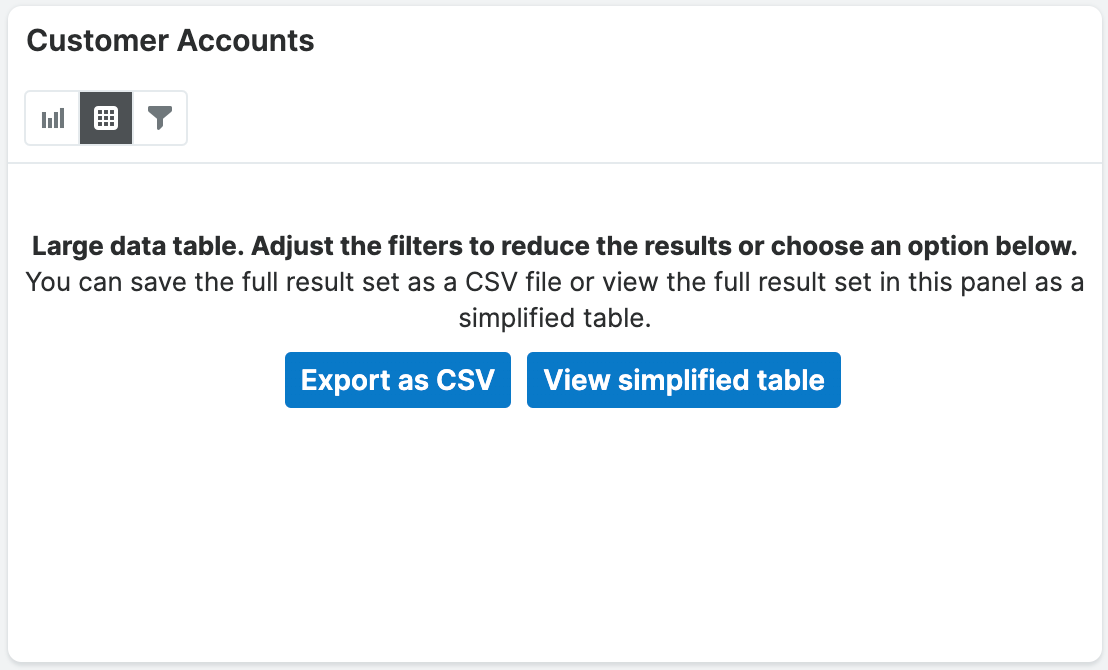
The filter tab shows the run-time filters on the current report. You can modify the filters on this tab but you cannot add new ones. Click the Open/Close arrow in the top right corner of each run-time filter and then edit the filter as desired. Click the Apply button to apply any changes you have made.
When a Report dashlet is added to a Home dashboard, dashboard filters allow you to control the run-time filters on many dashlets at once. For more information on dashboard filters, please refer to the Dashboards and Dashlets documentation for more information.
RSS Feed Dashlet
The RSS Feed dashlet allows you to view external RSS or Blog feeds via the dashboard on the intelligence pane. When adding the dashlet, you will need to enter in the desired feed URL (e.g., "https://news.google.com/news/headlines/section/topic/TECHNOLOGY?ned=us&hl=en&gl=US") in the Feed URL field. You can also select a value in the "Number of entries to show" field to display the most recent 5, 10, 15, or 20 entries from the feed and specify an auto-refresh interval (e.g., Every Hour) if desired. Once the dashlet is added to the intelligence pane, the applicable feeds will display and you can click the title of each feed to access the full story on the parent site. If you wish to access the full site where the RSS feeds originate from, simply click the title (e.g., Technology - Google News) below the dashlet header.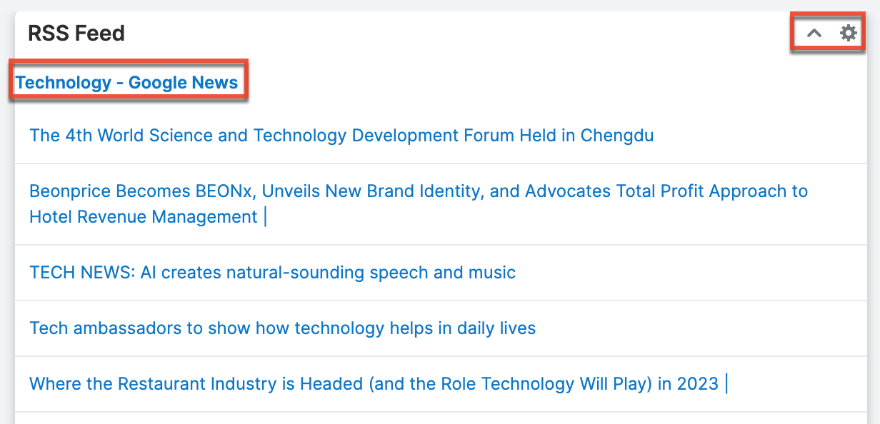
The Gear icon on the upper right of the dashlet allows you to edit, refresh, and remove the dashlet accordingly. To collapse the dashlet, click the Up arrow to the left of the Gear icon. To open up the dashlet, you can simply click the arrow again.
Sales Pipeline Chart Dashlet
The Sales Pipeline Chart dashlet illustrates the flow of open sales opportunities through the various sales stages by displaying the total dollar amounts for open records grouped by sales stage. The top of the sales funnel is the widest point and represents sales deals that are still in the earliest stage of "Qualification". The funnel narrows as unqualified prospects fall away and opportunities with higher win potential approach final sale.
Note: The Sales Pipeline Chart dashlet is not available for Sugar Serve users. For more information on license types and the functionality available for each, refer to the User Management documentation.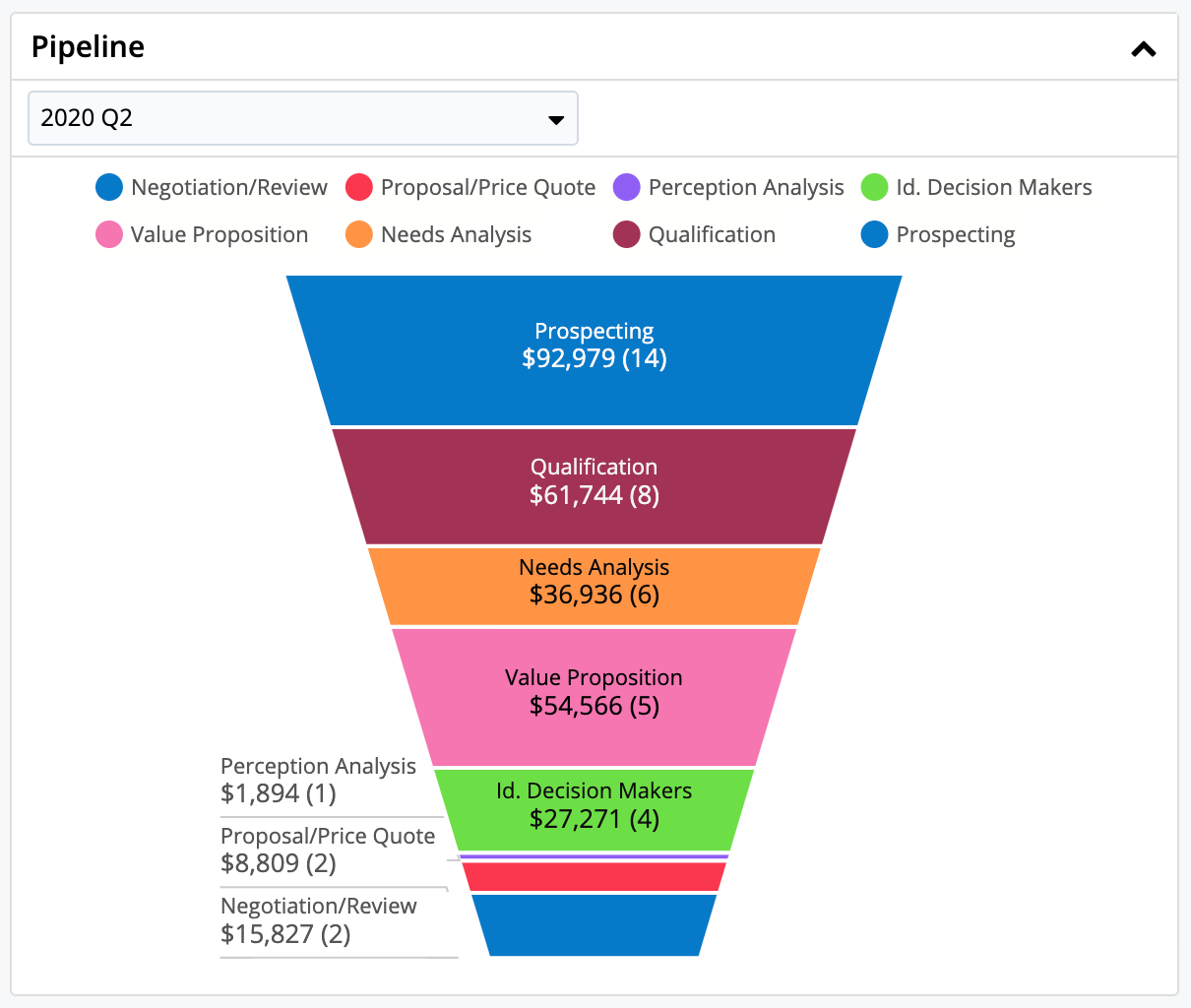
Note: The Sales Pipeline chart assumes that the sales stages are being used as defined in the out-of-the-box Sales Stage dropdown list. While the dashlet will display custom Sales Stage field values, the out-of-the-box Closed Won and Closed Lost field values must be preserved in order for Sugar's Sales Pipeline Chart to properly identify open vs. closed business. Any custom stages added to the Sales Stage dropdown by your organization will be displayed at the top of the funnel, regardless of how the stages are sorted within the dropdown.
You can customize the Sales Pipeline Chart to monitor the overall health of your personal funnel or the aggregate funnel for you and all of the users that report to you. After adding this dashlet to the homepage, toggle between "My Pipeline" and "My Team's Pipeline" using the one-person and group icons on the upper right of the dashlet. "My Pipeline" displays a summary of opportunities or revenue line items for the current user and "My Team's Pipeline" displays a summary of opportunities or revenue line items for the current user plus his direct reports as configured in the "Reports to" field of their user profile. Note that if you do not have any direct reports, you will not see the one-person and group icons.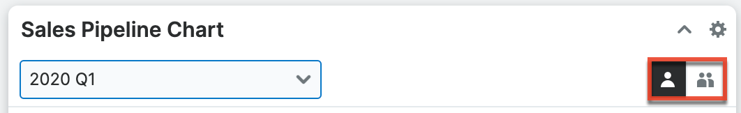
The pipeline can also be filtered by time periods that have been configured by the administrator in the Forecasts module by clicking on the time period dropdown. The chart will display only records with an expected close date within the specified date range. Hover over the time periods to see the dates that the time periods begin and end.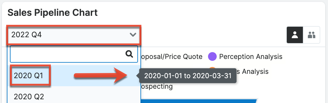
To further customize the dashlet, users can click on individual sales stage labels to add and remove those stages from the funnel view. In the example pictured below, only the Proposal/Price Quote and Negotiation/Review sales stages are enabled and therefore appear in the legend with solid dots. Sales stages that have been disabled will appear in the legend as empty circles.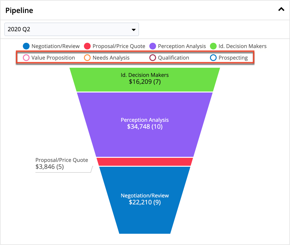
For more detailed information on forecasting, please refer to the Forecasts documentation.
Sugar Discover Dashlet
The Sugar Discover dashlet allows you to display an Enhanced Forecasting report on a Sugar dashboard. This dashlet is available only to Sugar Sell Premier users who have an access level of "DashletUser", "ReadOnly", or "Admin".
To add the dashlet to a dashboard, first select "Sugar Discover" from the Add Dashlet list. Then select the report you want to display and click "Save". Use the search bar to search for a specific report.
You can interact with the dashlets to adjust the view. Hovering over the data on the charts displays data labels with more information about the data point. You can click an item or multiple items in the chart legend to highlight the data related to that label on the chart. Click the item again to deselect them or click anywhere in the chart legend bar to deselect all items. You can also click directly on the data in the chart to select or deselect the data series.
Depending on how your report is set up, you may have the option to drill into the report. Drilling into a report means that you can click on a segment of the chart and open a pivot table to view details about that segment. Click the segment on your chart and you may need to click the blue "View Details" button to drill down. When you drill into a report, you will be redirected to the Sugar Discover interface. Click any hyperlinked text in the report to open the corresponding record in Sugar.
The Sugar Discover dashlet has four buttons along the bottom that are unique to this dashlet:
| Action | Description |
 |
Show or hide the chart legend and/or filter displays. |
 |
Open the Slicer view where you can adjust which predefined slices of the data to include in the chart. For example, if you have your data separable by industry, the Slicer view would allow you to select which of the industries to include in the chart. Enable the checkboxes next to the slices you want to include, click "Apply", then click "Back" in the top left corner to return to the chart. This button is visible only if there are slicers available for the dashlet. |
 |
Open the Discovery Insights view. Discovery insights are set up for specific fields and analyze the data series that are displayed in the chart and provide a glimpse of the biggest changes that are occurring to provide you with actionable insights. A blue dot on the icon indicates that there are unread insights to view. Click on an insight card to drill into a report. |
 |
Open the report in a new browser tab. This button is not available for users with a Role of DashletUser. |
For more information on the standard reports that can be displayed in this dashlet, please see the Enhanced Forecasting Reports documentation.
Timeline Dashlet
Note: The Timeline dashlet was known as the Interactions dashlet in Sugar versions 11.0.x and lower.
The Timeline dashlet appears in the Accounts, Cases, Contacts, Escalations, Leads, Opportunities, and Quotes record view dashboards, as well as in the Sales Console. It displays the current record's related activities and select field updates (e.g., a change to the Assigned To field) in the form of record cards. Each card in the dashlet is sorted in chronological order based on the date they occur or are due (for tasks), with the most recent at the top. By default, the Timeline dashlet will display the first set of twenty record cards and you can click "Show more..." to load the next set of cards. If the Timeline dashlet displays "No Activity", then there are no activity records related to the current record and no tracked field changes have been made.
You can also filter the Timeline dashlet to show only certain card types by clicking on "Related" below the dashlet header and selecting the desired card type. To see all of the current record's related activities and select field updates, select "All" in the Related options. 
When you hover over a card, an Actions menu, represented by three vertical dots, appears and contains additional options for each type of record card.
The different record cards and their available actions are described below:
| Record Card Type | Content Options | Actions Menu Options |
| Call card |
|
|
| Email card |
|
|
| Message card 2 |
|
|
| Meeting card |
|
|
| Note card |
|
|
| Task card |
|
|
| Update card 3 |
|
1 For Sugar Sell or Serve instances with call transcripts set up, add the Customer Sentiment field to preview view for the Calls module in order to display the information on the Call card.
2 Message cards are only shown in the Timeline dashlet if the Start Date field is populated on the message.
3 The tracked fields are Assigned To and Status on lead records and Sales Stage on opportunity records. The tracked fields for case records are Assigned To, Status, and Priority. Note that the field must be enabled for audit at the time the update occurs for it to appear in the Timeline dashlet.
Creating Activities via Timeline
You can create new activities directly from the Timeline Dashlet by clicking the Plus (+) icon in the dashlet header and selecting the type of record you wish to create. A quick-create drawer will open where you can enter the activity's details; the new activity will be automatically related to the record open in the adjacent record view.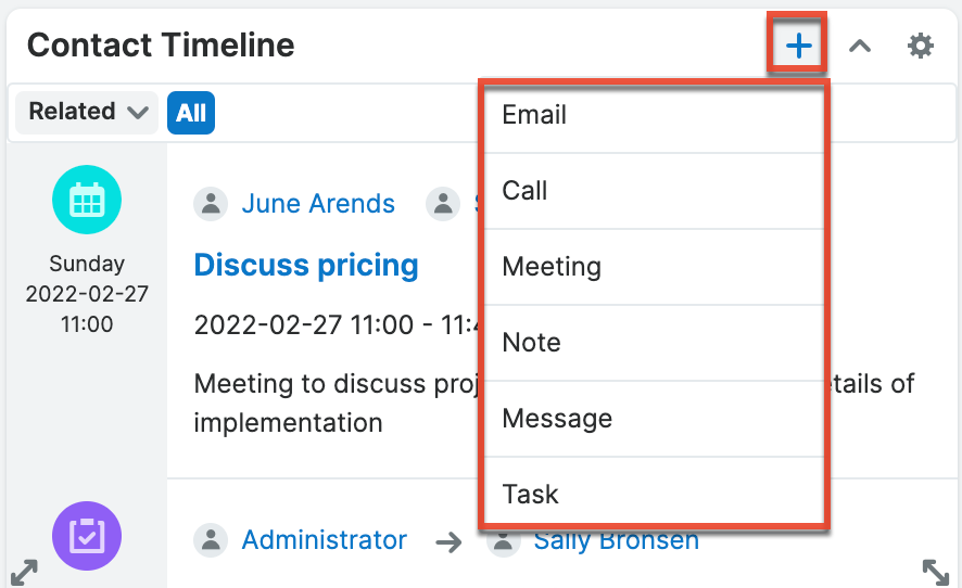
Refer to the Calls, Emails, Messages, Meetings, Tasks, and Notes documentation for more information on creating these records.
Editing Timeline Card Layouts
The fields shown for each card in the Timeline are based on the Preview layout for the corresponding module. An administrator can remove a field from a Timeline dashlet card by removing the field from the Preview layout for the card's module via Admin > Studio > {Module} > Layouts > Preview. For more information on editing the Preview layout, please refer the Layouts documentation in the Administration Guide.
Timeline Dashlet with Sugar Market
If your Sugar instance is integrated with Sugar Market, you can configure the Sugar Market sync settings to show the full customer journey in the Timeline Dashlet on Account, Lead, and Contact record view dashboards. The Sugar Market activities will be chronologically juxtaposed with the record's CRM activities, offering an uninterrupted view of the entire customer journey. Please refer to the Sugar Market Integration Guide for more information.
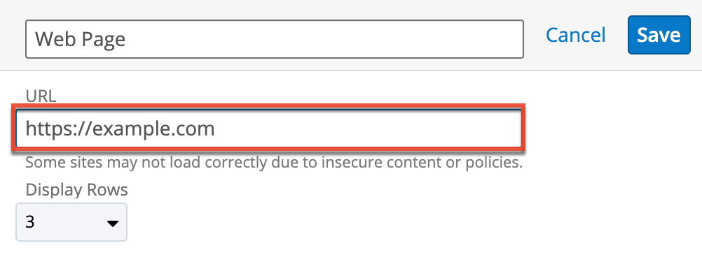
Web Page Dashlet
The Web Page dashlet allows users to load content from an external website in Sugar's dashboard. When adding this dashlet, you will need to enter the desired URL (e.g., https://example.com) in the URL field then select the display rows value to define the size of the dashlet. Please note that Sugar will only load content from trusted domains that the system administrator has approved in Admin > Content Security Policy Settings. If you get an error indicating that the content has not been approved, please reach out to your administrator as they will need to update your system's Content Security Policy settings. If the CSP settings get updated while you are logged in to Sugar, you will need to refresh your browser for the changes to take effect in your session.