Action Buttons
Overview
Action Buttons are custom buttons that can be added to records to enable users to perform quick actions directly from records such as sending an email, creating or editing a related record, and opening an external web page. Action Buttons are implemented as a field type in Studio and are easily extended using Sugar Logic and SugarBPM.
Understanding Action Buttons
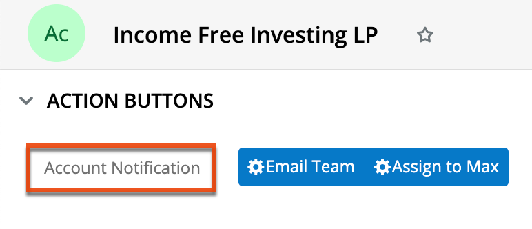
Action Buttons are powerful tools that provide your users with shortcuts to perform tasks within records that otherwise would require leaving the record. The benefit of using Action Buttons is that they support an efficient workflow, giving users the tools they need to perform their work directly where they need it. Action Buttons look like standard Sugar action buttons in record views and can be displayed in records, their headers, or both. Buttons are easily configurable by style (color, labels, icons) and function (direct action or calculated) and their availability in records can be made dependent on specific conditions as well as role or team-based permissions.
For examples of how Action Buttons can be used in records, please refer to the Action Button Example Use Cases section.
Compatibility
Action Buttons are Sugar fields and are subject to access control rules that may be set via team membership, user type, and role restrictions. For more information on teams and roles, please refer to the Team Management and Role Management documentation in the Administration Guide.
Note: If you previously installed the Custom Buttons package included in the wTools bundle, please refer to the Understanding Action Buttons vs wTools Custom Buttons article to help you determine if you should re-create your Action Buttons directly in Studio in your Sugar instance.
Configuring Action Buttons
Administrators can place an Action Button on a record by creating and configuring a new field in Studio with a Data Type of "ActionButton" for the record's module and then adding that field to the desired layout. The "ActionButton" type field requires additional configuration after the field is created. This section describes the configuration options available for Action Buttons. To see how Action Buttons are displayed in records, please refer to the User Interface documentation in the Application Guide.
A single ActionButton field may be configured to show one or more buttons. When one field contains more than one button, the buttons can be shown either side-by-side in the singular field's area or as an Actions-menu style button with a dropdown list using the display settings in the Layout Configuration panel. If you would like to have more granular control over the access and placement of multiple buttons within a module, consider creating them as separate fields so that they can be managed independently. For more information, refer to the Working With Multiple Buttons section.
Note: You can only configure custom Action Buttons as described in this section; you cannot configure the standard Sugar action buttons or module Actions menus.
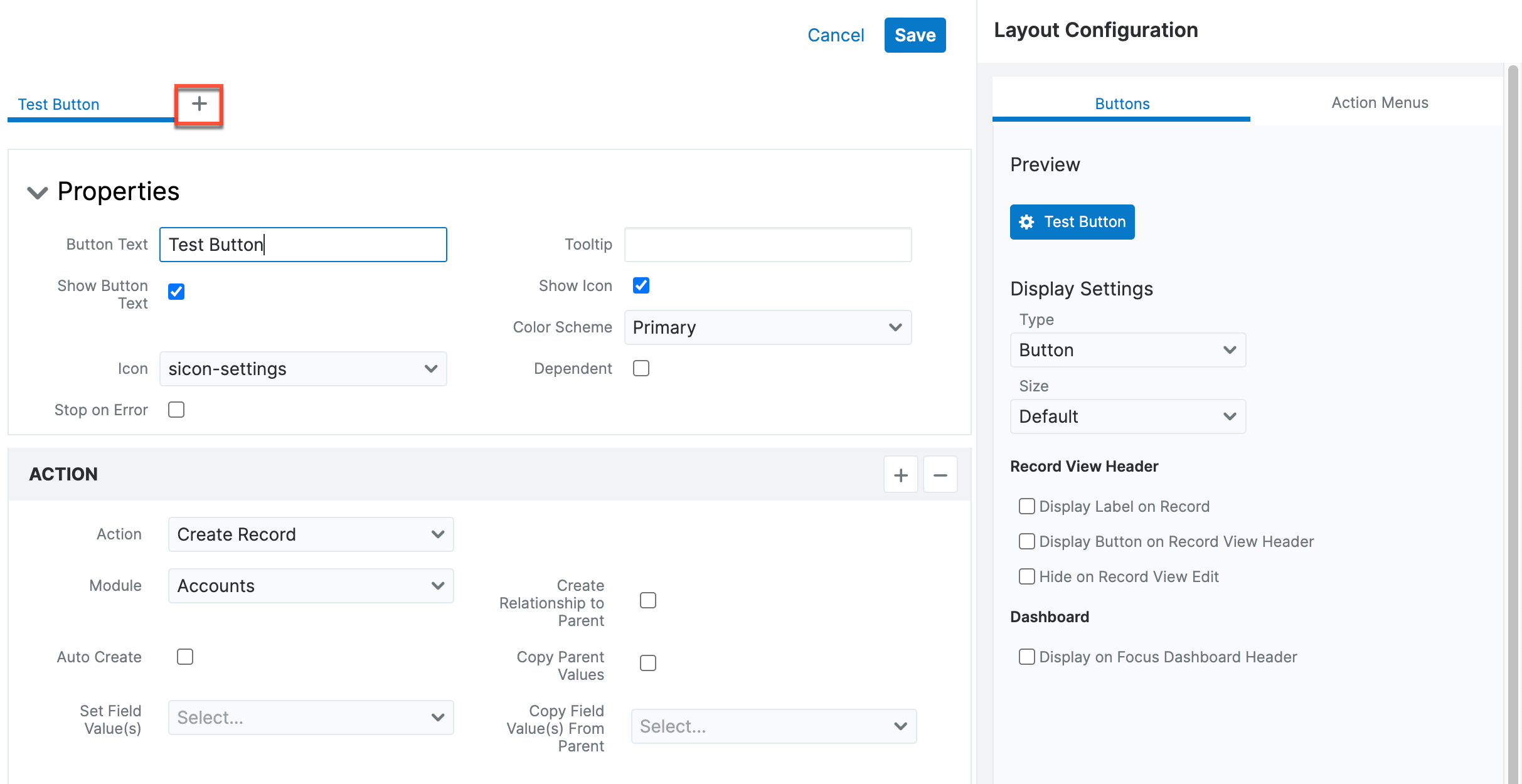
To configure Action Buttons, click "Configure Buttons" at the bottom of the field definition when creating the field: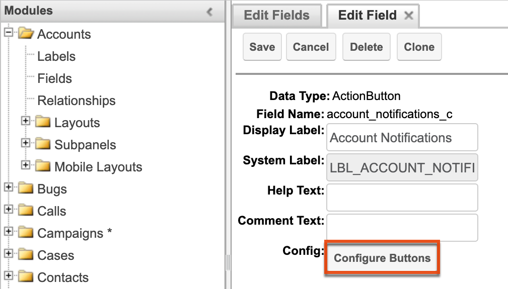
The button configuration drawer opens: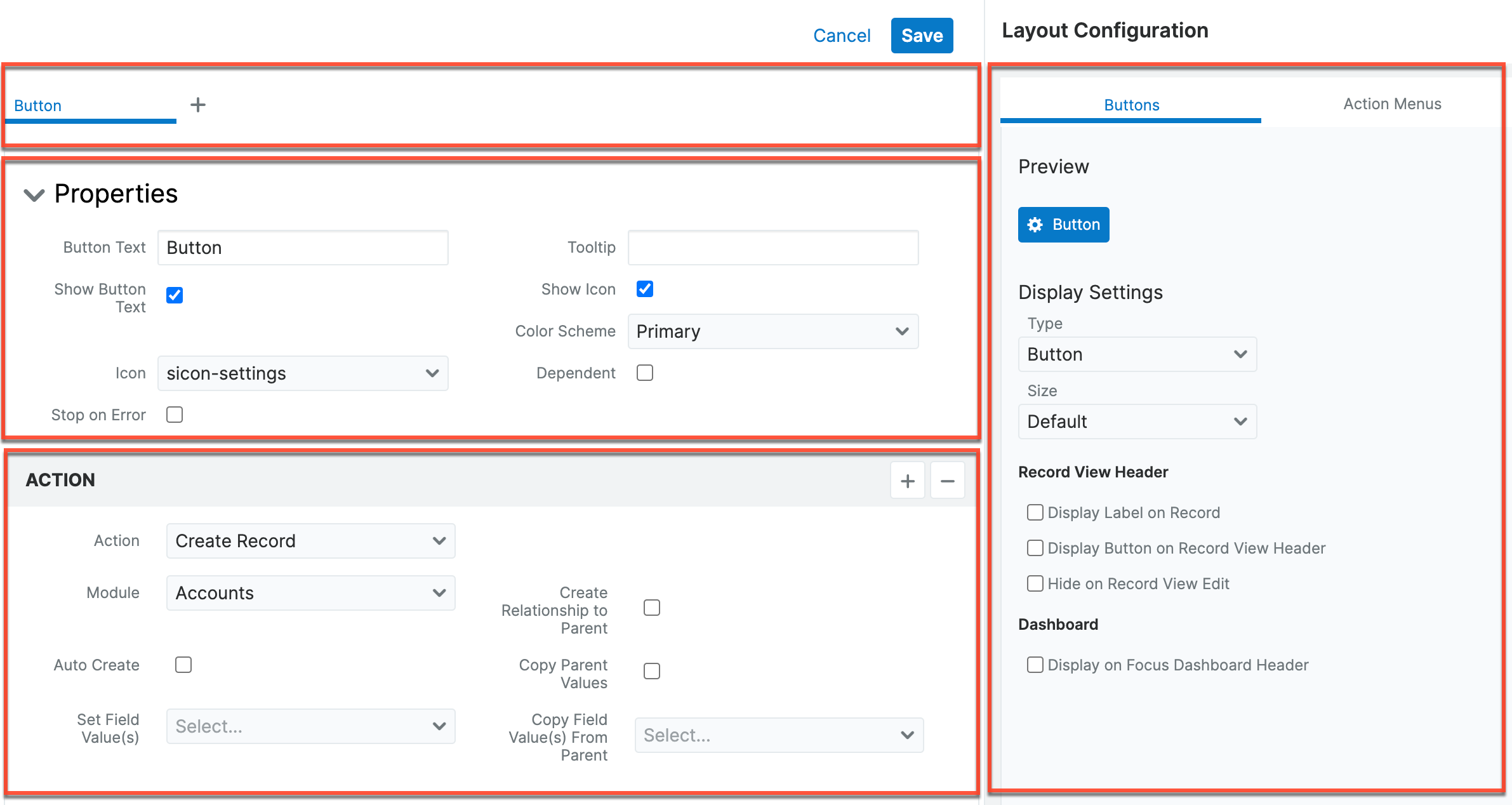
The configuration drawer includes the following sections:
- Header: A tabbed view of all buttons included in the current field.
- Properties: Options like the button's label, icon, color, and dependencies.
- Layout Configuration: Additional display options for record views and action menus.
- Action: The action(s) that will occur when the button is clicked by a user.
Refer to the following sections for information on configuring each of these areas.
Header
The Header section across the top of the drawer contains tabs that represent each button for the current field. The Properties and Action display for the selected tab. When there are multiple buttons for the field, display settings in the Layout Configuration panel apply to all buttons.
Properties
Define basic visual options in the Properties section of the Action Button configuration drawer. When there are multiple buttons for the field, these settings only apply to the button defined on the active tab in the header.
- Button Text: The text to be displayed on the button. You do not need to include text; you may want to only include an icon (see "Show Icon" below).
- Show Button Text: When enabled, the text identified in the Label field will be displayed on the button. When not selected, the button will be blank or display only the icon if the "Show Icon" option is selected.
- Color Scheme: The button color. Select an option from the dropdown list and view the results in the Preview section of the Layout Configuration panel.
- Dependent: When enabled, the button will only display in records when the conditions defined in the Formula field are met.
- Formula: Conditions that define the criteria for displaying the button on records. Please refer to the Sugar Logic documentation for more information.
- Tooltip: Text to be displayed when a user hovers over the button.
- Show Icon: When enabled, the icon identified in the Icon field below will display on the button. Refer to the Preview area of the Layout Configuration panel to see how the icon will appear on the button.
- Icon: Filename of the icon to be displayed on the button. The Show Icon field must be enabled for the icon to be displayed. Refer to the Preview area of the Layout Configuration panel to see how the icon will appear on the button.
- Stop on Error: When enabled, when an error is encountered on one action, the subsequent actions will not execute.
Layout Configuration
Define additional display options for the Action Button and view the button display in the Preview section of the Layout Configuration panel. This panel is divided into tabs for settings that apply to buttons and those that apply to action menus. When there are multiple buttons for the field, these settings apply to the entire group of buttons.
Buttons Tab
- Preview: View-only section that shows you the button appearance based on the current settings.
- Display Settings:
- Type: The Action Button style
- Dropdown: When multiple buttons are configured for the same field, the first button displays a dropdown list that contains the other button labels.
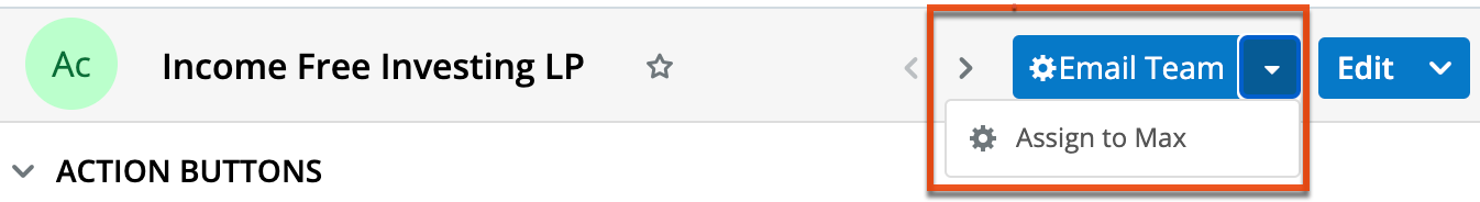
- Button: A single button.
- Button Group: When multiple buttons are configured for the same field, they are displayed in the record together with no space between them.

- Dropdown: When multiple buttons are configured for the same field, the first button displays a dropdown list that contains the other button labels.
- Display Label on Record: When enabled, displays the text identified in the Action Button Field Label above or next to the button on records (the location is determined by the user preference setting). This is not the label that is displayed on the button (see "Show Label" in the Properties section).
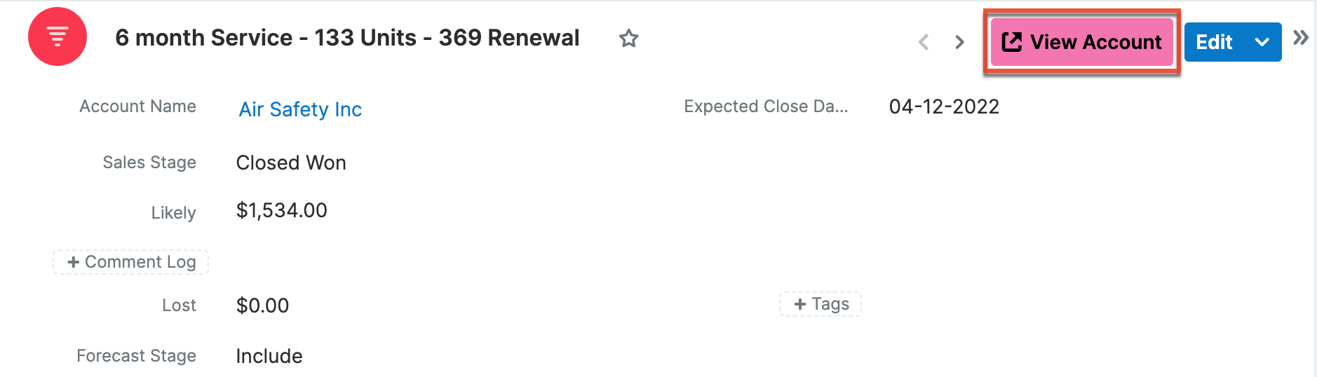
- Display Button on Record View Header: When enabled, displays the button in the record header adjacent to the record name. If the field is also added to the record view layout, users will see the button in both places. If this option is not enabled, then the button must be added to the record view layout in Studio.
- Hide on Record View Edit: When enabled, the button will be hidden when the record is in Edit mode.
- Size: Set the button's display size (Default, Small, Large). Refer to the Preview area after making a selection to compare sizes.
- Display on Focus Dashboard Header: When enabled, displays the button in the header adjacent to the focus dashboard title.
- Type: The Action Button style
Action Menus Tab
- Preview: View-only section that shows you the button appearance based on the current settings.
- Display Settings:
- List View: Display the button as an item in the list view actions menus.
- Subpanels: Display the button as an item in the subpanel actions menus.
- Record View Header: Display the button as an item in the record view actions menus.
- Record View Dashlet Header: Display the button as an item in the record view dashlet actions menus.
- Order: When multiple action buttons exist in the same module, this number dictates the order in which this button will display in the actions menus. The lowest number displays the highest in the list (e.g., "1" is higher in the actions menu list than "2").
- Focus Dashboard Header: Display the button as an item in the focus dashboard Action Menu when enabled.
Action
In the Action section, define the action that will occur when a user engages the Action Button.
| Action | Description | Fields |
| Assign Record | Assigns the record to the designated user. |
|
| Compose Email | Enables users to quickly compose an email using an email template. When the button is engaged, the configured email client is opened with the selected email template and designated recipients. |
|
| Create Record | Enables users to quickly create records in other modules from the current record. |
|
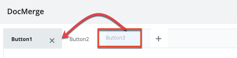
| Doc Merge | Launches the Doc Merge feature to create a document using data from the current record. |
|
| Open URL | Opens a URL in a new browser window. |
|
| Run Report | Provides a shortcut to run reports from a record. |
|
| Update Record | Provides a shortcut to update specific fields in the current record. |
|
Assigning Multiple Actions to One Button
To assign more than one action to the same button:
- After defining the first action as described in the Actions table above, click the + icon at the top right corner of the Action block.
- Define the action and repeat for any additional actions.
- To change the order in which the actions are processed, drag and drop the Action blocks into the order that you want the actions to process, with the first action being at the top.
- To delete an action, click the - icon at the top right corner of the Action block and then click the Confirm button in the confirmation message.
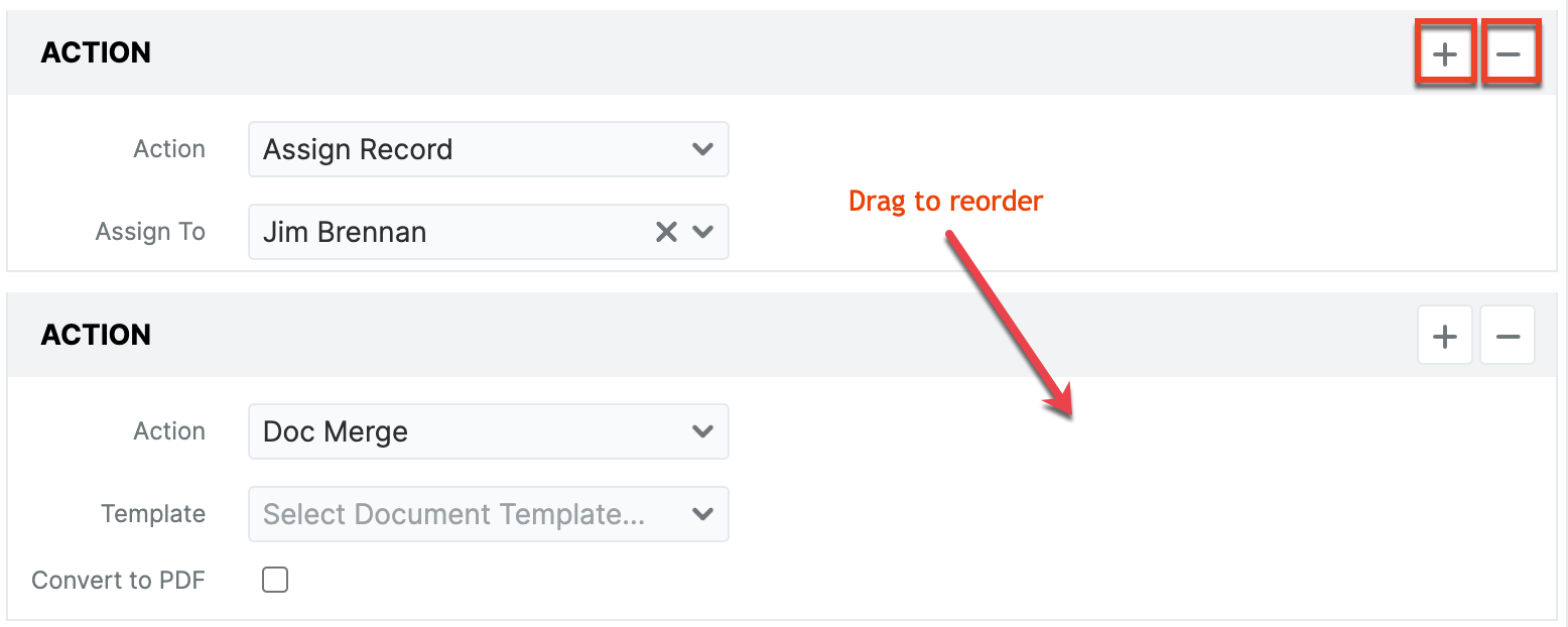
Note: To stop the chain of actions when an error is encountered, enable the Stop On Error option in the Properties section.
Working with Multiple Buttons
Several buttons can be shown within the same field. This is useful for grouping multiple shortcuts that are related to the same workflow within a module.
To create additional buttons for the current field:
- Click the plus icon in the header.
A new tab opens to define the new button and the button is added to the Preview display on the right.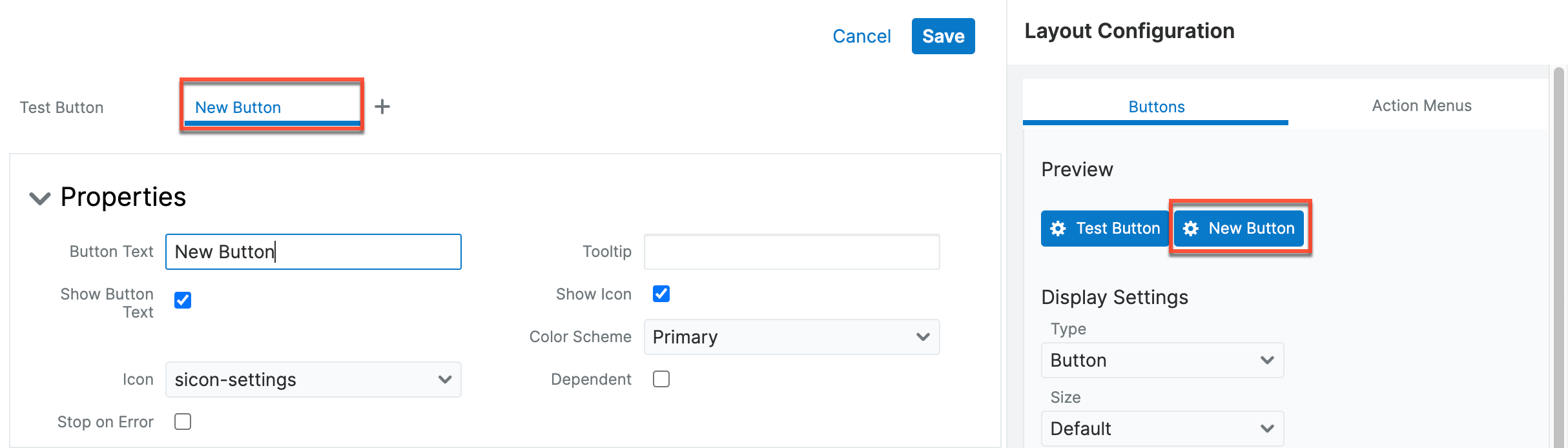
- To reorder buttons, drag the tab in the header to the desired location with the button on the far left being first.
Note: If buttons exceed the horizontal space in a record header, then the button type is automatically converted to a dropdown button.
Displaying Action Buttons in Records and Focus Dashboards
As with all field types, you need to add the Action Button to a layout before it will display in records unless you only want the buttons to display in the record header or focus dashboard header, which can be configured using the display settings in the Layout Configuration panel. Action Buttons can be added to record view layouts and mobile layouts.
Action Button Example Use Cases
There are many use cases for Action Buttons depending on the module and your own workflows. The following are just a few examples of how Action Buttons can be utilized. For details on how to implement these examples, please refer to the Creating an Action Button article.
- Escalate a Case
- Reject a Lead
- Add a Call Note to an Opportunity
- Access Supporting Documents from a Quote
- Email a Team
- Email the Contact Related to a Case
- Include a Map Link to Account Location
- Assign a Record to the Current User
- Opening a Dynamic URL
Escalate a Case
Provide your Support team with a one-step method of case escalation with an Action Button that updates the Priority field to "High" and the Assigned To field to the manager. While you can also define a Sugar BPM process for case escalation, utilizing an Action Button in this way does not require BPM knowledge and allows your Support reps to instantly escalate a case while engaged with a customer on the phone.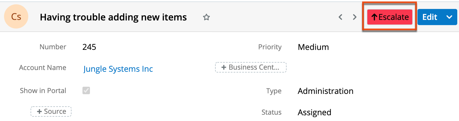
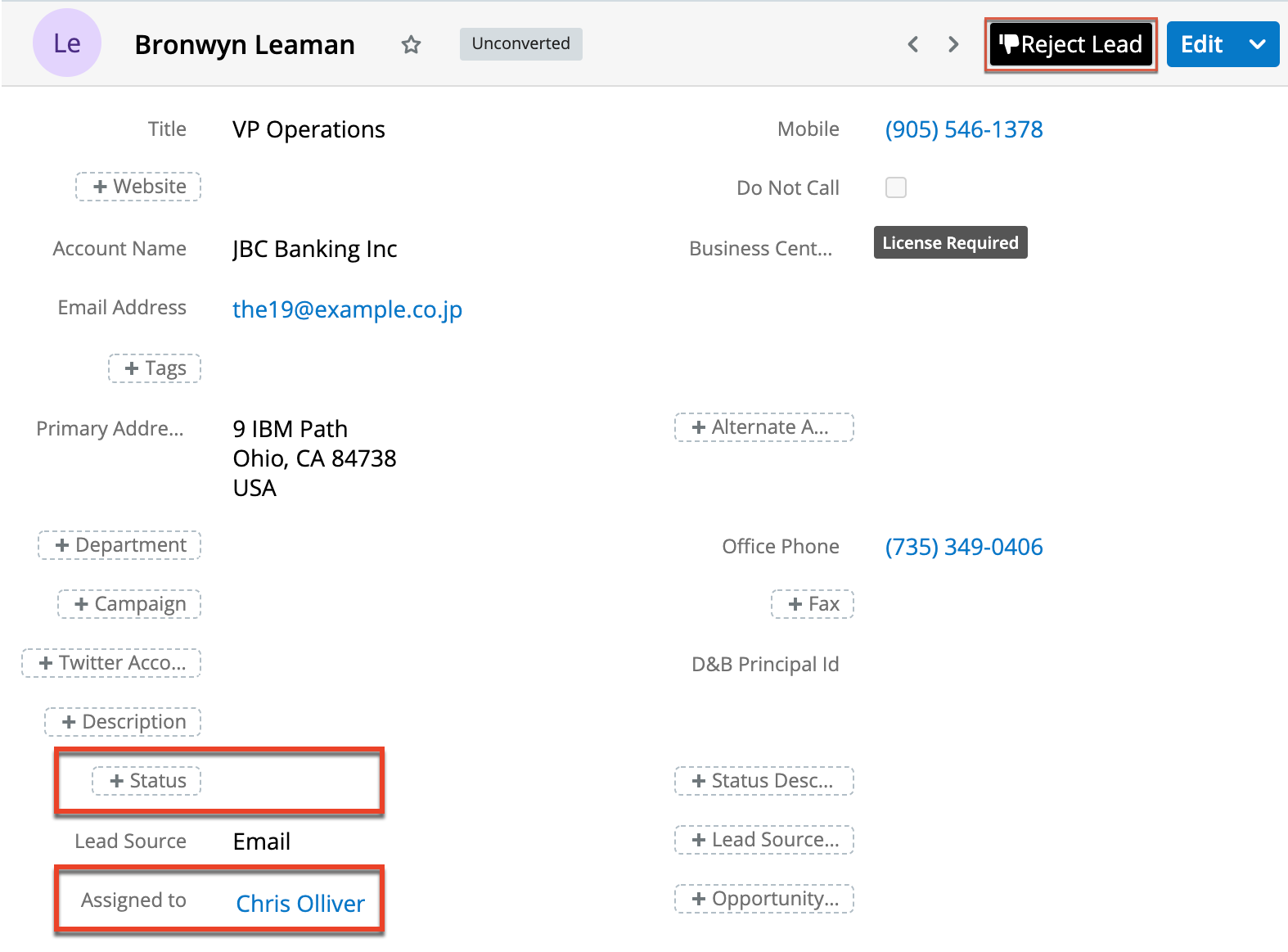
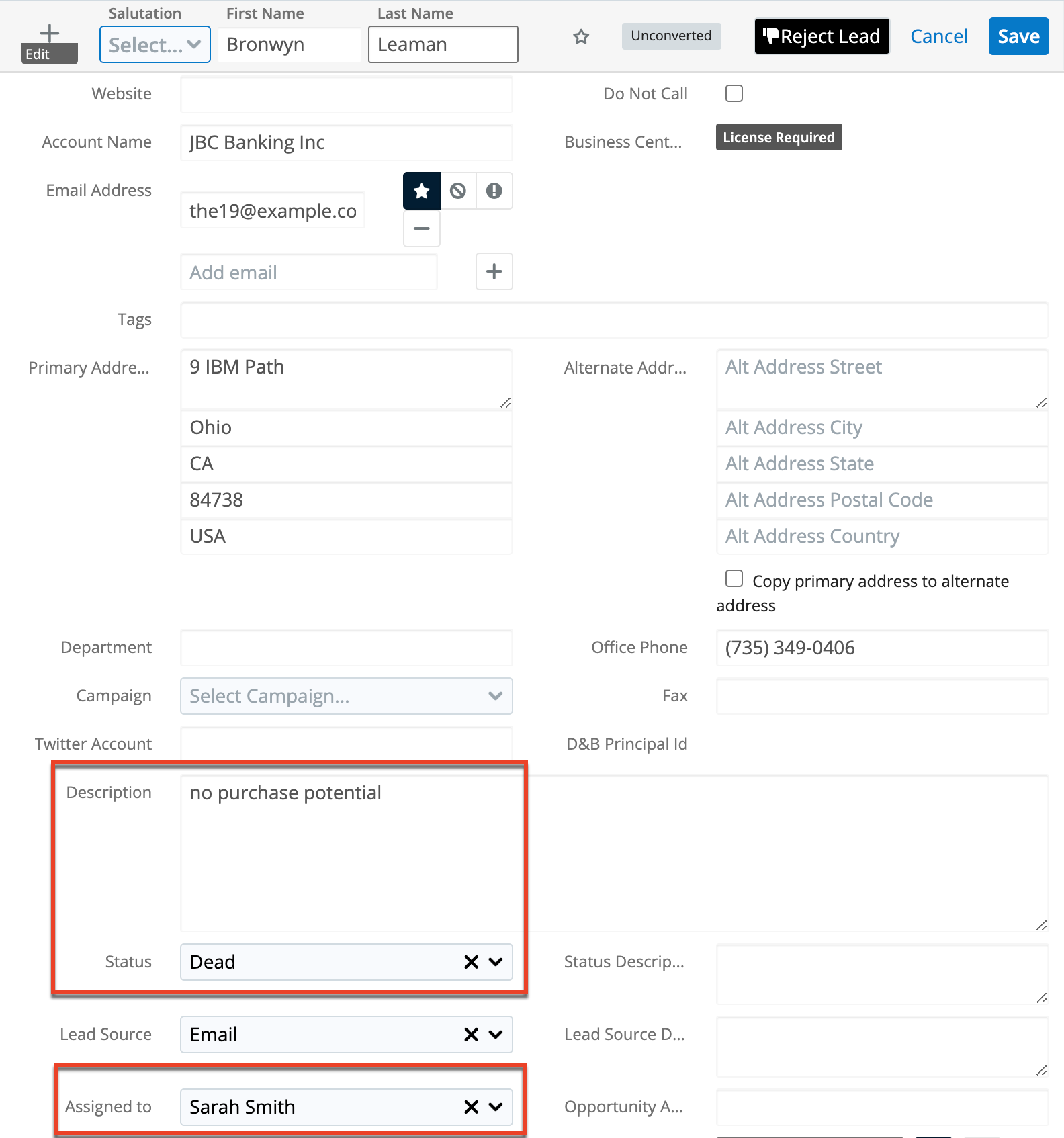
Reject a Lead
Enable your Sales team to quickly update a lead record to reject the lead, assigning the record to the regional sales manager, setting the status to "Dead", and adding "no purchase potential" to the Description field.
 |
 |
Add a Call Note to an Opportunity
Using an Action Button in an opportunity record can provide quick creation of calls associated with the opportunity. For example, automatically create a call record with the Status field set to "Held", Direction set to "Outbound", and Description populated with the name of the opportunity.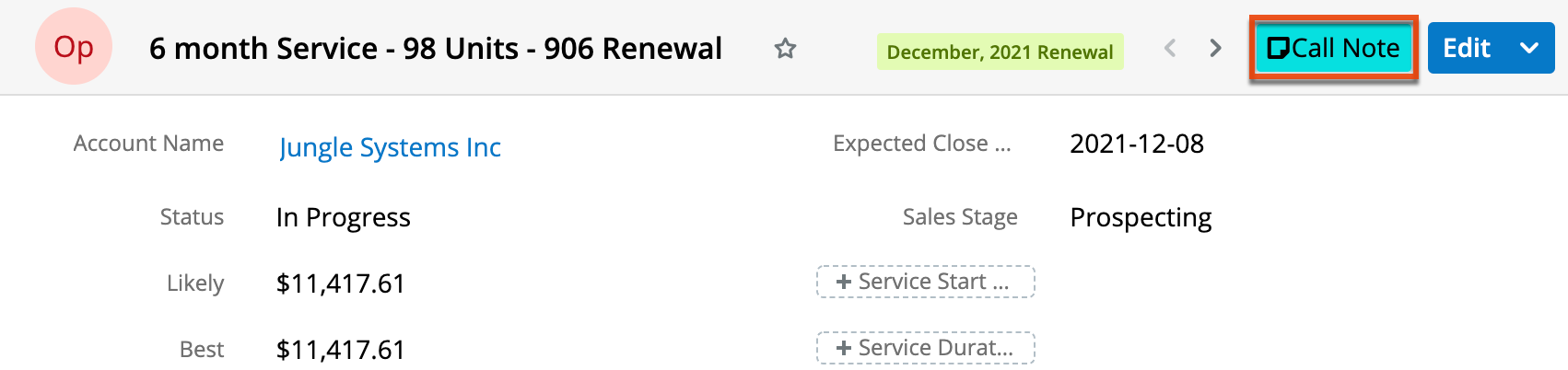
Access Supporting Documents from a Quote
Use an Action Button to provide a link to external systems that contain supporting documentation. For example, link to design documents located in a corporate intranet from a quote record to provide user access to all information directly where it is needed.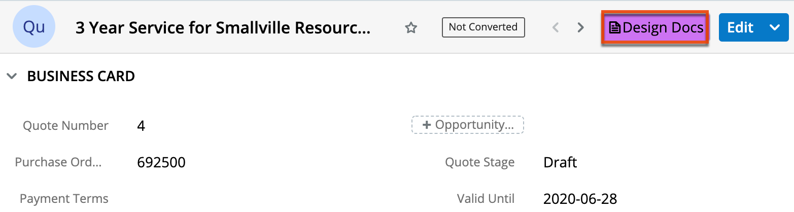
Email a Team
Including an email Action Button can be a time saver in any module. This type of Action Button enables users to quickly send email to a predetermined recipient list using an email template or process email template.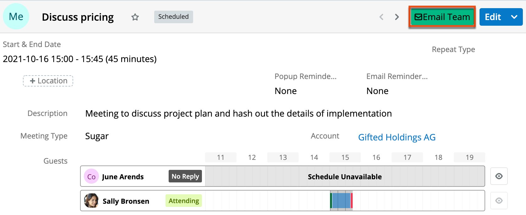
Email the Contact Related to a Case
This email Action Button provides a way to dynamically update the recipient of the email based on the record you are viewing. This Action Button will retrieve the primary email address of the contact related to the case. You can combine this with an email template or process email template to give yourself even more of a jump start on composing the email.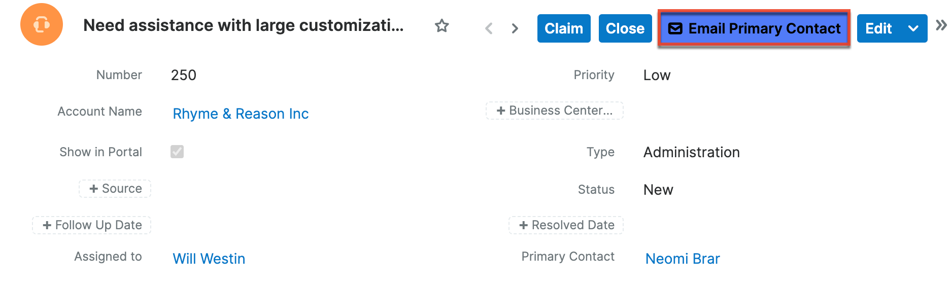
Include a Map Link to Account Location
Including an Action Button that links to a specific map location (e.g., https://google.com/maps?q={primary account address}) can provide your Sales team with directions to the account's location in one click.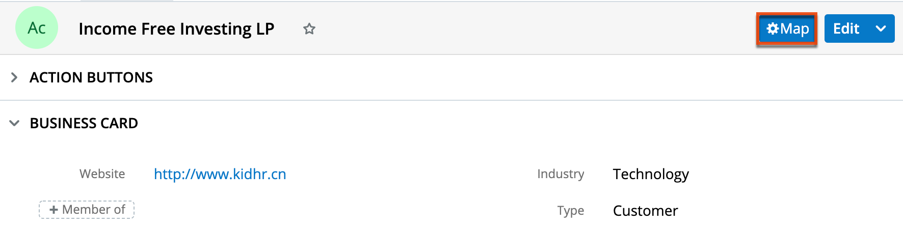
Assign a Record to the Current User
Adding an Action Button that assigns the currently viewed record to the logged-in user allows users to quickly claim a record as theirs. Out of the box, Sugar provides a stock example of this in the Cases module; please refer to the Cases documentation for more information on the "Claim" Action Button that is available by default.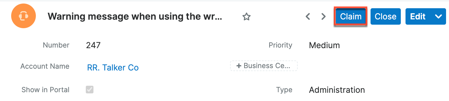
Opening a Dynamic URL
An Action Button can open a URL that changes based on the context of the current record. This Action Button retrieves the ID associated with the account related to an opportunity and updates the URL based on that account ID. This allows the button to open the related account record.