Dashboards and Dashlets
Overview
Sugar dashlets allow users to build specific data, insights, and useful visualizations into their Sugar views. Dashlets live within dashboards that are available on the Home page as well as on list view and record view intelligence panes. This documentation will cover information specific to managing dashboards and dashlets in your Sugar instance. For more information on specific dashlets, refer to the Sugar Dashlets documentation.
Most modules and views include out-of-the-box default dashboards which include some commonly-used dashlets. Sugar admin users may modify these stock, default dashboards or create additional dashboards to push to teams of users. Users can also create additional dashboards or pull shared dashboards onto their view from the Dashboards module and even create duplicates of existing dashboards to customize for their own use. If more than one dashboard is available for a particular view, users may switch between them using the view's dashboard selection list.
Understanding Dashboards
The following sections explain the various methods of accessing and working with dashboards as well as provide an overview of the factors involved in sharing common dashboards between users.
Dashboards in Views vs the Dashboards Module
Users can access dashboards in the two following ways, with each way offering different functionality.
- Dashboards in Views: Every-day use of dashboards occurs in the Home page as well as list view and record view intelligence panes on Sidecar modules. Accessing dashboards in these locations will be referred to as "dashboards in views". The Using Dashboards and Dashlets section of this page details the actions you can take when using dashboards in views.
- Dashboards Module: Certain actions are not available with accessing dashboards in views, particularly actions associated with sharing dashboards with other teams and making dashboards visible in views. These tasks are accomplished in the Dashboards module which includes a Dashboards list view and record view. The Dashboards list view can be accessed when viewing any dashboard in a view by selecting "Manage Dashboards" from the dashboard selection list. Viewing a dashboard in the Dashboards module does not display its dashlets or provide many of the actions available when using them in views. The Managing Dashboards section of this page details the actions you can take when accessing the Dashboards module.
Shared Dashboards
Several dashboard fields control whether a dashboard is available in a user's Dashboards module and whether it appears on the user's views.
Note: When a shared dashboard is modified, other users will see the effects of the changes after refreshing their view or switching to the affected dashboard.
Note: Dashlet Gear menus are available only to the containing dashboard's Assigned To user and system admin users.
Teams Access
The Teams field controls whether or not a dashboard is available in a user's Dashboards module. Dashboards follow the same team permissions rules as any other Sugar module. When a user first creates a dashboard, the Teams field is automatically set to only his or her private team, which typically makes it visible to that user and the user's management chain. This is because private teams, by default, only include the individual user, and Sugar recommends not adding other users to any private team. Each user's management chain inherently belongs to each of the user's teams. For more information, please refer to the Private Teams and Team Membership Types sections of the Team Management documentation.
The Teams field can be modified to allow other users to see it in their Dashboards module as described in the Sharing Dashboards With Teams section below. Once other users have teams access, the Favorite and Default Dashboard fields determine whether the dashboard appears for use in their views, as described in the next section.
Note: Admin users have access to all Sugar records, regardless of team membership. No dashboards will be hidden from admin users in their Dashboards module.
Favorites and Default Dashboards
Two dashboard fields factor into whether a dashboard to which a user has team access actually appears in that user's view: the Favorites designation and the Default Dashboards field.
The Default Dashboards field can only be edited by admin users. When it is checked, the dashboard will appear on the views of every user that has teams access. This effectively pushes the dashboard to users without their involvement. For more information, refer to the Pushing Dashboards to Teams section below.
When the Default Dashboards field is unchecked, a dashboard will only appear on a user's views when the user has marked it as a favorite. Dashboards can be favorited via the Dashboards module list view or record view. To remove a dashboard from the view, users can simply unmark the Favorites designation, either from the dashboard itself or from the Dashboards module. For more information, refer to the Pulling Dashboards to Your Views section below.
Personalizing Shared Dashboards
As an alternative to using a shared dashboard as-is, users can duplicate any dashboard that appears in their views. One of the main benefits of this is that it allows them to use the shared dashboard as a starting point for personalizing the dashlets to suit their particular needs. For more information, refer to the Duplicating Dashboards section.
Out-of-the-Box Default Dashboards
Many modules include prebuilt dashboards that come out of the box with Sugar. Admin users have the ability to modify or remove these dashboards. By default, most of these dashboards have the following attributes:
- Name: Following the format <Module> <View> (e.g., "Accounts List")
- Assigned To: Assigned to the primary admin user (ID = 1)
- Teams: Global
- Default Dashboard: Checked
It is important that admin users not treat these default dashboards like personal dashboards. So long as the Default Dashboard field remains checked, any changes made to the dashboards will be pushed to all users belonging to the associated team(s). Since the Global team is automatically selected for these dashboards, changes would affect all users. If an admin user wishes to modify the default dashboards for personal use, they should duplicate the dashboards then make changes to the new copy, which will be assigned to their private team and not have the Default Dashboard box checked. For more information, refer to the Personalizing Shared Dashboards section. Alternatively, admins can always create new dashboards from scratch for their personal use.
Users with a Sugar Sell or Enterprise license type have access to specialized dashboards called Sales Console as well as focus drawer dashboards. The Sales Console is a Home page dashboard that provides a powerful work environment for your organization's Sales agents and Customer Success Managers to automate and streamline renewal management. The Sales Console makes it easy to manage accounts, quickly see the status of your current quarter's renewal pipeline, and manage individual renewal opportunities. For more information, refer to the Sales Console documentation.
The focus drawer dashboard can be accessed by clicking the Focus icon which appears when hovering over certain links (e.g., a linked account name or call subject) across Sidecar modules and in dashboards (e.g., Sales Console). The focus drawer provides users with a 360-degree view of the linked record through a set of dashlets containing relevant information such as the record's related records, related activities (e.g., calls, meetings), purchase history, and active subscriptions. For more information on focus drawers, refer to the User Interface documentation.
Using Dashboards and Dashlets
Dashboards with their dashlets are available on the list view and record view of Sidecar modules. For example, to access the Accounts record view dashboards, click the Accounts module tab in the navigation bar. Then, click one of the account names that appear on the list view to open its record view. Ensure the intelligence pane is expanded by clicking the arrow icon at the top right of the list view. For more information about intelligence panes, refer to the User Interface page. Please note that the out-of-the-box Record View dashboards display a pre-defined set of dashlets that vary between each Sidecar module. The dashlets available in the dashboard will also vary depending on the user's assigned license type(s).
The floating actions button appears on the bottom-right corner of the intelligence pane, and it allows you to perform various actions (e.g., Create Dashboard) on the current dashboard. For more information, refer to the Dashboard Floating Actions Button section below.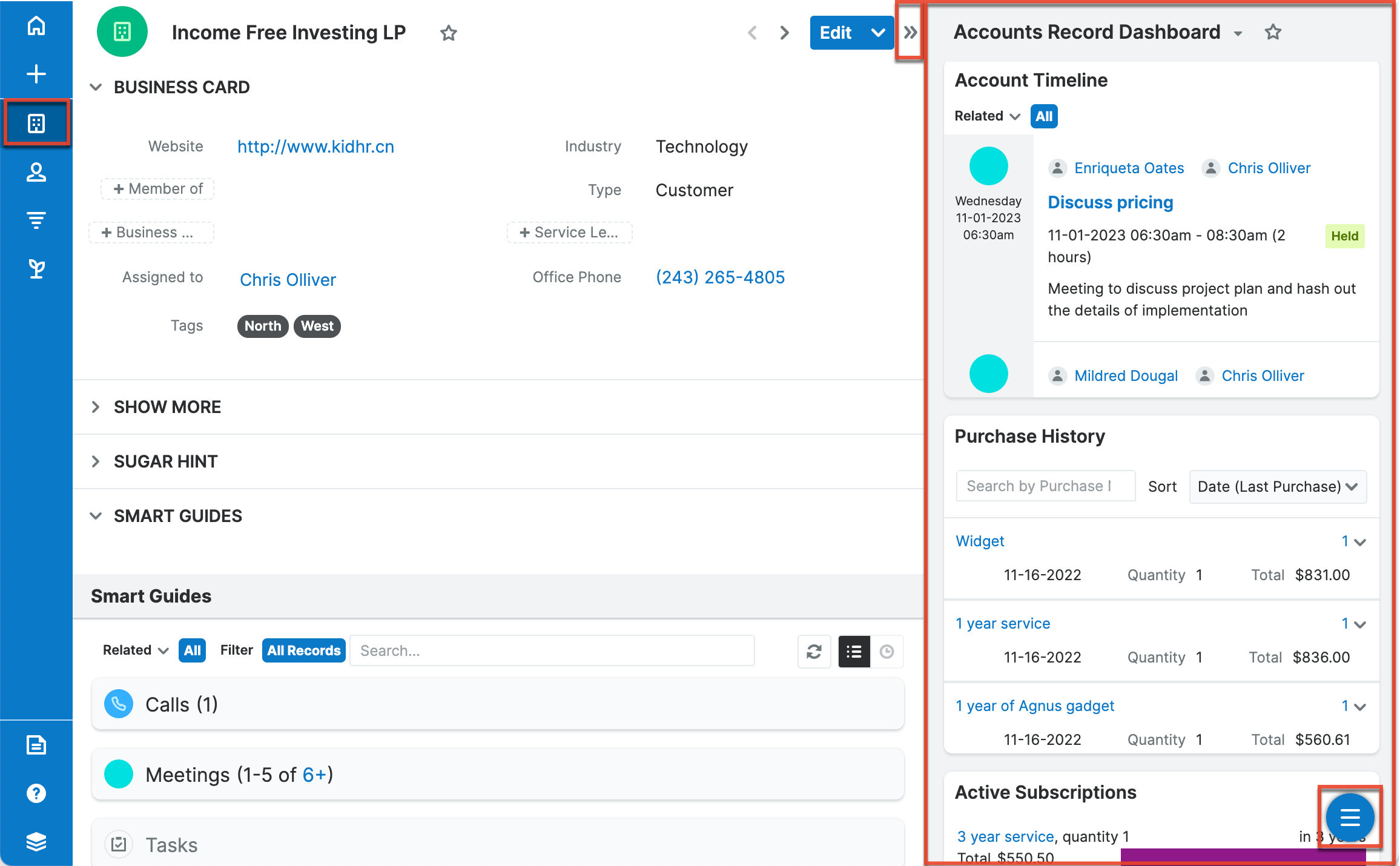
Dashboards are also available on the Home page which can be accessed by clicking the Home tab in the navigation bar. For more information about the Home module, refer to the Home documentation. Please note that the floating actions button appears on the bottom-right corner of the screen by default, and it allows you to perform various actions (e.g., Create Dashboard) on the current dashboard.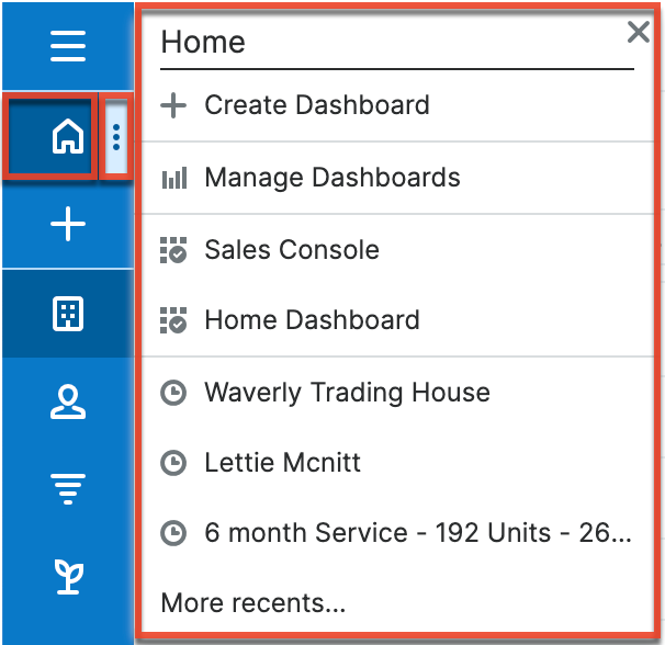
Both locations will remember which dashboard you last accessed in each view and open it automatically when you return.
Dashboard records are also visible in the Dashboards module which can be accessed by selecting "Manage Dashboards" from any view's dashboard selection list. The Dashboards list view and record view offer fields and functionality not available when viewing dashboards in intelligence panes and the Home page. However, the dashboard's layout and dashlets are not visible via the Dashboards module. For more information, refer to the Managing Dashboards section.
Dashboard Floating Actions Button
The floating actions button on the dashboard allows you to perform various actions such as creating dashboards, duplicate dashboards, etc. By default, the floating actions button appears on the bottom-right corner of the dashboard, but you can pin the floating actions button to the top corner by clicking the Pin to Top button in the floating actions menu. You can pin the floating actions button to the bottom corner again by clicking "Pin to Bottom".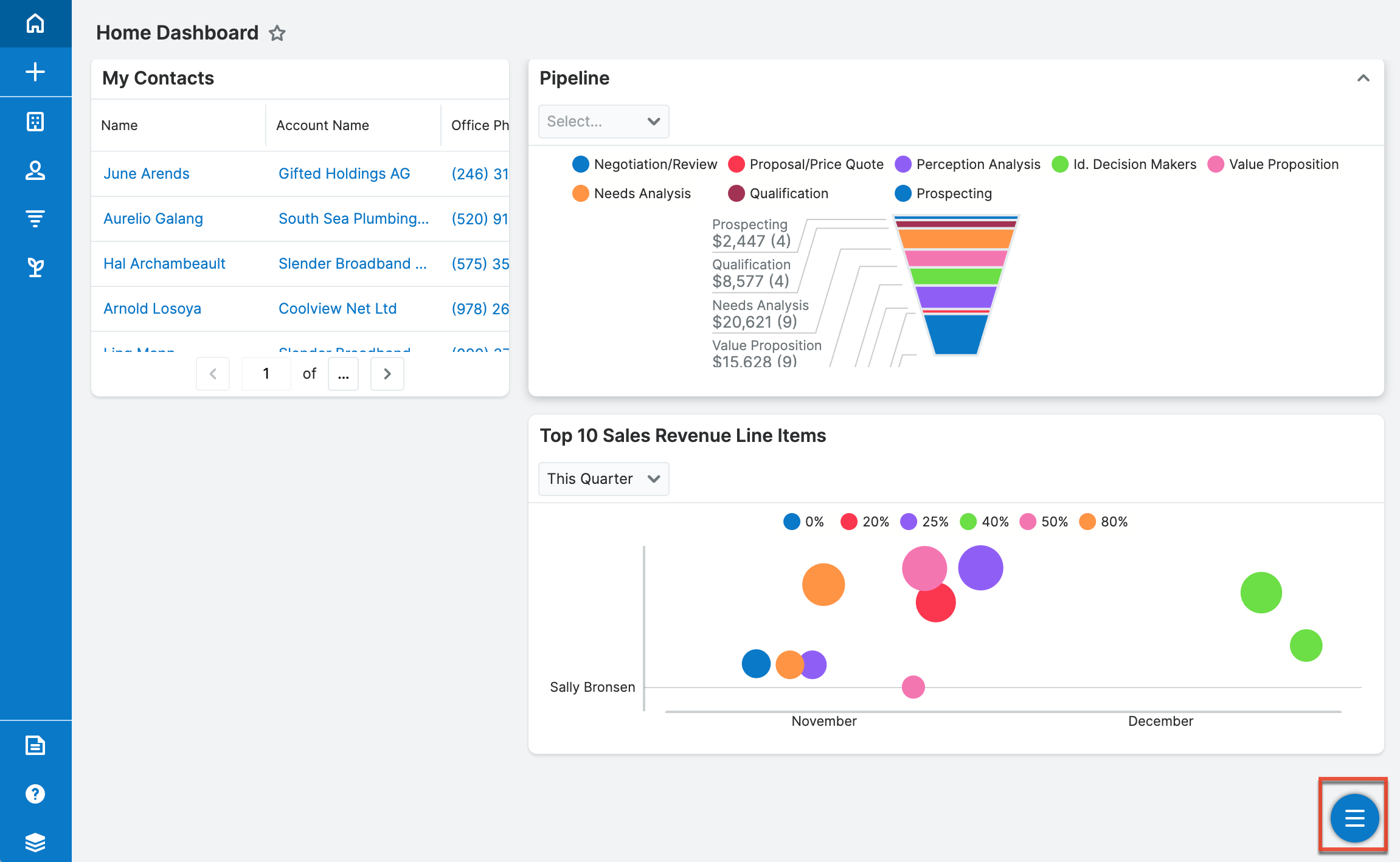
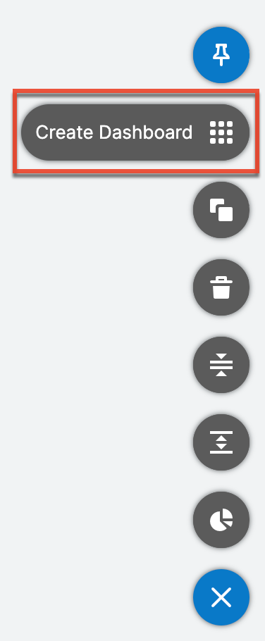
Click the floating actions button to view the available options (e.g., Create Dashboard, Add Dashlet) in the floating actions menu as shown below for the Accounts list view's intelligence pane as an example. Click the X button to collapse the floating actions menu and display the floating actions button again. Please note that the floating actions button also appears on the Console dashboard (e.g., Service Console) and allows you to perform actions such as creating dashboards and editing module tabs.
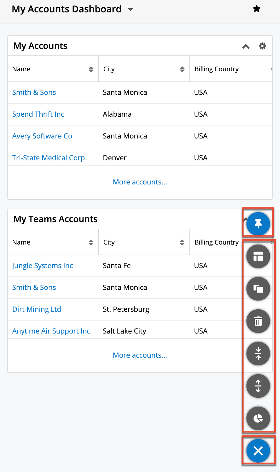
The options in the floating actions menu allow you to perform the following operations which are explained in more detail in the sections below:
| Option | Description |
| Create Dashboard | Create a new dashboard. |
| Duplicate Dashboard | Create and make changes to your own, private copy of the original dashboard without affecting what other users see. |
| Delete Dashboard | Delete the dashboard. |
| Collapse All Dashlets | Collapse all dashlets on the dashboard at once. Note that Sugar will remember the closed or open state of your dashlets the next time you return to the view. Note: This option appears for dashboards (e.g., Accounts List Dashboard) on intelligence panes. |
| Expand All Dashlets | Expand all dashlets on the dashboard at once. Note that Sugar will remember the closed or open state of your dashlets the next time you return to the view. Note: This option appears for dashboards (e.g., Accounts List Dashboard) on intelligence panes. |
| Add Dashlet | Add a dashlet to the dashboard. |
Note: A dashboard and its dashlets may be edited only by the dashboard's Assigned To user and system admin users. Any change to a shared dashboard will update the dashboard for all users.
Creating Dashboards
Users can create dashboards in list view and record view intelligence panes and on the Home page. By default, new dashboards are assigned to the creating user with the Teams field set to the creating user's private team. The dashboard is also automatically designated as a favorite so that it appears on the user's view after being created.
To make the dashboard available for other users, additional teams can be added to the Teams field via the dashboard's record view. Click "Manage Dashboards" from any dashboard selection list to access the Dashboards module list view, then click a dashboard's name to open it in record view. Admin users also have the ability to check the Default Dashboards field to push the dashboard onto the views for all members of the associated teams.
The following steps cover creating a new dashboard called "My Favorites Dashboard" in the Accounts list view intelligence pane as an example:
- Click the floating actions button in the intelligence pane then select "Create Dashboard".
- Enter the name for the new dashboard (e.g., My Favorites Dashboard) then click "Save".
- Click the Add Dashlet button to add any desired dashlets. For more information on adding dashlets, refer to the Adding Dashlets section.
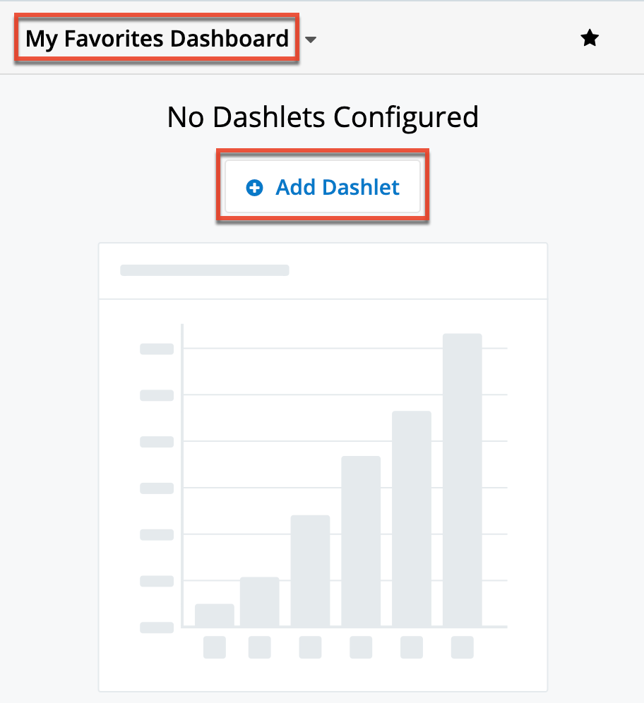
- Click "Save" to finalize the new dashboard.
Duplicating Dashboards
Duplicating a dashboard will create a copy of the original with the following attributes:
- Name: Copy of <Original Name> (e.g., "Copy of Accounts List")
- Assigned To: The user who performed the duplication
- Teams: The private team of the user who performed the duplication
- Default Dashboard: Unchecked
Duplication is recommended when you wish to personalize a shared dashboard. By making your changes to your own, private copy, the original dashboard will not be affected for other users. Additionally, dashboards can only be edited by their Assigned To user and admin users. Creating a copy of a shared dashboard owned by another user allows you to optimize the dashboard for your purposes. For more information, refer to the Personalizing Shared Dashboards section.
Duplicating a dashboard containing a List View dashlet with custom filters applied will duplicate the dashlet including the custom filter. Please note that you can edit the dashlet but will not be able to edit the shared filter in the Configuration Options page. If you remove the shared filter from the dashlet, you will not be able to apply the same filter again as you do not own it.
To create a copy of a dashboard, simply click the Duplicate Dashboard button from the floating actions menu. 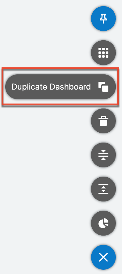
Editing Dashboards
The edit options available for dashboards include renaming dashboards, adding dashlets, resizing dashlets, and rearranging dashlets. Refer to the respective sections for more information.
Renaming Dashboards
Rename dashboards from an intelligence pane, the Home page, or the focus drawer. Click the pencil icon that appears when you hover over the dashboard name, and then type a new name. Shifting focus outside of the field automatically saves the new name. 
Dashboards can also be renamed via the Dashboards module by modifying the Name field.
Note: A dashboard may only be edited by its Assigned To user and system admin users. Any change to a shared dashboard will update the dashboard for all users.
Switching Between Dashboards
Select a dashboard from the dashboard selection list to switch which dashboard is displayed.
Between default dashboards, shared dashboards, and personal dashboards, users may have multiple dashboards active for a single Sugar view (e.g., Accounts list view). The dashboard selection list contains all of the user's active and default dashboards for the particular view and allows for switching between the dashboards. In order for a dashboard to appear in a view's dashboard selection list, the following criteria must be true:
- The dashboard's Module and View fields match the user's current module and view (e.g., Accounts list view). Each dashboard is only visible in the module and view where it was originally created.
- The user belongs to one or more of the teams selected in the dashboard's Teams field.
- The user has selected the dashboard as a favorite or the dashboard's Default Dashboard field is checked. Dashboards an admin has marked as default will appear in your views regardless of being a favorite or not.
On a record view or list view intelligence pane, click the arrow next to the current dashboard's name to view and select from the list of available dashboards. 
On the Home page, click the three-dots menu in the Home tab of the navigation bar to view and select from the list of available dashboards.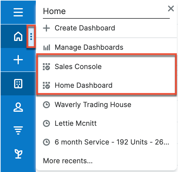
On the focus drawer, click the triangle next to the current dashboard's name (e.g., Contacts focus drawer) in the focus drawer header and select from the list of available dashboards.
Deleting Dashboards
When a dashboard is no longer useful, it can be deleted by the Assigned To user or an admin user. Deleting a dashboard will make it unavailable for any other users with whom it is shared.
Note: If a shared dashboard is no longer needed by its owner or the dashboard owner will no longer be using Sugar, the dashboard can be reassigned, either by editing the Assigned To field via the Dashboards module or using the Reassign Records function in Admin > User Management.
Use the following steps to delete a dashboard from a list view or record view intelligence pane or from the Home page:
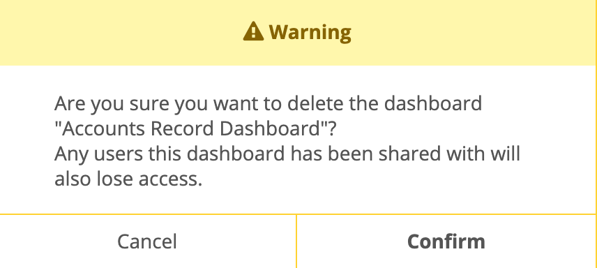
- Click the floating actions button on the intelligence pane then select "Delete Dashboard".
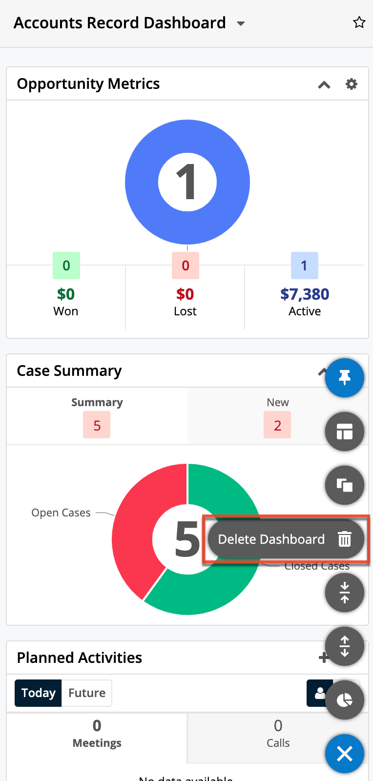
- Click the Confirm button in the confirmation dialog to finalize the deletion.
Dashboards can also be deleted via the Dashboards module from both list view and record view.
Removing Dashboards From Views
If a user no longer wishes to use a dashboard, they can unmark the Favorites designation by clicking the Star icon. For more information on how the Favorites designation factors into which dashboards are available in your views, please refer to the Pulling Dashboards to Your Views section. Please note that dashboards an admin user has designated as defaults by checking the Default Dashboard box will remain available for use in your dashboard selection list regardless of whether or not you have favorited the dashboard.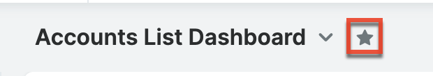
The Favorite designation is also available to edit via the Dashboards module.
Adding Dashlets
Users can add an unlimited number of dashlet rows to suit their business needs. Adding dashlets can be done when the dashboard is in edit mode either during dashboard creation or when editing an existing dashboard.
Note: A dashboard and its dashlets may only be edited by the dashboard's Assigned To user and system admin users. Any change to a shared dashboard will update the dashboard for all users.
Use the following steps to add a new dashlet in the Accounts list view intelligence pane as an example:
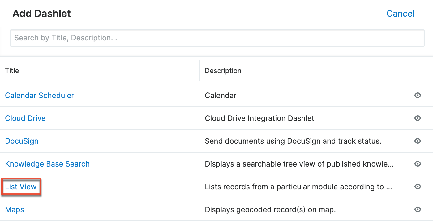
- Click the floating actions button in the intelligence pane then select "Add Dashlet".
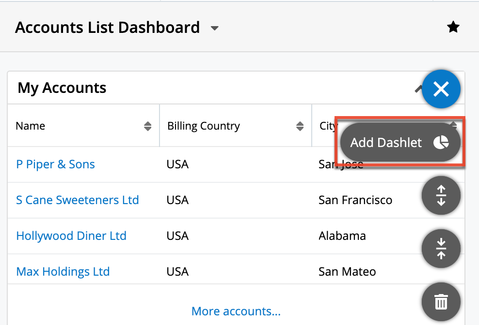
- Click the title (e.g., List View) corresponding to the desired dashlet in the Add Dashlet page.
- Configure the dashlet as desired then click "Save".

- The dashlet will now appear on your dashboard.
Rearranging Dashlets
Users have the option to arrange the dashlets within a dashboard to match their viewing preferences. You can easily swap two dashlets by dragging and dropping the dashlets in their desired locations. Simply click and drag a dashlet's menu bar to relocate it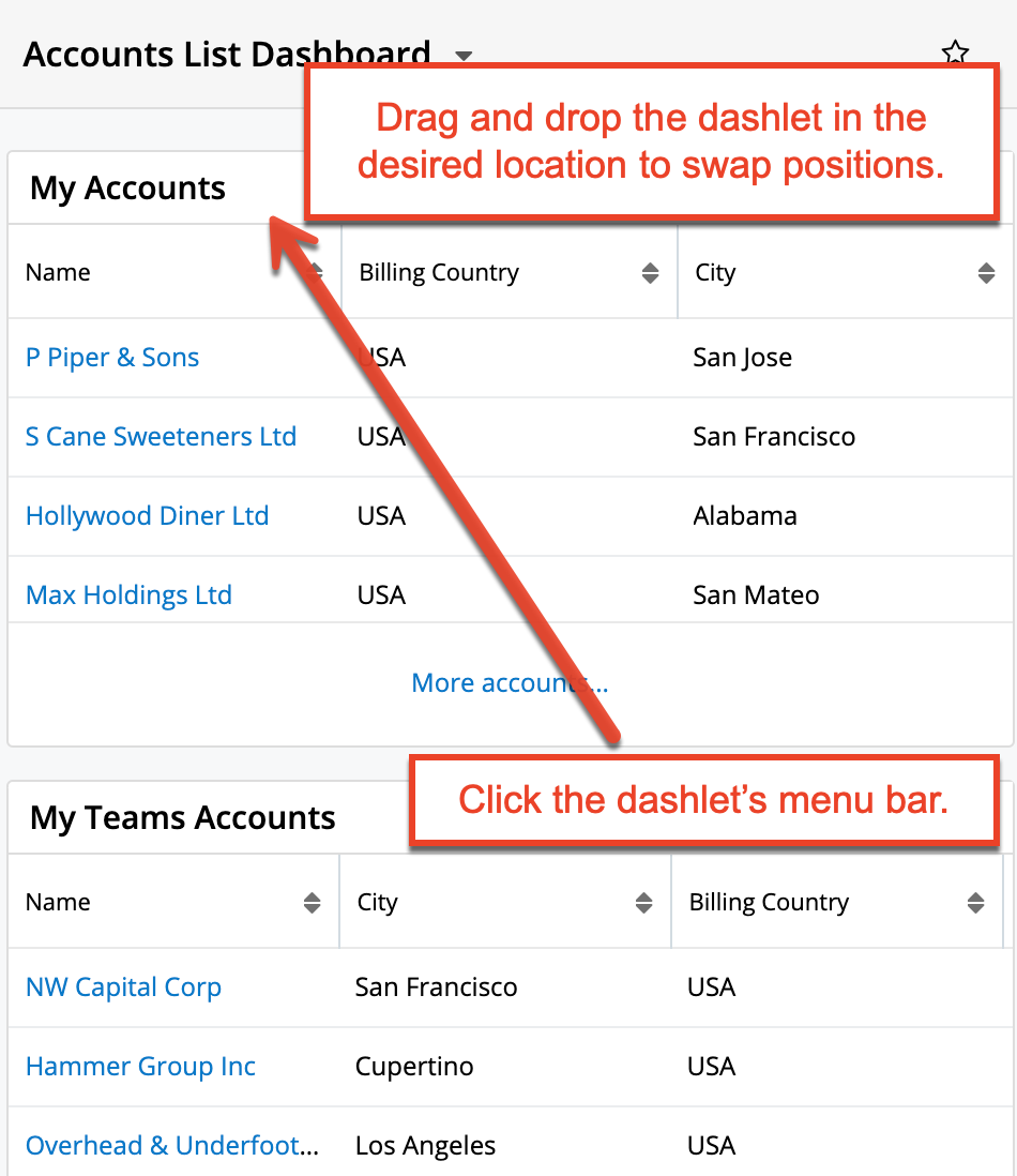
Note: A dashboard and its dashlets may only be edited by the dashboard's Assigned To user and system admin users. Any change to a shared dashboard will update the dashboard for all users.
Editing Dashlets
Dashlets can easily be configured to display specific information users want to view. Simply click the Gear icon at the top of the dashlet menu bar then select "Edit", which will display configuration options specific to the dashlet. Make the necessary changes using the available edit options then click "Save" to preserve the change. For more information about specific dashlets and how to configure them, refer to the Sugar Dashlets documentation.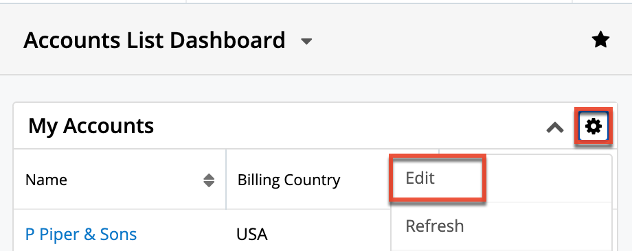
Note: You may not see the dashlet Gear menu, including the Edit option, if you are not the containing dashboard's Assigned To user or system admin user. Any change to a shared dashboard will update the dashboard for all users.
Deleting Dashlets
Users can delete dashlets they no longer wish to view on their dashboards by clicking the Gear icon at the top right of the dashlet and then selecting "Remove". Prior to deleting a dashboard, consider if other users have access to it and consider instead reassigning the dashboard and then un-favoriting it to remove it from your own views. For more information, refer to the Reassigning Dashboards and Removing Dashboards From Views sections.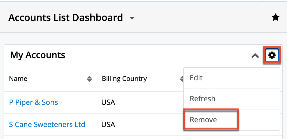
Note: You may not see the dashlet Gear menus, including the Delete option, if you are not the containing dashboard's Assigned To user or system admin user. Any change to a shared dashboard will update the dashboard for all users.
Collapsing and Expanding Dashlets
Users can collapse or expand individual dashlets by clicking the Up or Down arrow on the upper right of the dashlet. Sugar will remember the state of your dashlets the next time you return to the view. For dashboards on intelligence panes, users can also collapse or expand all dashlets on the dashboard by clicking the floating actions button and then selecting "Collapse All Dashlets" or "Expand All Dashlets".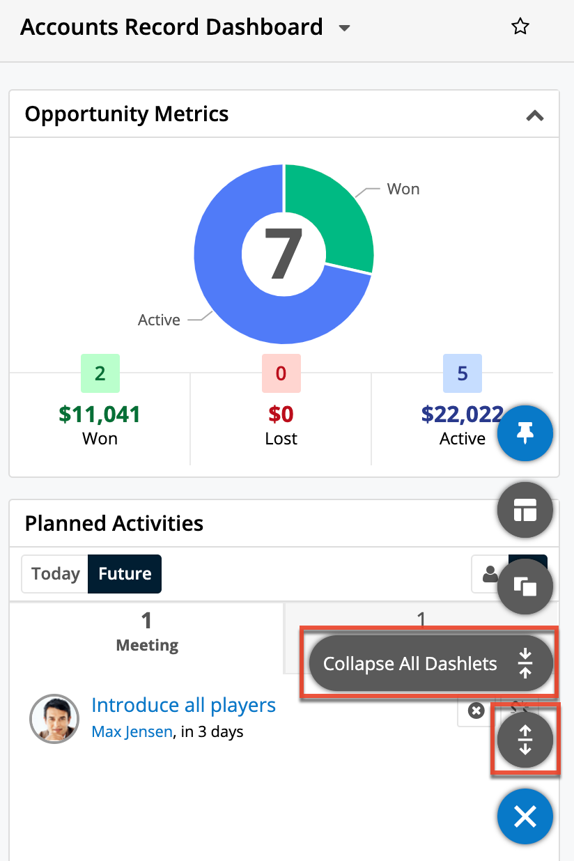
Resizing Dashlets
Users can easily resize the dashlets to fit the available screen real estate and accommodate their desired layout by clicking the double-ended arrow that appears in the bottom corners of the dashlet and dragging it to the desired size. Please note that Sugar will remember the new size of the dashlet when you return to the view. 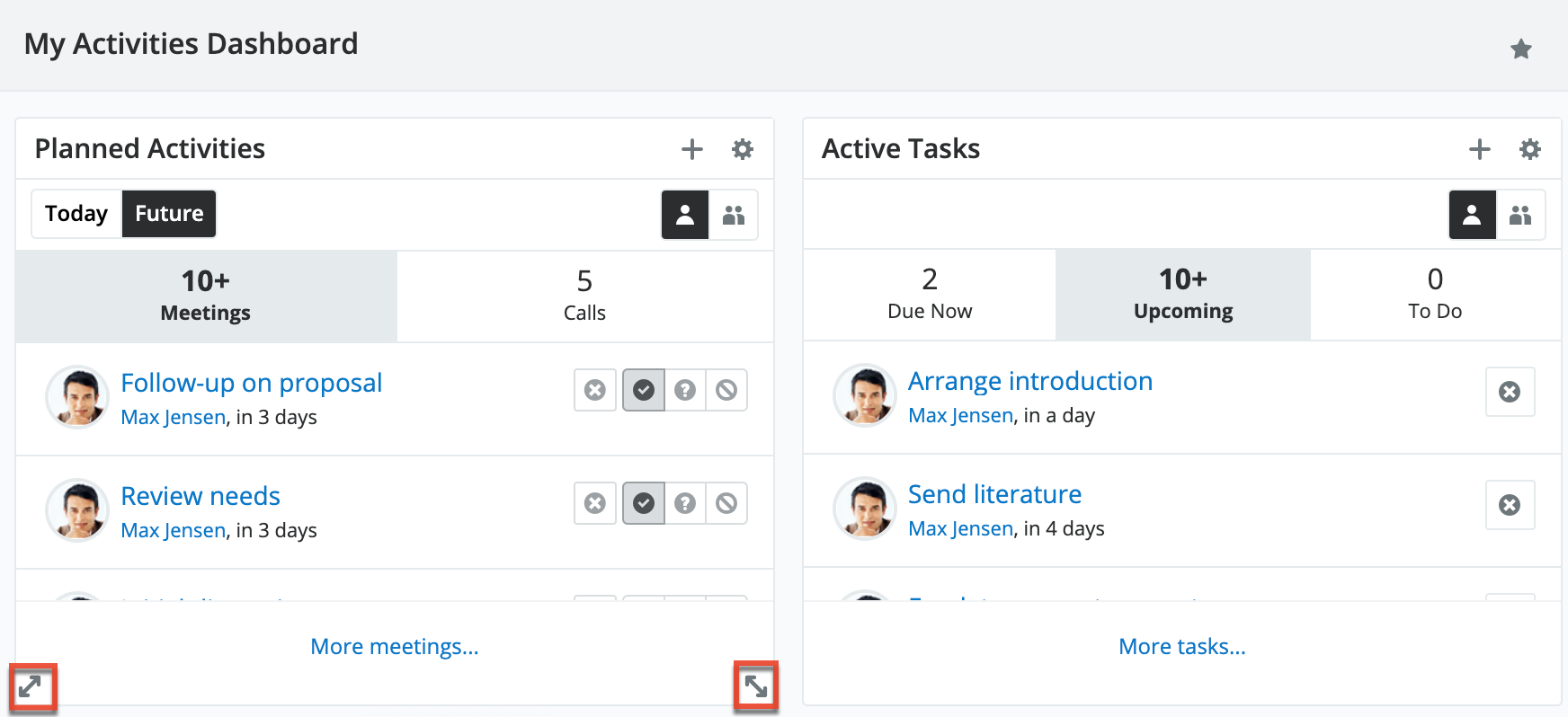
Note: Dashlets can only be resized by the containing dashboard's Assigned To user and system admin users. Any change to a shared dashboard will update the dashboard for all users.
Refreshing Dashlets
When users first navigate to a page in Sugar or refresh the browser window, all of the page's dashlets retrieve fresh information. To update dashlet data between page loads, the dashlets themselves must be refreshed. Dashlet refreshes can be performed manually or automatically.
Users can manually refresh a dashlet by clicking the Gear icon at the top of the dashlet menu bar and then selecting "Refresh". 
Users can schedule the dashlet to automatically refresh using the Auto-Refresh option. Click the Gear icon at the top of the dashlet menu bar then select "Edit". This will display the Configuration Options page where you can select how often the dashlet should automatically retrieve fresh information.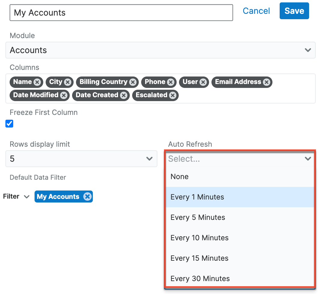
Note: You may not see the dashlet Gear menus, including the Refresh option, if you are not the containing dashboard's Assigned To user or system admin user.
Using Dashboard Filters
Dashboard filters are available for Home dashboards that have at least one Report Dashlet present. Note that dashboard filters are not available on the Sales Console.
A dashboard filter allows you to filter one or more Report Dashlets by controlling the run-time filters for the individual dashlets.
To view dashboard filters, click the Dashboard Filters button (funnel icon) in the upper right corner of the dashboard to open the Dashboard Filters panel. If no dashboard filters exist, click the Add Filter button to create a new filter. 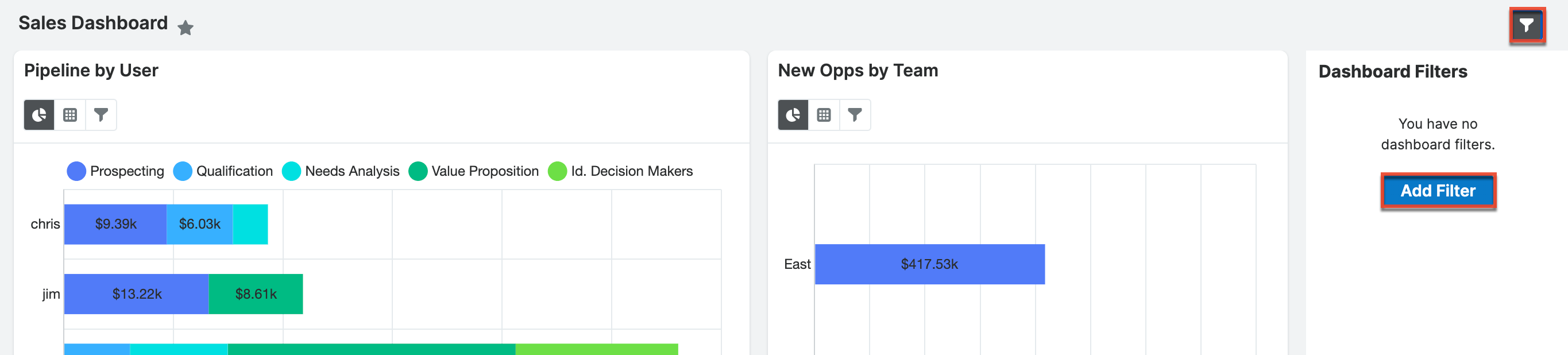
When you click the Add Filter button to create a new filter, a new filter group is created in the Dashboard Filters panel and Report dashlets with run-time filters display a list of available run-time filters. If a Report dashlet does not have run-time filters, or a dashlet is not a Report dashlet, you cannot control that dashlet with dashboard filters. 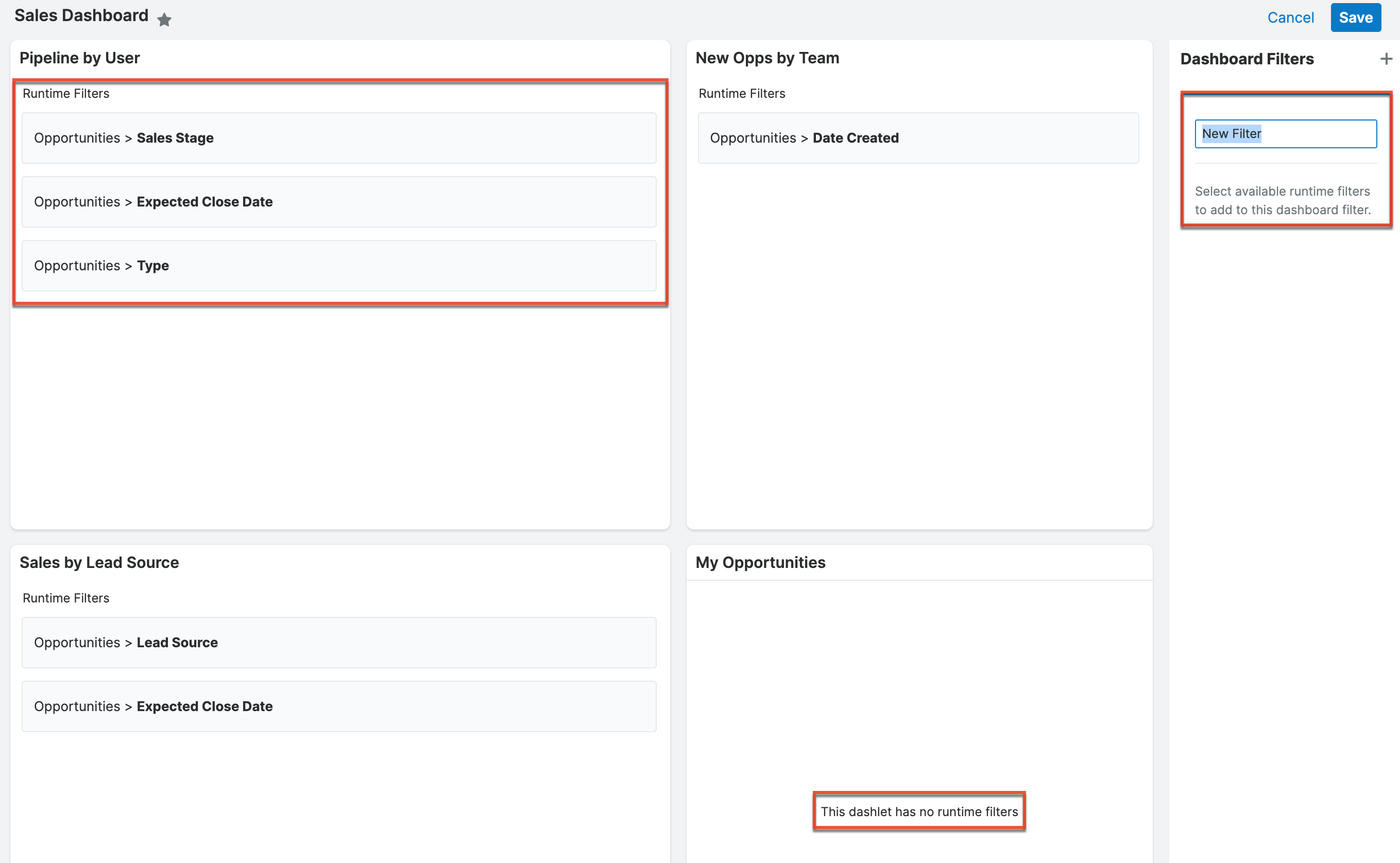
Provide a name for the dashboard filter and then click on a run-time filter (e.g., Expected Close Date) in a Report Dashlet to add it to the filter group. When you select a run-time filter, the run-time filter and dashlet's name are added to the dashboard filter group. Run-time filters in a dashboard filter must be compatible. Once you select a run-time filter, the run-time filters that are available to select on other Report Dashlets get updated according to the following rules:
- Relate and user name fields must share the same data type and target module
- Dropdown fields must share the same drop down list
- All other fields must have the same type of data (e.g., string, date)
Incompatible run-time filters are inactive until you either create a new dashboard filter group or select a compatible dashboard filter group. A dashboard filter group can have one or more run-time filters, but only one run-time filter from a single report can be used in a group. When you create a dashboard filter, you must select a default value for the filter.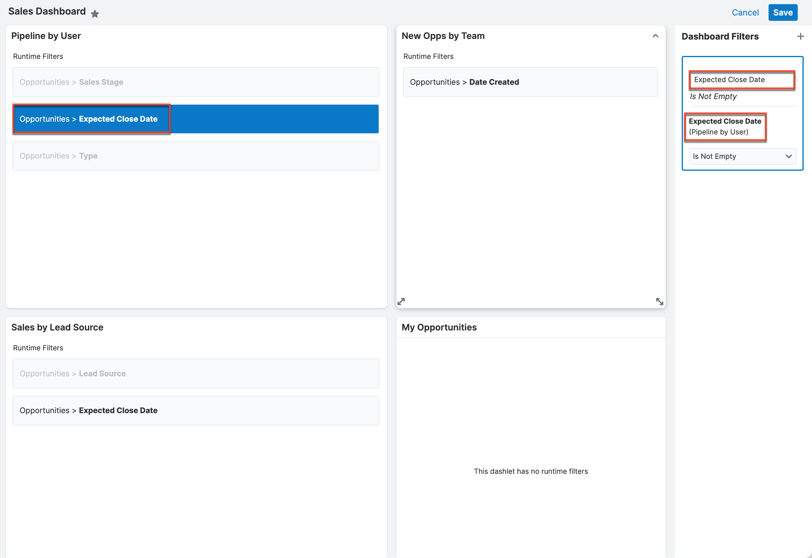
To add another dashboard filter, click the plus icon in the upper right corner of the Dashboard Filters panel. Note that run-time filters that have been used in another dashboard filter cannot be reused and that a checkmark appears next to the name. 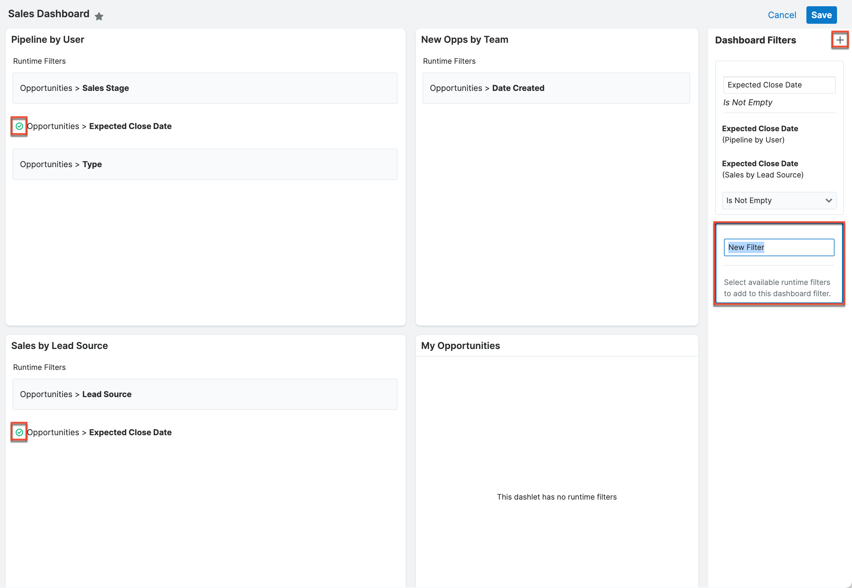
To remove a run-time filter from a filter group, click the x in the upper right corner of the run-time filter within the group or, with the filter group selected, click on the run-time filter in the dashlet frame to deselect it. 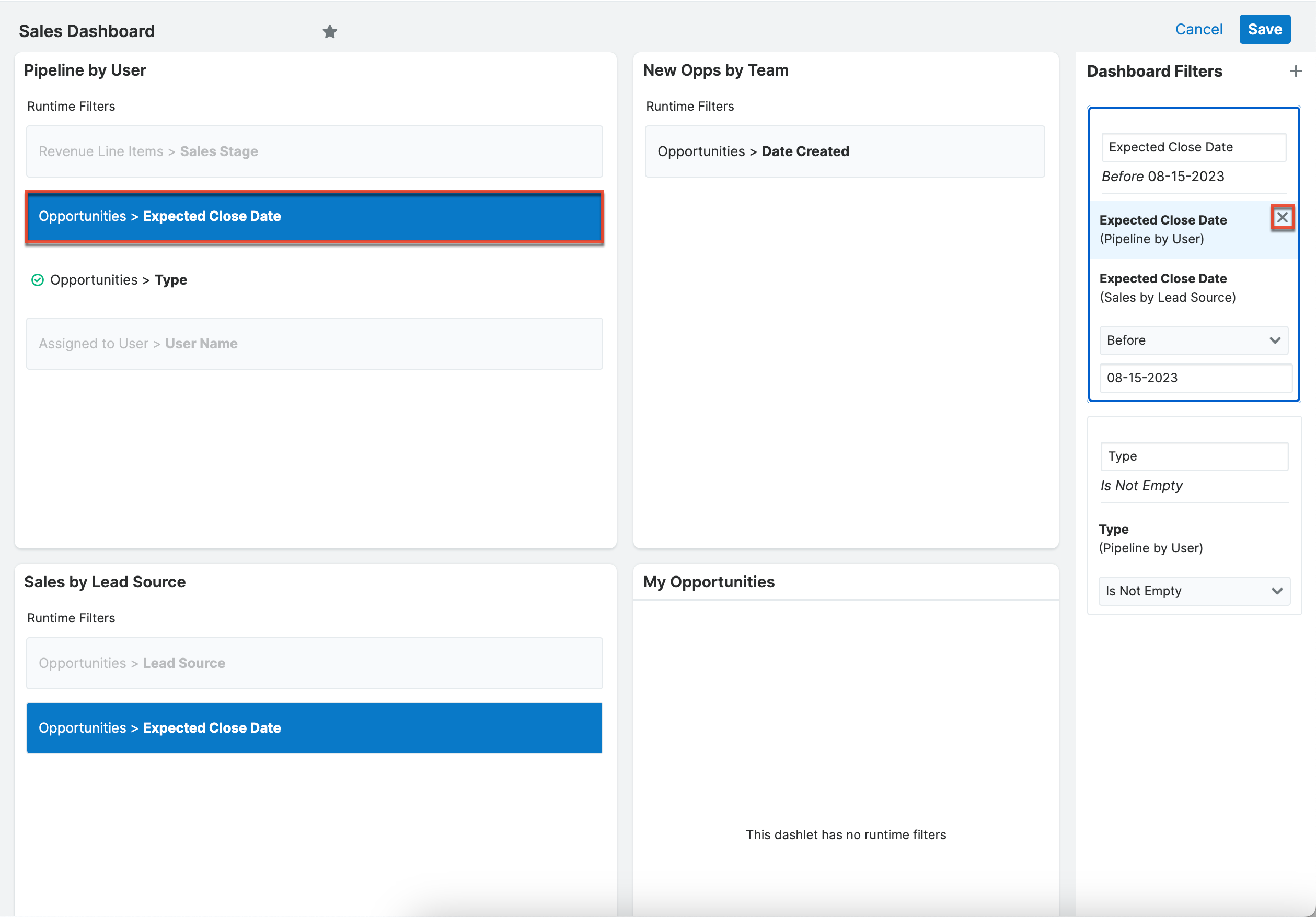
To remove an entire dashboard filter group, click the x in the upper right corner of the group. To collapse the group, click the up arrow. When you are done adding dashboard filters, click "Save" in the upper right corner of the dashboard. Click "Cancel" to exit without saving changes.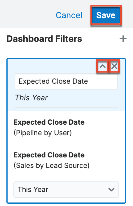
Note that if you remove a run-time filter from a report, the filter is automatically removed from the dashboard filter. If a dashboard filter contains only a single run-time filter and the run-time filter is removed from the report, the dashboard filter group gets automatically removed.
On the Home dashboard, the Dashboard Filters button (funnel icon) will display a number badge indicating the. number of dashboard filters present on your dashboard. If you wish to edit your dashboard filters, simply click the pencil icon in the top right corner of the Dashboard Filters panel. 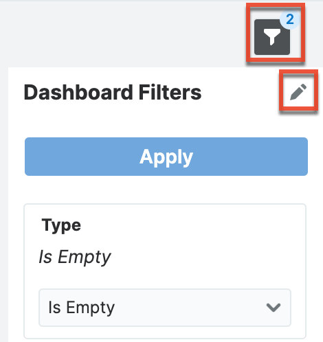
When you view your dashboard and want to use the dashboard filters, hovering over the dashboard filter group in the Dashboard Filters panel highlights the group and the dashlets that are affected by that particular dashboard filter. Keep in mind that other dashlets in your dashboard may be affected even if they are out of view on the screen. Adjust the dashboard filter in the Dashboard Filters panel and then click "Apply" to apply changes to the configured dashlets. When you share dashboards that have dashboard filters, other users can adjust the dashboard filters to suit their needs. Each user controls their own selections for the dashboard filter until the dashboard owner edits the default value or the report is edited. A user of a shared dashboard must have access to the reports being controlled by the dashboard filters in order to view and use the dashboard filter.
Any run-time filters that are used in dashboard filters are unavailable to use as run-time filters in the Report dashlets. Any run-time filters that are not used in dashboard filters are available to use to filter the individual dashlet.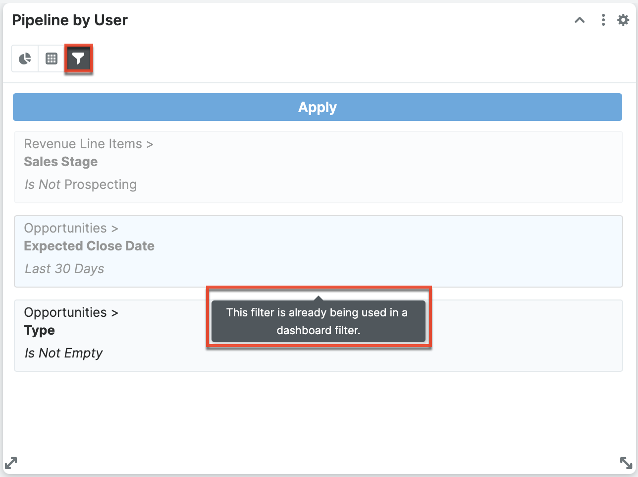
Managing Dashboards
The Dashboards module consists of dashboard records visible in the Dashboards list view and Dashboards record view. Please note that when viewing a dashboard in list view and record view, its dashlets are not visible. Rather, the Dashboards module allows users to share their dashboards with teams of users, pull dashboards to their own views, reassign dashboards, and update select fields on the dashboard record. Admin users are also able to push dashboards to the views of teams of users.
Note: To add dashlets, create/duplicate dashboards, etc., click the floating actions button on the Home page dashboard or list view/record view intelligence pane.
The Dashboards module can be accessed from any record view or list view intelligence pane or from the Home module. Simply select "Manage Dashboards" from the view's dashboard selection list.
From record view and list view intelligence panes, click the triangle next to the dashboard's name and select "Manage Dashboards".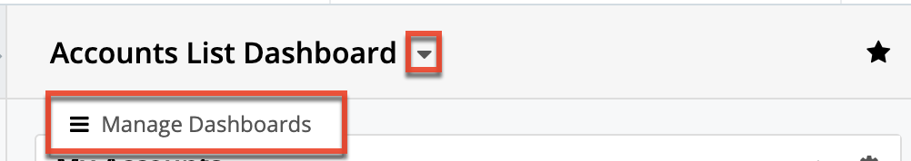
From the Home page, click the three-dots menu in the Home tab of the navigation bar and select "Manage Dashboards".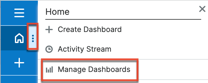
From the focus drawer, click the triangle next to the current dashboard's name (e.g., Contacts focus drawer) in the focus drawer header and select "Manage Dashboards".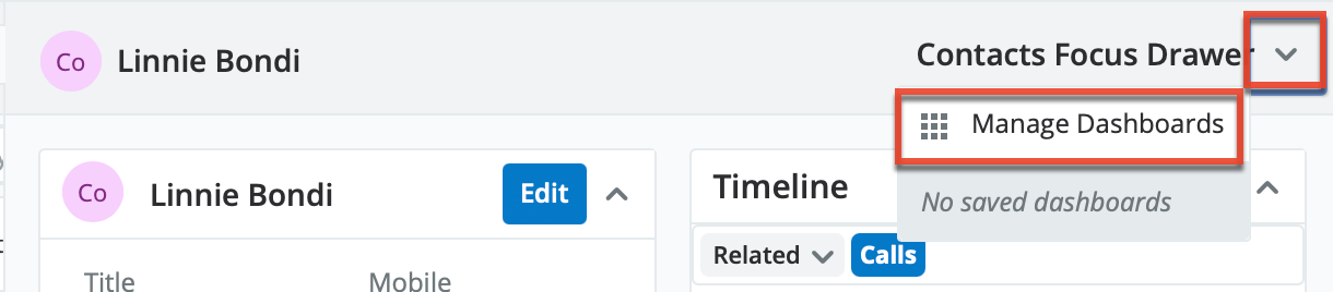
Doing so will open the Dashboards module in list view. The list view will automatically be filtered by the module and view you navigated from so that you can quickly locate dashboards available in that view. To locate other dashboards, simply modify or remove the filters. For more information about filtering list views, refer to the User Interface documentation.
Note: If you do not see the desired dashboard in your Dashboards module list view or receive a permissions error when attempting to navigate directly to its record view, you may not belong to one of its designated teams. The dashboard's owner or an admin user will need to update the dashboard's Teams field to grant you access. For more information, refer to the Team Management documentation in the Administration Guide. If the Teams field includes a team to which you belong, confirm that the dashboard's Module and View field match the module and view (e.g., Accounts record view) where you would like it to appear. Each dashboard can only be applied to the module and view where it was originally created. For more information, refer to the Shared Dashboards section above.
Dashboard Module Fields
The Dashboards module includes the following fields. For information on using and editing various field types, refer to the User Interface documentation.
| Field | Description |
| Assigned To | The Sugar user assigned to the dashboard. |
| Date Created | The date the dashboard record was created. |
| Date Modified | The date the dashboard record was last modified. |
| Default Dashboard | Specifies that the dashboard will appear in the specified module and view for all users belonging to the teams selected in the Teams field. Note: Only admin users can check or modify the Default Dashboard checkbox. |
| Module | The module (e.g., Accounts, Opportunities, Home) where the dashboard appears. Note: This field is read-only for all users. Dashboards cannot be moved from one module to another. |
| Name | The name of the dashboard that is displayed in the dashboard selection list. |
| Teams | The teams whose members have access to the dashboard in the Dashboards module. |
| View | The view (e.g., "List" for list view and "Record" for record view) where the dashboard appears. Note: This field is read-only for all users. Dashboards cannot be moved from one view to another. |
Working With the Dashboards Module
The following links will open specific sections of the User Interface documentation where you can read about views and actions that are common across most Sidecar modules. The sections following this Working With Dashboards section describe Dashboard-specific behaviors and functionality.
| Content Link | Description |
| Viewing Dashboards Viewing via List View Viewing via Record View |
The Viewing Records section describes the various methods of viewing dashboard records, including via the Dashboards list view and record view. Note: The Dashboards list view and record view include information about the dashboard but do not display the dashboard's dashlets. Dashboards including their dashlets are visible in intelligence panes and the Home page as described in the Using Dashboards and Dashlets section. |
| Searching for Dashboards List View Search Creating a Filter |
The Searching for Records section provides an introduction to list view search, which searches and filters within the Dashboards module. |
| Dashboards List View Total Record Count List View Search Checkbox Selection Mass Actions Menu Favorite Designation Column Reordering Column Resizing Column Sorting Column Selection Record Actions Menu Pagination |
The List View section walks through the many elements of the Dashboards list view layout which contains a filterable list of all dashboard records in Sugar. Note: A user can only access a dashboard's record actions menu in list view when they are the assigned user or an admin user. |
| Dashboards Record View Favorite Designation Next or Previous Record Show More |
The Record View section walks through the many elements of the Dashboards Record View layout which contains detailed information about a single dashboard record. Note: The Dashboards list view and record view include information about the dashboard but do not display the dashboard's dashlets. Dashboards including their dashlets are visible in intelligence panes and the Home page as described in the Using Dashboards and Dashlets section. |
| Editing Dashboards Editing Inline via Record View Editing via Record View Editing Inline via List View Mass Editing via List View |
The Editing Records section describes the various methods of editing existing dashboard records, including inline via the Dashboards record view, in full edit mode on the record view, inline via the Dashboards list view, and via the Mass Update option on the list view. |
| Deleting Dashboards Deleting via Record View Deleting via List View Mass Deleting via List View |
The Deleting Records section describes the various methods of deleting unwanted dashboards, including via the Dashboards record view, an individual record's Actions menu on the Dashboards list view, and the Mass Actions menu on the list view. Dashboards can also be deleted when viewing them in your intelligence pane or Home page as described in the Deleting Dashboards section. |
| Favoriting Dashboards Favoriting via List View Favoriting via Record View |
The Favoriting Records section describes the various methods of marking dashboards as favorites, including via the Dashboards list view and record view. Marking a non-default dashboard as a favorite makes it available for the user in the specified module and view. For more information, refer to the Pulling Dashboards to Your Views section. Once on a view, dashboards can be de-favorited as described in the Removing Dashboards From Views section. |
Sharing Dashboards With Teams
When a dashboard is first created, it is automatically assigned to the creating user and his or her private team. In order to make the dashboard available for others to use, the Teams field must first be updated to grant those users access. Refer to the Teams Access section for more information.
From the Dashboards list view, click a dashboard's name to open it in record view where additional teams can be added to the Teams field. Only the assigned to user and admin users can edit dashboard records, including the Teams field.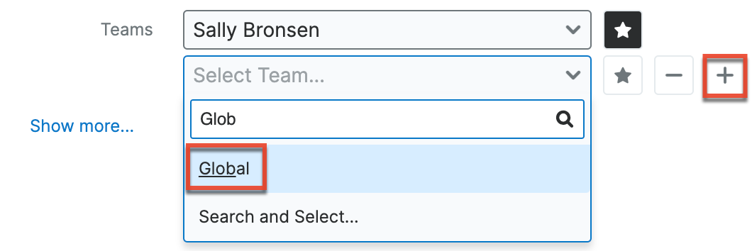
Once a dashboard has been shared with multiple users via the Teams field, those users can then favorite the dashboard to make it visible in their own views. Alternatively, an admin user can check the Default Dashboard field to push the dashboard to the user's views automatically. Refer to the Pulling Dashboards to Your Views and Pushing Dashboards to Teams sections for more information.
When a dashboard contains List View dashlets with custom filters applied, the filters will be shared with all members of the associated team(s). So, when the user views the shared dashboard, the List View dashlet will display a filtered list of records using the shared filter. Please note that users will only be able to see records as allowed by their team membership, user access type, and assigned roles. For more information on teams and roles, please refer to the Team Management and Role Management documentation in the Administration Guide. Please note that custom filters in the List View dashlet can only be edited by the original dashboard owner and any changes made to the shared filter will be pushed to all users belonging to the associated team(s). If the owner later deletes the filter, the shared filter will be removed from the List View dashlet for all users belonging to the associated team(s), and the dashlet will no longer return results when viewed from the dashboard.
Pulling Dashboards to Your Views
When a user wishes to use a dashboard that is available in their Dashboards module but does not appear in the relevant view's dashboard selection list, they can designate the dashboard as a favorite in order to pull it onto the view. Dashboards a user has marked as favorites will appear for use in the relevant view as prescribed by the dashboard's Module and View fields (e.g., Accounts list view).
- Navigate to the module and view where you would like to see the shared dashboard.
- Select the Manage Dashboards option.
- Locate the dashboard you wish to use.
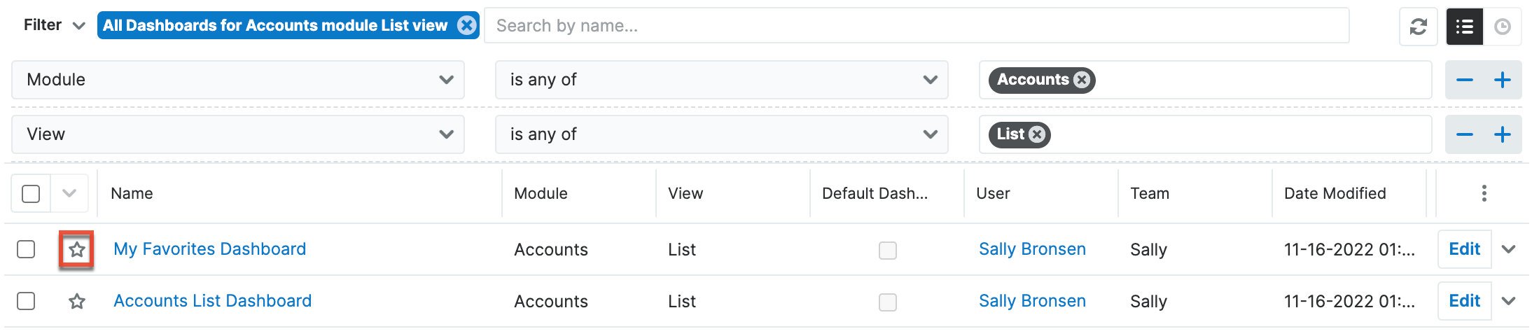
- Mark the dashboard as a favorite by clicking the star icon in the list view or record view.
- Return to the module and view to confirm that the dashboard is now available for selection.
Once a dashboard is a favorite and is available for use, it can be unmarked as a favorite from the Dashboards module or directly from the relevant view in order to remove it from that view's dashboard selection list. Dashboards an admin has marked as default will appear in your views regardless of being a favorite or not, as described in the Pushing Dashboards to Teams section.
Pushing Dashboards to Teams
Sugar admin users have the ability to push dashboards to the views for teams of users. This is a two-step process that involves first sharing the dashboard with the desired user's teams, then checking the Default Dashboard field. For more information on how the Teams field plays a role, refer to the Sharing Dashboards With Teams section. When the Default Dashboard field is checked, the dashboard will appear on the named module and view's dashboard selection list for every user that has teams access. This effectively pushes the dashboard to users without their involvement. Default dashboards have a checkmark on the standard dashboard icon when viewing them in the selection list on views.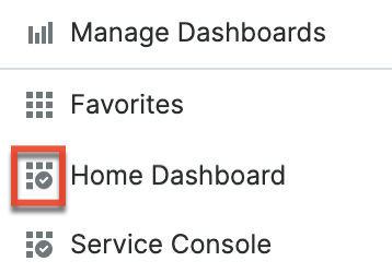
A dashboard can be pushed to its associated teams by updating the Default Dashboard checkbox when editing the record. Only admin users can edit the Default Dashboard field.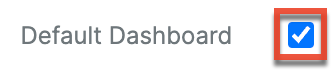
Sugar includes out-of-the-box default dashboards that automatically have "Default Dashboard" checked. Refer to the Out-of-the-Box Default Dashboards section for more information.
Reassigning Dashboards
There are several situations in which you may need to reassign a dashboard record to a different user. Only the Assigned To user and system admin users are able to edit dashboards. Therefore, reassigning the dashboard record will allow a different user to make changes to it. Additionally, because dashboards may be shared amongst multiple users, care needs to be taken before deleting a dashboard or removing a user account's record to Sugar. In both cases, the dashboard should be reassigned to prevent other users from losing access unintentionally.
A dashboard can be reassigned by updating the Assigned To field when editing the record. Only the assigned to user and admin users can edit dashboard records, including the Assigned To field.
When the dashboard is reassigned, the following changes will automatically be made:
- The previous Assigned to user loses the ability to edit the dashboard.
- If the new Assigned To user is not a member of any team in the Teams field, their private team is automatically appended to the Teams field.
- If the previous Assigned to user's private team is selected in the Teams field, it will remain selected so that they continue to have access to the dashboard.
Please note that a custom filter applied to a List View dashlet will not be transferred to the new Assigned To user, but rather shared. So, the new owner can edit the dashlet but will not be able to edit the shared filter in the Configuration Options page. If the applied custom filter is removed from the dashlet, they will not be able to apply the same filter again as they do not own it.
All of a user's assigned dashboards can be reassigned at once using the Reassign Records tool available in the User Management section of the Admin panel. This is especially useful to preserve others' access to a dashboard when a user account is being deactivated. For more information, refer to the User Management documentation in the Administration Guide.